
the Astro mascot
Overview
Astro is a free, open-source (MIT license) framework that is “the web framework for content-driven websites”. It can be used to generate static sites, build server-side rendered (SSR) sites, and define API endpoints.
A major focus of Astro is shipping less JavaScript code to browsers and doing more work on the server side.
Astro supports using many kinds of UI components including Astro, Alpine, Lit, Preact, React, SolidJS, Svelte, Vue, WebComponents, and more.
Astro uses the Islands architecture. Jason Miller (creator of the Preact framework) describes this approach as a way to “render HTML pages on the server, and inject placeholders or slots around highly dynamic regions that can then be hydrated on the client into small self-contained widgets, reusing their server-rendered initial HTML.” Each island is a bit of JavaScript-enabled interactivity and the water around them is static HTML.
Astro allows each “island” to use a different web UI frameworks, combining them into in a single web application.
Astro supports SSR adapters for Cloudflare, Netlify, Node, and Vercel.
Astro provides integrations with Tailwind for CSS styling and a few other packages.
Astro provides file-based routing that is specified by
the files and directories under the src/pages directory.
For example, the URL path /foo/bar refers to
the page defined in the file src/pages/foo/bar.astro.
Astro was created by Fred K. Schott. Fred previously worked on WebComponents at Google and was on the Polymer team. He also created Snowpack, “a lightning-fast frontend build tool”, that is no longer maintained. The functionality of Snowpack was superseded by Vite which is used as the build tool in Astro.
Development of Astro is managed by “The Astro Technology Company” which was founded in January 2022 with $7M in seed funding.
Top Benefits
The top benefits of using Astro include:
- sends less JavaScript code (zero by default) to browsers resulting in faster startup
- file-based routing simplifies mapping pages and endpoints to URLs
- provides image optimization
- makes static site generation (SSG) easy
- supports server-side rendering (SSR) of pages
- optimizes static content by confining dynamic behavior to “islands”
- supports TypeScript for providing intellisense and detecting errors while writing code
- can describe pages, components, and content with Markdown
- provides a simple syntax for defining Astro components that leans into web fundamentals (HTML, CSS, and JavaScript)
- can use components implemented in all the popular web frameworks
- can use content collections to easily generate static pages from data at build time
- integrates with many popular content management systems (CMS)
- supports implementing API endpoints in JavaScript or TypeScript
- integrates with Alpine, MDX, React, Svelte, Tailwind, and more
- simplifies installing and configuring integrations
- has a Discord channel that is very active and helpful
The top issues with using Astro include:
- primitive support for client-side interactivity (but combining the use of Alpine provides excellent support)
- fewer available component libraries than with other frameworks
Projects
To create an Astro project, enter npm create astro@latest.
This will prompt for the following:
-
permission to install create-astro
-
“Where should we created your new project”
Enter the name of a new subdirectory to be created. To create the project in the current directory, enter only ”.”. To enter a relative path, begin with ”./”.
-
“How would you like to start your new project”
The options are “Include sample files”, “Use blog template”, and “Empty”.
-
“Install dependencies” Yes or No
Press return to accept the default of “Yes”.
-
“Do you plan to write TypeScript” Yes or No
Press return to accept the default of “Yes”.
-
“How strict should TypeScript be? Strict, Strictest, or Relaxed
The default is “Strict”, but its best to select “Strictest”.
-
“Initialize a new git repository? Yes or No
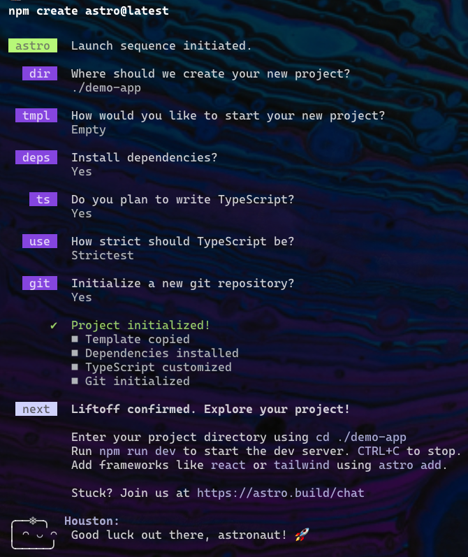
Once the project is created, follow the instructions that are output.
cdto the newly created directory.- Optionally add the Tailwind integration for Tailwind CSS styling
by entering
npx astro add tailwind. - Enter
npm startornpm run devto start a local server. Both do the same thing. - Browse localhost:4321 (the default port).
The Astro logo is a rocket. Astro uses 4321 for the default port because it is like a countdown sequence for a rocket launch.
Hot reloading is automatically configured so saved changes are automatically reflected in the browser.
To check for issues in the project code,
enter npx astro check or npm run astro check.
This will output errors, warnings, and hints.
To build the site for production, enter npm run build.
This runs astro check and stops if there are any errors.
Then it runs astro build which creates a dist directory
containing all the files needed to deploy the site.
The output lists all the generated files.
To preview the built site, enter npm run preview and browse localhost:4321.
To see a list of the available “astro” commands, enter npm run astro.
To open the Astro documentation in the default web browser,
enter npm run astro docs. For help on a specific topic,
click in the search input or press the slash key to move focus there.
Then enter a topic.
Configuration
The file astro.config.mjs defines Astro configuration options
including adapters (like node) and integrations (like Tailwind).
While this file can be manually modified,
it is easier and less error prone to add adapters and integrations
using the npx astro add {name} command which
installs an adapter or integration and updates the astro.config.mjs file.
The following example configuration file adds the use of the node adapter and the mdx and tailwind integrations.
import {defineConfig} from 'astro/config';
import mdx from '@astrojs/mdx';
import node from '@astrojs/node';
import tailwind from '@astrojs/tailwind';

export default defineConfig({
  integrations: [mdx(), tailwind()],
  output: 'server', // defaults to 'static'
  adapter: node({
    mode: 'standalone'
  })
});
The values for output and adapter shown above result from
adding an adapter with the command npx astro add {adapter-name}.
In this case the adapter name was “node”.
The output property can be set to the following values:
output value | Meaning |
|---|---|
'static' | All pages are generated at build time. (default) |
'hybrid' | All pages default to being generated at build time. |
'server' | All pages default to being generated on the server when requested. |
Perhaps a better name for “hybrid” would have been “ssg” (at build time) and a better name for “server” would have been “ssr” (on request).
In “hybrid” mode, to cause a specific page to NOT be generated at build time, add the following line in the component script:
export const prerender = false;
In “server” mode, to cause a specific page to be generated at build time, add the following line in the component script:
export const prerender = true;
If a page for a dynamic route
that is to be generated at build time
does not export a getStaticPaths function,
the following error message will be output by npm run build:
“[GetStaticPathsRequired] getStaticPaths() function
is required for dynamic routes.”
If a page for a dynamic route
that is to be generated on the server when requested
does define a getStaticPaths function, it will be ignored
and the following warning message will be output by npm run build:
“[WARN] [router] getStaticPaths() ignored
in dynamic page /src/pages/{path}/[{param}].astro.”
When output is set to “server” or “hybrid”,
a server adapter must be installed.
Otherwise running npm run build will output the error message
“[NoAdapterInstalled] Cannot use output: 'server' or output: 'hybrid'
without an adapter. Please install and configure the appropriate server adapter
for your final deployment.”
Astro maintains SSR adapters for Cloudflare, Netlify, Node, and Vercel. There are also community-maintained SSR adapters for AWS, Deno, and more.
For an excellent video on Astro rendering options, see Choosing between SSR, SSG, and dynamic rendering in Astro.
VS Code
If you use VS Code as your editor, consider installing these extensions:
-
Astro from astro.build
This provides language support for
.astrofiles using the Astro language server. It includes syntax highlighting, intellisense code completions, Emmet completions in HTML and CSS code actions for quick fixes, code formatting (using Prettier), code folding, and more. -
Houston from astro.build
Houston is the Astro mascot.
This extension provides a color theme using Astro colors which include “cool blues, minty greens, and soft purples”.
This extension also adds a “HOUSTON” section to the Explorer pane which becomes visible after restarting VS Code. This displays the mascot with a smiley face if the project has no errors. If there are errors, it displays a frowning face, sad face, or crying face depending on the number of errors.
Error messages are displayed in the “Problems” panel. When this panel is not visible, it can be displayed by selecting “Problems: Focus on Problems View” from the command palette. It can also be toggled by pressing ctrl-shift-m (cmd-shift-m on macOS).
-
MDX from unified
This provides language support for
.mdxfiles. -
Prettier - Code Formatter from prettier.io
This formats code using Prettier.
To configure code formatting, open any
.astrofile, open the Command Palette, and enter “Format Document”. It will prompt for configuring this and automatically do so. -
Tailwind CSS Intellisense from tailwindcss.com
This provides autocomplete, syntax highlighting, and linting for Tailwind CSS classes. When entering Tailwind class names for colors, it provides color preview swatches.
Prettier
The steps to configure an Astro project to use Prettier are:
-
Enter
npm install -D prettier-plugin-astro -
Create the file
.prettierrcat the root of the project.Some suggested options are shown here. The only one that is required is
plugins.{ "arrowParens": "avoid", "astroAllowShorthand": true, "bracketSpacing": false, "singleQuote": true, "trailingComma": "none", "plugins": ["prettier-plugin-astro"] } -
Add the following script in
package.json."format": "prettier --write '{public,src}/**/*.{astro,css,html,js,ts}'",
To format all the files in the project, enter npm run format.
Directory Structure
The public directory holds assets such as audio, images, and video
that will be served as-is and not affected by any optimizations.
Common subdirectories of the src directory are described in the table below.
The only special names are pages and content.
There are common names used for the others, but they are not enforced.
| Directory Name | Purpose |
|---|---|
src/components | This contains component source files that can be used in page components. |
src/content | This holds collections of content files. |
src/images | This holds images that will be used with the provided Image component in order to optimized them. |
src/layouts | This holds component source files that typically provide boilerplate HTML used by pages. |
src/pages | This contains component source files that represent complete pages of the app or API endpoints. Initially only index.astro is present. |
src/styles | This contains CSS files that define global styling. |
For site-wide constants, consider creating the file src/constants.ts
that export the constants.
In files that need the constants, import them from this file.
Pages
Pages are defined by files in the src/pages directory.
Think of pages like oceans and components like islands
in the islands architecture.
Islands are where interactivity can reside.
Examining the source of a page containing islands
reveals that Astro uses custom elements named “astro-island”.
Pages can be described by
Astro (.astro), HTML (.html), Markdown (.md), and MDX (.mdx) files.
Pages cannot be described by components from frameworks like React and Svelte
because those are potential sources of interactivity.
But pages can render those kinds of components.
In a sense, Astro can be thought of as a compiler that compiles page files into HTML files.
The URL path of a page is determined by its subdirectory path and file name.
For example, the file src/pages/demo/colors.md
defines the page at the URL path /demo/colors/.
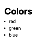
---
layout: ../layouts/Layout.astro
---

# Colors

- red
- green
- blue
The front matter property layout specifies the path to a layout component
that provides the HTML boilerplate for the page.
This can include link tags that refer to CSS files used to style the page.
This same page can be implemented as an Astro component
in the file src/pages/demo/colors.astro as follows:
---
import Layout from "../../layouts/Layout.astro";

const colors = ["red", "green", "blue"];
---

<Layout>
  <h1>Colors</h1>
  <ul>
    {colors.map((color) => <li>{color}</li>)}
  </ul>
</Layout>
Unlike with many other web frameworks, Astro does not require
specifying a key for repeated elements like the li elements above.
This is because Astro generates the elements at build-time and
doesn’t use client-side JavaScript to add, modify, and delete them
based on changes to collections.
A page can return the result of calling Astro.redirect({url})
to redirect to another page.
Astro Components
Astro components are defined in source files with a .astro file extension.
These describe HTML that will be rendered on the server.
This can contain three sections:
-
optional component script
This section begins and ends with lines that only contain three dashes, referred to as “code fences”. This is is the same syntax that is used in Markdown files for “front matter”.
Write JavaScript code inside the code fences. If TypeScript was enabled for the project, it can be used here.
The code in component scripts only runs at build time or during SSR. It is not sent to browsers. Output from
console.logcalls in component scripts appears where the server is running, not in the browser.Place code that should run in the browser inside a
scripttag that appears after the component script.Code in a component script can:
-
import other files with ESM syntax
-
declare types, such as the type of the props it accepts
For example:
// This can be defined with either "type" or "interface". type Props { prop1?: string; // optional prop prop2: number; // required prop }; -
use destructuring to get the values of props
For example:
const {prop1 = 'default value', prop2} = Astro.props as Props; -
declare variables that can be used in the HTML that follows
-
declare functions that can be called in the HTML that follows
-
use the Fetch API with top-level
awaitto get data from API endpoints
-
-
HTML to be rendered
This section uses a JSX-like syntax. Unlike JSX, this content is not pure XML. For example, it an contain unclosed elements like
!doctypeand self closing elements likebrandhr.A root element is not required, but the fragment syntax from React is supported (
<>...</>).To insert the value of a JavaScript expression, use
{expression}. This can appear in element attribute values and content.Conditional logic uses the same syntax as in React. For example,
{condition && HTML}or{condition ? HTML1 : HTML2}.Iteration also uses the same approach as in React. For example,
{collection.map(element => HTML)}.Expressions in curly braces are not reactive.
.astrofiles are rendered on the server only one time. -
optional
styletagThis defines CSS rules that are scoped to this component.
For a good example of defining a
reusable, customizable Button component, see astro-component-example-btn.
This uses TypeScript to describe all the supported props
which provides intellisense and error checking.
An Astro component can render another instances of itself recursively
using <Astro.self {props} />.
Slots
The HTML of a component can contain a slot element
which marks where content will be inserted.
For example, the following component in src/components/Border.astro
contains a slot element.
---
interface Props {
  color?: string;
}

const { color = "black" } = Astro.props;

const style = {
  borderColor: color,
  boxShadow: `5px 5px 5px ${color}`,
};
---

<div class="border" {style}>
  <slot />
</div>

<style>
  .border {
    border-width: 3px;
    border-radius: 1rem;
    display: inline-block;
    padding: 1rem;
  }
</style>
The slot element can include content to be used when none is provided.
For example, the <slot /> element above
can be replaced by <slot>Press Me</slot>.
This Border component can be used as follows.
Note how content is included.
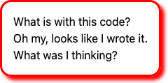
<Border color="red">
  What is with this code?
  <br />
  Oh my, looks like I wrote it.
  <br />
  What was I thinking?
</Border>
Builtin Components
Astro provides the following components:
-
<Code code={codeString} lang="{lang}" />This renders source code with syntax highlighting provided by Shiki. Shiki “generates HTML that looks exactly like your code in VS Code”.
This component takes the optional props
theme,inline, andwrap.Import this component with:
import {Code} from 'astro:components';Render this component with:
<code code="{codeString.trim()}" lang="js" />Add styling with:
<style is:global>
  .astro-code {
    padding: 1rem;
  }
</style>
For more detail see Code.
-
<Content />This renders the content of a content collection entry. See the Content Collections section.
-
<Debug name={value} />This renders a red bar with white text that displays “DEBUG” followed by the given name, followed by a black bar with white text that displays the given value. It is alternative to
console.logthat seems worse.For more detail see Debug.
-
<Fragment set:html={htmlString} />This renders multiple HTML elements without a wrapping element. This component does not need to be imported.
-
<Image />This renders an optimized images. This component does not need to be imported. See the Images section.
-
<Picture />This is an alternative to the
Imagecomponent that displays a responsive image selected from possible formats and sizes.For example:
---
import { Picture } from 'astro:assets';
import myDog from "../images/dog.png";
---

<Picture alt="my dog" src={myDog} formats={["webp", "avif"]} width={400} />
For more detail see Picture.
-
<Prism />This is an alternative to the
Codecomponent that the uses the Prism library. It must be installed withnpm install @astrojs/prism.Download a theme CSS file from PrismJS/prism-themes and import it. For example:
import "../styles/prism-gruvbox-dark.css";Import this component with:
import {Prism} from '@astrojs/prism';Render this component with:
<Prism code="{codeString.trim()}" lang="js" />For more detail see Prism.
-
<ViewTransitions />This enables the use of view transitions. See the View Transitions section.
Shorthand Attributes
Astro supports shorthand syntax for attributes like Svelte.
For example, <Layout title={title}> can be written as <Layout {title}>.
Naming Conventions
Files under the src/pages directory have lowercase names
because their names are used in URL paths.
Files under the src/components directory have PascalCase names
because their names become UI component names.
Styling
As described above, components defined in .astro files can include
a style tag that defines CSS rules that are scoped to the component.
Global styles can be defined in three ways.
The first option is to add a link tag to the head section of the HTML
that refers to a CSS file.
The second option is to include a <style is:global> tag
in a layout source file that is used by many pages.
The third option is to define a file like global.css
in the src or src/styles directory and include it
in all the page components that wish to use it as follows.
import '../styles/global.css';
TODO: Is the third option the only one that supports hot reload of the browser when styles are modified?
Layouts
By convention, the src/layouts directory contains .astro files
that describe common content that should wrap around the content of pages.
Any number of layout components can be defined.
Each page can choose the layout component it wishes to wrap its content inside.
Layout components can do all the things other components can do including taking props, importing files, and using other components.
For example, the file src/layouts/Layout.astro could contain the following.
Note the use of <slot /> to specify where
content will be inserted into the layout.
Only one slot element can be used
and named slots are not supported.
---
interface Props {
  title: string;
}
const { title } = Astro.props;
---

<!doctype html>
<html lang="en">
  <head>
    <meta charset="UTF-8" />
    <meta name="description" content="Astro description" />
    <meta name="viewport" content="width=device-width" />
    <link rel="icon" type="image/svg+xml" href="/favicon.svg" />
    <meta name="generator" content={Astro.generator} />
    <title>{title}</title>
  </head>
  <body>
    <slot />
  </body>
</html>
<style is:global>
  html {
    font-family: system-ui, sans-serif;
  }
</style>
This layout can be used in a page .astro file as follows.
Attribute syntax is used to pass props to components.
Note how the title prop value is passed to the Layout component.
---
import Layout from "../layouts/Layout.astro";
---

<Layout title="My Page">
  <main>
    <h1>My Page</h1>
  </main>
</Layout>
Layouts can be nested. For example, a page component MyPage
can wrap itself in LayoutInner which wraps itself in LayoutOuter.
Imports
Astro supports importing many kinds of file in JavaScript code. The supported file types include:
- Astro components (.astro)
- CSS (.css)
- CSS Modules (.module.css)
- Images (.svg, .jpg, .png, etc.)
- JavaScript (.js, .mjs)
- JSON (.json)
- JSX (.jsx, .tsx)
- Markdown (.md, .markdown, etc.)
- NPM Packages
- TypeScript (.ts)
- Other kinds of assets (TODO: audio and video)
For example, the following line imports
a JSON file with the path src/data/dogs.json
from a .astro file in the src/pages directory:
import dogs from '../data/dogs.json';
Path Aliases
Import paths can be relative to the current file,
be absolute from the root directory of the project,
or using a path alias defined in tsconfig.json.
For example, when inside the file src/components/shopping/PetShop.astro,
the file src/images/animals/dog.png can be imported in these ways:
import dogImage from '../../images/animals/dog.png';
import dogImage from '/src/images/animals/dog.png';
Path aliases can be defined in tsconfig.json
to simplify importing files from commonly used directories.
For example:
{
  "extends": "astro/tsconfigs/strictest",
  "compilerOptions": {
    "baseUrl": "./src",
    "paths": {
      "@components/*": ["components/*"],
      "@images/*": ["images/*"],
      "@layouts/*": ["layouts/*"]
    }
  }
}
This enables replacing an import like
import Layout from '../../../layouts/Layout.astro';
with this:
import Layout from '@layouts/Layout.astro';
Images
Images can be placed under the public directory, typically in public/images.
These can be referenced using a path string
that is relative to the public directory.
For example, <img alt="logo" src="/images/logo.png" />
searches from the public directory.
Astro will server images files placed under the public directory as-is
and will not provide image optimization.
In order to take advantage of image optimizations,
place images under the src/images directory,
import them into JavaScript code,
and render them using the provided Image component.
The Image component does not wait until it scrolls into view
before loading the image.
For example:
---
import { Image } from "astro:assets";
import logo from "../images/logo.png";
---

<Image alt="logo" src={logo} height={200} />
Content collection files can also use optimized images. This is described the “Content Collections” section.
For static sites, optimized images are generated concurrently at build time.
From the documentation at Images,
The Image component
“can transform a local or authorized remote image’s dimensions, file type,
and quality for control over your displayed image.
The resulting <img> tag includes alt, loading, and decoding attributes
and infers image dimensions to avoid Cumulative Layout Shift (CLS).”
Astro will also optimize remote images if the following
appears in the astro.config.mjs file:
export default defineConfig({
  image: {
    domains: ['astro.build']
  }
});
Astro image optimization includes:
- adding
imgelement attributes likedecoding="async"andloading="lazy". - generating WEBP versions of images to reduce file sizes (All major web browsers support the WEBP format.)
- adding attributes required to take advantage of services like Cloudinary
More image optimization is performed in production builds than when running in dev mode.
For pages that are generated at build time (SSG) and use the Image component,
optimized .webp files are created in the dist directory.
This mostly removes the need to use tools like Squoosh to optimize images.
Image optimization is performed by the sharp package.
The Picture component can be used in place of the Image component
to render an appropriate image from a selection of multiple formats and sizes.
Icons
Astro Icon provides access to many icon sets.
To install the “Astro Icon” integration, enter npx astro add astro-icon.
To see the available icon sets, browse icon sets.
To install an icon set, enter npm i -D @iconify-json/{set-name}.
Some valid icon set names include “fa6-solid” (Fontawesome),
“material-symbols”, “mdi”, “solar”, “tdesign”, and many more.
To use an icon, import the Icon component in the component script as follows:
import {Icon} from 'astro-icon/components';
Then render an icon with with something like the following:
<Icon name="fa6-solid:hat-wizard" size={60} title="wizard hat" />
The Icon component can als render SVG files
found in the src/icons directory.
For example, if the file src/icons/heart.svg exists,
it can be rendered with the following.
Note that there is no icon set name prefix on the icon name.
<Icon name="heart" size={60} title="heart" />
Dynamic Routes
Dynamic routes are routes defined under the pages directory with
directory or file names that contain a variable name inside square brackets.
These can be used for both pages and API endpoints.
For example, the following page defined in src/pages/index.astro
contains links to pages that are provided by a dynamic route.
---
import Layout from '../layouts/Layout.astro';

const colors = ["red", "green", "blue"];
---

<Layout>
  {
    colors.map((color) => (
      <div>
        <a href={`/${color}`}>{color}</a>
      </div>
    ))
  }
</Layout>
Rather than create a .astro file for each color,
we can create the file [color].astro shown below.
This file is used to render each of the color pages.
---
export function getStaticPaths() {
  const colors = ["red", "green", "blue"];
  return colors.map((color) => ({ params: { color } }));
}

// Astro.params contains matched segments of a dynamic route
// where directory names under the "pages" directory
// are surrounded by square brackets.
const { color } = Astro.params;
---

<Layout>
  <h1>
    You selected <span style={`color: ${color}`}>{color}</span>.
  </h1>
</Layout>
The getStaticPaths function is required when not using SSR
so Astro knows the pages it should generate at build time.
This function is not used when SSR is enabled.
Note how the colors array is defined inside the getStaticPaths function.
If defined outside that function, it will not be visible.
The reason is that the getStaticPaths function gets hoisted into its own scope.
That prevents it from accessing most things outside the function.
This is a limitation that the Astro team hopes remove in the future.
Often the getStaticPaths function needs to iterate over documents
in a content collection represented by CollectionEntry objects.
In this case it can be written similar to the following:
export async function getStaticPaths() {
  const dogs: CollectionEntry<'dogs'>[] = await getCollection('dogs');
  return dogs.map(dog => ({params: {name: dog.data.name}}));
}
ContentCollection objects have the following properties:
body- body text of the documentcollection- name of the collection to which the document belongsdata- object whose properties are the front matter variables in the documentid- file name of the document with the file extensionrender- an async function that returns a component that renders the body content, converting Markdown to HTMLslug- file name of the document without the file extension
Running npm run build generates the dist directory which will contain
the following files and more:
dist/blue/index.htmldist/green/index.htmldist/red/index.html
The getStaticPaths function is only required if SSR is not enabled.
One way to enable SSR is to install the node adapter
by entering npx astro add node.
This changes the astro.config.mjs file to use output: "server".
When SSR is enabled, running npm run build
will not generate HTML files for dynamic routes.
Instead, the HTML for dynamic routes
will be generated when requested by a client.
When a dynamic route such as [name].astro is used to
render a content collection document and no matching document is found,
it can use code like the following in the component script
to treat this like a “404 Not Found” error:
if (!document) return new Response('', {status: 404});
Dynamic route file names can contain an ellipsis to use rest parameters.
For example, the file src/pages/zoo/[...path].astro can match the paths
/zoo, /zoo/cats, and /zoo/cats/panther.
Event Handling
Code in the component script section is only run on the server-side. This means functions defined there cannot be used for client-side event handling.
One way specify client-side JavaScript code is to place it in a script tag within the HTML section. For example:
<button id="my-btn">Press Me</button>

<script>
  function handleClick() {
    alert('got click');
  }
  const myBtn = document.getElementById('my-btn');
  myBtn.addEventListener('click', handleClick);
</script>
Content Collections
Astro supports describing and retrieving collections of data
from files that are in a subdirectory the src/content directory.
Each subdirectory represents a different collection.
The files can use the Markdown, MDX, YAML, or JSON format.
All files in a collection must use the same format.
An analogy can be made between
content collections and relational database tables.
Each src/content subdirectory is like a database table.
Each file in these subdirectories is like a row in a database table.
Content collections are like databases without SQL
where the only supported queries are
retrieving a single document or all documents in a collection.
Modifying data in a database through API calls made from a web app can result in different data being subsequently rendered. However, modifying content collection documents during runtime will not result in different data being rendered. Think of content collection documents as being static rather than dynamic. So databases or CMSes should be used instead of content collections when dynamic updates are required.
The following steps can be taken to define and render a collection of dogs.
-
Create the directory
src/content. -
Create the file
config.tsin this directory.This file defines each of the collections. It uses Zod to describe and validate the schema of each collection. The schema defines which front matter properties are valid and provides a type-safe way to use the data. Editors like VS Code use the types to provide intellisense.
For example, the following describes a single collection named “dogs”.
import {defineCollection, z} from 'astro:content';

const dogs = defineCollection({
  type: 'content', // or 'data' when not using Markdown or MDX
  schema: z.object({
    // The return value from z.string() can be saved in a variable
    // and used on multiple properties to avoid calling it repeatedly.
    name: z.string(),
    breed: z.string()
  })
});

export const collections = {dogs};
To include references to optimized images, change the schema property as follows:
schema: ({image}) =>
  z.object({
    name: z.string(),
    breed: z.string(),
    photo: image()
  });
This enables the
photoproperty to be used in anImagecomponent as the value if thesrcattribute. -
Create the directory
src/content/dogs. -
Create one content file for each dog inside this directory.
Here is an example Markdown file:
---
name: Comet
breed: Whippet
website: https://www.akc.org/dog-breeds/whippet/
---

He loves the following:

- pool balls
- basketballs
- frisbees
Note the use of front matter to describe properties of this instance. String values of front matter properties do not need to be delimited with quotes.
When only the front matters is needed and no content, the YAML and JSON formats can be used instead.
Here is an example YAML file:
---
name: Comet
breed: Whippet
website: https://www.akc.org/dog-breeds/whippet/
Here is an example JSON file:
{ "name": "Comet", "breed": "Whippet", "website": "https://www.akc.org/dog-breeds/whippet/" } -
Access the collection in a component.
For example:
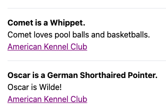
---
import Layout from "../../layouts/Layout.astro";
import Dog from "../../components/Dog.astro";
import { getCollection, type CollectionEntry } from "astro:content";

const dogs: CollectionEntry<"dogs">[] = await getCollection("dogs");
---

<Layout title="Dogs I Know">
  <main class="m-4">
    { dogs.map(dog => <Dog {dog} />) }
  </main>
</Layout>
The
getCollectionfunction accepts a second argument that is a function used to filter the entries. It is passeddataobjects one at a time and should return a boolean value indicating whether the correspondingCollectionEntryobject should be included in the result array. -
Create the
Dogcomponent: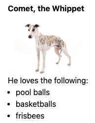
---
import { type CollectionEntry } from "astro:content";

interface Props {
  dog: CollectionEntry<"dogs">;
}

const { dog } = Astro.props;
const { breed, image, name } = dog.data;
// This gets a component that will render
// the content of the dog CollectionEntry.
const { Content } = await dog.render();
---

<hr />
<div class="my-4">
  <p class="font-bold">{name} is a {breed}.</p>
  <Content />
  <a href={website}>American Kennel Club</a>
</div>
For a more complete example of using content collections, see the project content-collections. This displays a component for each NFL team on the initial page. Clicking the component for any team navigates to a detail page using view transitions.


The file src/content/config.ts which defines the schema
for the for collection documents contains the following:
import {defineCollection, z} from 'astro:content';

const nfl = defineCollection({
  type: 'content', // 'content' for Markdown; 'data' for YAML and JSON
  schema: z.object({
    city: z.string(),
    name: z.string(),
    conference: z.string(),
    logoUrl: z.string(),
    headCoach: z.string(),
    established: z.number()
  })
});

export const collections = {nfl};
The file src/content/nfl/kansas-city-chiefs.md is one example
of the content files described by the schema above.
It contains the following:
---
city: Kansas City
name: Chiefs
conference: AFC West
logoUrl: https://res.cloudinary.com/nflleague/image/private/f_auto/league/ujshjqvmnxce8m4obmvs
headCoach: Andy Reid
established: 1960
---

After losing to the Raiders on Christmas Day, the Chiefs ...
When using a service like Netlify or Vercel to host an Astro app, pushing changes to the GitHub repository of the app will trigger a new build and deployment of the app. If content collection documents were added, modified, or deleted, this will result in changes to the deployed static pages.
References
A content collection document can contain properties that refer to
one or more other documents in the same or a different collection.
For example, a document describing one football team
in a collection named “nfl” can refer to other teams
with the following property defined in src/content/config.ts:
relatedTeams: z.array(reference('nfl')).optional();
Here is a document that includes this optional property:
---
city: Arizona
name: Cardinals
conference: NFC West
logoUrl: https://static.www.nfl.com/image/private/f_auto/league/u9fltoslqdsyao8cpm0k
headCoach: Jonathan Gannon
established: 1920
relatedIds: ['atlanta-falcons', 'baltimore-ravens', 'buffalo-bills']
---
A component can access related documents with the getEntries function. For example:
---
import {getEntries, type CollectionEntry} from 'astro:content';

interface Props {
  team: CollectionEntry<'nfl'>;
}

const {team} = Astro.props;
const {relatedTeams} = team.data;
const relatedEntries = await getEntries(relatedTeams || []);
---

<ul>
  {relatedEntries.map((entry) => (
    <li>{entry.data.name}</li>
  ))}
</ul>
Sanitizing Content
The content below the front matter in collection documents is not sanitized.
If there is a possibility that the content might contain something that
causes a Cross Site Scripting (XSS) attack (such as script tags),
then a different approach should be taken to render the content.
One approach is the install the npm packages sanitize-html, @types/sanitize-html, and marked. In the component script of the Astro component that renders the content, add the following:
import { marked } from 'marked';
import sanitizeHtml from 'sanitize-html';
...
const content = sanitizeHtml(collectionEntry.body);
const html = marked.parse(content);
Then instead of rendering <Content />, render <div set:html={html} />.
If the styling is less that desirable, consider applying the prose CSS class
from the @tailwindcss/typography plugin.
Pagination
Astro provides help for implementing pagination of content collections. For details, see Routing - Pagination.
The project content-collections provides a good example.
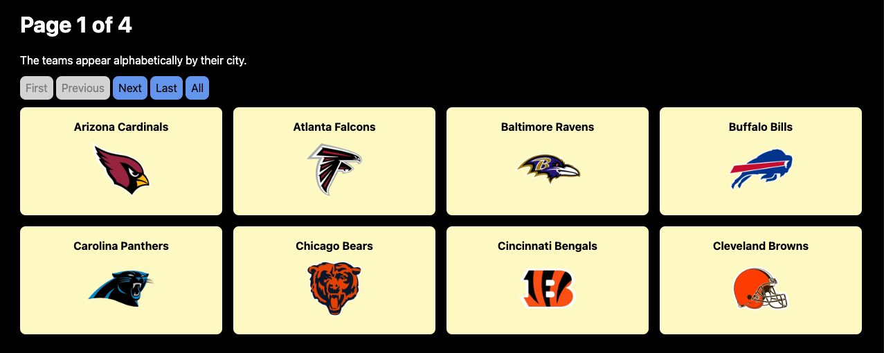
The file src/pages/[...page].astro, shown below, defines the pages for
the URLs ”/” (first page) and ”/{page-number}” (all pages after the first).
The URL “/all” navigates to the page that shows all the teams.
---
import type { InferGetStaticPropsType, GetStaticPaths } from 'astro';
import {getCollection, getEntry, type CollectionEntry} from 'astro:content';
import TeamSmall from '../components/TeamSmall.astro';
import Layout from '../layouts/Layout.astro';
import '../styles/global.css';

type Props = InferGetStaticPropsType<typeof getStaticPaths>;

export const getStaticPaths = (async ({paginate}) => {
    const teams: CollectionEntry<'nfl'>[] = await getCollection('nfl');
    const pages = teams.map((team) => (
        { params: { slug: team.slug } }
    ));
    return paginate(pages, { pageSize: 8 });
}) satisfies GetStaticPaths;

const { page } = Astro.props as Props;
const { currentPage, data, lastPage, url } = page;
const nextUrl = url.next;
const prevUrl = url.prev;

// Get entries to render on the current page.
const promises = data.map(async (obj) => getEntry('nfl', obj.params.slug));
const entries = await Promise.all(promises);
---

<Layout>
  <main class="bg-black h-full min-h-screen p-8">
    <h1>Page {currentPage} of {lastPage}</h1>
    <p>The teams appear alphabetically by their city.</p>
    <nav>
      <a class:list={{disabled: currentPage === 1}} href="/">First</a>
      <a class:list={{disabled: !prevUrl}} href={prevUrl}>Previous</a>
      <a class:list={{disabled: !nextUrl}} href={nextUrl}>Next</a>
      <a class:list={{disabled: currentPage === lastPage}}
        href={`/${lastPage}`}>Last</a>
      <a href="/all">All</a>
    </nav>
    <section class="gap-4 grid grid-cols-4">
      {entries.map(entry => <TeamSmall team={entry} />)}
    </section>
  </main>
</Layout>
The code above uses the getEntry function to retrieve a specific content collection entry.
An entry can have a property whose value is an array of ids for related entries within the same collection. To retrieve those, pass the array to the getEntries function.
Incremental Content Caching
Build times for projects that generate pages from large content collection
can be significantly reduced by enabling an experimental feature that
avoids doing work for documents that have not changed since the last build.
To enable it, add the following to the object
passed to the defineConfig function in astro.config.mjs:
  experimental: {
    contentCollectionCache: true
  },
Currently this only caches specific modules related to content collections
and adds files in the node_modules/.astro directory.
In the future this may also cache the generated .html files.
Unfortunately, I could not get this feature to work. From a comment in the Discord channel, “It’s still quite early and very experimental, so I wouldn’t be surprised if there’s a lot of edge cases where it doesn’t work.”
Astro.glob
The Astro.glob function provides another way to access the content of a collection of Markdown files.
For example, the Markdown files from the NFL content collection example above
can be moved to the src/data/nfl directory.
The following is an example of one of these Markdown files:
---
city: Kansas City
name: Chiefs
conference: AFC West
logoUrl: https://res.cloudinary.com/nflleague/image/private/f_auto/league/ujshjqvmnxce8m4obmvs
headCoach: Andy Reid
established: 1960
---

After losing to the Raiders on Christmas Day, the Chiefs ...
The following Astro component reads and renders the data in these Markdown files:
---
const teams = await Astro.glob("../data/nfl/*.md");
---

teams.map(({ Content, frontmatter }) => (
  <div>
    <h2>{frontmatter.name} {frontmatter.city}</h2>
    <Content />
  </div>
))
Using Astro.glob is a bit easier than using content collections.
But content collections have many advantages including
handling references between documents, property validation with
Zod,
pagination support, and incremental content caching.
The Astro.glob function can also read JSON files.
For example, suppose each of the NFL .md files
were instead .json files like the following:
{
  "city": "Kansas City",
  "name": "Chiefs",
  "conference": "AFC West",
  "logoUrl": "https://res.cloudinary.com/nflleague/image/private/f_auto/league/ujshjqvmnxce8m4obmvs",
  "headCoach": "Andy Reid",
  "established": 1960,
  "content": "After losing to the Raiders on Christmas Day, the Chiefs ..."
}
The following Astro component reads and renders the data in these JSON files:
---
const teams = await Astro.glob("../data/nfl/*.json");
---

teams.map(({ city, content, logoUrl, name }) => (
  <div>
    <h2>{name} {city}</h2>
    <img alt="team logo" src={logoUrl} width={50} />
    <p>{content}</p>
  </div>
))
Content Management Systems (CMS)
Astro can fetch content from many kinds of CMSes. These typically provide a better content authoring experience for non-technical users than editing Markdown files.
The content from CMSes is not treated the same as content collection Markdown files. Different code that is specific to the CMS must be written to access and render the content.
Astro has integrations for the following CMSes including CloudCannon, Contentful, Netlify, Sanity, Storyblok, Strapi, Wordpress, and many more.
For general details, see Use a CMS with Astro.
For details on using the Strapi CMS, see the YouTube video Getting Started with Astro and Strapi and the associated article How to Build a Blog with Astro, Strapi, and Tailwind CSS.
MDX
The MDX integration adds the following features to Markdown:
-
ability to define JavaScript variables whose values come from JavaScript expressions
-
ability to insert the values of front matter properties and JavaScript variables into the content using curly braces
-
ability to render components implemented in any of the supported frameworks
Rendered components can add interactivity to what would otherwise be static content.
MDX files have the .mdx file extension.
MDX syntax differs from Markdown syntax in a few ways that are described at Deviations from Markdown.
To install the MDX integration in an Astro project, enter npx astro add mdx.
Here is an example of a page described by a .mdx file
that demonstrates inserting front matter properties and JavaScript variables.
---
layout: ../layouts/Layout.astro
player: Mark
score: 19
---

This page is described by **MDX**.

The score for {frontmatter.player} is {frontmatter.score}.

export const twoPi = (Math.PI \* 2).toFixed(4);

2π is approximately {twoPi}.
Here is a component definition in the file src/components/Greet.astro:
---
const { name } = Astro.props;
---

<p class="text-bold text-red-500">Hello, {name}!</p>
Here is MDX in the file src/content/dogs/comet.mdx
that imports and renders the Greet component.
---
layout: ../layouts/Layout.astro
name: Comet
breed: Whippet
website: https://www.akc.org/dog-breeds/whippet/
---

import Greet from "../../components/Greet.astro";

<Greet name={frontmatter.name} />

He loves the following:

- pool balls
- basketballs
- frisbees

Learn about the <a href={frontmatter.website}>{frontmatter.breed}</a>.
Other Frameworks
Astro supports using components from many other frameworks including Alpine, Lit, Preact, React, SolidJS, Svelte, Vue, WebComponents, and more.
React
Let’s walk through the steps to use a React component.
-
Install the React integration by entering
npx astro add react. -
Define a React component in the
src/componentsdirectory.For example, here is the file
Counter.tsx:import {type FC, useState} from 'react'; interface Props { label?: string; start?: number; } const Counter: FC<Props> = ({label = '', start = 0}) => { const [count, setCount] = useState(start); return ( <div style={{display: 'flex', alignItems: 'center', gap: '1rem'}}> {label && <div>{label}</div>} <button disabled={count <= 0} onClick={() => setCount(c => c - 1)}> - </button> <div>{count}</div> <button onClick={() => setCount(c => c + 1)}>+</button> </div> ); }; export default Counter; -
Use the new component in another component or page.
import Counter from "@components/Counter.tsx";
...
<Counter label="Tally" start={3} client:load />
There are five provided
clientdirectives that tell Astro that a non-Astro component requires client-side JavaScript code to be loaded. Theclientdirectives differ in when the JavaScript will be loaded. When not applied, JavaScript for non-Astro components is not loaded.clientdirectives cannot be applied to Astro components. However,scripttags in Astro components are always included in clients.Directive When JS is loaded client:idlewhen browser is idle client:loadimmediately client:mediawhen a CSS media query condition is met client:onlyafter page load with no SSR client:visiblewhen component becomes visible Integrations can add support for custom
clientdirectives.
For more detail on using React components in Astro, see React integration.
Svelte
Let’s walk through the steps to use a Svelte component.
-
Install the Svelte integration by entering
npx astro add svelte. -
Define a Svelte component in the
src/componentsdirectory.For example, here is the file
Counter.svelte:<script> export let label = ''; export let start = 0; let count = start; </script> <div class="row"> {#if label} <div>{label}</div> {/if} <button disabled={count <= 0} on:click={() => count--}>-</button> <div>{count}</div> <button on:click={() => count++}>+</button> </div> <style> .row { display: flex; align-items: center; gap: 1rem; } </style> -
Use the new component in another component or page.
import Counter from "@components/Counter.svelte";
...
<Counter label="Tally" start={3} client:load />
For more detail on using Svelte components in Astro, see Svelte integration.
Alpine
The Alpine JavaScript library can be used in Astro components to add interactivity. This is an alternative to implementing interactive components using another framework such as React, Svelte, or Vue.
To install the Alpine integration, enter npx astro add alpinejs.
However, Astro components are always rendered at build time or on the server (SSR). Unlike with frameworks like React and Svelte, it is not possible for runtime changes to their props to trigger them to re-render.
One alternative is to register event listeners that directly update the DOM. This is considerably more tedious and error prone than implementing components in a framework like Svelte.
A better alternative is to update the Alpine x-data objects
that supply data to the components that need to update.
For an example of this approach, see alpine-demo
Defining Functions
Often Astro components that use Alpine need to call custom JavaScript functions. But where should the functions be defined?
Alpine CANNOT call functions defined in these ways:
-
component script section
Code that appears here is only available at build time or on the server during SSR.
For example, this WILL NOT make the
demofunction available to Alpine.--- function demo() { console.log('in demo'); } --- -
<script>with no attributesVite performs tree shaking and will not recognize function calls made in Alpine directives. This will result in the removal of function definitions that appear in plain
scripttags.For example, this WILL NOT make the
demofunction available to Alpine.<script> function demo() { console.log('in demo'); } </script> -
<script type="module">Module scripts create their own scope, so functions defined in these are not visible outside unless they are exported and then imported into another
script. Butimportstatements can only appear in other module scripts.For example, this WILL NOT make the
demofunction available to Alpine.<script type="module"> function demo() { console.log('in demo'); } </script>
Alpine CAN call functions defined in these ways:
-
<script defer>From MDN, the
deferattribute “is set to indicate to a browser that the script is meant to be executed after the document has been parsed, but before firing DOMContentLoaded.”Vite does not perform tree shaking of functions defined in this kind of
scripttag.For example, this WILL make the
demofunction available to Alpine.<script defer> function demo() { console.log('in demo'); } </script> -
<script is:inline>The
is:inlinedirective tells Astro include thisscriptas-is in the DOM. Astro will not bundle this JavaScript or remove duplicates.Vite does not perform tree shaking of functions defined in this kind of
scripttag.For example, this WILL make the
demofunction available to Alpine.<script is:inline> function demo() { console.log('in demo'); } </script> -
globalThisFunctions attached to the global object are available everywhere. To avoid polluting the global namespace with a large number of function names, consider attaching one object to the global object that holds all the functions.
For example, this WILL make the
ns.demofunction available to Alpine and can be called withns.demo().<script is:inline> globalThis.ns = { demo() { console.log('in demo'); } }; </script> -
dynamic imports
Dynamic imports can be used to import functions defined in other source files.
For example, here is the file
src/my-module.js.export function demo() { console.log('in demo'); }This WILL make the
demofunction available to Alpine.<script is:inline> import('/src/my-module.js') .then(module => { demo = module.demo; }) .catch(err => { console.log('error importing my-module.js:', err); }); </script>Regardless of the number of times a component containing this
scripttag is used, the browser will only load the filemy-module.jsone time. -
<script src="{path}">With this approach, functions are defined in a separate source file. For example, here is the file
src/components/my-script.js.globalThis.ns = { demo() { console.log('in demo'); } };This WILL make the
ns.demofunction available to Alpine and can be called withns.demo(). Regardless of the number of times a component containing thisscripttag is used, the browser will only load the filemy-script.jsone time.<script src="./my-script.js"></script>
From the Astro docs at is:inline, “The is:inline directive is implied whenever
any attribute other than src is used on a <script> or <style> tag.”
An issue with scripts that are “inline” is that no deduplication is performed on them. If an Astro component contains inline scripts, they will appear in the DOM once for every usage of the component.
Alpine Example
Now let’s walk through the steps to use Alpine in Astro. Alpine is a much lighter weight framework than frameworks like React, Svelte and Vue. But Alpine is still quite capable.
-
Install the Alpine integration by entering
npx astro add alpinejs. -
Define an Astro component that uses Alpine in the
src/componentsdirectory.For example, here is the file
Counter.astro:--- interface Props { label?: string; start?: number; } const { label = "", start = 0 } = Astro.props; --- <div class="row" x-data={`{ count: ${start} }`}> {label && <div>{label}</div> } <button :disabled="count <= 0" @click="count--">-</button> <div x-text="count"></div> <button @click="count++">+</button> <!-- This demonstrates calling client-side JS code in Alpine event handling. --> <button @click="demo">Click Me</button> </div> <!-- The is:inline directive opts out of Astro processing and includes the script tag as-is. See detail below. A workaround is to attach the function to the window object. --> <script is:inline> function demo() { alert("Demo time!"); } </script> <style> .row { display: flex; align-items: center; gap: 1rem; } </style> -
Use the new component in another component or page.
import Counter from "@components/Counter.astro";
...
<Counter label="Tally" start={3} />
Unlike with Svelte and other components, Astro components that use Alpine do not need a
client:*directive in order to have client-side interactivity.
For more detail on using Alpine in Astro, see Alpine integration.
Component Communication
Server-side generated (SSG) components which include all .astro files
cannot pass functions to other components.
This prevents server-side rendered (SSR) components
(implemented with frameworks like React, Svelte, and Vue)
that are rendered from an SSG component
from returning data to the SSG component.
When this kind of inter-component communication is needed, all the components involved must be SSR components.
A workaround for this limitation is to use the Alpine x-data directive.
In the following example, the file src/pages/index.astro
defines a value for score using x-data.
The file src/components/Demo.astro is rendered by the previous file.
It has access to x-data defined on any element
to which it is a descendant in the DOM tree.
It can also define it’s own x-data properties.
In this case is defines a double function
which doubles the value of the score property.
This change will be visible back in index.astro.
src/pages/index.astro
---
import Demo from "../components/Demo.astro";
---

<html>
  <body x-data="{score: 19}">
    <p>index score = <span x-text="score"></span></p>
    <Demo />
  </body>
</html>
src/components/Demo.astro
<div x-data="{ double() { score *= 2; } }">
  <p>Demo score = <span x-text="score"></span></p>
  <button @click="double">Double it!</button>
</div>
A downside of this approach is that because the data is not passed using props,
it is not clear what data the Demo component might be using.
It has access to all the data in the x-data objects of all ancestor elements.
Also, if the nesting of components that use x-data becomes somewhat deep,
the danger of unintentional name clashes in x-data property names increases.
Sharing State (nanostores)
The recommended way to share state (data) between components is to use the nanostores library. This library is not specific to Astro and can be used with many web frameworks. It is very lightweight, adding less that 1KB to the project. nanostores are somewhat similar to Svelte stores.
To install the nanostores library in an Astro project,
enter npm install nanostores.
There are three kinds of stores:
- “atom” stores hold a single data value which can be of any type including boolean, number, string, array, or object. When the value is an object, the entire value can be modified, but not individual properties.
- “map” stores hold multiple named properties. This is typically used for objects rather than using an atom store.
- “computed” stores compute their value based on the values of other stores.
One limitation is that nanostores cannot be passed as props to components.
Store Setup
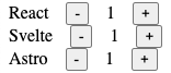
Let’s walk through an example of using an atom nanostore to share a number value between three components that are implemented in React, Svelte, and Astro. The three components have identical functionality. Each component renders a count whose value comes from an atom store. Minus and plus buttons enable changing the count value. Changing the value from any component affects the value displayed in all of them since they all use the same nanostore.
To install the nanostores library, enter npm install nanostores.
To use nanostores in React components,
also enter npm install nanostores @nanostores/react.
To add support for the Alpine library which is used in the Astro component,
enter npx astro add alpinejs.
Persistence
For sharing state across page transitions, see @nanostores/persistent.
To install this, enter npm install nanostores @nanostores/persistent.
To use this to define stores, import it as follows:
import {persistentAtom} from '@nanostores/persistent';
To make an atom store persistent, change const myStore = atom(value);
to the following:
const myStore = persistentAtom('someName', value, {
  encode: JSON.stringify,
  decode: JSON.parse
});
Store Creation
Here is the code the creates the nanostore defined in the file src/stores.ts.
It also defines a helper function that is needed by the Astro component.
import {atom, computed, map} from 'nanostores';

const score = atom(0);

// @ts-ignore
globalThis.stores = {
  count: atom(1)
};
React Component
Here is a React component that uses the count nanostore
defined in the file src/components/Counter.tsx.
import {type FC} from 'react';
import {useStore} from '@nanostores/react';

interface Props {
  label?: string;
}

const Counter: FC<Props> = ({label = ''}) => {
  // @ts-ignore
  const {count} = globalThis.stores;
  const value = useStore(count);
  return (
    <div style={{display: 'flex', alignItems: 'center', gap: '1rem'}}>
      {label && <div>{label}</div>}
      <button disabled={value <= 0} onClick={() => count.set(value - 1)}>
        -
      </button>
      <div>{value}</div>
      <button onClick={() => count.set(value + 1)}>+</button>
    </div>
  );
};

export default Counter;
Svelte Component
Here is a Svelte component that uses the count nanostore
defined in the file src/components/Counter.svelte.
<script>
  const {count} = globalThis.stores;

  export let label = '';
</script>

<div class="row">
  {#if label}
    <div>{label}</div>
  {/if}
  <!-- In Svelte, add $ prefix to get the value of a nanostore. -->
  <button disabled={$count <= 0} on:click={() => count.set($count - 1)}>-</button>
  <div>{$count}</div>
  <button on:click={() => count.set($count + 1)}>+</button>
</div>

<style>
  .row {
    display: flex;
    align-items: center;
    gap: 1rem;
  }
</style>
Astro Component
Here is an Astro component that uses the count nanostore
defined in the file src/components/Counter.astro.
---
interface Props {
  label?: string;
}

const {label = ''} = Astro.props;
---

<div
  class="row"
  x-data
  x-init="counterSetup($data)"
  x-effect="setCount(Number(count))"
>
  {label && <div>{label}</div> }
  <button :disabled="count <= 0" @click="count--">-</button>
  <div x-text="count"></div>
  <button @click="count++">+</button>
</div>

<script is:inline>
  // This updates an Alpine x-data property
  // every time a related store value changes.
  function sync(store, data, property) {
    store.subscribe(value => data[property] = value);
  }

  function counterSetup(data) {
    const {count} = stores;
    sync(count, data, 'count');
    data.setCount = count.set;
  }
</script>

<style>
  .row {
    display: flex;
    align-items: center;
    gap: 1rem;
  }
</style>
Page Component
Here is an Astro page that uses all three of the components defined above.
This is defined in the file src/pages/index.astro.
---
import Layout from '../layouts/Layout.astro';
import Counter1 from '../components/Counter.tsx';
import Counter2 from '../components/Counter.svelte';
import Counter3 from '../components/Counter.astro';
---

<script type="module">
  import '/src/stores.js'; // sets a global variable
</script>

<Layout>
  <h1>nanostores Demo</h1>

  <main x-data x-init="topSetup($data)">
    <!-- Using client:only instead of client:load addresses
         a timing issue with setting globalThis.stores. -->
    <Counter1 label="React" client:only="react" />
    <Counter2 label="Svelte" client:only="svelte" />
    <!-- client:* directives cannot be applied to Astro components. -->
    <Counter3 label="Astro" />
  </main>
</Layout>
Directives
In addition to the client: directives described in the previous section,
Astro supports these directives:
| Directive | Action |
|---|---|
class:list={[...]} | converts an array of CSS class names into a string of class names |
define:vars | applied to style or script elements to provide access to the values of front matter variables |
is:inline | disables Astro processing of style and script elements leaving them as-is |
is:global | applied to a style element to make the styles global rather than scoped to the current component |
is:raw | treats descendant elements and interpolations as text |
set:html={string} | injects a string of HTML into the element |
set:text | injects a string of text into the element |
If a value in the class:list array is an object,
the keys must be class names and the values must be Boolean expressions
that determine whether the class name should be included.
If a value is array, it is flattened into the surrounding array.
If a value is false, undefined, or null, it is skipped.
For example:
<nav>
  <a class:list={{disabled: currentPage === 1}} href="/">First</a>
  <a class:list={{disabled: !prevUrl}} href={prevUrl}>Previous</a>
  <a class:list={{disabled: !nextUrl}} href={nextUrl}>Next</a>
  <a class:list={{disabled: currentPage === lastPage}}
    href={`/${lastPage}`}>Last</a>
</nav>
The define:vars directive turns front matter variables into CSS variables.
For example, here is an Astro component defined in src/components/Text.astro:
---
const { bg, fg } = Astro.props;
---

<div class="text">
  <slot />
</div>

<style define:vars={{ bg, fg }}>
  .text {
    background: var(--bg, yellow);
    color: var(--fg, black);
    display: inline-block;
    padding: 0.5rem;
  }
</style>
This component can be used as follows:

---
import Text from "../components/Text.astro";
---

<Text>First</Text>
<Text fg="white" bg="blue">Second</Text>
Applying the is:inline directive to a style or script element
has the following effects:
- will be rendered exactly where it is authored
- styles will be global and not scoped to the component
- will not be bundled into an external file
- will appear as many times as it is rendered, rather than just once
- will not have its
import,@import, andurl()references resolved relative to the.astrofile - tree shaking will not remove functions that Astro thinks are not called (important when functions are called from Alpine event handling attributes)
If the string value of set:html comes from an untrusted source, use a
sanitizer such as sanitize-html to avoid cross site scripting attacks (XSS).
This directive can be applied to a Fragment component
when a wrapping element is not needed.
If the value is a Promise, Astro will wait for it to resolve
and use the result as the HTML to insert.
The string value of set:text is automatically escaped, replacing
certain characters such as " with a character entity such as ".
Dev Toolbar
When running in dev mode, Astro provides a Dev Toolbar in a dark gray oval that is centered at the bottom of the browser window. It is partially hidden from view until the mouse hovers over it.

The toolbar contains the following four buttons:
-
Menu (Astro icon)
This provides options to “Report a Bug”, provide “Feedback”, view “Documentation”, and join the “Community” (on Discord). It also features some optional integrations. The “View all” link opens a browser tab for viewing all available integrations.
The “Copy debug info” button in the upper-right copies information to the clipboard that is useful when reporting a bug. This includes the version of Astro, version of Node, operating system, package manager (ex. npm), the adapter in use (ex. @astrojs/node), and a list of the installed integrations. The copied text can be pasted into a bug report.
-
Inspect (arrow icon)
This enables inspecting interactive components that are marked with a
client:*directive. These directives can only be applied to non-Astro components.Click this button to display an outline around all the interactive components on the page. Hover over one to get a dialog that shows:
- the specific
client:*directive that was applied - the props that were passed to the component
- a link that be clicked to open the source file for the component in VS Code
- the specific
-
Audit (document icon)
This scans the page for accessibility issues. Elements that have issues are given a purple outline. Hover over them to see a dialog that describes the issues.
-
Settings (gear icon)
This displays a dialog for modifying settings. There are currently only two settings, “Verbose logging” and “Disable notifications”, both of which are off by default.
To close any dialog displayed by the Dev Toolbar, press the escape key.
If having access to the Dev Toolbar is not desired,
it can be disabled by entering npx astro preferences disable devToolbar.
It can be enabled again by entering npx astro preferences enable devToolbar.
Custom 404 Page
To create a custom 404 page, add the file src/pages/404.astro.
This page can import and use layouts and other components
just like any other page.
The following is an example.
---
import Layout from "../layouts/Layout.astro";
---
<Layout>
<main>
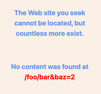
<p>
The Web site you seek
<br />
cannot be located, but
<br />
countless more exist.
</p>
<p>
No content was found at
<br />
<span id="path"></span>
</p>
</main>
</Layout>
<script>
const span = document.getElementById('path');
if (span) span.textContent = window.location.pathname;
</script>
<style>
main {
display: flex;
flex-direction: column;
justify-content: center;
align-items: center;
gap: 3rem;
height: 100vh;
width: 100vw;
background-color: linen;
color: cornflowerblue;
font-weight: bold;
}
p {
font-size: 1.5rem;
margin: 1rem 0;
text-align: center;
}
#path {
color: red;
}
</style>
View Transitions
Astro supports adding view transitions
that are applied when navigating from one page to another.
This includes clicking links implemented with <a> elements,
triggering the browser forward and back buttons, and submitting forms.
For more control over when transitions occur, see router control.
This feature is built on the Web View Transitions API. As of December 2023, the only major web browsers that support this are Chrome and Edge. Polyfills are provided to support view transitions in browsers that do not yet support the View Transitions API.
Astro disables all view transitions when the CSS media feature “prefer-reduce-motion” is enabled. This is based on an operating system specific setting. For example, in macOS this is configured in the Settings app under Accessibility … Display … Reduce motion.
For basic fade out, fade in transitions between all pages, modify the layout files used by all the pages as follows. This specifies the transition that should occur when leaving a page.
---
import { ViewTransitions } from "astro:transitions";
...

---

<html>
  <head>
    ...
    <ViewTransitions />
  </head>
  ...
</html>
The ViewTransitions component must appear as a child of the head element
for any transitions to occur, including custom transitions.
The built-in transitions include:
-
fadeThe current page fades out and new page fades in.
-
initialThis uses the browser default transition.
-
slideThe current page slides out to the left and new page slides in from the right. The opposite occurs when navigating back to the previous page.
-
noneThis disables transition animations. It is typically applied to the
htmlelement to disable all transition animations for the entire page.
To specify a page-level transition other than the default,
add the transition:animate directive to the body element of each page.
If all pages use a common layout, this can be applied in that layout component.
For example, the following will configure a slide transition where
going forward causes the current page to slide out to the left
and the new page to slide in from the right.
Going back triggers the opposite transitions.
<body class="p-4" transition:animate={slide({ duration: '1s' })}>
To specify a transition on a specific element
(which can be the root element of a page),
add the transition:animate="{transition-type}" directive.
For example, <main transition:animate="slide">.
To transition certain elements on a page but not the whole page,
add transition:animate="none" to the html element
and transition:animate="{transition-name}" to specific elements.
To customize the transition,
pass a configuration object to the transition function.
For example, <main transition:animate={slide({ duration: '2s' })}>.
When identical Image components are on both the current page
and the next page and they have the transition:name directive,
one will morph into the other through the view transition.
This is especially useful when the image size of each of the pages differs.
For example:
import whippet from "../images/whippet.webp"; ... --- ...
<img alt="whippet" src="{whippet}" transition:name="whippet" />
...
When identical audio and video elements are on both
the current page and the next page and they are playing
and they have the transition:name and transition:persist directives,
they will continue playing without interruption through the view transition.
For example:
<audio
  controls
  src="/sample.mp3"
  transition:name="my-audio"
  transition:persist
></audio>
<video controls width="200" transition:name="my-video" transition:persist>
  <source src="/bunny-video.mp4" type="video/mp4" />
</video>
To define a custom transition, create an object that
conforms to the TransitionDirectionalAnimations interface
which requires forwards and backwards properties.
Those properties must be objects that
conform to the TransitionAnimation interface
which requires old and new properties.
For example: TODO: This is not quite working yet. See astro-examples/view-transitions/src/layouts/SpinLayout.astro.
const spinAnim = {
  old: {
    name: 'spinOut',
    duration: '1s',
    easing: 'linear',
    fillMode: 'forwards'
  },
  new: {
    name: 'spinIn',
    duration: '1s',
    easing: 'linear',
    fillMode: 'backwards'
  }
};

const spin = {
  forwards: spinAnim,
  backwards: spinAnim
};
For more detail, see View Transitions. Also, check out astro-vt-bot.
Prefetching
Prefetching is the act of loading resources that will be needed to render a page before navigating to that page. In Astro, this can be triggered by hovering over link, clicking a link, or merely scrolling a link into view.
Prefetching is automatically enabled when view transitions are enabled.
That is done by including the <ViewTransitions /> component
in the head section of the HTML.
When not using view transitions, prefetching can be enabled
by adding the following in astro.config.mjs:
prefetch: true;
Then add the data-astro-prefetch to each a element
where prefetching should be performed.
The default prefetching strategy is “hover”.
To use the “tap” or “viewport” strategy, set the value of the
data-astro-prefetch attribute to one of those values.
To change the default prefetch strategy,
change the prefetch value in astro.config.mjs to the following:
prefetch: {
  defaultStrategy: 'some-strategy';
}
To make all anchor tags use prefetching my default,
removing the need to add the data-astro-prefetch attribute to them,
change the prefetch value in astro.config.mjs to the following:
prefetch: {
  prefetchAll: true;
}
Prefetching the page at a specified URL path can be triggered manually in client scripts. For example, this might be done in response to a button click, rather than relying on interaction with an anchor tag. For example:
import { prefetch } from 'astro:prefetch';
...
prefetch('/some/path');
For more detail, see Prefetch.
Middleware
Astro supports defining a middleware function named onRequest
in the file src/middleware.ts that is called before each page transition.
This function can:
- set properties on the
localobject that every page can access withAstro.locals - verify whether the user is authorized to visit the target URL
- modify the HTML to be rendered
The following example demonstrates each of the actions described above.
import {defineMiddleware} from 'astro:middleware';

// This is state that lives across page transitions.
let score = 0;

const securePaths = ['/secret'];

export const onRequest = defineMiddleware(async (context, next) => {
  score++;

  const {locals, url} = context;
  locals.score = score;
  locals.title = 'My Title';

  const response = await next();
  const {headers} = response;

  // Consider checking the requested content type to
  // determine the kind of response that should be returned.
  const contentType = headers.get('content-type');
  console.log('contentType =', contentType);

  if (securePaths.includes(url.pathname)) {
    // Check for authentication.
    const authorization = headers.get('Authorization');
    if (!authorization) {
      /*
      // This response triggers prompting for credentials
      // using HTTP basic authentication.
      return new Response('Unauthorized', {
        status: 401,
        headers: {
          'Cache-Control': 'no-cache, no-store, must-revalidate',
          'WWW-Authenticate': 'Basic realm="Secure Area"'
        }
      });
      */

      return new Response('Unauthorized', {
        // status: 401, // "Forbidden"; will not redirect to Location
        status: 302, // "See Other"; will redirect to Location
        headers: {
          'Cache-Control': 'no-cache, no-store, must-revalidate',
          Location: url.origin + '/unauthorized' // a defined page
        }
      });
    }
  }

  /*
  // Optionally modify the HTML being returned.
  const html = await response.text();
  const modifiedHtml = html; // make some change
  return new Response(modifiedHtml, {
    headers: response.headers,
    status: 200
  });
  */

  return response; // unaltered
});
Cookies
Cookies provide one way for an Astro page to share data with other pages in the same app.
One downside of using cookies is the legal requirement to prompt users for permission to store them.
Here is a page defined in src/pages/index.astro
that sets a cookie based on user input using Alpine.

---
import Layout from '../layouts/Layout.astro';

const cookie = Astro.cookies.get('score');
let score = cookie?.number() ?? 0;
---

<Layout>
  <div x-data={`{score: ${score}}`} x-effect="ns.setScore(Number(score))">
    <input type="range" min="0" max="10" x-model="score" />
    <span x-text="score"></span>
  </div>
  <a href="/report">Report</a>
</Layout>

<script>
  // @ts-ignore
  globalThis.ns = {
	  setScore(score: number) {
	    const ms = 5 * 60 * 1000; // 5 minutes
	    const expires = new Date(Date.now() + ms).toUTCString();
	    document.cookie = `score=${score}; expires=${expires}`;
    }
  };
</script>

<style>
  input[type='range'] {
    width: 20rem;
  }
</style>
Here is a page defined in src/pages/report.astro
that gets the cookie and displays its value.
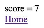
---
import Layout from '../layouts/Layout.astro';

// If the output mode is "static", this will output the following warning:
// [WARN] `Astro.request.headers` is not available in "static" output mode.
// To enable header access, enable SSR.
const cookie = Astro.cookies.get('score');
const score = cookie?.number() ?? 0;
---

<Layout>
  <div>score = {score}</div>
  <a href="/">Home</a>
</Layout>
Table of Contents
The markdown plugin remark-toc can automatically generate a table of contents for Markdown files based on headings. It will render a hyperlink for each heading that can be clicked to jump to it.
To use this plugin:
-
Enter
npm install remark-toc -
Add the following in
astro.config.mjs:import {defineConfig} from 'astro/config'; import remarkToc from 'remark-toc'; export default defineConfig({ markdown: { remarkPlugins: [remarkToc] } }); -
Add
# Table of Contentsto each Markdown file that should include a table of contents to indicate where it should inserted.
Options can be provided to this plugin.
To do so, change the remarkPlugins configuration value
to something like the following:
remarkPlugins: [
  [
    remarkToc,
    {
      maxDepth: 3,
      ordered: true,
      tight: false
    }
  ]
];
The supported options include:
-
headingThis is a case-insensitive regular expression that matches headings that specify where the TOC should be inserted. It defaults to
"(table[ -]of[ -])?contents?|toc". This matches “table of contents”, “table-of-contents”, “contents”, and “toc”. -
maxDepthThis is the maximum heading level to be included in the TOC. It defaults to
6. For example, a value of 2 will only include headings with#and##. -
orderedThis is a Boolean value that indicates whether the TOC should be wrapped in an
olelement (true) or aulelement (false). It defaults tofalse. -
parentsThis does not seem useful.
-
prefixThis does not seem useful.
-
skipThis is a regular expression that matches all headings that should not appear in the TOC. By default no headings are skipped.
-
tightWhen set to
truethis reduces the vertical space between lines in the TOC. Set this tofalseto add space. This defaults totrue.
Here is the beginning of a Markdown file for which a table of contents will be generated.
## Table of Contents

The National Football League (NFL) ...

## AFC East

### Miami Dolphins

### Buffalo Bills

### New York Jets

### New England Patriots

## AFC North

### Baltimore Ravens

### Cleveland Browns

### Pittsburgh Steelers

### Cincinnati Bengals
Here is the table of contents that is rendered.
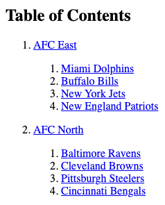
API Endpoints
Endpoint functions can be invoked at build time or run time.
They are defined in .js and .ts files under the src/pages directory.
Consider placing these files in a subdirectory named “api”.
All .js and .ts files in an Astro project
are only used on the server side, never in browsers.
For endpoints that return JSON, consider including .json
at the end of the file name. For example, dogs.json.ts.
Endpoint URLs are defined by file-based routing, just like UI pages.
Endpoints are not UI pages.
It seems odd that they are defined in the pages directory
rather than in a dedicated directory like apis or endpoints.
Perhaps a future version of Astro will make this change.
Endpoints can return data in any format including JSON and HTML (perhaps for use with HTMX). However, currently endpoints cannot use Astro components to generate HTML. That capability is planned for the future. For now, see the HTMX section below which uses Astro pages as endpoints.
Endpoints can be defined by dynamic routes
where directory names under the “pages” directory
are surrounded by square brackets.
Astro.params contains the matched segments of a dynamic route
and can be used in endpoint functions to access those matches.
Astro.request holds a standard Request object.
Endpoint functions can use it to get the request method, URL, headers, and body.
Astro.url is a standard URL object
created from the value of Astro.request.url.
It contains properties that holds parts of the URL
including origin and pathname.
Astro.response holds a standard ResponseInit object.
Endpoint functions can use it to set the
response status, statusText, and headers.
Astro.cookies is an object with methods that endpoint functions
can use to test for (has), get, set, and delete cookies.
The following code in the file src/pages/pets/dog.json.ts
demonstrates creating an endpoint that returns JSON created from
data found in the collection defined in the previous section.
import {getCollection, type CollectionEntry} from 'astro:content';

export async function GET() {
  const dogs: CollectionEntry<'dogs'>[] = await getCollection('dogs');
  const data = dogs.map(dog => dog.data);
  return new Response(JSON.stringify(data));
}
For better type checking and intellisense in editors like VS Code, define endpoint functions as follows:
import type {APIRoute} from 'astro';

export const GET: APIRoute = () => {
  ...
};
API endpoints are defined by the functions
GET, POST, PUT, PATCH, and DELETE.
Each of this take an APIContext object
that contains the following properties:
params: an object containing properties that match the dynamic segments of the route.props: an object containing properties supplied by the getStaticPaths function (only available in server-side rendering)request: a Request object that contains the method, url, headers, and bodyclientAddresscookiesgeneratorlocalsredirectsiteurl
To demonstrate defining endpoints that support CRUD operations
we will see code that performs these on a collection of todo objects.
Each object has the properties id, text, and completed.
We need to share the collection of todos between two source files.
One way to accomplish this is to create a source file
that creates and exports the collection.
This file can be imported by other source files
that need to access the collection.
The following file in src/pages/todo-state.ts does this.
type Todo = {
  id: number;
  text: string;
  completed: boolean;
};

export const todoMap = new Map<number, Todo>();
The endpoints defined in src/pages/todos.ts do two things:
- retrieve all the todos as a JSON array
- create a new todo, returning its JSON
import type {APIContext} from 'astro';
import {todoMap} from './todos-state.ts';

let lastId = 0; // used by addTodo and POST functions

// Add some initial todos.
function addTodo(text: string) {
  const todo = {id: ++lastId, text, completed: false};
  todoMap.set(todo.id, todo);
}
addTodo('buy milk');
addTodo('cut grass');

export async function GET() {
  const todos = [...todoMap.values()];
  return new Response(JSON.stringify(todos), {
    headers: {'Content-Type': 'application/json'}
  });
}

export async function POST({request}: APIContext) {
  const todo = await request.json();
  if (todo.completed === undefined) todo.completed = false;
  const id = ++lastId;
  todo.id = id;
  todoMap.set(id, todo);
  return new Response(JSON.stringify(todo), {status: 201});
}
The endpoints defined in src/pages/todos/[id].ts do four things:
- retrieve a todo as JSON
- update a todo with JSON
- patch a todo with JSON
- delete a todo
Files with square brackets in the name define dynamic routes where path parameters are used. In this case the path parameter is the id of a todo.
Dynamic routes can be used for both pages and API endpoints.
Dynamic routes require enabling SSR.
One way to do this is to add the node adapter by entering npx astro add node.
import type {APIContext} from 'astro';
import {todoMap} from '../todos-state.ts';

export async function GET({params}: APIContext) {
  const {id} = params;
  const idNumber = Number(id);
  const todo = todoMap.get(idNumber);
  return new Response(JSON.stringify(todo), {
    headers: {'Content-Type': 'application/json'}
  });
}
export async function PUT({params, request}: APIContext) {
  const {id} = params;
  const idNumber = Number(id);
  const todo = await request.json();
  todo.id = idNumber; // ensures the id matches the path parameter
  const exists = todoMap.has(idNumber);
  if (exists) todoMap.set(idNumber, todo);
  const status = exists ? 200 : 404;
  return new Response(JSON.stringify(todo), {status});
}

export async function PATCH({params, request}: APIContext) {
  const {id} = params;
  const idNumber = Number(id);
  const updates = await request.json();
  updates.id = idNumber; // ensures the id matches the path parameter
  let todo = todoMap.get(idNumber);
  if (todo) {
    todo = {...todo, ...updates};
    todoMap.set(idNumber, todo);
  }
  const status = todo ? 200 : 404;
  return new Response(JSON.stringify(todo), {status});
}

export async function DELETE({params, request}: APIContext) {
  const {id} = params;
  if (!id) return new Response('missing "id" parameter', {status: 400});

  const idNumber = Number(id);
  const status = todoMap.delete(idNumber) ? 200 : 404;
  return new Response('', {status});
}
When starting the server, include the --host option
to enable using localhost in URLs that hit the endpoints.
For example, the dev and start scripts in package.json
should match the following:
    "dev": "astro dev --host",
    "start": "astro dev --host",
For more detail, see Server Endpoints (API Routes).
Form Submits
Form submits can be handled by an Astro page or an API endpoint. Using an Astro page is ideal when no server-side processing is needed. Using an API endpoint enables server-side processing and redirecting to another Astro page. Let’s examine both cases.
Here is an Astro page defined in src/pages/index.astro that renders a form.
---
import Layout from "../layouts/Layout.astro";

// Choose one of the following lines.
// const action = "/api/form-handler"; // uses API endpoint
const action = "/form-handler"; // uses another page
---

<Layout>
  <form action={action} method="POST">
    <div>
      <label for="name">Name:</label>
      <input type="text" name="name" required size="20" />
    </div>
    <div>
      <label for="age">Age:</label>
      <input type="number" name="age" required />
    </div>
    <div>
      <button>Submit</button>
    </div>
  </form>
</Layout>

<style>
  form {
    display: flex;
    flex-direction: column;
    gap: 1rem;
  }

  input[type="number"] {
    width: 3rem;
  }
</style>
Here is a page defined in src/pages/form-handler.astro
that can handle a form submission using POST
or a redirect from an API endpoint using GET.
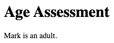
---
import Layout from "../layouts/Layout.astro";
import { categorizeByAge } from "../categorize.ts";

let message = "";
const { request } = Astro;
const { method } = request;

if (method === "GET") {
  // This is used by the redirect in src/pages/api/form-handler.ts.
  message = Astro.url.searchParams.get("message") || "missing message";
} else if (method === "POST") {
  // This is used when the form action is "/form-handler".
  try {
    const data = await request.formData();
    const name = data.get("name");
    const age = Number(data.get("age"));
    const category = categorizeByAge(age);
    message = `${name} is ${category}.`;
  } catch (error) {
    message = error instanceof Error ? error.message : "unknown error";
  }
}
---

<Layout>
  <h1>Age Assessment</h1>
  <p>{message}</p>
</Layout>
Here is an API endpoint defined in the file src/pages/api/form-handler.ts.
import type {APIContext, APIRoute} from 'astro';
import {categorizeByAge} from '../../categorize.ts';

// This is used when the form action is "/api/form-handler".
// This requires SSR configuration.
export const POST: APIRoute = async ({
  redirect,
  request
}: APIContext): Promise<Response> => {
  const data = await request.formData();
  const name = data.get('name');
  const age = Number(data.get('age'));
  const category = categorizeByAge(age);
  const message = `${name} is ${category}.`;
  return redirect(`/form-handler?message=${message}`, 302);
};
Here is the categorizeByAge function defined in src/categorize.ts.
export function categorizeByAge(age: number): string {
  if (age <= 12) return 'a child';
  if (age <= 19) return 'a teenager';
  if (age <= 65) return 'an adult';
  return 'a senior';
}
HTMX
Astro added support for “page partials” which make it more natural to use HTMX.
These render HTML with only body element content.
The <!doctype html>, html, head (and its contents), and body elements
are not output.
To indicate that an Astro component should be rendered as a partial, add the following in its component script:
export const partial = true;
For an example app that combines Astro and HTMX, see astro-htmx-todo-app. This uses Astro page as endpoints.
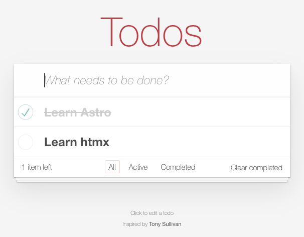
HTTP requests can be triggered by interacting with any HTML element and use any HTTP verb. These requests can target an Astro page. The component script in the page can determine which verb was used and respond accordingly.
Another option to consider is implementing Astro endpoints
that are invoked using HTMX and having those use hx-redirect
to redirect to a specific Astro page that generates the HTML to be returned.
Internationalization
Astro supports internationalization.
The Astro approach is it to duplicate each component for each supported language and store them in directories whose names are language codes. This is a bad approach because any changes require modifying multiple files.
TODO: Describe how to use this.
Tailwind Typography Plugin
The Tailwind @tailwindcss/typography plugin “provides a set of “prose” classes you can use to add beautiful typographic defaults to any vanilla HTML you don’t control, like HTML rendered from Markdown, or pulled from a CMS.”
There are a large number of provided CSS classes whose names all begin with “prose”. These control the font size, text color, and more. See the documentation linked above for details.
To install and configure this plugin:
-
Enter
npx astro add tailwind -
Enter
npm install -D @tailwindcss/typography -
Edit
tailwind.config.mjsand add the following to thepluginsarray:require('@tailwindcss/typography')
To use this plugin, add prose CSS classes to specific HTML elements
that contain the elements to be styled.
The large screenshot below demonstrates how many features of Markdown are styled by this plugin.
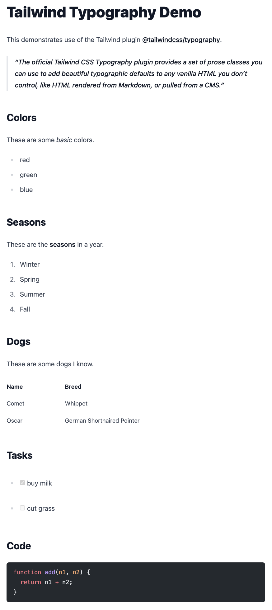
The following files from an Astro project produce the screenshot above.
src/layouts/Layout.astro
Note the use of the CSS class prose and
the slot element that marks where content will be inserted.
<!DOCTYPE html>
<html lang="en">
  <head>
    <style>
      body {
        padding: 1rem;
      }
    </style>
  </head>
  <body class="prose">
    <slot />
  </body>
</html>
src/pages/index.md
Note the reference to the layout above using a front matter property.
---
layout: ../layouts/Layout.astro
---

# Tailwind Typography Demo

This demonstrates use of the Tailwind plugin
[@tailwindcss/typography](https://tailwindcss.com/docs/typography-plugin).

> The official Tailwind CSS Typography plugin provides
> a set of prose classes you can use to add beautiful
> typographic defaults to any vanilla HTML you don’t control,
> like HTML rendered from Markdown, or pulled from a CMS.

## Colors

These are some _basic_ colors.

- red
- green
- blue

## Seasons

These are the **seasons** in a year.

1. Winter
1. Spring
1. Summer
1. Fall

## Dogs

These are some dogs I know.

| Name  | Breed                      |
| ----- | -------------------------- |
| Comet | Whippet                    |
| Oscar | German Shorthaired Pointer |

## Tasks

- [x] buy milk
- [ ] cut grass

## Code

```js
function add(n1, n2) {
  return n1 + n2;
}
```
Bun instead of Node
Astro provides the following caution about using Bun instead of Node
to execute astro commands and run the Astro server:
“Using Bun with Astro may reveal rough edges.
Some integrations may not work as expected.”
To create an Astro project using Bun:
-
Enter
bunx create-astro@latest {project-name}. -
cdto the new project directory. -
Add Bun type definitions by entering
bun add -d bun-types. -
Edit
tsconfig.jsonand add the following:"compilerOptions": { "types": ["bun-types"] } -
Start the development server with
bunx --bun astro dev. -
Build the site with
bunx --bun astro build. -
Preview the built site with
bunx --bun astro preview.
Using Bun instead of Node provides better performance. It also enables using all the features of Bun such as SQLite support. The following Astro page demonstrates this.
---
import { Database } from "bun:sqlite";
import Layout from "../layouts/Layout.astro";

type Todo = {
  id: number;
  text: string;
  completed: number; // 0 or 1 for SQLite compatibility
};

const db = new Database("todos.db", { create: true });
const query = db.query("select * from todos;");
const todos = query.all() as Todo[];
---

<Layout>
  <h1>Astro with Bun</h1>
  { todos.map((todo) => (
    <div>
      <input type="checkbox" checked={todo.completed === 1} />
      <span>{todo.text}</span>
    </div>
  )) }
</Layout>
For more details, see Using Bun with Astro.
Starlight
Starlight is a documentation theme built on Astro.
TODO: Describe how to use this.
Resources
- Astro Home Page
- Astro Quick Start Course by Traversy Media
Unorganized Content
Summarize the steps to deploy an Astro project to Netlify and Vercel.
See the commercial CloudCannon CMS (https://cloudcannon.com) which uses Astro content collection documents.