Scales
It is common to need to "scale" data values to fit in a range of values
that correspond to the width or height of an element such as svg.
D3 provides several methods that create a function for doing this.
The most commonly used is the scaleLinear method.
The scaleLinear method returns an object
that supports domain and range methods.
The domain represents the bounds (min to max)
of data values that need to be scaled.
The range represents the bounds to which they will be mapped.
For example, suppose our data is an array of objects that have
the properties countryName and population.
We want to represent values as low as zero
and as high as the highest population value.
To determine the minimum and maximum data values,
we can use the min and max methods.
These take an array of data and an optional function
the will be passed a data element and returns a value
to be considered for determining the minimum or maximum value.
For example, we can determine the maximum population in our data
with the following:
const maxPopulation = d3.max(data, d => d.population);
If we want to show the values as horizontal bars in an SVG that has a width of 800, the following code creates a function to do this:
const myScale = d3.scaleLinear().domain([0, maxPopulation]).range([0, 800]);
The myScale function we have created
takes a number between 0 and maxPopulation
and it returns a number between 0 and 800.
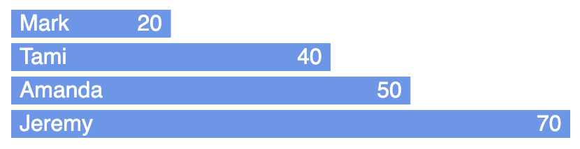
Using SVG rect elements to create a bar chart
When rendering SVG rect elements for each of the bars,
we can use this function as follows to set their widths:
.attr('width', d => myScale(d.population))
Here is HTML and JavaScript code for creating a simple bar chart using D3 and SVG.
index.html
<html>
  <head>
    <title>D3 SVG Bar Chart</title>
    <script src="https://d3js.org/d3.v5.min.js"></script>
    <script src="bar-chart.js" defer></script>
    <style>
      body {
        font-family: sans-serif;
      }

      rect {
        fill: cornflowerblue;
      }

      text {
        fill: white;
      }
    </style>
  </head>
  <body></body>
</html>
bar-chart.js
const barHeight = 20;
const barMargin = 4; // vertical spacing between
const barTotal = barHeight + barMargin;
const players = [
  {name: 'Mark', score: 20},
  {name: 'Tami', score: 40},
  {name: 'Amanda', score: 50},
  {name: 'Jeremy', score: 70}
];
const svgWidth = 400;
const svgHeight = 300;

// Get the highest score.
const highScore = d3.max(players, player => player.score);

// Create a linear scale that maps values from zero to the maximum score
// to values from zero to the width of the SVG.
const widthScale = d3.scaleLinear().domain([0, highScore]).range([0, svgWidth]);

// Create an SVG element.
const svg = d3
  .select('body')
  .append('svg')
  .attr('width', svgWidth)
  .attr('height', svgHeight);

// Create a selection containing one SVG group for each data value
// that are translated in the y-direction so they are visually separated.
const barGroups = svg
  .selectAll('g')
  .data(players)
  .enter()
  .append('g')
  .attr('transform', (_, i) => `translate(0, ${i * barTotal})`);

// Create a rect for each data value.
barGroups
  .append('rect')
  .attr('width', player => widthScale(player.score))
  .attr('height', barHeight);

// Create text for each data value that displays a player name.
barGroups
  .append('text')
  .text(player => player.name)
  .attr('x', 6) // at beginning of bar
  .attr('y', barTotal / 2 + 3); // centered vertically

// Create text for each data value that displays a player score.
barGroups
  .append('text')
  .text(player => player.score)
  .attr('x', player => widthScale(player.score) - 24) // at end of bar
  .attr('y', barTotal / 2 + 3); // centered vertically
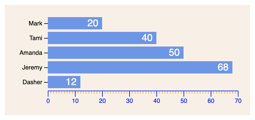
Adding Axes
The D3 methods to create axes do so by mapping a data range to a width to a pixel range. They draw an axis containing tick marks and values. But they do not position the axes relative to a chart. That part is up to you.
There are four methods for creating an axis.
They are axisBottom, axisLeft, axisTop, and axisRight.
The differ in the orientation of the axis (horizontal or vertical)
and the side of the axis on where tick marks appear.
The ticks method specifies the number of ticks to display.
They will be spaced evenly across the axis.
The tickFormat method can be set to a function that takes a tick index
and returns the label to render for that tick.
Pass an empty string to render an empty tick label for all of them.
The tickSize method specifies the length of each tick.
It defaults to 6.
Set it to a negative number to draw lines across the chart.
For example, .tickSize(-usableHeight).
The tickPadding method specifies the space between each tick
and corresponding label. It defaults to 3.
The tickValues method takes an array of labels to be rendered for the ticks.
By default the data value is rendered.
index.html with axes
<html>
  <head>
    <title>D3 SVG Bar Chart</title>
    <script src="https://d3js.org/d3.v5.min.js"></script>
    <script src="bar-chart.js" defer></script>
    <style>
      .bar text {
        fill: white;
        pointer-events: none;
      }

      body {
        font-family: sans-serif;
      }

      .major-x-axis > .tick > line {
        stroke-width: 2;
      }

      .minor-x-axis {
        color: orange;
      }

      rect {
        fill: cornflowerblue;
      }

      svg {
        background-color: linen;
      }

      .tooltip {
        position: absolute;
        background: pink;
        border: solid gray 1px;
        border-radius: 5px;
        opacity: 0; /* initially hidden */
        padding: 0.5rem;
        pointer-events: none;
      }

      .y-axis .domain {
        display: none;
      }
    </style>
  </head>
  <body></body>
</html>
bar-chart.js with axes
const BAR_HEIGHT = 20;
const BAR_MARGIN = 4; // vertical spacing between
const LEFT_PADDING = 70;
const PADDING = 20;
const SVG_WIDTH = 400;

const barTotal = BAR_HEIGHT + BAR_MARGIN;
const players = [
  {name: 'Mark', score: 20},
  {name: 'Tami', score: 40},
  {name: 'Amanda', score: 50},
  {name: 'Jeremy', score: 68},
  {name: 'Dasher', score: 12}
];
// Leave room for top PADDING, bottom PADDING, and x axis.
const svgHeight = PADDING * 3 + players.length * barTotal;
const usableHeight = svgHeight - PADDING * 3;
const usableWidth = SVG_WIDTH - LEFT_PADDING - PADDING;

// Get the highest score rounded up to the nearest multiple of 10.
const highScore = Math.ceil(d3.max(players, player => player.score) / 10) * 10;

// Create a linear scale that maps values from zero to the maximum score
// to values from zero to the width of the SVG.
const widthScale = d3
  .scaleLinear()
  .domain([0, highScore])
  .range([0, usableWidth]);

// Create an SVG element.
const svg = d3
  .select('body')
  .append('svg')
  .attr('width', SVG_WIDTH)
  .attr('height', svgHeight);

const tooltip = d3.select('body').append('div').classed('tooltip', true);

// Create a selection containing one SVG group for each data value
// that are translated in the y-direction so they are visually separated.
const barGroups = svg
  .selectAll('g')
  .data(players)
  .enter()
  .append('g')
  .classed('bar', true)
  .attr(
    'transform',
    (_, i) => `translate(${LEFT_PADDING}, ${PADDING + i * barTotal})`
  );

// Create a rect for each data value.
barGroups
  .append('rect')
  .attr('width', player => widthScale(player.score))
  .attr('height', BAR_HEIGHT)
  // Cannot use an arrow function because we need the value of "this".
  .on('mouseenter', function (player) {
    // Configure the tooltip.
    tooltip
      .text(player.score)
      .style('left', d3.event.pageX + 'px')
      .style('top', d3.event.pageY + 'px');
    // Show the tooltip.
    tooltip.transition().style('opacity', 1);
    // Fade the bar.
    d3.select(this).style('opacity', 0.5);
  })
  // Cannot use an arrow function because we need the value of "this".
  .on('mouseout', function () {
    // Hide the tooltip.
    tooltip.transition().style('opacity', 0);
    // Restore the bar opacity.
    d3.select(this).style('opacity', 1);
  });

// Create text for each data value that displays a player score.
barGroups
  .append('text')
  .text(player => player.score)
  .attr('x', player => widthScale(player.score) - 24) // at end of bar
  .attr('y', barTotal / 2 + 3); // centered vertically

const xAxisScale = d3
  .scaleLinear()
  .domain([0, highScore])
  .range([0, usableWidth]);
const xAxisMinor = d3
  .axisBottom(xAxisScale)
  .ticks(highScore) // show a tick at every 1
  .tickFormat('') // hides labels
  .tickSize(5); // length of each tick (default is 6)
const xAxisMajor = d3
  .axisBottom(xAxisScale)
  .ticks(highScore / 10) // show a tick at every multiple of 10
  // highStore is guaranteed to be a multiple of 10.
  .tickPadding(10) // space between end of tick and label; default is 3
  .tickSize(10);
//.tickSize(-usableHeight); // to draw across chart
const xAxisTransform = `translate(${LEFT_PADDING}, ${
  PADDING + players.length * barTotal
})`;
svg
  .append('g')
  .call(xAxisMinor)
  .classed('minor-x-axis', true)
  .attr('transform', xAxisTransform);
svg
  .append('g')
  .call(xAxisMajor)
  .classed('major-x-axis', true)
  .attr('transform', xAxisTransform);

// Generate tick values that will place the ticks
// at the vertical center of each of the bars.
const yTickValues = players.map((_, i) => i + 0.5);

const yAxisScale = d3
  .scaleLinear()
  .domain([players.length, 0]) // reversed order
  .range([usableHeight, 0]); // top to bottom
const yAxis = d3
  .axisLeft(yAxisScale)
  .ticks(players.length)
  .tickFormat((_, i) => {
    const player = players[i];
    return player ? player.name : '';
  })
  .tickValues(yTickValues);
svg
  .append('g')
  .call(yAxis)
  .classed('y-axis', true)
  .attr('transform', `translate(${LEFT_PADDING}, ${PADDING - BAR_MARGIN / 2})`);