Overview
Lit is library that simplifies developing web components compared to using only standard browser APIs.
Other popular options include:
Lit components are native web components, so they can be used everywhere web components can be used.
The Lit library is implemented in TypeScript. Lit components can be implemented in JavaScript or TypeScript. When using JavaScript, no build step is required.
JavaScript does not yet support decorator syntax. TypeScript must be used to take advantage of Lit decorators, which simplify the code.
Lit provides a large amount of functionality that goes well beyond just implementing web components for their reusability across web frameworks. Lit can be used as a replacement for SPA frameworks like React, Svelte, Vue, and Angular. Whether using Lit in this way is a good idea is debatable.
Resources
-
Build With Lit YouTube channel
See the playlists “Build it with Lit”, “Lit University”, and “Talks”
-
HTML with Superpowers introduction to web components from Dave Rupert
See examples on the “Using” page that include “details-utils” and “two-up”.
Used By
Companies reportedly using Lit include Adobe, Cisco, Ford, GitHub, IBM, IKEA, Lego, Microsoft, Netflix, Red Hat, Reddit, SAP, VMware, and many more.
Abobe uses Lit in Photoshop for the Web.
Google uses Lit for Chrome DevTools.
Installing
The easiest way to get started using Lit is to get the library from this CDN. This single file can be saved locally to avoid depending on the CDN. The minimized, compressed file is only 5.8 KB.
Another approach is to use Vite. This has many advantages including:
- configuration to use TypeScript
- running in watch mode so code changes are automatically recompiled
- automatic browser updates
The following steps create a new project that uses Vite and Lit.
-
Enter
npm create vite@latest. -
If prompted with “OK to proceed”, press the return key.
-
After the “Project name” prompt, enter a project name.
-
For the “Select a framework” prompt, select “Lit”.
-
For the “Select a variant” prompt, select “TypeScript”.
-
cd to the new project directory.
-
Install dependencies by entering
npm installorbun install. -
Run the project by entering
npm run devorbun dev.Currently running
bun devin macOS gives the error “Cannot find module @rollup/rollup-darwin-x64”. It should be looking for the ARM version, not the x64 version. A workaround is to usenpm run devfor now. -
Type “h” and press the return key for help.
-
Type “o” and press the return key to open a browser tab for localhost:5173.
Tooling
ESLint has a plugin for Lit at eslint-plugin-lit.
To use this, enter npm install -D * where * each of the following:
eslint@typescript-eslint/parser@typescript-eslint/eslint-plugineslint-plugin-lit
Create the file .eslintrc.json containing the following:
{
  "extends": [
    "plugin:@typescript-eslint/recommended",
    "plugin:lit/recommended"
  ],
  "parser": "@typescript-eslint/parser",
  "parserOptions": {
    "ecmaVersion": 2020,
    "sourceType": "module"
  },
  "rules": {}
}
Add the following script in package.json:
"lint": "eslint --cache --ext=.js,.ts --fix src",
Add the line .eslintcache in .gitignore.
VS Code has an extension for Lit that provides syntax highlighting, type checking, code completion, and checks for improperly closed tags. See lit-plugin.
To use Emmet expansions in Lit html tagged template literals inside VS Code,
add the following in settings.json.
  "emmet.includeLanguages": {
    "javascript": "html",
    "typescript": "html"
  }
Basic Example
The following code from the file src/greet-message.ts
implements a basic custom element using Lit and TypeScript.
Using TypeScript provides type checking in code editors like VS Code.
Using TypeScript also allows the use of
decorators like @customElement and @property.
The @customElement decorator assigns a name to the custom element.
The @property decorator can declare attributes
that can be applied to the custom element.
Lit components must extend the LitElement class.
The LitElement class extends the ReactiveElement class (from Lit),
which extends the HTMLElement class (from the HTML standard).
import {css, html, LitElement} from 'lit';
import {customElement, property} from 'lit/decorators.js';

// The class name is not required to match the custom element name.
@customElement('greet-message')
export class GreetMessage extends LitElement {
  // This value will come from an HTML attribute.
  @property() name = '';

  override render() {
    // Checking for required attributes is optional.
    if (!this.name) throw new Error('name is a required attribute');
    return html`<div>Hello, ${this.name}!</div>`;
  }

  // The `styles` property can be defined anywhere in
  // the class definition, not just at the bottom.
  // Making it "static" shares the value across all instances.
  // :host refers to outermost element rendered by this custom element.
  static styles = css`
    :host {
      color: purple;
    }
  `;
}
Note how the HTMLElement attachShadow method is not called.
The LitElement superclass takes care of that for you.
The following code from the file src/greet-message.js implements
the same custom element using JavaScript instead of TypeScript.
JavaScript-based custom elements cannot use decorators,
so they use a different approach to
declare the custom element name and properties (attributes).
import {css, html, LitElement} from 'lit';

export class GreetMessage extends LitElement {
  static properties = {
    name: {type: String}
  };

  override render() {
    if (!this.name) throw new Error('name is a required attribute');
    return html`<div>Hello, ${this.name}!</div>`;
  }

  static styles = css`
    :host {
      color: purple;
    }
  `;
}
customElements.define('greet-message', GreetMessage);
The following code from the file src/greet-message-native.js implements
the same custom element using JavaScript.
It uses the native web component approach rather than using Lit.
Note how it relies on using DOM APIs like
the createElement and appendChild methods.
export class GreetMessage extends HTMLElement {
  constructor() {
    super();

    const name = this.getAttribute('name');
    if (!name) throw new Error('name is a required attribute');

    const div = document.createElement('div');
    div.textContent = `Hello, ${name}!`;
    div.style.color = 'purple';

    // The "mode" option is required and the recommended value is "open".
    // When set to "open", `this.shadowRoot` is set.
    // When set to "closed", it is not.
    this.attachShadow({mode: 'open'});
    this.shadowRoot.appendChild(div);
    // Using shadow DOM is not required.  We can replace
    // the previous two lines with the following.
    // this.appendChild(div);

    // Yet another way this could be implemented ...
    /*
    this.attachShadow({mode: 'open'});
    this.shadowRoot.innerHTML = `
      <div style="color: purple;">Hello, ${name}!</div>
    `;
    */
  }
}
customElements.define('greet-message', GreetMessage);
The value of this.shadowRoot, when set, is a ShadowRoot object.
This can be accessed in other lifecycle methods such as connectedCallback.
One use is to register listeners for slotchange events.
The following HTML renders the custom element defined above.

<!DOCTYPE html>
<html>
  <head>
    <title>Lit Demo</title>
    <!-- Change src value to use a different web component version. -->
    <script type="module" src="/src/greet-message.ts"></script>
  </head>
  <body>
    <greet-message name="World"></greet-message>
  </body>
</html>
Counter
A common web component example is to implement a counter component. The following code shows one way to implement this using Lit.

import {css, html, LitElement} from 'lit';
import {customElement, state} from 'lit/decorators.js';

@customElement('my-counter')
export class Counter extends LitElement {
  @state() count = 0;

  override render() {
    return html`
      <button ?disabled=${this.count === 0} @click=${() => this.count--}>
        -
      </button>
      <div>${this.count}</div>
      <button @click=${() => this.count++}>+</button>
    `;
  }

  static styles = css`
    :host {
      display: flex;
      gap: 1rem;
      align-items: center;

      font-family: monospace;
      font-size: 2rem;
    }

    button {
      --size: 3rem;
      width: var(--size);
      height: var(--size);

      background-color: orange;
      border: none;
      border-radius: 50%;
      font-size: 2rem;
    }
  `;
}
Properties
Lit uses the @property decorator to declare the attributes
that can be specified in instances of custom elements.
These values are reactive, meaning that changing the value
causes the render method to be called.
The @property decorator takes a PropertyDeclaration object.
One of the supported options is type, which can have the value
String, Number, Boolean, Array, or Object.
These are Lit type hints, not TypeScript types.
The default type is String.
When the type is Number, the value is passed to the Number constructor
which results in NaN for non-numeric strings.
When the type is Boolean, the value is set
based on whether the attribute is present.
When the type is Array or Object, the value is passed to JSON.parse
to get the property value.
Only string values can be specified in HTML. JavaScript must be used to set attributes to other types of values.
Lit does not provide a way to specify that an attribute is required.
All @property declarations must be initialized,
but they can be initialized to an empty string.
The render method or any lifecycle method can check for
required attributes and throw an error if not found.
See the example in the “Basic Example” section above.
State
Lit uses the @state decorator to declare instance properties
that are set via attributes.
These values are reactive, meaning that changing the value
causes the render method to be called.
Instance properties that are declared without the
@property or @state decorator are not reactive.
The following custom Lit element demonstrates the reactivity
of @property and @state variables.
import {html, LitElement} from 'lit';
import {customElement, property, state} from 'lit/decorators.js';
@customElement('state-changes')
export class StateChanges extends LitElement {
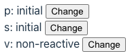
@property() p = '';
@state() s = 'initial';
v = 'non-reactive';
changeP() {
this.p = 'changed';
}
changeS() {
this.s = 'changed';
}
changeV() {
this.v = 'changed';
// v is not a reactive property,
// so the change won't trigger a call to render.
this.requestUpdate(); // triggers call to render
}
override render() {
return html`
<div>
p: ${this.p}
<button @click=${this.changeP}>Change</button>
</div>
<div>
s: ${this.s}
<button @click=${this.changeS}>Change</button>
</div>
<div>
v: ${this.v}
<button @click=${this.changeV}>Change</button>
</div>
`;
}
}
An instance of this custom element can be created as follows.
<state-changes p="initial"></state-changes>
Decorators
Lit supports many decorators.
We have already seen @customElement, @property, and @state.
Other supported decorators include:
-
@eventOptionsThis specifies an options object to be passed to calls that Lit makes to
addEventListenerandremoveEventListener. The supported options are documented in MDN. They includecapture,once,passive, andsignal.For example, adding
@eventOptions({once: true})before the definition of a callback function prevents it from being called more than once. -
@queryThis specifies a CSS selector that will be used to query the DOM tree of the component to find a matching element. It is a applied to a property declaration and the property is set to a reference to the matching element.
For example:
// This sets `pBtn` to a reference to the `button`
// inside the element with id "p".
@query('#p button') pBtn!: HTMLDivElement;

// This is an event handling method that is
// called when a specific button is clicked.
changeP() {
  this.p = this.p === 'go' ? 'stop' : 'go';
  // This changes the color of button.
  this.pBtn.style.color = this.p === 'go' ? 'green' : 'red';
}

override render() {
  return html`
    <div id="p">
      p: ${this.p}
      <button @click=${this.changeP}>Change</button>
    </div>
  `;
}
See the “Refs” section for an alternative.
-
@queryAllThis specifies a CSS selector that will be used to query the DOM tree of the component to find all matching element. It is a applied to a property declaration and the property is set to a
NodeListcontaining the matching elements.For example:
// This sets `buttons` to a `NodeList` containing references // to all the `button` elements inside this component. @queryAll('button') buttons!: NodeList; // This is an event handling method that is // called when a specific button is clicked. changeP() { this.p = this.p === 'go' ? 'stop' : 'go'; // This changes the color of each `button`. for (const node of this.buttons) { const button = node as HTMLButtonElement; button.style.color = this.p === 'go' ? 'green' : 'red'; } } -
@queryAsyncThis is similar to to
@query, but sets a property to aPromise.For example:
// This sets `pBtn` to a `Promise` that will resolve to // a reference to the `button` inside the element with id "p". @queryAsync('#p button') pBtn!: Promise<HTMLButtonElement>; // This is an event handling method that is // called when a specific button is clicked. async changeP() { this.p = this.p === 'go' ? 'stop' : 'go'; const pBtn = await this.pBtn; if (pBtn) { // This changes the color of the button. pBtn.style.color = this.p === 'go' ? 'green' : 'red'; } } -
@queryAssignedElementsThis specifies a slot name or CSS selector. It sets a property to an array of
HTMLElementobjects representing the elements that were assigned to the slot or selected element.@queryAssignedElements({ // selector: 'li' slot: 'breakfast' }) breakfastElements!: HTMLElement[];To get the elements assigned to the default slot, omit the argument to
@queryAssignedElements.See examples in the “Slots” section below.
-
@queryAssignedNodesThis specifies a slot name or CSS selector. It sets a property to an array of
Nodeobjects representing the nodes (includingTextnodes) that were assigned to the slot or selected element.For example:
@queryAssignedNodes({ slot: 'lunch' }) lunchNodes!: Node[];To get the nodes assigned to the default slot, omit the argument to
@queryAssignedNodes.
Refs
Refs provide an alternative to the @query decorator
for getting a reference to a DOM element.
For example:
import {html, LitElement} from 'lit';
import {customElement} from 'lit/decorators.js';
import {createRef, ref, type Ref} from 'lit/directives/ref.js';
@customElement('greet-message')
export class GreetMessage extends LitElement {
inputRef: Ref<HTMLInputElement> = createRef();
override render() {
...
return html`
...
<input
type="text"
size="20"
${ref(this.inputRef)}
@input=${() => (this.newName = this.inputRef.value.value)}
/>
...
`;
}
}
The expression this.inputRef.value gives the DOM input element.
Adding .value to this gets the value of the input.
Using the @query decorator, as shown earlier, is a bit easier.
Tagged Template Literals
Lit implements the html and css tagged template literals.
These using the browser’s built-in parsers to parse the text
before any ${...} interpolations are processed.
The text must be well-formed HTML before the interpolations are inserted.
From the Lit documentation, “Because the browser’s built-in parser is very lenient, most cases of malformed templates are not detectable at runtime, so you won’t see warnings — just templates that don’t behave as you expect. We recommend using linting tools and IDE plugins to find issues in your templates during development.”
TODO: Describe what these provide beyond string concatenation. TODO: See https://lit.dev/docs/templates/overview/.
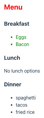
Slots
Web components can have one default slot and any number of named slots.
These are defined using the HTML slot element.
Instances of the component can specify content to be placed in the slots.
The slot element can be self closing and can have a name attribute.
For example, <slot name="footer" />.
The following example demonstrates using slots.
import {html, LitElement, type PropertyValues} from 'lit';
import {customElement, queryAssignedElements} from 'lit/decorators.js';
@customElement('slots-demo')
export class SlotsDemo extends LitElement {
// To get an array of HTMLElement objects rather than Node objects,
// use @queryAssignedElements.
// Use @queryAssignedNodes when you also
// want to capture Node objects like Text.
@queryAssignedElements({
  // selector: 'li'
  slot: 'breakfast'
})
breakfastElements!: HTMLElement[];
@queryAssignedElements()
defaultElements!: HTMLElement[];
// The override keyword ensures that the method being overridden
// is spelled correction and takes the correct parameters.
override firstUpdated(changedProperties: PropertyValues): void {
super.firstUpdated(changedProperties);
for (const el of this.defaultElements) {
el.style.color = 'red';
}
for (const el of this.breakfastElements) {
el.style.color = 'green';
}
}
override render() {
return html`
<div>
<h2><slot /></h2>
<h3>Breakfast</h3>
<slot name="breakfast">No breakfast options</slot>
<h3>Lunch</h3>
<slot name="lunch">No lunch options</slot>
<h3>Dinner</h3>
<slot name="dinner">No dinner options</slot>
</div>
`;
}
}
The following HTML renders the custom element defined above.
<!DOCTYPE html>
<html>
  <head>
    <title>Slots Demo</title>
    <script type="module" src="/src/slots-demo.ts"></script>
  </head>
  <body>
    <slots-demo>
      <p>Menu</p>
      <ul slot="breakfast">
        <li>Eggs</li>
        <li>Bacon</li>
      </ul>
      <ul slot="dinner">
        <li>spaghetti</li>
        <li>tacos</li>
        <li>fried rice</li>
      </ul>
    </slots-demo>
  </body>
</html>
Lifecycle
Lit supports all the standard web component lifecycle methods.
Lit also supports additional methods and properties that are part of its “reactive update cycle”. These include the following.
shouldUpdate
This method is called automatically before an update is performed.
It should return true to allow the update and false to reject it.
Property changes made in this method WILL NOT trigger another update.
willUpdate
This method is called automatically after shouldUpdate.
Property changes made in this method WILL NOT trigger another update.
update
This method is called automatically after willUpdate.
Property changes made in this method WILL NOT trigger another update.
Overriding this method is rare.
render
This method is called automatically by
the update method defined in LitElement.
It is unique to Lit and not part of the web components standard.
This method can return:
- the result of invoking
htmltagged template literal - a primitive value (string, number, or boolean)
- DOM nodes
- arrays/iterables of the above types
The html tagged template literal can be used multiple times
to construct parts of a return value
that is composed of multiple HTML strings.
This method should not:
- use data other than component property to determine what it returns
- modify any component properties
- have any side effects
It should return the same result for the same set of component property values.
firstUpdated
This method is called automatically the first call to update.
Property changes made in this method WILL trigger another update.
updated
This method is called automatically after every call to update.
adoptedCallback
This method is called automatically when a custom element instance is moved to a new document.
Overriding this method is rare.
hasChanged
This method is defined in the options object
passed to the @property or @state decorator.
It is called automatically every time the associated property value changes.
It should return true to allow the change and false to reject it.
updateComplete
This is a property whose value is a Promise
that resolves when the latest update completes.
It can be useful to await this before dispatching a custom event.
performUpdate
This method can be called to perform a synchronous update,
resulting in a call to the render method.
Calling this can be useful when a non-reactive property
that affects what is rendered is modified.
requestUpdate
This method can be called to request an asynchronous update,
resulting in a call to the render method.
Calling this can be useful when a non-reactive property
that affects what is rendered is modified.
The following code demonstrates each of the lifecycle methods,
except the rarely used adoptedCallback method.
import {css, html, LitElement, type PropertyValues} from 'lit';
import {customElement, property, query, state} from 'lit/decorators.js';

@customElement('greet-message')
export class GreetMessage extends LitElement {
  @state() newName = '';

  @property({
    // This can validate proposed property value changes.
    hasChanged(newVal: string, oldVal: string) {
      console.log('hasChanged for name: changing from', oldVal, 'to', newVal);
      // Only allow the change if the length is more than 1.
      const valid = newVal.length > 1;
      return valid;
    }
  })
  name = '';

  // This is set based on the presence of the "shout" attribute.
  @property({type: Boolean}) shout = false;

  // This gets a reference to the DOM element with id "nameInput".
  @query('#nameInput') nameInput!: HTMLInputElement;

  override attributeChangedCallback(
    name: string,
    old: string,
    value: string
  ): void {
    super.attributeChangedCallback(name, old, value);
    console.log(
      'attributeChangedCallback:',
      name,
      'changing from',
      old,
      'to',
      value
    );
  }

  override connectedCallback(): void {
    super.connectedCallback();
    console.log('connectedCallback entered');
  }

  override disconnectedCallback(): void {
    super.disconnectedCallback();
    console.log('disconnectedCallback entered');
  }

  override render() {
    if (!this.name) throw new Error('name is a required attribute');

    let message = `Hello, ${this.name}!`;
    if (this.shout) message = message.toUpperCase();

    // The `?` before `disabled` below creates
    // a one-way boolean attribute binding.
    // A `.` is used to create a one-way property binding
    // for attributes with string or number values.
    return html`
      <div>${message}</div>
      <form
        @submit=${(e: SubmitEvent) => {
          e.preventDefault();
          this.name = this.newName;
          this.newName = ''; // clears the input
        }}
      >
        <input
          id="nameInput"
          type="text"
          size="20"
          required
          .value=${this.newName}
          @input=${() => (this.newName = this.nameInput.value)}
        />
        <button ?disabled=${this.newName.length <= 1}>Update</button>
      </form>
    `;
  }

  // This is called before `willUpdate`.
  override shouldUpdate(changedProperties: PropertyValues): boolean {
    // no need to call super
    console.log('shouldUpdate: changedProperties =', changedProperties);
    return true;
  }

  // This is called before `update`.
  override willUpdate(changedProperties: PropertyValues) {
    // no need to call super
    console.log('willUpdate : changedProperties =', changedProperties);
  }

  // This is rarely implemented.  The super method calls `render`.
  override update(changedProperties: PropertyValues) {
    super.update(changedProperties); // must call this
    console.log('update: changedProperties =', changedProperties);
  }

  // This is called after the first call to `update`.
  override firstUpdated(changedProperties: PropertyValues) {
    // no need to call super
    console.log('firstUpdated: changedProperties =', changedProperties);
  }

  // This is called after every call to `update`.
  override updated(changedProperties: PropertyValues) {
    // no need to call super
    console.log('updated: changedProperties =', changedProperties);
  }

  static styles = css`
    :host {
      color: purple;
      font-size: 2rem;
      font-weight: bold;
    }
  `;
}
To conditionally hide an element, use a boolean attribute binding
for the standard DOM hidden attribute. For example:
<div ?hidden=${some-condition}>some content</div>
Directives
Lit provides a number of “directive” functions
that can be useful in html tagged template literals.
Most of their functionality can be implementing in
plain JavaScript code instead, so their value is debatable.
The ifDefined directive only adds an attribute to an element
if a given value is defined.
If it is defined, the value is used as a part of the attribute value.
The join directive takes an iterable (typically an Array)
of content strings and a “joiner”.
The joiner can be a static string of content or
a function that is passed an index and returns a string of content.
The directive renders each content string in the iterable
with the joiner between each pair.
The range directive creates an iterable over a range of integers
starting from zero and stopping one short of a given “end” value.
It can also be passed arguments for the start, end, and step values.
The when directive is useful when content must be computed
based on a condition. It takes a condition and two functions,
one to compute the true content and one to compute the false content.
The choose function is similar to the when function,
but bases content on a non-Boolean value.
It is similar to a switch statement in JavaScript.
Each case computes the content to use with a function.
The map directive iterates over an iterable (typically an Array)
and renders content returned by a function for each element.
The repeat directive is similar to the map function,
but it takes an iterable (typically an Array),
a function to compute a “key” value,
and a function to compute content.
The key value is used to optimize DOM updates.
It is not passed to the content function.
If only one function is passed, this behaves the same as map.
There are additional directives not described here. See Built-in directives for more detail.
The following code demonstrates the usage of many of the directives.
import {html, LitElement} from 'lit';
import {customElement, property} from 'lit/decorators.js';
import {choose} from 'lit/directives/choose.js';
import {classMap} from 'lit/directives/class-map.js';
import {ifDefined} from 'lit/directives/if-defined.js';
import {join} from 'lit/directives/join.js';
import {map} from 'lit/directives/map.js';
import {range} from 'lit/directives/range.js';
import {repeat} from 'lit/directives/repeat.js';
import {styleMap} from 'lit/directives/style-map.js';
import {when} from 'lit/directives/when.js';

@customElement('directives-demo')
export class DirectivesDemo extends LitElement {
  @property() color?: string;
  @property() fruit!: string;
  @property({type: Boolean}) timeOnly = false;

  static fruits = [
    {id: 7, name: 'apple', color: 'red'},
    {id: 3, name: 'banana', color: 'yellow'},
    {id: 2, name: 'blueberry', color: 'blue'},
    {id: 9, name: 'orange', color: 'orange'}
  ];

  static fruitMap = {
    apple: 'red',
    banana: 'yellow',
    blueberry: 'blue',
    orange: 'orange'
  };

  getDate() {
    return new Date().toLocaleString();
  }

  getTime() {
    return new Date().toLocaleTimeString();
  }

  override render() {
    const to = this.timeOnly;
    const classes = {c1: to, c2: to, c3: to};
    const styles = {
      color: to ? 'purple' : 'blue',
      fontSize: to ? '2rem' : '1rem',
      fontWeight: to ? 'bold' : 'normal'
    };

    return html`
      <section>
        <div class=${classMap(classes)} style=${styleMap(styles)}>
          My favorite fruit color is
          ${choose(
            this.fruit,
            [
              // These functions can return an `html` tagged template literal.
              ['apple', () => 'red'],
              ['banana', () => 'yellow'],
              ['blueberry', () => 'blue'],
              ['orange', () => 'orange']
            ],
            () => `invalid fruit ${this.fruit}`
          )}.
        </div>

        <ul>
          ${map(
            DirectivesDemo.fruits,
            (fruit, index) => html`
              <li style="color: ${fruit.color}">${index + 1}: ${fruit.name}</li>
            `
          )}
        </ul>

        <ul>
          ${repeat(
            DirectivesDemo.fruits,
            fruit => fruit.id,
            (fruit, index) => html`
              <li style="color: ${fruit.color}">${index + 1}: ${fruit.name}</li>
            `
          )}
        </ul>

        <!-- This renders 10, 20, 30. -->
        ${repeat(range(3), number => html`<div>${(number + 1) * 10}</div>`)}

        <!-- The style attribute is only set if
             a value for this.color was supplied. -->
        <div style="color: ${ifDefined(this.color)}">
          ${when(this.timeOnly, this.getTime, this.getDate)}
        </div>

        <div
          style="border: 1px solid gray; display: inline-block; padding: 1rem"
        >
          ${join(
            map(
              DirectivesDemo.fruits,
              fruit => html`<div>${fruit.name}</span>`
            ),
            html`<hr />`
          )}
        </div>
      </section>
    `;
  }
}
Event Handling
Lit supports registering event handling functions with event bindings.
An event binding is an attribute whose name is @ followed by an event name.
The value must be a function object,
not a call to a function or JavaScript code.
String interpolation (${fn}) is used to insert the function
into the html tagged template literal.
For example:
import {css, html, LitElement} from 'lit';
import {customElement} from 'lit/decorators.js';

function handleClick() {
  alert('in handleClick function');
}

@customElement('alert-on-click')
export class AlertOnClick extends LitElement {
  handleClick() {
    alert('in handleClick method');
  }

  override render() {
    return html`
      <button @click=${this.handleClick}>Click Me</button>
      <button @click=${handleClick}>Click Me</button>
    `;
  }

  static styles = css`
    :host {
      border: 1px dashed red;
      padding: 1rem;
    }

    button {
      border-radius: 0.5rem;
      border: 3px solid cornflowerblue;
      padding: 0.5rem;
      background-color: lemonchiffon;
      cursor: pointer;
    }
    button:hover {
      background-color: orange;
    }
  `;
}
“Composed events” that are set to bubble can bubble out of the shadow DOM of web components. Most standard UI events fit this criteria.
When this happens, the event is “retargeted”. This means the event
appear to come from the host element of the web component rather than
from the actual element that triggered the event (such as an input).
The event also loses the values of some of its properties.
There are two ways that such an event can be handled in a web component and captured in a page that uses the web component. I prefer the first approach because it requires less work from users of the web component.
-
Capture in the web component and dispatch a custom event.
For example, a web component whose custom element name is
toggle-switchcould contain the following:handleChange(event) { const {checked} = event.target; const newEvent = new CustomEvent('toggle', { detail: {checked} }); this.dispatchEvent(newEvent); } render() { return html` <input type="checkbox" ?checked=${this.checked} @change=${this.handleChange} /> `; }A page that uses
toggle-switchcould contain the following to handle the customtoggleevent. This example uses Alpine syntax to register an event listener.<head> ... <script> function handleToggle(event) { const {checked} = event.detail; console.log('handleToggle: checked =', checked); } </script> </head> <body> <toggle-switch label="Bluetooth" @toggle="handleToggle($event)" ></toggle-switch> </body> -
Don’t handle in the web component and used
composedPathin the page.For example, a web component whose custom element name is
toggle-switchcould contain the following:render() { return html`<input type="checkbox" ?checked="${this.checked}" />`; }A page that uses
toggle-switchcould contain the following to handle the standard DOMinputevent. This example uses Alpine syntax to register an event listener.<head> ... <script> function handleInput(event) { // event.composedPath() returns an array of all the // nodes the event will pass through, starting from the // element that triggered the event (`input` in this case) // and ending at the `document`. const input = event.composedPath()[0]; const {checked} = input; console.log('handleInput: checked =', checked); } </script> </head> <body> <toggle-switch label="Bluetooth" @input="handleInput($event)" ></toggle-switch> </body>
Context
The @lit/context package provides a way to make data available throughout a component subtree. It avoids “prop drilling” where data is passed through every layer of a component hierarchy.
To install this package, enter npm install @lit/context.
The following code in the file src/dog-context.ts defines
a data type and a context for holding an object of that type.
import {createContext} from '@lit/context';

export type Dog = {
  name: string;
  breed: string;
};

// <Dog> specifies the kind of data that can be provided to the context.
// 'dog' is a key associated with the context.
export const dogContext = createContext<Dog>('dog');
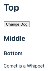
The following code in the file src/context-demo.ts
defines three custom elements.
The my-top element provides a value for the context,
renders a button that modifies the context value,
and renders a my-middle element.
The my-middle element renders a my-bottom element.
The my-bottom element consumes the value in the context
and renders data from it.
import {html, LitElement} from 'lit';
import {consume, provide} from '@lit/context';
import {customElement} from 'lit/decorators.js';
import {dogContext, type Dog} from './dog-context.js';

@customElement('my-top')
export class MyTop extends LitElement {
  // This places a Dog object into the dogContext.
  @provide({context: dogContext})
  dog: Dog = {name: 'Comet', breed: 'Whippet'};

  changeDog() {
    this.dog = {name: 'Snoopy', breed: 'Beagle'};
  }

  override render() {
    return html`
      <div>
        <h1>Top</h1>
        <button @click=${this.changeDog}>Change Dog</button>
        <my-middle></my-middle>
      </div>
    `;
  }
}

@customElement('my-middle')
export class MyMiddle extends LitElement {
  override render() {
    return html`
      <div>
        <h2>Middle</h2>
        <my-bottom></my-bottom>
      </div>
    `;
  }
}

@customElement('my-bottom')
export class MyBottom extends LitElement {
  // This gets a Dog object from the dogContext.
  // Without the subscribe option, the dog property won't be updated
  // when the dog object held by the context changes.
  @consume({context: dogContext, subscribe: true}) dog?: Dog;

  override render() {
    const text = this.dog
      ? `${this.dog.name} is a ${this.dog.breed}.`
      : 'No dog found';
    return html`
      <div>
        <h3>Bottom</h3>
        <div>${text}</div>
      </div>
    `;
  }
}
The following HTML renders an instance of the my-top custom element.
<!DOCTYPE html>
<html>
  <head>
    <title>Context Demo</title>
    <link rel="stylesheet" href="./src/index.css" />
    <script type="module" src="/src/context-demo.ts"></script>
  </head>
  <body>
    <my-top></my-top>
  </body>
</html>
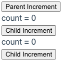
Web components that consume context data cannot modify it. But they can dispatch custom events that bubble up to the provider of the context data. Event handlers in the provider can modify the context data and consumers will be notified.
The following example demonstrates this.
Clicking any of the buttons increments the count value.
import {html, LitElement} from 'lit';
import {consume, createContext, provide} from '@lit/context';
import {customElement} from 'lit/decorators.js';

// A context can hold an object or a primitive value like a number.
type Data = {count: number};
export const dataContext = createContext<Data>('data');

@customElement('my-parent')
export class MyParent extends LitElement {
  @provide({context: dataContext}) data: Data = {count: 0};

  increment() {
    // this.data.count++; // doesn't work; must replace context object
    this.data = {count: this.data.count + 1};
  }

  override render() {
    return html`
      <div @increment=${this.increment}>
        <button @click=${this.increment}>Parent Increment</button>
        <my-child></my-child>
        <my-child></my-child>
      </div>
    `;
  }
}

@customElement('my-child')
export class MyChild extends LitElement {
  @consume({context: dataContext, subscribe: true}) data?: Data;

  increment() {
    const {host} = this.shadowRoot;
    host.dispatchEvent(new CustomEvent('increment', {bubbles: true}));
  }

  override render() {
    return html`
      <div>
        <div>count = ${this.data.count}</div>
        <button @click=${this.increment}>Child Increment</button>
      </div>
    `;
  }
}
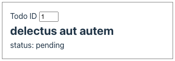
Async Tasks
The @lit/task package simplifies obtaining data to render asynchronously. This includes fetching data from network endpoints.
To install this package, enter npm install @lit/task.
The following code in the file src/task-demo.js demonstrates this.
import {css, html, LitElement} from 'lit';
import {customElement, state} from 'lit/decorators.js';
import {Task} from '@lit/task';

type Todo = {
  userId: number;
  id: number;
  title: string;
  completed: boolean;
};

const URL_PREFIX = 'https://jsonplaceholder.typicode.com/todos/';

async function getTodo(id: number): Promise<Todo> {
  // Simulate a long-running query.
  return new Promise((resolve, reject) => {
    setTimeout(async () => {
      try {
        const res = await fetch(URL_PREFIX + id);
        if (res.ok) {
          resolve(await res.json());
        } else {
          reject(`bad status ${res.status}`);
        }
      } catch (error) {
        reject(error);
      }
    }, 1000);
  });
}

@customElement('task-demo')
export class TaskDemo extends LitElement {
  @state() todoId = 1;

  // The task runs when the component is created,
  // and again any time one of its arguments changes.
  task = new Task(this, {
    task: getTodo,
    args: () => [this.todoId]
  });

  changeTodoId(e: Event) {
    const input = e.target as HTMLInputElement;
    this.todoId = Number(input.value);
  }

  override render() {
    // What this renders is based on the whether the task
    // is pending, complete, or has experienced an error.
    const taskDisplay = this.task.render({
      pending: () => html`<img alt="spinner" src="/spinner.gif" />`,
      complete: todo => html`
        <h2>${todo.title}</h2>
        <div>status: ${todo.completed ? 'complete' : 'pending'}</div>
      `,
      error: error => html`<div class="error">${error}</div>`
    });

    return html`
      <label>
        Todo ID
        <input
          type="number"
          @input=${this.changeTodoId}
          .value=${this.todoId}
        />
      </label>
      ${taskDisplay}
    `;
  }

  static styles = css`
    :host {
      border: 1px solid gray;
      padding: 1rem;
      width: 20rem;
    }

    .error {
      color: red;
    }

    h2 {
      margin: 0;
    }

    img[alt='spinner'] {
      display: block;
      height: 2rem;
    }

    input {
      width: 2rem;
    }
  `;
}
The following HTML renders an instance of the task-demo custom element.
Changing the todo ID in the input triggers running the task again.
<!DOCTYPE html>
<html>
  <head>
    <title>Task Demo</title>
    <link rel="stylesheet" href="./src/index.css" />
    <script type="module" src="/src/task-demo.ts"></script>
  </head>
  <body>
    <task-demo></task-demo>
  </body>
</html>
Localization
The @lit/localize package supports language translations.
To install this package, enter npm install @lit/localize
and npm install @lit/localize-tools.
Modify the source files for each web component
that requires language translations.
Surrounded each piece of text to be translated
with a call to the msg function.
The argument to msg must be literal text, not a variable.
The reason is that the lit-localize extract command
only extracts text found in msg calls.
It doesn’t execute the code, so it wouldn’t be able to
determine all the possible values of a variable.
The following examples show all the supported scenarios.
Note that the str must also be used when
the text does not contain HTML AND includes an interpolation.
- plain strings:
msg('Hello World') - string with expressions:
msg(str`Hello ${name}`) - HTML templates:
msg(html`Hello <b>World</b>`) - HTML templates with expressions:
msg(html`Hello <b>${name}</b>`) - nested inside HTML templates:
html`<button>${msg('Hello World')}</button>`
For example:
import {LitElement, msg} from '@lit/localize';
import {configureLocalization, localized, msg} from '@lit/localize';
...
  override render() {
    const text = msg('My favorite color is');

    const colors = {
      red: msg('red'),
      blue: msg('blue'),
      green: msg('green')
    };
    const color = colors[this.color] ?? this.color;

    return html`
      <select @change=${this.changeLocale}>
        ${this.options}
      </select>
      <div>${text} ${color}.</div>
    `;
  }
Optionally include a second argument in each call to msg
that is an option with the desc property whose value is
a string that describes the text to be translated.
These descriptions will appear as note elements in
the generated XLIFF files to assist human translators.
Create the file lit-localize.json in the root directory of the project
containing the following.
The targetLocales property specifies the languages and regions
for which translations are desired.
{
  "$schema": "https://raw.githubusercontent.com/lit/lit/main/packages/localize-tools/config.schema.json",
  "sourceLocale": "en",
  "targetLocales": ["es-419", "zh-Hans"],
  "tsConfig": "./tsconfig.json",
  "output": {
    "mode": "runtime",
    "outputDir": "./src/generated/locales",
    "localeCodesModule": "./src/generated/locale-codes.ts"
  },
  "interchange": {
    "format": "xliff",
    "xliffDir": "./xliff/"
  }
}
Add the following npm scripts in package.json.
"localize:extract": "lit-localize extract",
"localize:build": "lit-localize build",
Enter npm localize:extract.
This creates an xliff directory containing
one .xliff file for each language/region.
Edit these files and add a target element after each source element
that specifies the desired translation.
Running the extract command again after adding new calls to msg
in the JavaScript code does not overwrite existing .xliff files.
It just adds trans-unit elements for the new strings to be translated.
Enter npm localize:build.
This creates the src/generated directory containing
the file locale-codes.ts and a locales subdirectory
containing one .ts file for each language/region.
The following code in the file src/localize-demo.js demonstrates this.
import {html, LitElement} from 'lit';
import {customElement, property} from 'lit/decorators.js';
import {
  configureLocalization,
  localized,
  msg,
  updateWhenLocaleChanges
} from '@lit/localize';

import {sourceLocale, targetLocales} from './generated/locale-codes.js';

export const {getLocale, setLocale} = configureLocalization({
  sourceLocale,
  targetLocales,
  loadLocale: locale => import(`./generated/locales/${locale}.ts`)
});

@customElement('localize-demo')
@localized()
export class LocalizeDemo extends LitElement {
  @property() color = 'red';
  options: string[] = [];

  constructor() {
    super();

    // The following line can be used in place of `@localized()` above.
    //updateWhenLocaleChanges(this);

    this.options.push(html`<option>en</option>`);
    for (const locale of targetLocales) {
      this.options.push(html`<option>${locale}</option>`);
    }
  }

  changeLocale(e: Event) {
    const select = e.target as HTMLSelectElement;
    setLocale(select.value);
  }

  override render() {
    const text = msg('My favorite color is');

    const colors = {
      red: msg('red'),
      blue: msg('blue'),
      green: msg('green')
    };
    const color = colors[this.color] ?? this.color;

    return html`
      <select @change=${this.changeLocale}>
        ${this.options}
      </select>
      <div>${text} ${color}.</div>
    `;
  }
}
The following HTML renders an instance of the localize-demo custom element.
Selected a different locale from the select updates the message.
<!DOCTYPE html>
<html>
  <head>
    <title>Localize Demo</title>
    <link rel="stylesheet" href="./src/index.css" />
    <script type="module" src="/src/localize-demo.ts"></script>
  </head>
  <body>
    <localize-demo></localize-demo>
  </body>
</html>
The .xliff files created by the lit-localize extract command
use the XLIFF 1.2 format from 2008.
It’s unclear when it doesn’t use the XLIFF 2.0 format from 2014.
Chess Board Example
gchessboard is a web component (not using Lit) that renders a chess board. The pieces can be dragged to any squares, not just valid ones. This enables quickly setting up a position to study.
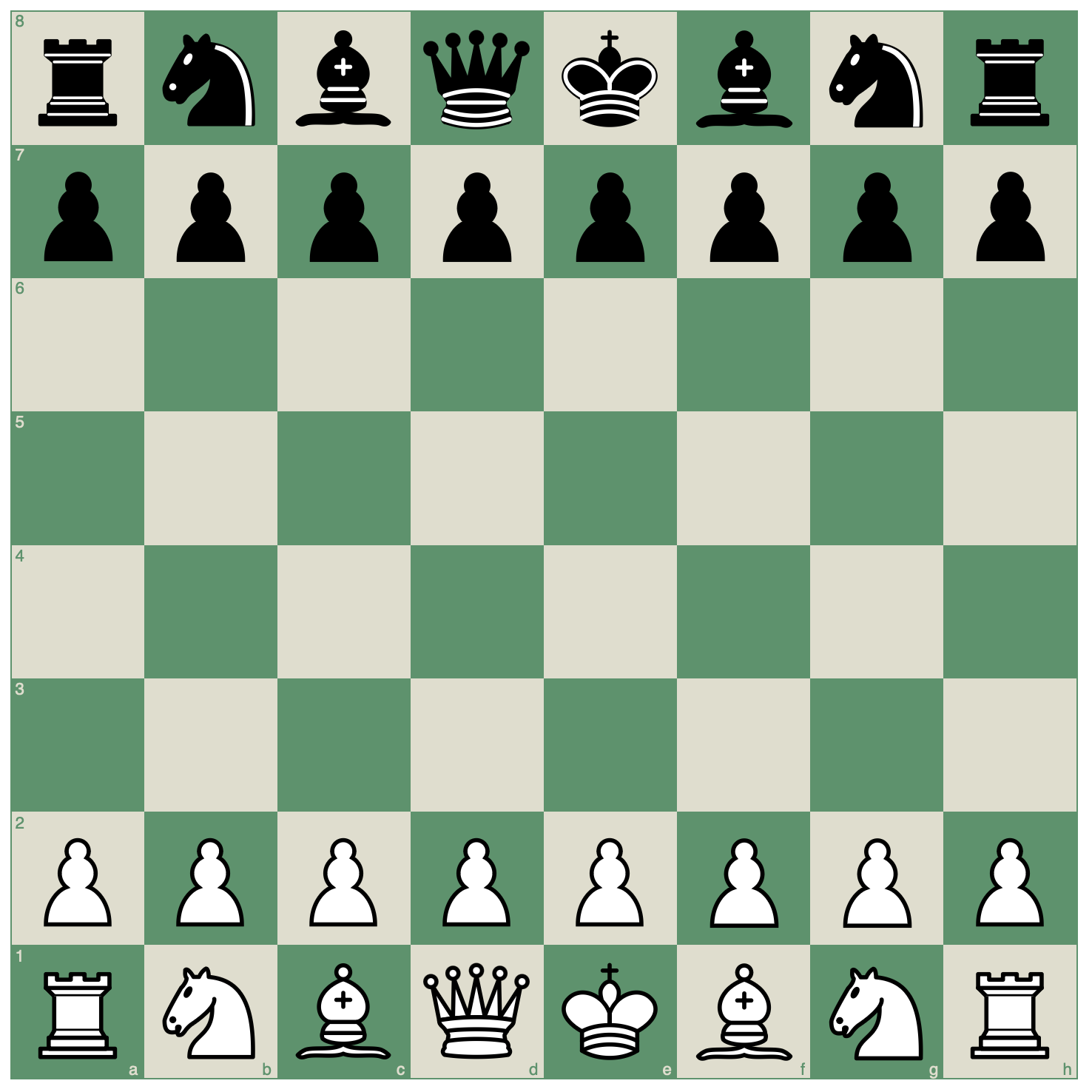
To try this, add the following to a new file, perhaps named chess.html.
Then open the HTML file in any modern web browser.
<!DOCTYPE html>
<html>
  <head>
    <title>Chess Board</title>
    <style>
      g-chess-board {
        margin: auto;
        width: 50%;
      }
    </style>
    <script type="module" src="https://unpkg.com/gchessboard"></script>
  </head>
  <body>
    <g-chess-board fen="start" interactive></g-chess-board>
  </body>
</html>
Markdown
Web components can be used in Markdown files.
When using Vite with the Lit template:
-
Enter
npm run build. -
Copy the generated
.jsfile.Copy
dist/assets/index_*.jsto a directory that is accessible to the server that servers the Markdown file. For my Astro-based blog, this is thesrc/assetsdirectory. -
Rename the copied file to something more meaningful.
For example, the name could be
lit-components.js. -
Add a script tag in the Markdown file.
This should point to the renamed
.jsfile. For example:<script type="module" src="/blog/assets/lit-components.js"></script> -
Use the custom element. For example:
<greet-message name="World"></greet-message>
The following is an example of using a web component
in the blog page you are currently reading.
Try inspecting the page and changing the value of the name attribute.
The update will be seen on the page.
Type Inference
When an instance of a custom element is created
using the DOM createElement method, TypeScript cannot infer
the specific type and assumes it is HTMLElement.
For example, in the following code TypeScript will
infer the type of el to be HTMLElement.
const el = document.createElement('alert-on-click');
For many custom elements, this is not a concern
because element instances will be created in this way.
When this is a concern, enable inferring a more specific type
by adding an entry to the HTMLElementTagNameMap as follows.
declare global {
  interface HTMLElementTagNameMap {
    'alert-on-click': AlertOnClick;
  }
}
With this in place, the type of el will be inferred to be AlertOnClick.
Errors Detected
Lit error detection includes the following:
- defining multiple custom elements with the same name
The following kinds of errors are not detected.
-
Mistyping the name of a custom element in HTML.
The element will be treated as if it were a
divelement.
Lit Labs
Lit Labs is a collection of experimental packages that add functionality to Lit. The Lit team provides these in order to gather feedback. Successful packages graduate to become officially supported.
Keep these packages separate from the Lit core enables keeping the core as small as possible. Each project can choose the additional packages it wishes to use.
The following subsections describe popular Lit Lab packages. Some have already graduated. These packages are under development as of February 2024.
-
CLI for generating framework wrappers for Angular, React, and Vue
-
eleventy-plugin-lit for pre-rendering Lit web components at build time
-
motion for adding animations
-
observers for detecting specific kinds of changes including mutation, resize, intersection, and performance
-
preact-signal for making it easier to share observable state
-
router for associating URL paths with components to be rendered
-
ssr for server-side rendering
-
testing for implementing unit tests for Lit components
-
virtualizer to avoid spending time rendering elements that are not currently in view. A common example is rendering a scrolling list of items.
These packages are near graduation as of February 2024.
- scoped-registry-mixin provides a way to “scope custom element definitions to shadow roots, such that the mapping of tag names to custom element class doesn’t rely on a single global registry”.
These packages have graduated.
-
@lit/context for making data available throughout a component subtree
-
@lit/localize for supporting multiple languages
-
@lit/react to create React wrappers for web components
-
@lit/task for asynchronous tasks like fetching data
Publishing Components
When publishing a library of Lit components, you can choose to
include the Lit library in the bundle or omit it.
In either case, the shared file should be an ES module.
If the Lit library is not included in the bundle,
users of your components will need script tags
to include both your component library and the Lit library.
Consider releasing two versions of each Lit component library, one that includes the Lit library and one that doesn’t. The former will be easier to use. But the latter is better in cases where multiple Lit component libraries are being used.
If more than one copy of the Lit library is included in a page, more JavaScript code that necessary will be downloaded and there can be conflicts between different versions of the library.
For more detail, see Publishing.
Unorganized Content
To force a custom element instance to update, call its requestUpdate method.
Consider using your small js2html library to generate HTML in web components.