Overview
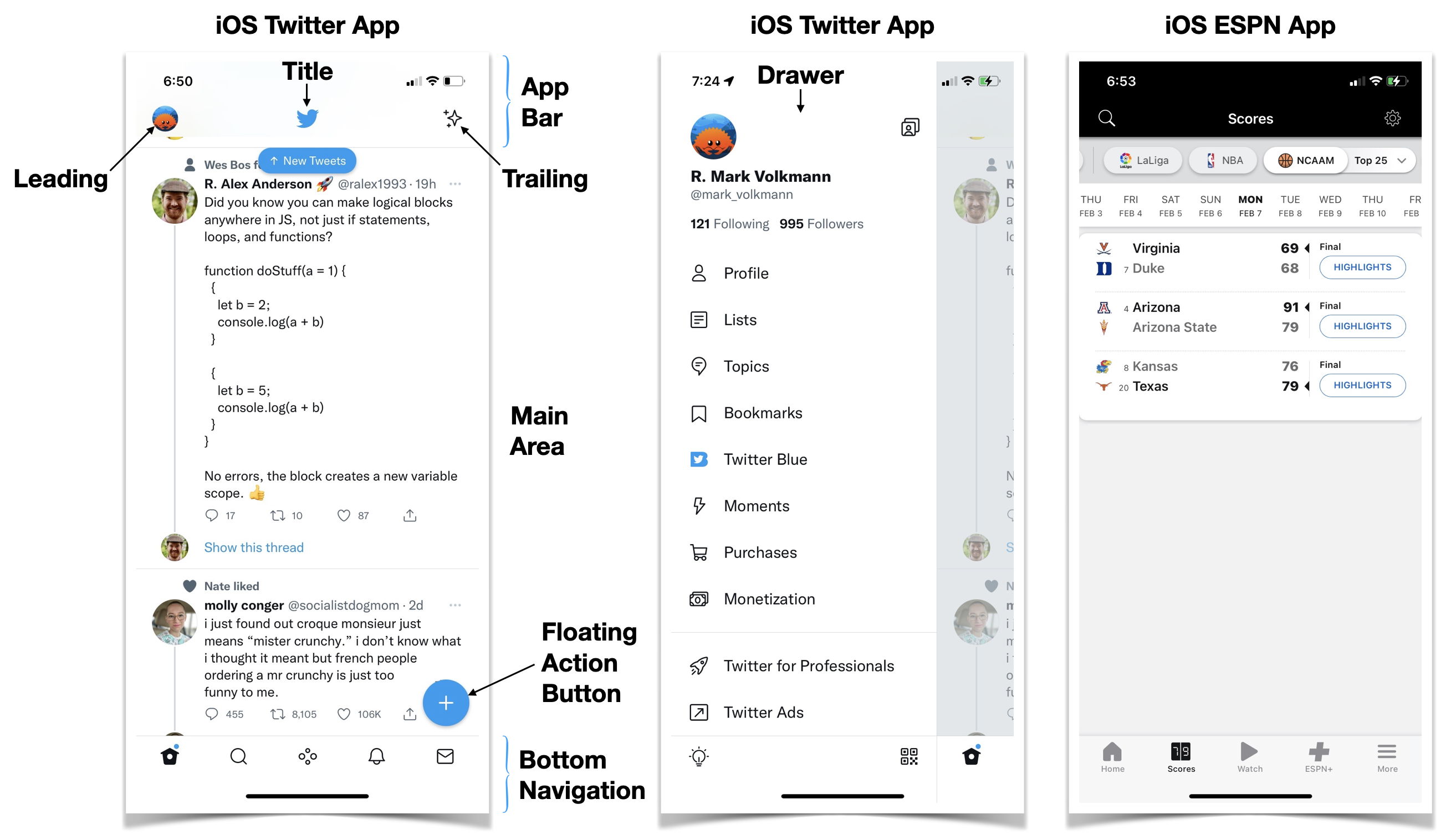
While there is no standard for the design of mobile applications that run on phones and tablets, there are common elements that appear in most such apps. These are documented here.

App Bar
An "app bar" appears at the top of the screen. It contains three areas that from left to right are referred to as "leading", "title", and "trailing" (called "actions" in Flutter). The title typically contains a page name, but an be an icon. The leading and trailing areas typically contain one or more buttons that often contain icons.
Typically the app bar has a shadow at the bottom that causes it to appear raised above the main area.
In some apps the app bar is hidden when the main area is not scrolled to the top.
Drawer
A "drawer", also referred to as a "hamburger menu", contains navigation links. It can also contain data. Drawers slide in from the left when an action bar leading button is tapped.
Bottom Navigation
A "bottom navigation" area appears at the bottom of the screen. It contains up to five icons with optional text below them. Tapping these navigates to another screen within the app. In iOS the new screen slides in from the right.
Typically the bottom navigation area has a shadow at the top that causes it to appear raised above the main area.
Stack Navigation
In "stack navigation", each page visited is placed on the top of a stack. Popping a page from the top of the stack returns to the previous page. Users typically request this by tapping a left-pointing angle bracket that appears in the action bar leading area.
Main Area
The "main area" appears below the action bar and above the bottom navigation area. When it is taller than the available space, it scrolls vertically behind the app bar and bottom navigation area.
List Tiles
In scrolling lists of the data, each item is represented by a "list tile". Similar to an action bar, these have three areas. The leading and trailing areas are optional and typically contain icon buttons. The center area contains a title and optional subtitle that can wrap to multiple lines when needed.
Swiping a list tile to the left often uncovers a red delete button that deletes the item when tapped.
List vs. Detail Screens
When presenting information about a set of items, a common pattern is to display a vertically scrollable list of items represented by list tiles. When the center area of a list tile is tapped, a stack navigation occurs to display a detail screen for the tapped item. The detail view displays a left-pointing angle bracket in its action bar leading area that navigates back to the detail view when tapped.
Floating Action Buttons (FAB)
A "floating action button" is typically a circle containing an icon that appears raised above other screen content. Tapping the button executes the primary action of the current screen. For example, in the Twitter app, tapping the floating action button containing a plus sign navigates to a screen for entering text for a new tweet.
Usually each screen within an app either has one FAB or none, but it is possible to have more than one. Typically FABs are displayed near the lower-right corner of the screen. But they can also be displayed in the lower-left, lower-center, upper-left, upper-center, or upper-right.
Search
Searching the data of an app is typically initiated by tapping a button containing a magnifying glass icon. Tapping this opens a text input at the bottom of the app bar.
iOS-specific Design
TODO: Add this.
Android-specific Design
TODO: Add this.