Overview
matplotlib is a Python library for data visualization.
To install this package, enter pip install matplotlib.
The most commonly used submodule in matplotlib is pyplot.
To import this, use one of the following:
from matplotlib import pyplot as plt
import matplotlib.pyplot as plt
Note that by convention the plt alias is used to refer to pyplot.
Navigation
Plots created by matplotlib typically have a navigation bar at the bottom that includes the following buttons:
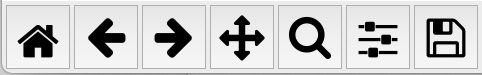
| Button | Action | Keyboard Shortcut |
|---|---|---|
| house | returns to original view, similar to web browser home button |
h or r |
| left arrow | goes to previous view, similar to web browser back button |
left arrow or c |
| right arrow | goes to next view, similar to web browser forward button |
right arrow or v |
| four arrows | toggles "pan and zoom" mode | p |
| magnifying glass | toggles "zoom to rectangle" mode | o |
| sliders | opens dialog of sliders to adjust plot | none |
| floppy | opens a file save dialog to save current view to a PNG file | ctrl-s |
After activating "pan and zoom" mode, hold left mouse button down and drag to pan in any direction or hold right mouse button down and drag to zoom in or out, creating a new view.
After activating "zoom to rectangle" mode, use the mouse to drag a rectangle and the plot will zoom to that rectangle, creating a new view.
In the dialog of sliders, left, bottom, right, and top adjust the size of the margin on those sides of the plot. The wspace and hspace slides seem to have no effect.
Other keyboard shortcuts include:
| Action | Keyboard Shortcut |
|---|---|
| toggle full screen; doesn't work in macOS |
f or ctrl-f |
| close window | ctrl-w |
| constraint pan to x direction | hold x |
| constraint pan to y direction | hold y |
| toggle grid lines (none, major, major and minor, minor) | g or G |
| toggle x-axis scale between linear and log; mouse cursor must be over plot |
L or k |
| toggle y-axis scale between linear and log; mouse cursor must be over plot |
l (lowercase L) |
Legends
To add a legend to a plot, call plt.legend().
By default, matplotlib takes its best guess on where to place the legend.
To override this with a specific location,
add the loc argument set to a string or a number.
| String | Code |
|---|---|
| 'best' | 0 |
| 'upper right' | 1 |
| 'upper left' | 2 |
| 'lower left' | 3 |
| 'lower right' | 4 |
| 'right' | 5 |
| 'center left' | 6 |
| 'center right' | 7 |
| 'lower center' | 8 |
| 'upper center' | 9 |
| 'center' | 10 |
All of these options place the legend inside the plot.
To display the legend outside of the plot, add the bbox_to_anchor argument
set to a tuple that specifies its x and y location
with percentages of the plot width and height.
For example, bbox_to_anchor=(1, 1) places the upper-left corner
of the legend at the top-right corner of the plot.
Line Charts
To create a basic line chart:
from matplotlib import pyplot as plt
import numpy as np

student_ids = np.arange(1, 5) # [1, 2, 3, 4]
test1_scores = [75, 90, 65, 95]
test2_scores = [80, 85, 80, 100]
plt.plot(student_ids, test1_scores)
plt.plot(student_ids, test2_scores)
plt.show()
This produces the chart below:
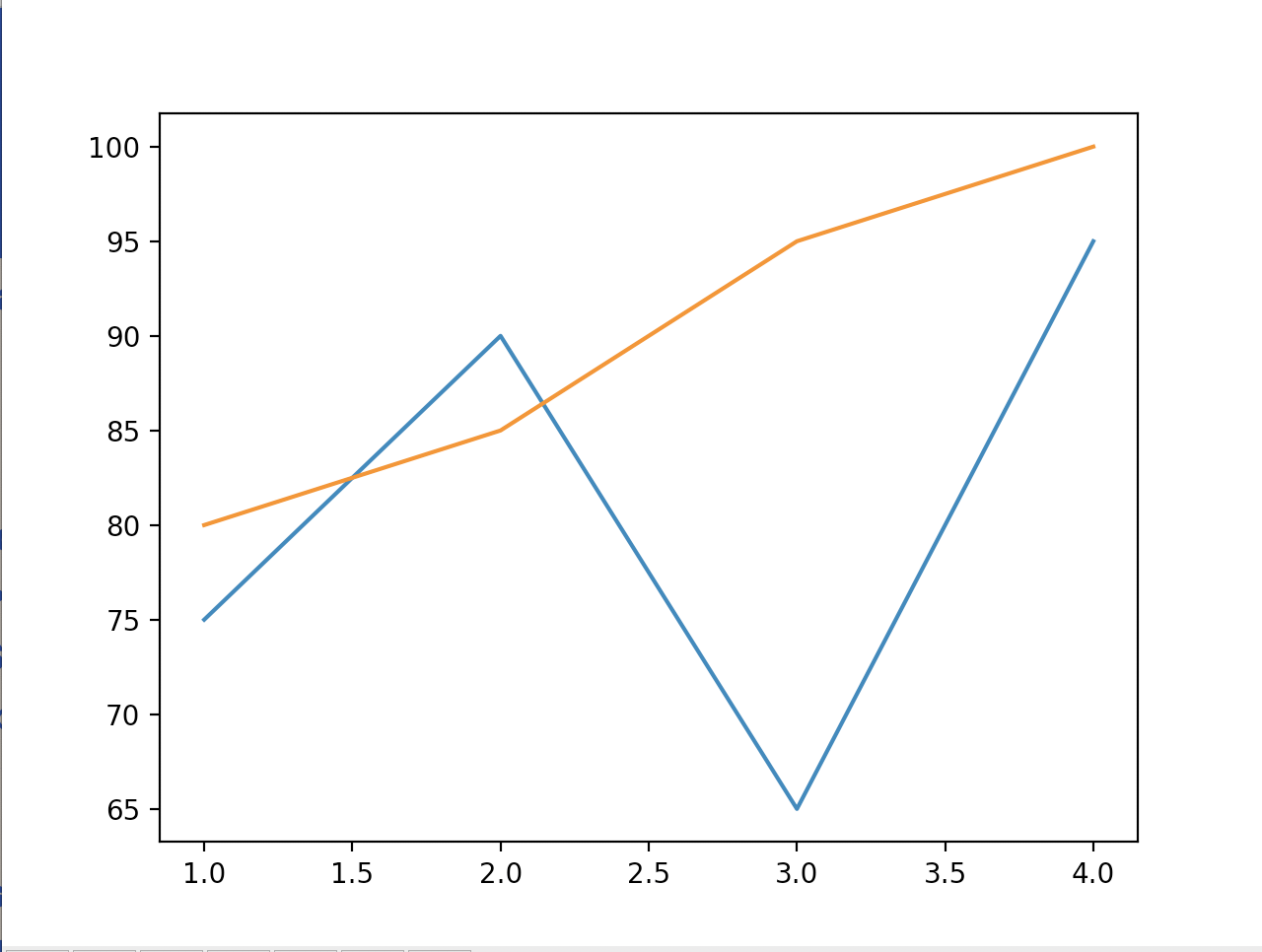
The chart automatically scales to accommodate the data and the x and y tick marks are automatically determined.
Line Chart Enhancements
There are many ways to enhance this chart as shown in the table below.
| Enhancement | Code |
|---|---|
| add chart title | plt.title('Test Scores') |
| add x-axis label | plt.xlabel('Student') |
| add y-axis label | plt.ylabel('Score') |
| add label to a line | plt.plot(x_values, y_values, label='test #1') |
| set color of a line | plt.plot(x_values, y_values, color='red') |
| set width of a line | plt.plot(x_values, y_values, linewidth=3) |
| set line style | plt.plot(x_values, y_values, linestyle='--') |
| add legend | plt.legend() |
| set x ticks | plt.xticks(student_ids) |
| set y ticks | plt.yticks(y_ticks) |
The xticks and yticks methods override tick marks
that are automatically provided.
They are desirable in this case because our student numbers are integers,
not values like 1.5 or 2.5.
To change the font uses, add a fontdict argument
to some of these method calls.
For example, to change the font used for the chart title
we can change the call to the title method as follows:
plt.title('Test Scores', fontdict={'fontname': 'Comic Sans MS','fontsize': 24})
Colors can be specified by name or by hex code following by a pound sign.
To specify the color of a line, add a color argument.
Line Styles
The lines are solid by default.
To specify another line style, add a linestyle argument.
Supported line styles include:
| Style | Syntax |
|---|---|
| solid | 'solid' or '-' |
| dotted | 'dotted' or ':' |
| dashed | 'dashed' or '--' |
| dashdot | 'dashdot' or '-.' |
For more line style variations, see matplotlib Linestyles.
Markers
Markers are shapes that can be rendered at data points.
The data points on the lines do not include markers by default.
To add markers to a line, specify a marker argument.
Marker values include:
| Marker | Syntax |
|---|---|
| point | '.' |
| pixel | ',' |
| circle | 'o' |
| plus | '+' |
| x | 'x' |
| diamond | 'D' |
| diamond thin | 'd' |
| triangle down | 'v' |
| triangle up | '^' |
| triangle left | '<' |
| triangle right | '>' |
| square | 's' |
| pentagon | 'p' |
| hexagon | 'h' |
| hexagon rotated | 'H' |
| octagon | '8' |
| plus filled | 'P' |
| star | '*' |
For more marker variations, see matplotlib Markers.
To change the size of markers, specify a markersize argument.
Markers are composed of two parts, an edge (border) and a face (interior).
By default, both have the same color as the line on which they appear.
To change the marker color, specify the
markeredgecolor and/or markerfacecolor arguments.
Enhancements Demo
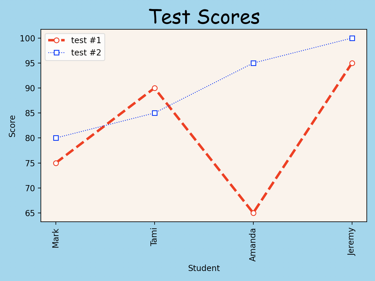
Let's try some of these enhancements.
from matplotlib import pyplot as plt

students = [
    {'id': 1, 'name': 'Mark', 'scores': [75, 80]},
    {'id': 2, 'name': 'Tami', 'scores': [90, 85]},
    {'id': 3, 'name': 'Amanda', 'scores': [65, 95]},
    {'id': 4, 'name': 'Jeremy', 'scores': [95, 100]}
]

student_ids = [s['id'] for s in students]
student_names = [s['name'] for s in students]
test1_scores = [s['scores'][0] for s in students]
test2_scores = [s['scores'][1] for s in students]

#plt.xkcd()  # for xkcd sketch-style drawing mode
plt.title(
    'Test Scores',
    fontdict={'fontname': 'Comic Sans MS','fontsize': 24})
plt.xlabel('Student')
plt.ylabel('Score')
plt.plot(
    student_ids, test1_scores, color='red',
    label='test #1', linestyle='--', linewidth=3, marker='o',
    markersize=7, markerfacecolor='white')
plt.plot(
    student_ids, test2_scores, color='blue',
    label='test #2', linestyle=':',
    marker='s', markerfacecolor='white')
plt.legend()
plt.xticks(ticks=student_ids, labels=student_names, rotation='vertical')
figure = plt.gcf()
figure.tight_layout() # adjusts padding around plots to fit tick labels
figure.canvas.set_window_title('Test Scores')
figure.axes[0].set_facecolor('linen')  # background color inside chart
figure.patch.set_facecolor('skyblue') # background color outside chart
plt.show()
With all of these enhancements in place, the chart becomes the following:
We can also create this same chart using a pandas DataFrame as follows:
from matplotlib import pyplot as plt
import pandas as pd

students = pd.DataFrame([
    {'id': 1, 'name': 'Mark', 'scores': [75, 80]},
    {'id': 2, 'name': 'Tami', 'scores': [90, 85]},
    {'id': 3, 'name': 'Amanda', 'scores': [65, 95]},
    {'id': 4, 'name': 'Jeremy', 'scores': [95, 100]}
])

def get_score(scores, index):
    return scores[i] if i < len(scores) else 0

# Add a column of scores to the DataFrame for each test.
test_count = students.scores.apply(len).max()
for i in range(test_count):
    students[f'test{i + 1}'] = students.scores.apply(get_score, index=i)

# Plot a line for each test.
# This approach doesn't enable customizing each line.
#students.plot(x='name', y=[f'test{i + 1}' for i in range(test_count)])

figure, axes = plt.subplots()
line_options = [
    {
        'color': 'red',
        'linestyle': '--',
        'linewidth': 3,
        'marker': 'o'
    },
    {
        'color': 'blue',
        'linestyle': ':',
        'linewidth': 1,
        'marker': 's'
    }
]
for i in range(test_count):
    students.plot(
        ax=axes, # required to plot multiple lines
        label=f'test #{i + 1}',
        markerfacecolor='white',
        x='name', # source of x values
        y=f'test{i + 1}', # source of y values
        **line_options[i])

plt.title(
    'Test Scores',
    fontdict={'fontname': 'Comic Sans MS','fontsize': 24})
plt.xlabel('Student')
plt.ylabel('Score')
plt.xticks(
    ticks=range(len(students)),
    labels=students.name,
    rotation='vertical')
plt.gcf().tight_layout() # adjusts padding around plots to fit tick labels
plt.show()
Saving Plots
To save a plot in a PNG file:
plt.savefig(file_path, dpi=300)
If no directory is specified, the file is saved in the current directory.
The dpi argument (dots per inch) can be omitted,
in which case it defaults to 100.
Higher DPI values create larger files.
Plotting Functions
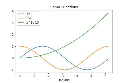
It's easy to plot functions. Using NumPy enables applying a function to an array of numbers to obtain the values to plot. For example:
from matplotlib import pyplot as plt
import numpy as np

f = lambda x: x**2 / 10
x_values = np.arange(0, math.pi*2, 0.1)
plt.plot(x_values, np.sin(x_values), label='sin')
plt.plot(x_values, np.cos(x_values), label='cos')
plt.plot(x_values, f(x_values), label='x^2 / 10')
plt.title('Some Functions')
plt.xlabel('radians')
plt.legend()
plt.plot()
Animating Plots
The matplotlib.animation package supports creating animated plots.
The following example reads from the file data.csv every second.
In the first pass and any time the data changes,
it clears the plot and plots the new data.
# Disable pylint rule that treats all module-level variables as constants.
# pylint: disable=C0103

from random import randint
import matplotlib.pyplot as plt
# animation is missing from Pylance bundled type stub files.
import matplotlib.animation as animation

# Can pass figsize=(width,height) in inches.
# Can specify dots per inch with dpi=number (ex. 300).
fig = plt.figure()

ax = fig.add_subplot(1, 1, 1)
last_data = ''  # used to determine if file contents have changed
x_values = []
y_values = []

def animate(_: int) -> None:
    """Plots data found in the file data.csv."""

    global last_data, x_values, y_values

    data = open('data.csv', 'r').read()
    if data == last_data:
        # Could just return here if we only want updates from the file.
        # For fun, randomly pick a point to change.
        index = randint(0, len(x_values) - 1)
        y_values[index] = randint(0, 10)
    else:
        last_data = data
        lines = data.split('\n')
        x_values = []
        y_values = []
        for line in lines:
            if len(line) > 1:
                x, y = line.split(',')
                x_values.append(int(x))
                y_values.append(int(y))

    ax.clear()  # this method is missing from Pylance bundled type stub files
    ax.plot(x_values, y_values)

# We must hold a reference to the Animation object returned here
# to allow the timer to update the animations.  If not held,
# that object is garbage collected and the animation will not work.
ani = animation.FuncAnimation(fig, animate, interval=1000)

plt.show()
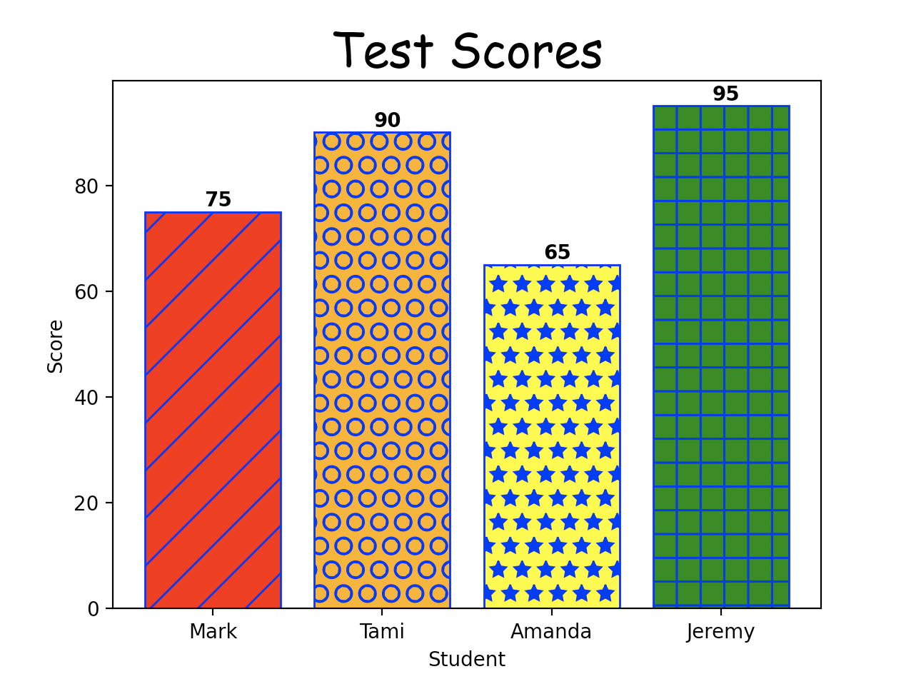
Bar Charts
We can create a bar chart showing one test result per student with the following:
from matplotlib import pyplot as plt

students = [
    {'id': 1, 'name': 'Mark', 'scores': [75, 80]},
    {'id': 2, 'name': 'Tami', 'scores': [90, 85]},
    {'id': 3, 'name': 'Amanda', 'scores': [65, 95]},
    {'id': 4, 'name': 'Jeremy', 'scores': [95, 100]}
]

student_ids = [s['id'] for s in students]
student_names = [s['name'] for s in students]
test_index = 0
test_scores = [s['scores'][test_index] for s in students]
indexes = range(len(students))

colors = ['red', 'orange', 'yellow', 'green']
hatches = ['/', 'O', '*', '+']
horizontal = False # change to True for horizontal

# Create plot with width=10" and height=4".
figure, axes = plt.subplots(figsize=(10, 4))

if horizontal:
    bars = axes.barh(width=test_scores, y=indexes)
else:
    bars = axes.bar(height=test_scores, x=indexes)

for index, bar in enumerate(bars):
    bar.set_hatch(hatches[index])
    bar.set_edgecolor('blue')  # also sets hatch color
    bar.set_facecolor(colors[index])
    score = test_scores[index]
    score_x = score + 1 if horizontal else index - 0.05
    score_y = index - 0.05 if horizontal else score + 1
    axes.text(score_x, score_y, str(score), color='black', fontweight='bold')

plt.title(
    'Test Scores',
    fontdict={'fontname': 'Comic Sans MS', 'fontsize': 24})
plt.xlabel('Score' if horizontal else 'Student')
plt.ylabel('Student' if horizontal else 'Score')

if horizontal:
    plt.yticks(indexes, student_names)
else:
    plt.xticks(indexes, student_names)

plt.show()
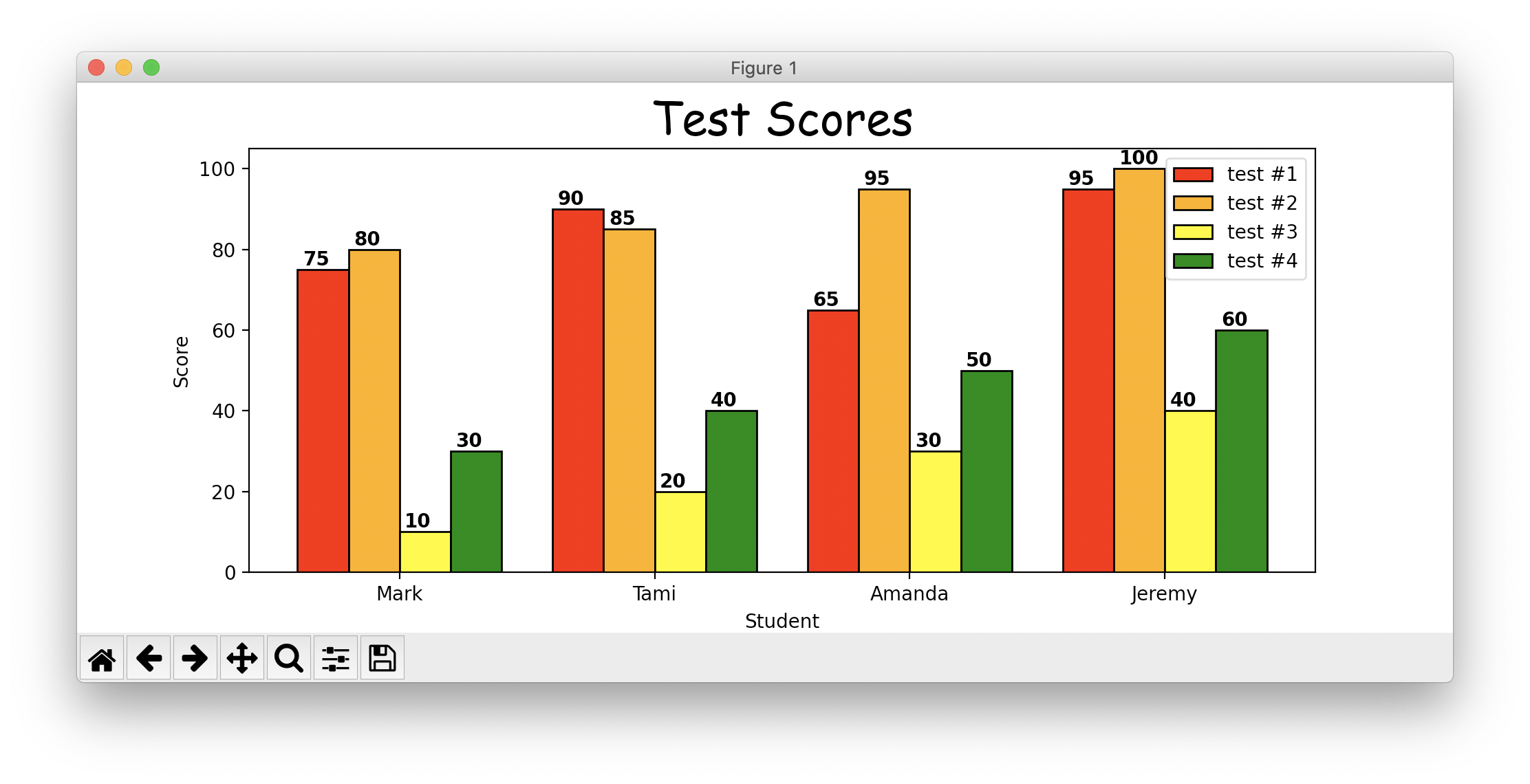
It's a bit more complicated to show a bar for each test taken by each student.
from functools import reduce
from matplotlib import pyplot as plt

horizontal = False  # change to True for horizontal
colors = ['red', 'orange', 'yellow', 'green']
students = [
    {'id': 1, 'name': 'Mark', 'scores': [75, 80, 10, 30]},
    {'id': 2, 'name': 'Tami', 'scores': [90, 85, 20, 40]},
    {'id': 3, 'name': 'Amanda', 'scores': [65, 95, 30, 50]},
    {'id': 4, 'name': 'Jeremy', 'scores': [95, 100, 40, 60]}
]

text_delta = 0.08 if horizontal else 0.04
student_count = len(students)
student_indexes = range(student_count)
test_count = reduce(lambda acc, s: max(acc, len(s['scores'])), students, 0)
student_ids = [s['id'] for s in students]
student_names = [s['name'] for s in students]

bar_margin = 0.1
bar_width = (1 - bar_margin * 2) / test_count
bar_start_dx = -0.5 + bar_margin + bar_width / 2

figure, axes = plt.subplots(figsize=(10, 4))

for test_index in range(test_count):
    label = f'test #{test_index + 1}'
    test_scores = [s['scores'][test_index] for s in students]
    bar_dx = bar_start_dx + bar_width * test_index
    locations = [i + bar_dx for i in student_indexes]
    if horizontal:
        bars = axes.barh(
            width=test_scores,
            label=label,
            height=bar_width,
            y=locations)
    else:
        bars = axes.bar(
            height=test_scores,
            label=label,
            width=bar_width,
            x=locations)

    for index, bar in enumerate(bars):
        print('height =', bar.get_height())
        bar.set_edgecolor('black')
        bar.set_facecolor(colors[test_index])
        score = test_scores[index]

        size = bar.get_width() if horizontal else bar.get_height()
        text_position_major = index + bar_dx - text_delta
        text_position_minor = size + 1
        score_x = text_position_minor if horizontal else text_position_major
        score_y = text_position_major if horizontal else text_position_minor
        axes.annotate(text=str(test_scores[index]), xy=(score_x, score_y))

plt.title(
    'Test Scores',
    fontdict={'fontname': 'Comic Sans MS', 'fontsize': 24})
plt.xlabel('Score' if horizontal else 'Student')
plt.ylabel('Student' if horizontal else 'Score')

if horizontal:
    plt.yticks(student_indexes, student_names)
else:
    plt.xticks(student_indexes, student_names)

plt.legend(loc='upper right')
figure.tight_layout()
plt.show()
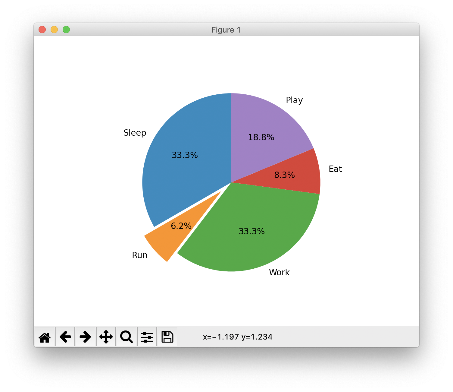
Pie Charts
We can create a pie chart indicating percentages of a whole that categories represent. For example, we can show percentages of a day when certain activities occur assuming that no two activities can occur at the same time.
import matplotlib.pyplot as plt

day = {
    'Sleep': 8,
    'Run': 1.5,
    'Work': 8,
    'Eat': 2,  # total for all meals
    'Play': 0  # will compute
}
day['Play'] = 24 - sum(day.values())

explode = [0] * len(day)  # start with no slices pulled out
explode[1] = 0.15  # pull out 2nd slice by this percentage

fig, ax = plt.subplots()

# Create a pie chart where the slices are
# ordered and plotted counter-clockwise.
ax.pie(
    day.values(),
    explode=explode,
    labels=day.keys(),
    autopct='%1.1f%%',  # adds value text to slices
    # shadow=True, # gives 3D effect
    startangle=90)  # first slice begins here

# Equal aspect ratio causes pie to be drawn as a circle.
# This doesn't seem to be necessary.
# ax.axis('equal')

plt.show()
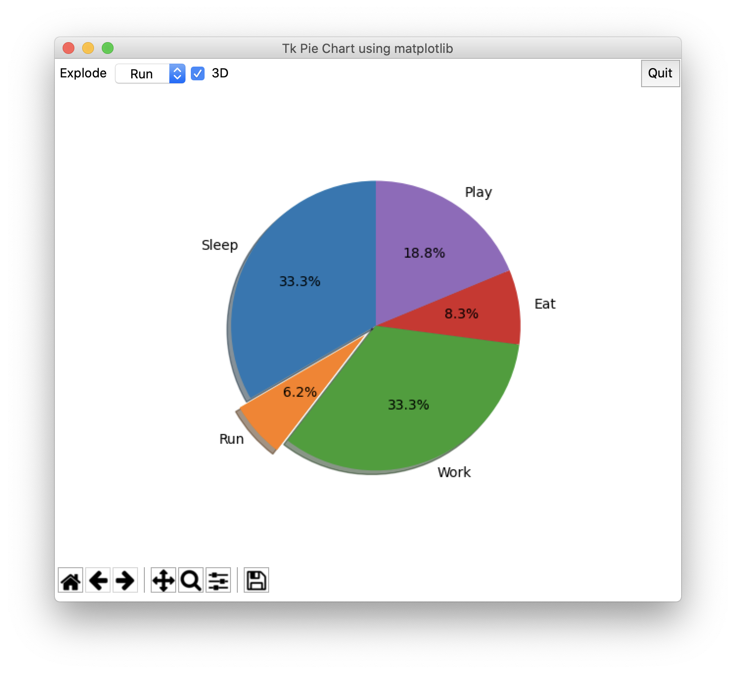
The following example demonstrates embedding charts generated by matplotlib in a tkinter GUI application.
from tkinter import *
from matplotlib import pyplot as plt
from matplotlib.backends.backend_tkagg import (
    FigureCanvasTkAgg, NavigationToolbar2Tk)

# Support Matplotlib key bindings.
from matplotlib.backend_bases import key_press_handler

# Override the Figure class from tkinter.
from matplotlib.figure import Figure

day = {
    'Sleep': 8,
    'Run': 1.5,
    'Work': 8,
    'Eat': 2,  # total for all meals
    'Play': 0  # will compute
}
day['Play'] = 24 - sum(day.values())

def find_index(predicate, seq):
    for index in range(0, len(seq)):
        if predicate(seq[index]):
            return index
    return None

def plot():
    # Determine which slice if any to explode.
    explode = [0] * len(day)  # start with none exploded
    activity = activity_var.get()
    activities = list(day.keys())
    activity_index = find_index(lambda s: s == activity, activities)
    if activity_index != None:
        explode[activity_index] = 0.1  # explode by this percentage

    shadow = want_3d.get() == 1

    fig.clear()  # clears previous content
    fig.add_subplot().pie(
        day.values(),
        explode=explode,
        labels=day.keys(),
        autopct='%1.1f%%',  # adds value text to slices
        shadow=shadow,  # gives 3D effect
        startangle=90)  # first slice begins here
    canvas.draw()

def quit():
    root.quit()  # stops mainloop
    root.destroy()  # necessary on Windows to prevent an error

root = Tk()
root.title('Tk Pie Chart using matplotlib')

frame = Frame(root)
frame.pack(side=TOP, fill=X)

Label(frame, text="Explode").pack(side=LEFT)

activity_var = StringVar(value='none')
activity_var.trace('w', lambda *args: plot())  # ignoring arguments
default_value = 'none'
slice_menu = OptionMenu(frame, activity_var, default_value, *day.keys())
slice_menu.config(width=4)  # sized to hold widest value
slice_menu.pack(side=LEFT)

want_3d = IntVar()
cb = Checkbutton(frame, command=plot, text='3D', variable=want_3d)
cb.pack(side=LEFT)

quit_btn = Button(frame, text="Quit", command=quit, padx=5, pady=5)
quit_btn.pack(side=RIGHT)

fig = Figure()
canvas = FigureCanvasTkAgg(fig, master=root)
canvas.draw()
# This canvas object is not a Tk widget,
# but it has a method to get one.
canvas.get_tk_widget().pack()

# Forward key press events to matplotlib key press handler.
def on_key_press(event):
    key_press_handler(event, canvas, toolbar)
canvas.mpl_connect("key_press_event", on_key_press)

# Add the matplotlib toolbar at the bottom of the window.
toolbar = NavigationToolbar2Tk(canvas, root)
toolbar.update()

plot()  # initial plot

mainloop()  # start the event loop
Annotations
See mpldatacursor and mplcursors.