Overview
seaborn is a Python library for data visualization. It builds on matplotlib to provide a higher level API for creating charts with less code. It also has strong integration with the pandas package.
To install this package, enter pip install seaborn.
To use Seaborn, import both it and matplotlib.
from matplotlib import pyplot as plt
import seaborn as sns
The alias "sns" is the initials of the character Samuel Norman Seaborn from the television show "The West Wing". It's supposed to be funny, but I just find it confusing.
Built-in Datasets
Seaborn includes many datasets that can be used to experiment
with the plot types it supports.
To get a list of these dataset names, call sns.get_dataset_names().
These include anagrams, anscombe, attention, brain_networks,
car_crashes, diamonds, dots, exercise, flights, fmri,
gammas, geyser, iris, mpg, penguins, planets, tips, and titanic.
To load one of these datasets into a pandas DataFrame:
df = sns.load_dataset(name)
For all the examples that follow, we will use the "mpg" dataset which provides miles per gallon data and more for cars with model years from 1970 to 1982.
To see the column names and a few rows from this dataset,
print df.head() which outputs the following:

Distribution Plot
From the docs, this "provides access to several approaches for visualizing the univariate or bivariate distribution of data, including subsets of data defined by semantic mapping and faceting across multiple subplots."
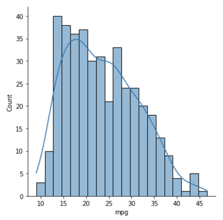
The example below shows the number of cars in each range of MPG values.
The bins argument specifies the number of bins
into which the data should be split.
The MPG ranges are determined by this value.
The kde argument stands for "kernel density estimation"
and causes the curve through the bars to be rendered.
sns.displot(df['mpg'], bins=20, kde=True)
Histogram Plot
From the docs, this plots "univariate or bivariate histograms to show distributions of datasets."
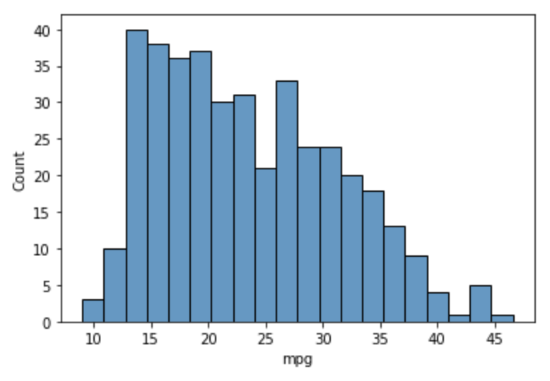
The example below shows the number of cars in each range of MPG values.
MPG ranges are determined by the value of bins.
It is very similar to displot and just seems to just add a top border.
sns.histplot(df['mpg'], bins=20)
Joint Plot
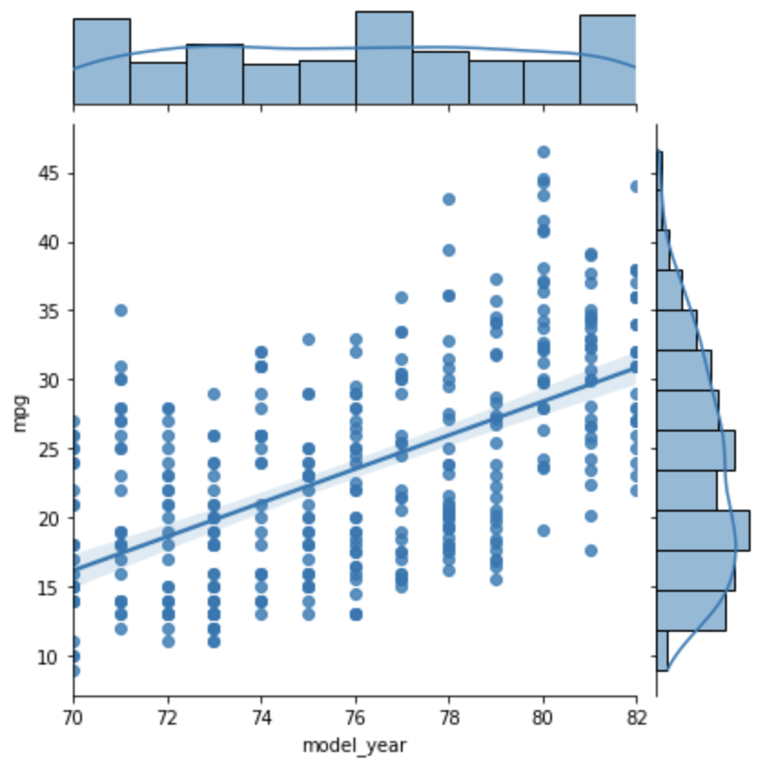
This plots two variables with bivariate and univariate graphs.
The example below shows a dot for each car at year/mpg intersections and a linear regression line. The histogram at the top indicates the number of cars in each model year range. The histogram on the right indicates the number of cars in each mpg range. We see from this that the most common mpg range is around 19 mpg.
Setting the kind argument to reg causes the
linear regression line to be computed and rendered.
sns.jointplot(data=df, x='model_year', y='mpg', kind='reg')
KDE Plot
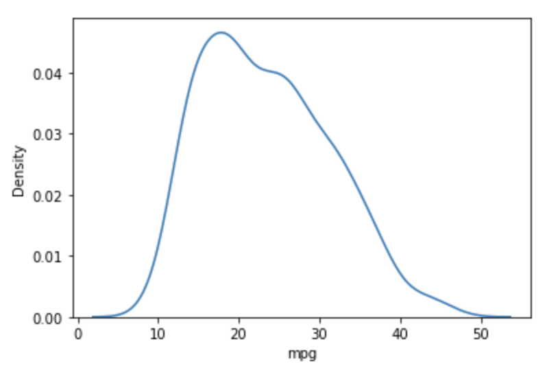
From the docs, this "is a method for visualizing the distribution of observations in a dataset, analogous to a histogram. KDE represents the data using a continuous probability density curve in one or more dimensions."
The example below gives an indication of the number of vehicles in the dataset for each MPG value.
sns.kdeplot(df['mpg'])
Styles
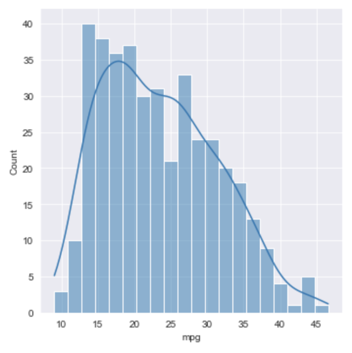
From the docs, the set_style method "affects things like
the color of the axes, whether a grid is enabled by default,
and other aesthetic elements."
Call this before generating a plot.
To set colors, pass it one of "white", "dark", "whitegrid", or "darkgrid".
To add tick marks to the axes, pass it "ticks".
It seems that it is not possible to set colors AND add tick marks because that requires two calls and the second just overrides the first.
sns.set_style('darkgrid')
#sns.set_style('ticks')
sns.displot(df['mpg'], bins=20, kde=True)
Context
From the docs, the set_context method "affects things like
the size of the labels, lines, and other elements of the plot,
but not the overall style" of the most recent plot.
The default context is “notebook”.
Other contexts are “paper”, “talk”, and “poster”,
which scale values used by "notebook" by 0.8, 1.3, and 1.6, respectively.
Explicitly setting the context to "notebook" makes everything much larger than expected!
Removing/Moving Spines
Call sns.despine() after creating a plot to
remove the solid lines and tick marks from specific sides,
passing it boolean arguments that indicate which sides to remove.
When bottom is set to True the top spine is also removed
unless top is set to False.
Similarly, when left is set to True the right spine is also removed
unless right is set to False.
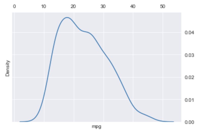
For example, in the previous plot we can display right and top spines instead of left and bottom spines as follows:
sns.kdeplot(df['mpg'])
sns.despine(left=True, right=False, bottom=True, top=False)
Color Palettes
By default, Seaborn supports six variations of matplotlib palettes. These are "deep", "muted", "pastel", "bright", "dark", and "colorblind". The colors in each palette can be viewed at color palettes.
One of these color palettes is used in the next example.
Pair Plot
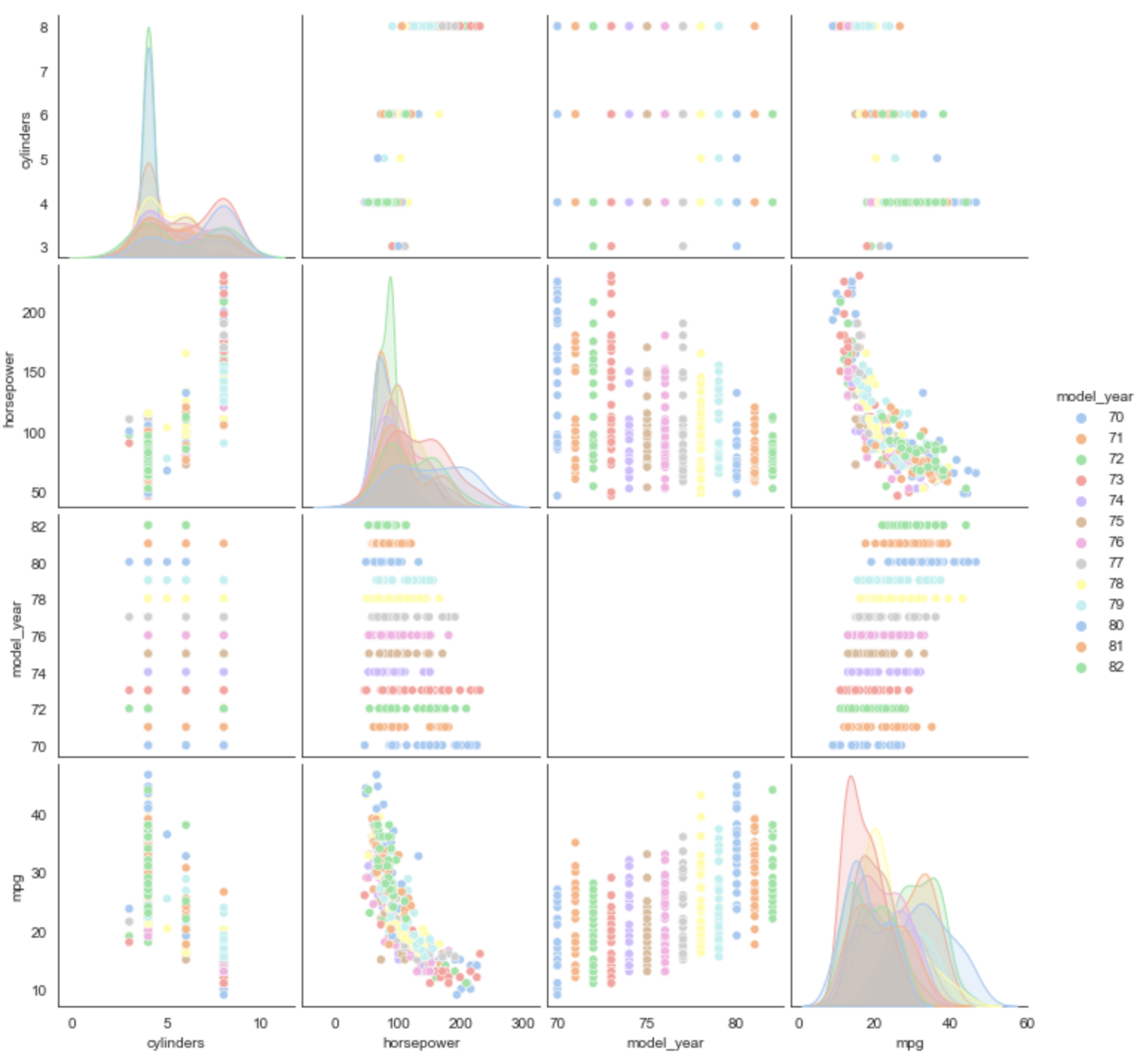
From the docs, "By default, this function will create a grid of Axes such that each numeric variable in data will by shared across the y-axes across a single row and the x-axes across a single column. The diagonal plots are treated differently: a univariate distribution plot is drawn to show the marginal distribution of the data in each column." Wow, that's a lot to take in!
The "vars" argument limits the variables that are plotted.
The "palette" argument specifies a color palette to use.
The "hue" argument specifies a column name to be treated as a category for the purpose of assigning colors from the palette.
This takes a long time to complete (~15 seconds) because it generates many plots.
Compare this to a PairGrid plot described later.
sns.set_style('white')
sns.pairplot(
  df,
  vars=['cylinders', 'horsepower', 'model_year', 'mpg'],
  palette="pastel",
  hue="model_year")
Rug Plot
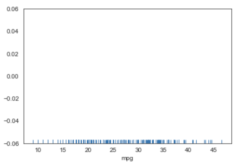
From the docs, this plots "marginal distributions by drawing ticks along the x and y axes." This just indicates concentrations of data values and seems less useful than the other supported plots.
sns.rugplot(df['mpg'])
Bar Plot
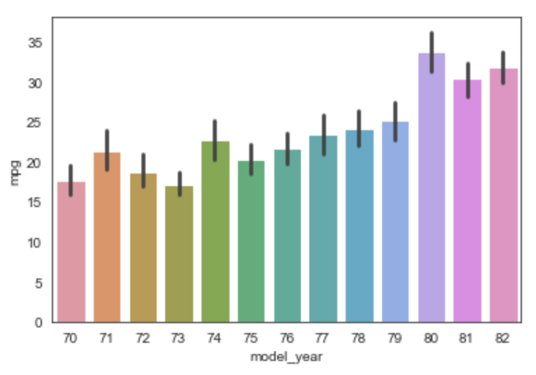
From the docs, "A bar plot represents an estimate of central tendency for a numeric variable with the height of each rectangle and provides some indication of the uncertainty around that estimate using error bars."
For example, the plot below shows the average (mean) MPG value for cars in each model year. The black vertical line at the top of each bar shows the min and max values in that model year.
sns.barplot(data=df, x='model_year', y='mpg')
To change the calculation of the heights, add the estimator argument,
set to the function that will compute the value.
For example, to plot the maximum values in each model year
instead of mean values, import the numpy package as np
and add the estimator=np.max argument.
Count Plot
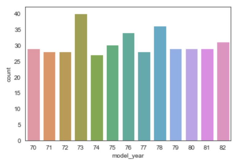
This produces a bar chart that shows the rows counts for each unique value of a given column.
sns.countplot(data=df, x='model_year')
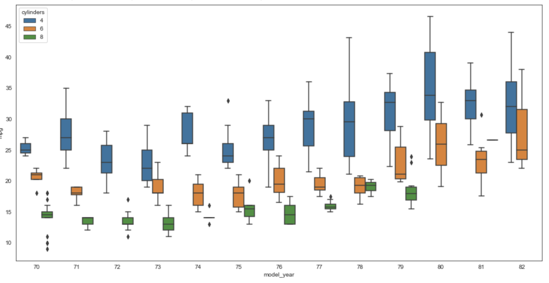
Box Plot
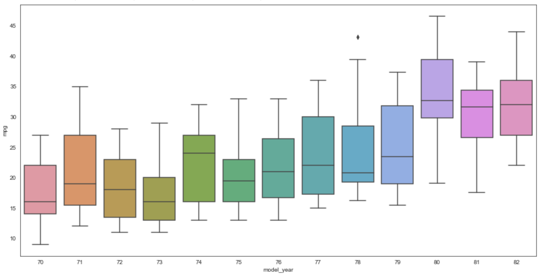
From the docs, this "shows the distribution of quantitative data in a way that facilitates comparisons between variables or across levels of a categorical variable." It is also known as a "box and whisker" plot.
Each box shows quartiles of the dataset. The whiskers extend to show the rest of the distribution, excluding points that are determined to be "outliers".
- The horizontal line across the boxes represents the median value, not the mean.
- The box extends one standard deviation above and below the median.
- The horizontal line at the top of the top "whisker" represents the maximum value.
- The horizontal line at the bottom of the bottom "whisker" represents the minimum value.
- The small black diamonds represent outlier data.
cylinders = [4, 6, 8] # not interested in 3 or 5 cylinder cars
subset_df = df.loc[df['cylinders'].isin(cylinders)]
year_71_df = subset_df.loc[subset_df['model_year'] == 71]
# To manually verify box values ...
print('For cars in 1971, min =', year_71_df['mpg'].min(),
      ', max =', year_71_df['mpg'].max(),
      ', mean =', year_71_df['mpg'].mean(),
      ', and median =', year_71_df['mpg'].median())

plt.figure(figsize=(16,8))
# This will render one box for each hue value within each x value.
# Statistics are gathered from the y values.
sns.boxplot(data=subset_df, x='model_year', y='mpg')
The print call above outputs:
For cars in 1971, min = 12.0 , max = 35.0 , mean = 21.25 , and median = 19.0
Examine the box for the year 1971 below to verify what is plotted.
To plot a separate box for each cylinder value within each year,
add the hue argument as follows:
sns.boxplot(data=subset_df, x='model_year', y='mpg', hue='cylinders')
Strip Plot
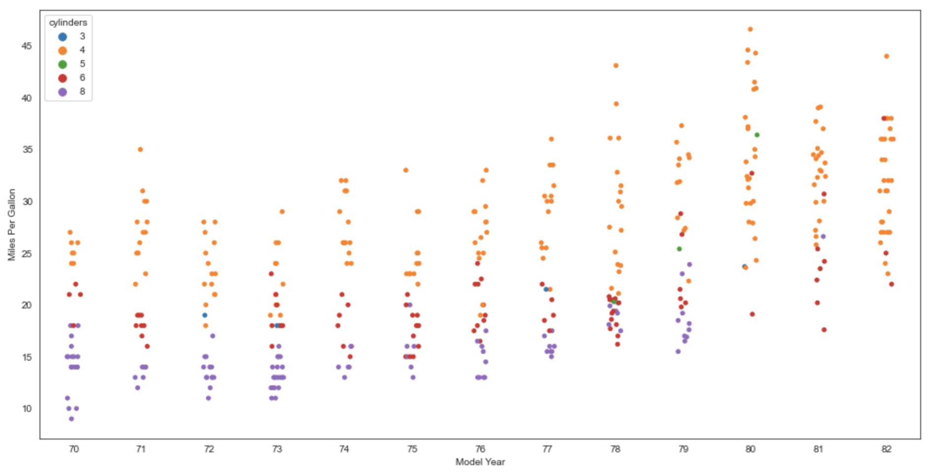
From the docs, this draws "a scatterplot where one variable is categorical."
In the example below, the categorical variable "model_year".
Add dodge=True to place the dots for each hue value in its own column.
Add jitter=True to spread the dots horizontally a bit farther to reduce overlap.
plt.figure(figsize=(16,8))
sns.stripplot(data=df, x='model_year', y='mpg', hue='cylinders')
plt.xlabel('Model Year')
plt.ylabel('Miles Per Gallon')
Colormaps
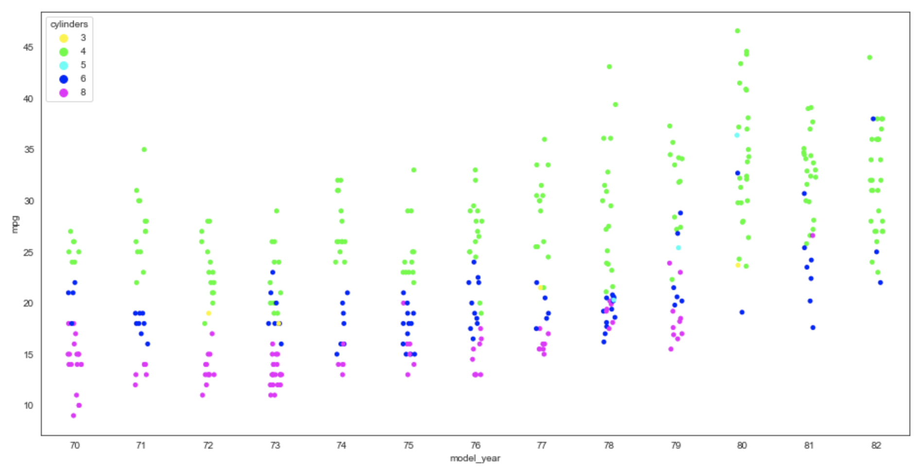
The matplotlib package provides many pre-built colormaps
whose names can be used as the value of the palette option.
To see a list of colormap names, see colormaps.
For example, here is the previous plot using the "hsv" colormap.
plt.figure(figsize=(16,8))
sns.stripplot(data=df, x='model_year', y='mpg', hue='cylinders', palette='hsv')
Swarm Plot
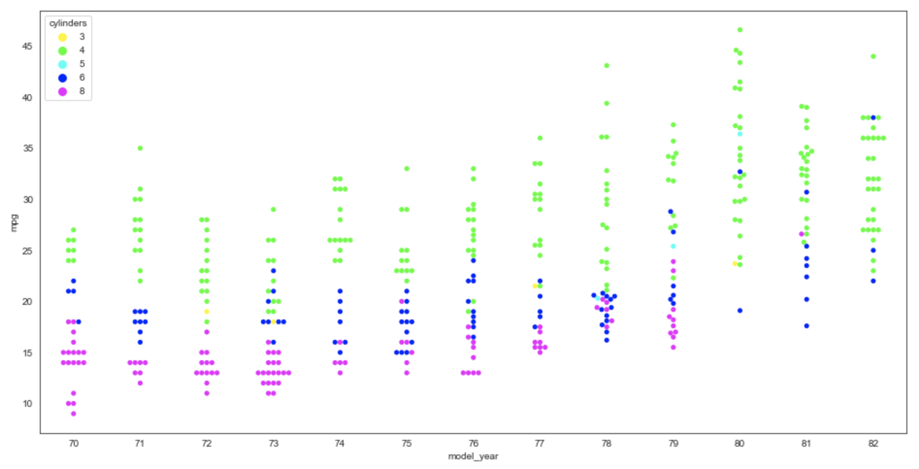
From the docs, this draws "a categorical scatterplot with non-overlapping points." It looks nearly identical to a strip plot, but the points are spread more horizontally so they do not overlap.
plt.figure(figsize=(16,8))
sns.swarmplot(data=df, x='model_year', y='mpg', hue='cylinders', palette='hsv')
Heatmap Plot from Correlation Data
A heatmap shows the degree of correlation between column values.
Create a matrix DataFrame from the original one that contains the correlation values
and pass this to the heatmap method.
Set the annot argument to True to display correlation values in the cells.
Every column has strong correlation with itself, receiving a value of 1.
Depending on the colormap, cells with darker colors typically indicate
strong correlation between the column name to the left of the cell
and the column name below the cell.
We can build a correlation matrix by call the corr method on the DataFrame.
matrix = df.corr()
print(matrix)
This outputs the following correlation values:
                       mpg  cylinders  displacement  horsepower    weight  \
    mpg           1.000000  -0.775396     -0.804203   -0.778427 -0.831741
    cylinders    -0.775396   1.000000      0.950721    0.842983  0.896017
    displacement -0.804203   0.950721      1.000000    0.897257  0.932824
    horsepower   -0.778427   0.842983      0.897257    1.000000  0.864538
    weight       -0.831741   0.896017      0.932824    0.864538  1.000000
    acceleration  0.420289  -0.505419     -0.543684   -0.689196 -0.417457
    model_year    0.579267  -0.348746     -0.370164   -0.416361 -0.306564

                  acceleration  model_year
    mpg               0.420289    0.579267
    cylinders        -0.505419   -0.348746
    displacement     -0.543684   -0.370164
    horsepower       -0.689196   -0.416361
    weight           -0.417457   -0.306564
    acceleration      1.000000    0.288137
    model_year        0.288137    1.000000
We can use this correlation matrix to produce a heat map plot with the following:
sns.heatmap(matrix, annot=True, cmap='YlOrRd', linecolor='white', linewidth=1)
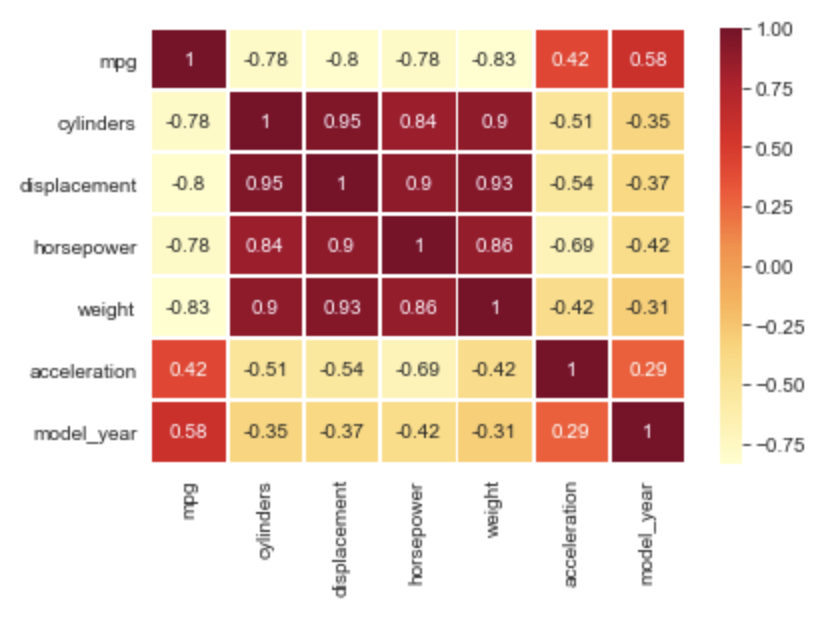
This heat map shows the following:
- The value that most affects
mpgismodel_year. - There is a strong correlation between
displacementandcylinders. - There is a weak correlation between
horsepowerandacceleration.
Heatmap Plot from a Pivot Table
Creating a heat map from a pivot table is useful when the correlation we wish to show is between specific values of a given column.
For example, we can correlate model_year and cylinders to mpg.
Note that some cells have no value because there are no cars in the dataset
for that combination of model_year and cylinders.
matrix = df.pivot_table(columns='model_year', index='cylinders', values='mpg')
sns.heatmap(matrix, annot=True, cmap='YlOrRd')
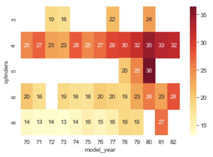
This plot shows that in this dataset
the highest mpg comes from 1980 cars with 5 cylinders.
Cluster Map
From the docs, this plots "a matrix dataset as a hierarchically-clustered heatmap." It is very similar to the "Heat Map from Correlation Data" example above, but it clusters like data points by reordering the rows and columns.
matrix = df.corr()
sns.clustermap(matrix, annot=True, cmap='YlOrRd')
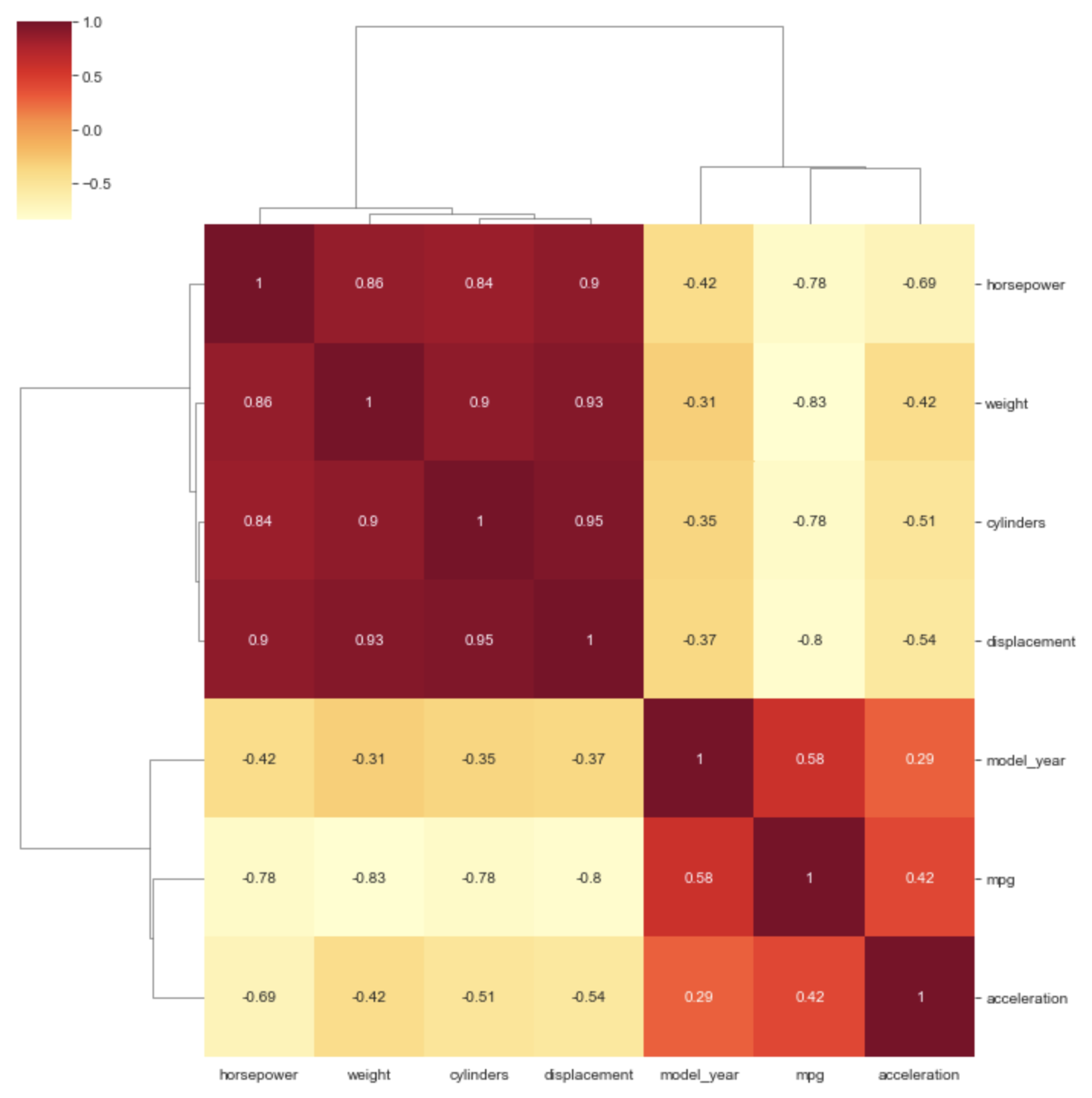
The meaning of the grouping brackets on the left and top sides of the plot are not clear to me. I know they represent clusters of data, but what is the criteria for clustering?
PairGrid Plot
A PairGrid plot creates many plots of a specific kind
for each combination of two columns.
To limit the columns in the DataFrame that are mapped to plot columns,
add the x_vars argument whose value is a list of column names.
To limit the columns in the DataFrame that are mapped to plot rows,
add the y_vars argument whose value is a list of column names.
For example, we can choose to create scatter plots where
the color of each dot is determined by the mpg value.
mpg_grid = sns.PairGrid(
    df, hue='mpg', palette='YlOrRd',
    x_vars=['cylinders', 'horsepower', 'model_year'],
    y_vars=['horsepower', 'weight', 'model_year'])
mpg_grid.map(plt.scatter)
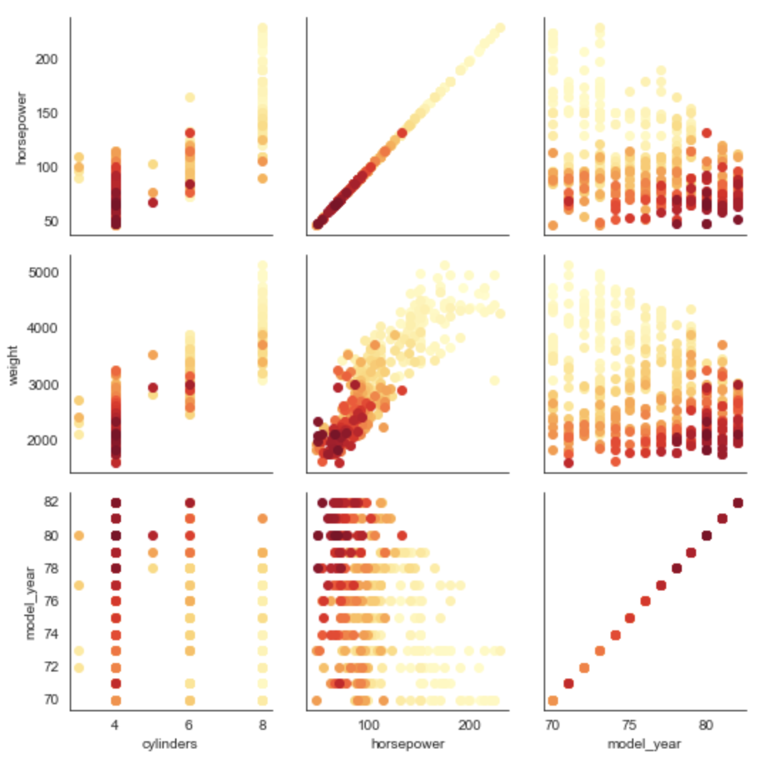
Compare this to Pair plot described earlier.
Focusing on one of the generated plots below, the one in the lower-left
shows mpg values using various colors
for combinations of cylinder and model_year values.
It shows that for a given number of cylinders, the mpg average
has tended to increase for newer model years.
FacetGrid Plot
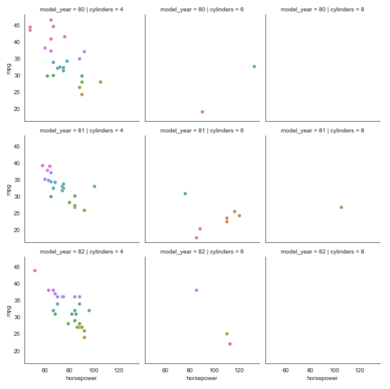
From the docs, this is a "multi-plot grid for plotting conditional relationships."
In the example below there is one plot for
each combination of cylinders and model_year.
Each plot is a scatter plot where
the x-axis is horsepower and the y-axis is mpg.
# Get the subset of the data that excludes 3 and 5 cylinder cars
# and only includes model years in the 80's.
cylinders = [4, 6, 8]
subset_df = df.loc[df['cylinders'].isin(cylinders) & (df['model_year'] >= 80)]

fg = sns.FacetGrid(subset_df, col='cylinders', row='model_year', hue='mpg')
fg.map(sns.scatterplot, 'horsepower', 'mpg')
Regression Plot
From the docs, this plots "data and regression model fits across a FacetGrid."
In the example below we plot a point for each car
where the x-axis is model_year and the y-axis is mpg.
The color of each point is based its cylinders value.
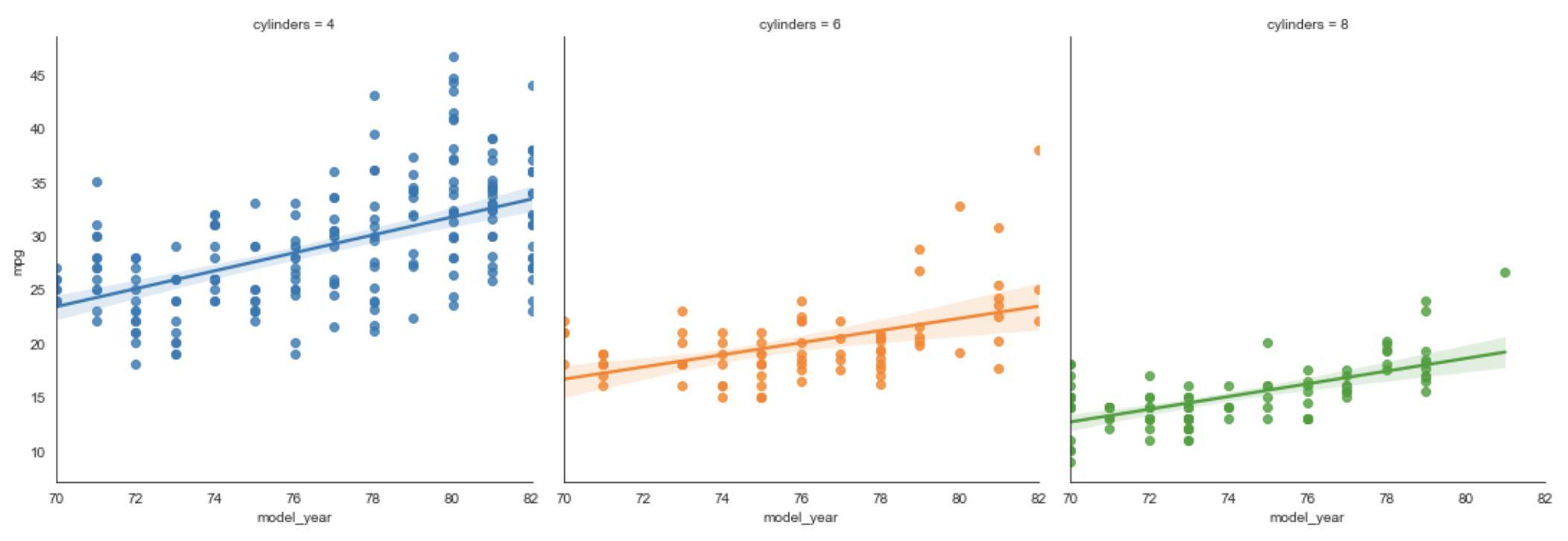
Each regression line shows the change in mpg for a given cylinders value.
cylinders = [4, 6, 8] # not interested in 3 or 5 cylinder cars
subset_df = df.loc[df['cylinders'].isin(cylinders)]
sns.lmplot(data=subset_df, x='model_year', y='mpg', hue='cylinders')
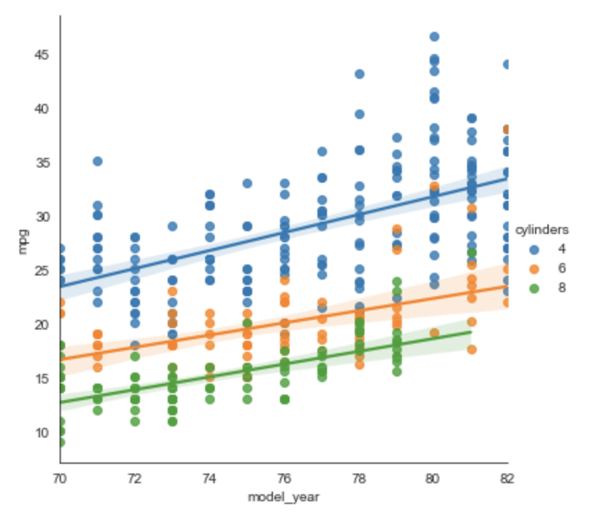
This shows that mpg has improved more rapidly for 4 cylinder cars
than for cars with more cylinders.
To show separate plots for each unique value of a given column,
add the col argument set to that column name.
For example, the following renders a separate plot
for each value found in the cylinders column.
sns.lmplot(data=subset_df, x='model_year', y='mpg', hue='cylinders', col='cylinders')
