Overview
The name "tkinter" is short for "Tk interface". It is a Python interface to Tk which is a GUI toolkit originally created for the Tcl programming language. The Tk license allows free commercial usage.
The official documentation for tkinter can be found here. Better documentation can be found at tutorialspoint. Many of the links on this page are to pages of the tutorialspoint site.
Tk 8.5 added themed widgets. These are not yet covered here. See Tk themed widgets.
Alternatives
Alternative GUI libraries for Python include:
-
Jython
This is a Java implementation of Python that enables use of Java-based GUI libraries such as JavaFX and Swing whose licenses allow free commercial usage. -
Kivy
This library was officially released in 2011. Apps that use it run on Linux, Windows, macOS, Android, and iOS. The Kivy license allows free commercial usage. -
PyQt
This is a set of Python bindings for the Qt C++ GUI framework. The Qt license does not allow free commercial usage. At last check the cost of commercial licenses was $550 USD per developer. -
wxPython
This is a set of Python bindings for the wxWidgets C++ GUI library. Apps that use it run on Linux, Windows, and macOS. It uses platform-specific widgets. The wxWidgets license allows free commercial usage.
Characteristics of tkinter that distinguish it from these alternatives are that it is easier to use and it comes pre-installed with Python.
Simple Example
Let's create a GUI app that just renders a label. Running the following code opens a window that displays text.
import sys
from tkinter import *

root = Tk() # a kind of window that inherits from Wm (window manager)
root.title('My Window Title')
root.iconbitmap('school-rulers.ico') # can't see in macOS
root.configure(background='linen') # sets background color
# Some examples use the config method which is just an alias.

print(font.families()) # prints list of available fonts
my_font = font.Font(family='Chalkboard', size=72, weight='bold')

# Label and Button are two of the many supported widgets.
label = Label(bg='systemTransparent', font=my_font, text='Hello, World!')
# One of three layout methods must be called on each widget
# in order for them to be rendered.
# The pack method is the simplest layout method.
# Others are described later.
label.pack()

# Add a button for quitting the app.
Button(text='Quit', command=root.quit).pack()

# Enable exiting the app by pressing ctrl-c
# when the terminal window where it was started has focus.
signal.signal(signal.SIGINT, lambda *args: root.quit())

# Start the event loop.
mainloop()
In this example widgets are added directly to the main window. However, it is more typically to add multiple nested Frame objects to the main window and and add widgets to those in order to achieve desired layouts. The parent container of a widget is specified by the first argument to it constructor. When this is omitted, it defaults to the root window.
To specify the initial window size and screen location,
pass a specially formatted string to the geometry method.
For example:
width = 800
height = 600
initial_x = 100
initial_y = 300
root.geometry(f'{width}x{height}+{initial_x}+{initial_y}')
Windows are resizable by default. To prevent resizing on both the x and y directions, add the following:
root.resizable(False, False)
The mainloop function starts an event loop which
blocks code that follows from executing.
The event loop processes user interface events.
Closing the window causes the event loop to terminate
and allows code that follows to execute.
Assuming no additional blocking calls are made,
the end of the program is reached and it exits.
Widgets
Widgets can be categorized into two groups, those that act as containers for other widgets and those that do not.
Container Widgets
| Name | Description | Nearest DOM/HTML Equivalent |
|---|---|---|
Frame |
container | <div> |
LabelFrame |
labeled container | <fieldset> |
PanedWindow |
horizontal or vertical set of children that is resizable |
<div> |
Tk |
root window | DOM Window |
Toplevel |
additional window | DOM Window |
Non-container Widgets
| Name | Description | Nearest DOM/HTML Equivalent |
|---|---|---|
Button |
button that can be pressed;command option specifies function to call when clicked. |
<button> |
Canvas |
for drawing lines and shapes | <canvas> or <svg> |
Checkbutton |
checkbox | <input type="checkbox"> |
Entry |
single-line text inputcommand option specifies function to callwhen user changes value |
<input type="text"> |
Label |
label | <label> |
Listbox |
select list (not a drop-down) | <select> with <option> children |
Menu |
menu bar or menu; call add_* methods to add menu itemswith a label and a command |
none |
Menubutton |
menu name that can be clicked to open a menu | none |
OptionMenu |
drop-down list | <select> with <option> children |
Radiobutton |
radio button | <input type="radio">See example at link to left. |
Scale |
slider | <input type="range"> |
Scrollbar |
scrollbar | <div> with CSS overflow set to scroll |
Text |
multi-line text input | <textarea> |
Spinbox |
number input | <input type="number"> |
tkMessageBox |
dialog box; see ask* and show* methods |
alert, confirm, prompt, and <dialog> |
Styling Limitations
Tk has some platform-specific styling limitations. For example, in macOS the background color and relief of a button cannot be changed. This makes it difficult to implement hover effects. One option for macOS is to use tkmacos. Another may be to use Tk themed widgets.
command Option
The following components accept a command option that specifies a function
to be called when the user clicks them or changes their value:
Button, Checkbutton, Radiobutton, Scale, Scrollbar, and Spinbox.
The Entry widget does not support the command option.
To trigger a call to a function when the value changes,
listen for a virtual event as follows:
TODO: FINISH THIS!
The Listbox widget does not support the command option.
To trigger a call to a function when the selected lines change,
listen for a virtual event as follows:
def print_selected_indexes(event):
    selected_indexes = myListbox.curselection() # a tuple
    print('selected_indexes =', selected_indexes)

myListbox.bind('<<ListboxSelect>>', print_selected_indexes)
The Text widget also does not support the command option.
To trigger a call to a function when the selected lines change,
listen for a virtual even as follows:
def print_text(event):
    # '-1c' removes newline from end
    value = text.get('1.0', 'end-1c') + event.char
    print('value =', value)

myText.bind('<Key>', print_text)
state Option
The following components accept a state option that defaults to NORMAL,
but has the value ACTIVE when the mouse is over it
and can be set to DISABLED to disable it:
Button, Checkbutton, Entry, Menubutton, Radiobutton,
Scale, Text, and Spinbox.
Widgets whose state is DISABLED are "grayed out".
The Listbox widget does not support the state option.
However, the configure method can be called on any widget to set its options.
This can be used to set the state of a Listbox as follows:
myListbox.configure(state=DISABLED)
Variable Wrappers
Variable wrappers are classes provided by tkinter
that track changes to Python variables that hold primitive values.
The classes are BooleanVar, DoubleVar, IntVar, and StringVar.
For example, an IntVar can be used to track the state of a Checkbutton.
Note that Checkbutton does not have a method to get its current state.
from tkinter import *

root = Tk()

cb_wrapper = IntVar(value=1) # initially checked

def report():
    print('checked?', cb_wrapper.get() == 1)

cb = Checkbutton(root, command=report, text='My Label', variable=cb_wrapper)
cb.pack()

mainloop()
A similar approach is used to get the value of a Radiobutton
using its variable or textvariable option.
Canvas
The Canvas widget provides many methods for drawing on the canvas including
create_arc, create_bitmap, create_image, create_line, create_oval,
create_polygon, create_rectangle, create_text, and create_window.
The create_window method paces another widget on the canvas.
The Canvas widget can be used to implement custom widgets
by using the bind method to listen to events such as clicks.
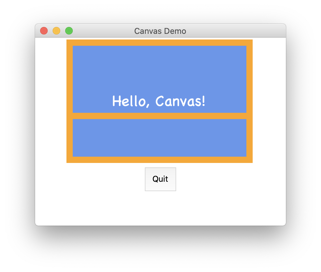
Here's a simple example of using a Canvas widget:
from tkinter import *
from tkinter import font

root = Tk()
root.geometry('400x300')
root.title('Canvas Demo')

height = 200
width = 300
canvas = Canvas(height=height, width=width)
canvas.create_rectangle(0, 0, width, height, fill='cornflowerblue', width=0)

outline_width = 10
fudge = 2
canvas.create_rectangle(
    outline_width - fudge, outline_width - fudge2,
    width - outline_width/2, height - outline_width/2,
    outline='orange', width=10) # width is the outline width

canvas.create_line(
    0, 125, width - outline_width / 2, 125,
    fill='orange', width=outline_width)

my_font = font.Font(family='Chalkboard', size=24)
canvas.create_text(
    width/2, height/2, fill='white', font=my_font, text='Hello, Canvas!')

canvas.pack()

def canvas_click(event):
    print('canvas_click: x, y =', event.x, event.y)

canvas.bind("<Button-1>", canvas_click)

Button(text='Quit', command=root.quit, padx=10, pady=10).pack()

mainloop()

Layout Methods
| Layout Method | Details |
|---|---|
pack |
arranges widgets on the four sides of container |
place |
places widgets and specific positions in container |
grid |
places widgets at row/column positions in container |
The layout method is specified on a widget, not on a container.
This means it is possible for a container to contain widgets
that use different layout methods.
An error will be reported if there is an attempt
to use grid and pack in the same container.
It is not an error to use place along with either grid or pack,
but typically this should be avoided.
In the tables below:
- Values that are all uppercase are constants defined by tkinter, not strings. Typically their values are the lowercase string version of the name.
- Percentages are float values between zero and one.
pack
The pack method accepts the following options:
| Option | Values |
|---|---|
expand |
fill unused space horizontally and vertically;False (default) or True |
fill |
similar to expand, but can retain minimal dimensions;NONE (default), X, Y, or BOTH |
side |
TOP (default), BOTTOM, LEFT, or RIGHT |
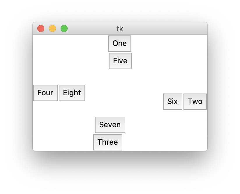
Here is a simple example of using pack.
It demonstrates that if multiple widgets are packed to the same side,
they line up in the order they were packed.
from tkinter import *

root = Tk()
root.geometry('300x200')

def add_button(text, side):
    btn = Button(root, padx=5, pady=5, text=text)
    btn.pack(side=side)

add_button('One', TOP)
add_button('Two', RIGHT)
add_button('Three', BOTTOM)
add_button('Four', LEFT)

add_button('Five', TOP)
add_button('Six', RIGHT)
add_button('Seven', BOTTOM)
add_button('Eight', LEFT)

mainloop()
TODO: Why is centering off here?

grid
The grid method accepts the following options:
| Option | Values |
|---|---|
column |
column index; default is 0 |
columnspan |
# of columns to occupy; default is 1 |
ipadx |
internal x padding in pixels; default is 0 |
ipady |
internal y padding in pixels; default is 0 |
padx |
external x padding in pixels (margin); default is 0 |
pady |
external y padding in pixels (margin); default is 0 |
row |
row index; default is 0 |
rowspan |
# of rows to occupy; default is 1 |
sticky |
position if cell is larger; centered by default; compass direction N, S, E, W, NE, NW, SE, or SW |
Skipped rows and columns do not occupy any space.
place
The place method accepts the following options.
| Option | Values |
|---|---|
anchor |
compass directionN, S, E, W, NE, NW (default), SE, or SW |
bordermode |
INSIDE or OUTSIDE; indicates whetherborder is included in height and width |
height |
in pixels |
width |
in pixels |
relheight |
percentage of parent height |
relwidth |
percentage of parent width |
relx |
location as percentage of parent width |
rely |
location as percentage of parent height |
x |
location in pixels |
y |
location in pixels |
Options that accept percentage values support creating responsive layouts that respond to resizing the window.
To center a widget horizontally, set options so that
relwidth + 2 * relx == 1.
To center a widget vertically, set options so that
relheight + 2 * rely == 1.
Images
To render images in a tkinter app, use the pillow library
which can be installed by entering pip install pillow.
An image can be added as the background of nearly any widget.
Often a Label is used as shown in the following example.
from tkinter import *
from PIL import Image, ImageTk # stands for Python Imaging Library

root = Tk()

image = Image.open('Boston-2013.jpg')
photo_image = ImageTk.PhotoImage(image)
label = Label(root, image=photo_image)
label.pack()

mainloop()
Custom Widgets
One way to implement custom widgets is to define a new class
that inherits from the class of an existing widget.
For example, we can defined a widget named EntryPlus
that inherits from Entry and adds support for a placeholder option.
Here is that class definition from the file entry_plus.py:
from tkinter import Entry, StringVar
from typing import Any, Dict

class EntryPlus(Entry):
    """
    This is a Tk widget that inherits from the `Entry` widget
    and adds support for placeholder text.
    It requires specifying the textvariable option.
    """

    def __init__(self, **options: Dict[str, Any]):
        # Require the `textvariable` option.
        var: StringVar = options.get('textvariable')
        self.var = var
        if not var:
            raise Exception('must supply textvariable option')

        # If there is a placeholder and
        # the `textvariable` is currently empty,
        # set the `textvariable` value to the placeholder.
        self.placeholder = str(options.get('placeholder'))
        value = str(var.get())
        if self.placeholder and not value:
            var.set(self.placeholder)

        # Remove the `placeholder` option before passing options
        # to the superclass, because it isn't valid for `Entry`.
        del options['placeholder']
        Entry.__init__(self, **options)

        # Listen for `FocusIn` and `FocusOut` events.
        self.bind('<FocusIn>', self.focused)
        self.bind('<FocusOut>', self.blurred)

    # When focus moves out, if the value
    # is empty, set it to the placeholder.
    def blurred(self, _) -> None:
        if self.var.get() == '':
            self.var.set(self.placeholder)

    # When retrieving the value, if it matches
    # the placeholder then return an empty string.
    def get(self) -> str:
        value = self.var.get()
        return '' if value == self.placeholder else value

    # When focus moves in, if the value
    # matches the placeholder then remove it.
    def focused(self, _) -> None:
        if self.var.get() == self.placeholder:
            self.var.set('')
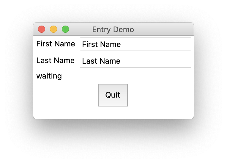
Here is an example application that uses the EntryPlus widget:
from tkinter import *
from entry_plus import EntryPlus

root = Tk()
root.geometry('400x300')
root.title('Entry Demo')

first_name_var = StringVar()
last_name_var = StringVar()

row = 0
Label(text='First Name').grid(row=row, column=0)
first_name_entry = EntryPlus(
    placeholder='First Name', textvariable=first_name_var)
first_name_entry.grid(row=row, column=1)

row += 1
Label(text='Last Name').grid(row=row, column=0)
last_name_entry = EntryPlus(
    placeholder='Last Name', textvariable=last_name_var)
last_name_entry.grid(row=row, column=1)

def update_label(*_):
    fn = first_name_entry.get()
    ln = last_name_entry.get()
    text = f'Hello, {fn} {ln}!' if fn and ln else 'waiting'
    label.configure(text=text)

first_name_var.trace_add('write', update_label)
last_name_var.trace_add('write', update_label)

row += 1
label = Label()
label.grid(row=row, column=0, columnspan=2, sticky=W)
update_label()

row += 1
btn = Button(text='Quit', command=root.quit, padx=10, pady=10)
btn.grid(row=row, column=0, columnspan=2)

# first_name_entry.focus()

mainloop()
