Overview
Shoelace is an open source “forward-thinking library of web components”. The web components are defined using Lit.
Shoelace provides a large collection of UI components that can be used with all web frameworks or vanilla JavaScript with no framework. The current set of components includes Alert, Animated Image, Animation, Avatar, Badge, Breadcrumb, Breadcrumb Item, Button, Button Group, Card, Carousel, Carousel Item, Checkbox, Color Picker, Copy Button, Details, Dialog, Divider, Drawer, Dropdown, Format Bytes, Format Date, Format Number, Icon, Icon Button, Image Comparer, Include, Input, Menu, Menu Item, Menu Label, Mutation Observer, Option, Popup, Progress Bar, Progress Ring, QR Code, Radio, Radio Button, Radio Group, Range, Rating, Relative Time, Resize Observer, Select, Skeleton, Spinner, Split Panel, Switch, Tab, Tab Group, Tab Panel, Tag, Textarea, Tooltip, Tree, Tree Item, and Visually Hidden.
The left nav of the Shoelace website lists all the current components. Clicking a component name displays detailed documentation that includes example usages with source code. Copy code from the documentation, paste it into your files, and customize as needed.
Light and dark themes are provided.
All the styling can be customized through CSS custom properties and CSS rules.
The Shoelace components can have the following functionality that is described in their documentation:
- custom methods that your JavaScript code can call
- dispatched custom events to which your JavaScript code can listen
- slots into which your HTML can insert content
- UI “parts” that can be individually styled
See the documentation for each component for details.
Shoelace has been managed by the “Font Awesome” company since October, 2022.
Installing
The easiest way to use Shoelace is from a CDN.
Include the following in the head element
of each web page that wishes to use Shoelace.
Modify the version number in each URL to use the latest version.
<link
  rel="stylesheet"
  href="https://cdn.jsdelivr.net/npm/@shoelace-style/shoelace@2.14.0/cdn/themes/light.css"
/>
<script
  type="module"
  src="https://cdn.jsdelivr.net/npm/@shoelace-style/shoelace@2.14.0/cdn/shoelace-autoloader.js"
></script>
The link tag above loads the light theme.
To instead load the dark theme, change “light” to “dark” in the CSS URL.
Alternative, load both the light and dark themes and allow the user to choose.
This approach is described in the “Light/Dark” mode section below.
The script tag above loads JavaScript for all the components.
It is also possible to include only specific components
by using a separate script tag for each.
For example, the following only loads the JavaScript for the Switch component.
<script
  src="https://cdn.jsdelivr.net/npm/@shoelace-style/shoelace@2.14.0/cdn/components/switch/switch.js"
  type="module"
></script>
The Shoelace source files can be installed locally to avoid relying on a CDN. To install npm, enter one of the following commands.
npm install @shoelace-style/shoelace
bun add @shoelace-style/shoelace
There are several options for making the files under node_modules
available to the app.
When Shoelace is obtained from a CDN, it will include the Lit library. This may conflict with your own usage of Lit.
When using a bundler like Vite or Bun,
import Shoelace from the node_modules dist directory.
This will not include the Lit library,
so you must add a script that that includes Lit.
VS Code Completions
The following steps enable code completions for Shoelace components in HTML files.
-
Install Shoelace from npm.
-
Create the file
.vscode/settings.jsonat the root of the project. -
Add the following in the file.
{ "html.customData": [ "./node_modules/@shoelace-style/shoelace/dist/vscode.html-custom-data.json" ] } -
Restart VS Code.
Avoiding Flash Of Undefined Custom Elements (FOUCE)
When a page containing Shoelace components is initially rendered, the CSS and JavaScript for the components may not be loaded yet. This can cause FOUCE and layout shift. To avoid this, include the following CSS which prevents rendering components that are not yet “defined”.
:not(:defined) {
  visibility: hidden;
}
A more involved approach using customElements.whenDefined
is described in Waiting for Components to Load.
Light/Dark Mode
It’s a good idea to support both light and dark modes.
The default mode should be based on user preference specified in their operating system. For example, in macOS this is specified in the Settings app by selecting “Appearance” in the left nav and then clicking “Light”, “Dark”, or “Auto”.
The user should also be allowed to change the mode, perhaps using a Switch component.
The following code uses Alpine to implement this.
<html>
  <head>
    ...
    <script
      defer
      src="https://cdn.jsdelivr.net/npm/alpinejs@3.x.x/dist/cdn.min.js"
    ></script>
    ...
    <script defer>
      const state = {
        prefersDark: window.matchMedia('(prefers-color-scheme: dark)').matches
      };

      document.addEventListener('alpine:init', () => {
        Alpine.data('state', () => state);
      });

      window
        .matchMedia('(prefers-color-scheme: dark)')
        .addEventListener('change', event => {
          state.prefersDark = event.matches;
          updateMode();
        });

      function configureWatches(watch) {
        watch('prefersDark', updateMode);
      }

      function updateMode() {
        const el = document.documentElement;
        if (state.prefersDark) {
          el.classList.add('sl-theme-dark');
        } else {
          el.classList.remove('sl-theme-dark');
        }
      }

      updateMode();
    </script>
  </head>
  <body x-data="state" x-init="configureWatches($watch)">
    ...
    <sl-switch
      size="large"
      :checked="prefersDark"
      x-on:sl-change="prefersDark = $event.target.checked"
    >
      Dark Mode
    </sl-switch>
    ...
  </body>
</html>
Slots
Many components have slots where content can be inserted.
The slot attribute specifies a named slot where content should be placed.
For example, the Card component has a default slot (for body content) and three optional slots named “image”, “header”, and “footer”. The content of these slots is rendered in a single column where the image is at the top, followed by the header, the default content (no slot name provided), and the footer. The order in which the content of the slots is rendered is not affected by the order in which they appear in the HTML.
For example, the following Card component uses all four slots.
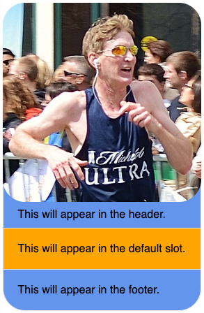
<sl-card class="my-card">
  <img slot="image" alt="Boston 2013" src="boston2013.png" />
  <div slot="header">This will appear in the header.</div>
  This will appear in the default slot.
  <div slot="footer">This will appear in the footer.</div>
</sl-card>
Styling of this component is described in the next section.
Parts
Many components are composed of parts.
Each part can be styled separately using
the standard CSS ::part pseudo-element.
For example, the Card component has the parts, “base” (represents the entire component), “image”, “header”, “body”, and “footer”.
The following CSS styles the card component shown in the previous section.
.my-card img {
  aspect-ratio: auto;
  max-width: 285px;
  height: auto;
  width: auto;
}

.my-card::part(base) {
  background-color: cornflowerblue;
  border-radius: 2rem;
}

.my-card::part(image) {
  border-radius: 2rem;
}

.my-card::part(body) {
  background-color: orange;
}
Events
Some components dispatch events. These can be standard DOM events and custom events.
For example, the Menu component dispatches sl-select events
and the Switch component dispatches s-change events.
To listen for events, register event listeners on the components. This can be done with vanilla JavaScript or with Alpine.