by R. Mark Volkmann, partner and Distinguished Software Engineer at Object Computing, Inc..
Overview
When developing web applications it is useful to be able to render a single component rather than run the entire app. This is especially true when the component does not appear on the first rendered page. For example, suppose we are developing a shopping app with the typical flow of login, add products to cart, and checkout. During development of a component that appears on the checkout page it is tedious to have to retrace all of these steps in order to test changes to the new component.
Storybook solves this! It provides a web app where a list of components in various states appear in the left nav. Clicking one renders only that component in its main area. We can then interact with it in all the ways it supports. Storybook also provides a nice way to demo each component to stakeholders and focus on the design and styling of each component.
Storybook with Svelte
Storybook can be used with many web frameworks. Let’s dive into how it can be used with Svelte, appropriate as I’m the author of the Manning book Svelte and Sapper in Action. Detailed instructions for using Storybook with Svelte components can be found in the Storybook documentation at Introduction to Storybook for Svelte.
To add the use of Storybook to an existing Svelte application,
cd to the top application directory and enter npx sb init.
This takes a couple of minutes to complete
and results in the following changes:
-
It installs all the development dependencies needed by Storybook.
-
It adds the following npm scripts in
package.json:"storybook": "start-storybook -p 6006", "build-storybook": "build-storybook" -
It creates the
.storybookdirectory, which contains themain.jsfile that configures Storybook. -
It creates the
src/storiesdirectory containing several example components and their stories. Note that typically source files for the components being demonstrated are placed in thesrcdirectory rather than thestoriesdirectory.
To run Storybook enter npm run storybook.
To add components to Storybook,
add one .stories.js file for each component
in the stories directory.
These files should be similar to the
provided Button.stories.js file.
It is common for a .stories.js file to define multiple
stories that render the same component in different states.
Each state has a name that is displayed in the left nav
below the component name.
For example, the states for the provided Button component
are “Primary”, “Secondary”, “Large”, and “Small”.
When new .stories.js files are created or
existing .stories.js files are modified,
Storybook automatically detects the changes and updates its UI.
Example Component and Stories
Let’s create a new Svelte component and implement Storybook stories for it! Start by entering the following commands to create a new Svelte app and setup Storybook:
npx degit sveltejs/template storybook-demo
cd storybook-demo
npm install
npx sb init
Add the file src/Pie.svelte containing the code below.
This component renders a progress indicator in the form of a pie chart.
It uses SVG to draw the pie and takes advantage of the
Svelte tweened function to animate changes to the value.
The component accepts four props.
The bgColor, fgColor, and size props
have default values and are therefore optional.
The value prop does not have a default value and is therefore required.
Understanding the details of this code is not important,
but if you have questions about it feel free to email me.
<script>
  import {tweened} from 'svelte/motion';

  export let bgColor = 'tan';
  export let fgColor = 'blue';
  export let size = 50;
  export let value; // 0 to 100

  const store = tweened(value, {duration: 500});

  $: half = size / 2;
  $: viewBox = `0 0 ${size} ${size}`;
  $: circumference = 2 * Math.PI * half;

  let dashArray = '';

  $: {
    const v = Math.max(0, Math.min(100, value)); // ensures value in range
    store.set(v);
    const dash = ((v / 100) * circumference) / 2;
    dashArray = `${dash} ${circumference - dash}`;
  }
</script>

<svg height="{size}" width="{size}" {viewBox}>
  <circle class="bg" fill="{bgColor}" r="{half}" cx="{half}" cy="{half}" />
  <circle class="fg" r={half / 2} cx={half} cy={half} fill="transparent"
  stroke={fgColor} stroke-width={half} stroke-dasharray={dashArray} />
</svg>

<style>
  svg {
    transform: rotate(-90deg);
  }
</style>
Add the file src/stories/Pie.stories.js containing the following
which renders the Pie component using a default value of 30:
import Pie from '../Pie.svelte';

export default {
  title: 'Pie',
  component: Pie,
  argTypes: {
    bgColor: {control: 'color'},
    fgColor: {control: 'color'},
    size: {control: 'number'},
    value: {control: 'range'}
  }
};

const Template = props => ({
  Component: Pie,
  props
});

export const Primary = Template.bind({});
Primary.args = {value: 30};
Enter the command npm run storybook.
This starts the Storybook server and
opens the Storybook app in your default web browser.
Click the Pie component in the left nav to render the following:
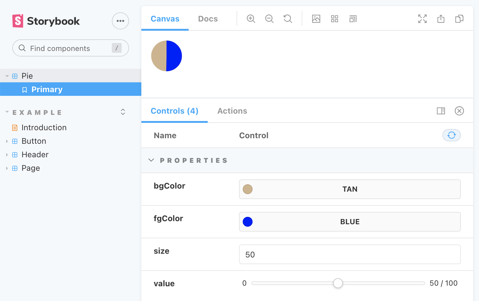
If desired, the example components can be deleted
from the src/stories directory so they no longer render.
To change any of the props passed to the Pie component,
enter new values in the “Controls” section at the bottom.
For example, drag the value slider for the value prop to change the
value rendered by the Pie component to any value from zero to 100.
The bgColor, fgColor, and size props can also be modified.
Very nice!
Static Deploy
Sometimes it is desirable to generate and deploy a static version of Storybook, including all the registered components. This allow others to browse the deployed Storybook site without having to install any software. They can then view the components, interact with them, and provide feedback.
To generate a static Storybook site, enter npm run build-storybook.
This creates the storybook-static directory
containing all the required HTML and JavaScript files.
All required CSS is compiled into the JavaScript files.
To view the site locally before deploying it,
open the index.html file in a web browser.
To deploy the site, copy the contents of the ‘storybook-static’ directory
to any web server.
For more detail on deploying Storybook, see Publish Storybook.
Conclusion
Storybook provides a great way to see a list of components used by an app, demonstrate them in various states, and to interact with them! When a bug is discovered in a component, it can be debugged in the context of Storybook. This is typically faster than debugging in an app that uses the component because there is no need to navigate to where the component is used.
More more on Svelte, check out Svelte and Sapper in Action.