Overview
iOS 16 introduced the PhotosPicker view.
It provides an easier way to allow users to select assets from their photo library than using UIPickerController from UIKit.
See the excellent YouTube videos from Stewart Lynch, PhotosPicker - SwiftUI.
Example App
See PhotosPickerDemo which demonstrates everything shared in the Steward Lynch video linked above.
The app has two tabs.

Single Image tab
The first tab "Single Image" allows the user to select a single image from their photo library. Tap the icon in the upper-right corner to view the photo library.

See the code for SingleImagePicker.
The matching argument to PhotosPicker accepts many values. Examples from How to let users select pictures using PhotosPicker by Paul Hudson include:
.screenshotsto only accept screenshots..any(of: [.panoramas, .screenshots]).not(.videos)to accept anything that is not a video.any(of: [.images, .not(.screenshots)]))
Multiple Images tab
The second tab "Multiple Images" allows the user to select multiple images from their photo library. Tap the icon in the upper-right corner to view the photo library.

See the code for MultipleImagePicker.
Embedding
iOS 17 added the ability to embed a PhotosPicker in an app. instead of rendering it in a sheet controlled by a separate process. This is configured with three new view modifiers.
To display a PhotosPicker inline within an app, apply the view modifier photosPickerStyle(.inline).
To hide specific controls that the PhotosPicker supplies by default, apply the photosPickerDisabledCapabilities({capability}) view modifier. where the supported capabilities are collectionNavigation, search, selectionActions, sensitivityAnalysisIntervention, and stagingArea. The selectionActions capability includes the "Clear" button (deselects all) and the "Done" button (closes picker when not inline).
It seems there is no need to disable any of the capabilities if they are configured to be hidden using the photosPickerAccessoryVisibility view modifier. The first argument specifies whether you will indicate which edges containing controls should be .visible or .hidden. The association of controls to edges differs based on the platform. In iOS, the navigation bar is at the top and contains the Clear button, the Done button, and a segmented Picker to select "Photos" or "Albums". In iOS, the toolbar is at the bottom and contains the "Options" button and some text. The following view modifier hides all edges:
.photosPickerAccessoryVisibility(.hidden, edges: .all)See the demo app PhotosPicker2023Demo.
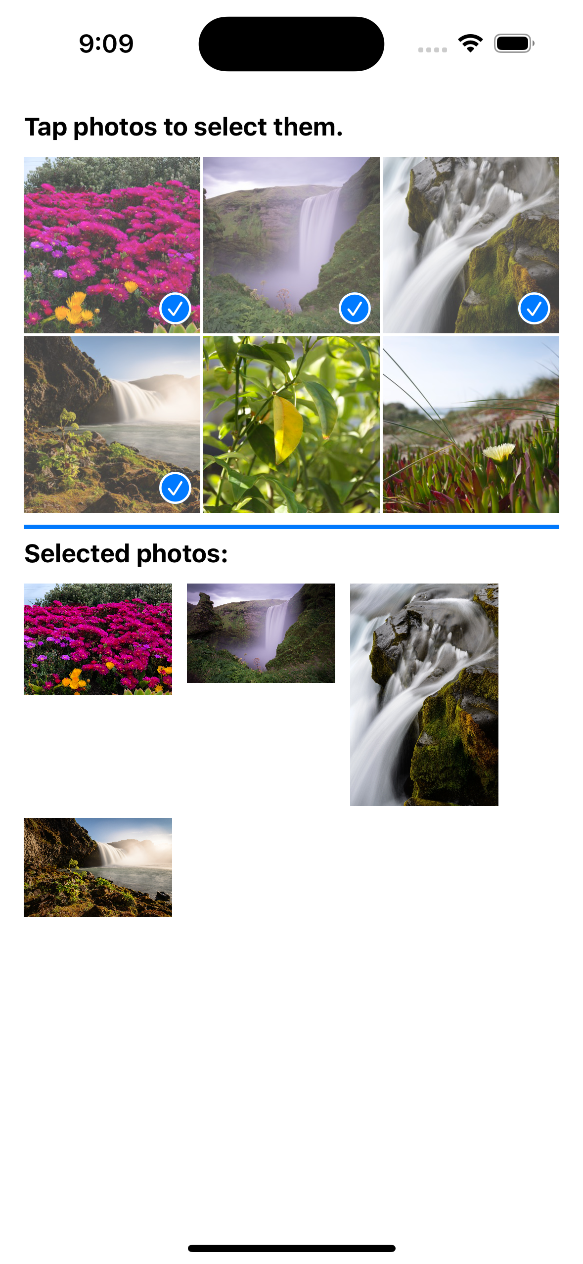
The app above renders a PhotoPicker with the following:
PhotosPicker(
    selection: $imageSelections,

    // When `selectionBehavior` is `continuous` or `continuousAndOrdered`,
    // the `selection` binding is updated after each selection is made
    // rather than waiting for a "Done" button to be tapped.
    // Also, most buttons are hidden.
    // This value places checkmarks in blue circles on each selected image.
    selectionBehavior: .continuous, // value added in iOS 17
    // This value places numbered blue circles on each selected image.
    // selectionBehavior: .continuousAndOrdered, // value added in iOS 17

    // matching: .images,

    preferredItemEncoding: .current

    // photoLibrary: .shared()
) {
    Image(systemName: "photo")
        .imageScale(.large)
}

// This embeds the PhotosPicker in this app instead of
// rendering it in a sheet controlled by a separate process.
.photosPickerStyle(.inline)

// This also embeds the PhotosPicker,
// but it renders the photos in a single, scrollable row.
// .photosPickerStyle(.inline)


// This hides all controls normally rendered by the PhotosPicker.
.photosPickerAccessoryVisibility(.hidden, edges: .all)

// .ignoresSafeArea()
// The height of each row is 120.
.frame(height: 240) // two rows