Many commonly needed web components have already been implemented and are freely available in open source libraries.
Perhaps the best example of such a library is Web Awesome. Web Awesome is the new name for Shoelace which was first released in 2020. It is maintained by Font Awesome which provides a large library of over 60,000 free and paid icons.
If you are already using Shoelace, migrating to Web Awesome is easy. Most of the components have the same names and APIs. All that is required is to:
- change the
scriptelement that includes the Shoelace library to include the Web Awesome library instead - change the custom element name prefixes from “sl” to “wa”
Web Awesome components are implemented using Lit.
Most of the components provided by Web Awesome are free to use. But it also provides some “Pro” components whose usage requires a subscription fee.
Compared to Shoelace components, Web Awesome components provide improvements in accessibility, performance, theming, and server-side rendering (SSR).
At publication time, Web Awesome was still in beta, but the components are quite usable and have been battle tested for years under the name “Shoelace”.
Components
Let’s run through brief descriptions of each of the components provided by Web Awesome, to get a feel for the breadth of the components. This list was compiled when the newest version was 3.0.0-beta-6.
wa-animated-image: displays animated GIFs and WEBPswa-animate: animates an element using presets or custom keyframeswa-animation: displays an animated GIF or WEBP that will play/pause on clickwa-avatar: displays a generic or custom avatar image in a circle, square, or square with rounded cornerswa-badge: displays a status or count, optionally over the upper-right corner of a buttonwa-breadcrumbandwa-breadcrumb-item: displays a group of links used for site navigationwa-button: displays a button with many options for color, appearance, size, shape, start/end decorations, and loading indicatorswa-button-group: displays a group of related buttons in a common sectionwa-callout: displays an important message with a preceding icon in a box that stands outwa-card: displays information in a card layout with optional header and footer sectionswa-carouselandwa-carousel-item: displays any number of content items (typically images) one at a time with controls to switch between themwa-checkbox: displays a checkbox with a labelwa-color-picker: displays a color swatch that users can click to open a color picker in order to select a different color and optional opacity; can specify a set of predefined color swatcheswa-comparison: displays two content overlapping items (typically images) and a slider that users can drag left or right to compare parts of the contentwa-copy-button: displays a button that can be clicked to copy a property value in another element (typicallyvalue) to the clipboardwa-details: displays a summary description that can be clicked to toggle display of more detail; use multiple with the samenameattribute for accordion behavior where at most one is expandedwa-dialog: displays a modal dialog with more features than an HTMLdialogelementwa-divider: displays a stylable divider that can be horizontal or verticalwa-drawer: renders content that slides in from any side of the pagewa-dropdownandwa-dropdown-item: displays a customizable list of options and sub-options that can trigger an action when selectedwa-format-bytes: displays a number of bytes in an appropriate unit (ex. kB, MB, or GB)wa-format-date: displays a date and/or time in a specified locale and formatwa-format-number: displays a number in a specified locale and format, optionally as a percentage or currencywa-icon: displays an icon from the Font Awesome library or a custom icon librarywa-include: includes the contents of another HTML filewa-input: displays a styled HTMLinputelement with many optional features including a label, placeholder, hint, clear button, password view toggle, start/end icons, and morewa-mutation-observer: declarative interface to the MutationObserver APIwa-popover: displays a floating panel associated with another component that contains related information and/or interactive elementswa-progress-bar: displays a customizable horizontal bar that indicates the progress of an operationwa-progress-ring: displays a customizable pair of rings that offer an alternative towa-progress-barwa-qr-code: generates and displays a customizable QR code for a given URLwa-radio-groupandwa-radio: displays a set of customizable radio buttonswa-rating: displays a customizable set of icons that can be clicked to indicate a ratingwa-relative-time: displays a date or time duration description relative to the current date/time (e.g. “yesterday” or “3 minutes ago”)wa-resize-observer: declarative interface to the ResizeObserver APIwa-scroller: creates a scrollable container for content that may be larger that the allocated spacewa-selectandwa-option: displays a customizable alternative to an HTMLselectelement with many optional features including a label, placeholder, hint, clear button, and ability to select multiple valueswa-skeleton: displays a placeholder for content that will be rendered later (prevents layout shift)wa-slider: displays a customizable alternative to an HTMLinputelement whosetypeis set to “range” with many optional features including a label, hint, tooltip, increment markers, reference labels, vertical orientation, and ability to select a pair of valueswa-spinner: displays a spinning semi-circle that indicates an activity is being performedwa-split-panel: displays a pair of content areas divided by a draggable, vertical or horizontal bar that modifies the size of each areawa-switch: displays a customizable toggle switch that represents a Boolean valuewa-tab-groupandwa-tabandwa-panel: displays a set of tabs that each have content where only the active tab content is visiblewa-tag: displays a customizable label that looks like a button (used bywa-selectwhenmax-options-visibleis greater than one)wa-textarea: displays a styled HTMLtextareaelement with many optional features including a label, placeholder, hint, and ability to resize in specific wayswa-tooltip: associates a customizable tooltip with a specific element that is displayed when the user hovers over the elementwa-treeandwa-tree-item: displays a customizable tree of items where parent items can be expanded and collapsed, and the manner in which items can be selected can be specifiedwa-zoomable-frame: displays any content in a frame that can be zoomed in and out
Most of these components are demonstrated in a single HTML file in the GitHub repository project web-awesome-demo.
Importing Components
There are at least three options, described below, for using Web Awesome components. The first two options use a CDN. The last option installs the Web Awesome package into your project.
Advantages of using a CDN include:
- reduced load on your server
- faster load times for users that are geographically closer to a CDN server than your server
- removed need to download files at all due to browser caching for users that have previously visited sites that uses the same files
Disadvantages of using a CDN include:
- depending on an external service that, while unlikely, could periodically be down
- future unavailability of a specific package version due to deprecation
- possibly slower for users that are geographically closer to your server than a CDN server
- lost opportunity to bundle packages, resulting in more HTTP requests
- revealing information about your users to the CDN
In each of the examples below, replace “CDN” with its URL prefix which currently is the following:
https://early.webawesome.com/webawesome@3.0.0-beta.6/dist
CDN with Autoloader
The easiest option is to use the Web Awesome autoloader. This automatically loads the JavaScript needed for each component from a CDN the first time they appear in the DOM. An advantage of this approach is that there is no need to request loading of specific components. A disadvantage is that users may notice a very slight delay each time a component is used for the first time.
To use them option, we need to make a few changes to the main HTML file of the site.
First, add a class attribute to the html element as follows:
This configures the use of the default theme and the brand color “blue”.
<html class="wa-theme-default wa-palette-default wa-brand-blue" lang="en">
  ...
</html>
Second, add the following link element as a child of the head element.
This loads the Web Awesome default theme.
<link rel="stylesheet" href="{CDN}/styles/webawesome.css" />
Third, add the following script element as a child of the head element.
This loads the Web Awesome autoloader which watches DOM modifications
for unregistered Web Awesome custom elements and lazy loads them.
<script type="module" src="{CDN}/webawesome.loader.js"></script>
To demonstrate this, we can add the following script element
inside the head element.
It finds a button and a target element on the page by their ids.
It then adds a click handler to the button
that sets the innerHTML of the target element to a wa-icon.
The JavaScript for the wa-button custom element
is loaded when the page is loaded.
But the JavaScript for the wa-icon custom element
is not loaded until the button is clicked.
<script>
  window.onload = () => {
    const button = document.getElementById('add-button');
    const target = document.getElementById('target');
    button.addEventListener('click', () => {
      target.innerHTML = '<wa-icon slot="icon" name="trash"></wa-icon>';
    });
  };
</script>
<wa-button id="add-button">Add Icon</wa-button>
<div id="target"></div>
CDN with Specific Components
The benefit of this approach is that it doesn’t use the autoloader. There is no delay each time a new component is used for the first time because all the required component JavaScript code is loaded up front.
To use this option, use CDN URLs to include a theme CSS file and the JavaScript for each component to be used. For example:
<link rel="stylesheet" href="{CDN}/styles/webawesome.css" />

<script type="module">
  import '{CDN}/components/avatar/avatar.js';
  import '{CDN}/components/icon/icon.js';
</script>
Project Install
This approach has the same benefit describe above gained by not using the autoloader. In addition, it does not use a CDN and therefore is not affected by CDN outages.
To use this option:
-
cdto your project root directory. -
Enter the command
npm install @awesome.me/webawesome -
Remove all
linkandscriptelements that refer to Web Awesome CDN files. -
Import the Web Awesome CSS rules and each component being used.
For the sample project, add the following in
index.htmlinside theheadelement:<script type="module"> import '@awesome.me/webawesome/dist/styles/webawesome.css'; import '@awesome.me/webawesome/dist/components/badge/badge.js'; import '@awesome.me/webawesome/dist/components/button/button.js'; import '@awesome.me/webawesome/dist/components/dialog/dialog.js'; import '@awesome.me/webawesome/dist/components/drawer/drawer.js'; import '@awesome.me/webawesome/dist/components/input/input.js'; import '@awesome.me/webawesome/dist/components/progress-bar/progress-bar.js'; import '@awesome.me/webawesome/dist/components/progress-ring/progress-ring.js'; import '@awesome.me/webawesome/dist/components/radio-group/radio-group.js'; import '@awesome.me/webawesome/dist/components/radio/radio.js'; import '@awesome.me/webawesome/dist/components/rating/rating.js'; import '@awesome.me/webawesome/dist/components/relative-time/relative-time.js'; import '@awesome.me/webawesome/dist/components/switch/switch.js'; </script>
When not using a CDN, you will see several warning messages in the DevTools Console that can be safely ignored. These are described in the open issue #1269. Hopefully this issue will be resolved soon.
If the VS Code extension “Web Components Language Server” is installed
and the @awesome.me/webawesome package is installed in a project,
VS Code will provide element and attribute completions
for Web Awesome custom elements.
If Web Awesome is being obtained from a CDN, create the file wc.config.js
containing the following in order to get completions:
TODO: See issue #27.
export default {
  libraries: {
    '@awesome.me/webawesome': {
      manifestSrc: '{CDN}/dist/custom-elements.json'
    }
  }
};
Styles, Themes, and Design Tokens
Web Awesome supports several ways to change the styling of its components.
- Customize individual instances of components.
- Use a predefined theme.
- Create and use a custom theme.
As an example of customizing component instances,
we can change the background color of all wa-tag elements that have
their variant attribute set to “danger” with the following CSS rule:
wa-tag[variant='danger'] {
  background-color: coral;
}
Each theme is a collection of CSS custom properties which are also referred to as “CSS variables” or “design tokens”. Design tokens help to achieve styling consistency across a web site or web app. Their values can be modified in one place to adjust styling across an entire site/app.
Web Awesome provides three free themes which are named “Default”, “Awesome”, and “Shoelace”. The Default theme is intended to serve as the starting point for most new projects. A significant difference in the Awesome theme is that buttons gain a bottom shadow. The Shoelace theme provides backward compatibility for users migrating from Shoelace. It features smaller border radius values than the Default theme, but is otherwise quite similar to the Default theme. The CSS for each of these themes can be found in a GitHub repository at Web Awesome free themes.
Web Awesome also currently provides eight themes that require a paid subscription to “Web Awesome Pro”. In addition, there are many third-party commercial themes.
To use the free, Default theme, change the html element to the following:
<html
  class="wa-theme-default wa-palette-default wa-brand-blue"
  lang="en"
></html>
and add the following link element,
updating the URL as new versions of Web Awesome are released:
<link rel="stylesheet" href="{CDN}/dist/styles/webawesome.css" />
The file webawesome.css imports the following:
-
themes/default.cssThis defines CSS properties for the default theme.
-
native.cssThis specifies default styling for many HTML elements.
-
utilities.cssThis imports all the CSS files in the
utilitiessubdirectory which includeslayout.csswhich defines layout-related CSS classes described later.
Alternatively, clone the Web Awesome GitHub repository,
copy the styles directory from packages/webawesome/src into your project,
and change the href value to styles/webawesome.css.
To change the brand/primary color used by the theme,
change “blue” in the CSS class name wa-brand-blue to “red”, “orange”,
“yellow”, “green”, “cyan”, “indigo”, “purple”, “pink”, or “gray”.
To use the free themes Awesome or Shoelace, change “default” in the class names
on the html element to the lowercase version of the desired theme name.
Then add the following after the link element for “webawesome.css”:
<link rel="stylesheet" href="{CDN}/dist/styles/themes/{theme-name}.css" />
Web Awesome provides a tool for creating custom themes that requires a paid account. To use this, browse the Themes page and click the “Create a Theme” button.
Creating a custom theme without a paid account is doable, but tedious.
Make a copy of the styles/themes/default.css file,
modify its contents, and change the
link element href attribute to use the new theme file.
To force dark mode, add the class wa-dark to the html element.
To automatically add that CSS class only when the user
configures their system preferences to use dark mode,
add the following script element:
<script>
  window.onload = async () => {
    window
      .matchMedia("(prefers-color-scheme: dark)")
      .addEventListener("change", (event) => {
        document.documentElement.classList.toggle("wa-dark", event.matches);
      });
  };
</script>
Layout
Web Awesome provides a set of CSS classes that can make it easier to achieve specific component layouts than directly using flexbox and grid layouts. These CSS classes enable specifying styling directly in HTML elements, rather than in separate CSS. This is somewhat similar to using Tailwind, but with longer class names.
All the CSS classes related to layout are defined in
styles/utilities/layout.css which is automatically included when
a link element for styles/webawesome.css is present.
Each of the following CSS classes use display: flex except wa-grid.
wa-cluster: places child elements in rows, wrapping when the next element doesn’t fit on the current rowwa-flank: places content on the left and right sides of another elementwa-frame: maintains a specific aspect ratio which is useful for images and videoswa-grid: usesdisplay: gridwa-split: divides content into two side-by-side sectionswa-stack: places child elements in a single column
To specify the amount of space to leave between elements, use the
CSS classes wa-gap-{size} where size, from smallest to largest,
is 0, 3xs, 2xs, xs, s, m, l, xl, 2xl, or 3xl.
Specifying a gap size automatically sets the display property to “flex”.
To specify cross-axis alignment of items when display is “flex”,
use the CSS classes wa-align-items-{option} where option
is start, center, end, baseline, or stretch.
The following example lays out child elements
using flexbox with a gap of 1rem.
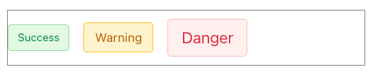
<div
  class="wa-align-items-center wa-gap-m"
  style="border: 1px solid gray; height: 4rem;"
>
  <wa-tag variant="success" size="small">Success</wa-tag>
  <wa-tag variant="warning" size="medium">Warning</wa-tag>
  <wa-tag variant="danger" size="large">Danger</wa-tag>
</div>
The following example lays out child elements using wa-grid:
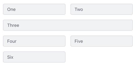
<div class="wa-grid wa-gap-m" style="grid-template-columns: repeat(2, 1fr)">
  <wa-tag>One</wa-tag>
  <wa-tag>Two</wa-tag>
  <wa-tag class="wa-span-grid">Three</wa-tag>
  <wa-tag>Four</wa-tag>
  <wa-tag>Five</wa-tag>
  <wa-tag>Six</wa-tag>
</div>
If you are already familiar with using flexbox and grid layouts directly in CSS, you may find that to be easier than using the layout CSS classes provided by Web Awesome.
Sample Project
Let’s walk through using the following Web Awesome components:
wa-buttonwa-dialogwa-drawerwa-inputwa-progress-barwa-progress-ringwa-radio-groupandwa-radiowa-ratingwa-relative-timewa-switch
All the code for this project can be found in the GitHub repository at web-awesome-sample-project.
-
Create a directory for the project.
-
cdto the project directory. -
Create a
package.jsonfile by enteringnpm init -y. -
Install vite by entering
npm install -D vite. -
Add the following script in
package.json:"dev": "vite" -
Create the file
index.htmlcontaining the following, replacing{CDN}with the CDN URL for Web Awesome:<!DOCTYPE html> <html lang="en"> <head> <title>Web Awesome Demo</title> <link rel="stylesheet" href="{CDN}/dist/styles/webawesome.css" /> <link rel="stylesheet" href="styles.css" /> <script type="module" src="{CDN}/dist/webawesome.loader.js"></script> <script type="module" src="script.js"></script> </head> <body> <h1>Web Awesome Demo</h1> </body> </html> -
Create the file
styles.cssand add the following rule inside it:body { display: flex; flex-direction: column; gap: 1rem; background-color: aliceblue; padding: 2rem; } -
Create the file
script.jscontaining the following:window.onload = () => { // We will add code here later. }; -
Start a local HTTP server by entering
npm run dev. -
Browse
localhost:5173and verify that “Web Awesome Demo” is rendered.
wa-radio-group and wa-radio
Let’s add radio buttons that can be selected to change the color of the page heading.
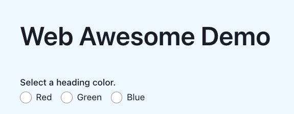
Add the following in index.html at the bottom of the body element:
<wa-radio-group
  id="color-radio"
  label="Select a heading color."
  orientation="horizontal"
  size="small"
>
  <wa-radio value="red">Red</wa-radio>
  <wa-radio value="green">Green</wa-radio>
  <wa-radio value="blue">Blue</wa-radio>
</wa-radio-group>
Add the following in script.js inside the window.onload callback function:
// Find all the DOM elements we need to access.
const colorRadio = document.getElementById('color-radio');

// Configure event handling.
colorRadio.addEventListener('change', () => {
  const h1 = document.querySelector('h1');
  h1.style.color = colorRadio.value;
});
Click each of the radio buttons and verify that
the color of the h1 element changes to the selected color.
wa-input and wa-relative-time
Let’s add a date input for your next dentist appointment. After a date is entered/selected, the difference from now to that date will be displayed with text like “tomorrow” or “in 2 weeks”.
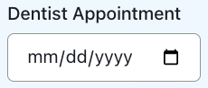
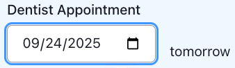
Add the following in index.html at the bottom of the body element:
<div class="wa-align-items-end wa-gap-m">
  <wa-input
    id="date-input"
    label="Dentist Appointment"
    placeholder="date"
    type="date"
  ></wa-input>
  <wa-relative-time id="relative-time"></wa-relative-time>
</div>
Add the following rule in styles.css so the wa-relative-time component
is not rendered until a date is entered:
#relative-time {
  display: none;
}
Add the following in script.js before the call to window.onload:
let relativeTime;

function showRelativeTime(dateString) {
  const date = new Date(dateString);

  // Update the time portion of the date to match the current time.
  const now = new Date();
  date.setHours(
    24 + now.getHours(),
    now.getMinutes(),
    now.getSeconds(),
    now.getMilliseconds()
  );

  relativeTime.setAttribute('date', date.toISOString());
  relativeTime.style.display = 'inline-block';
}
Add the following in script.js at the end of
the window.onload callback function:
const dateInput = document.getElementById('date-input');
relativeTime = document.getElementById('relative-time');
dateInput.addEventListener('change', event => {
  showRelativeTime(event.target.value);
});
Click the calendar icon in the date input. Select the day after today. Verify that the text “tomorrow” appears after the date input. Select other dates and verify that the correct relative date appears.
wa-button, wa-badge, wa-switch
Let’s add a button users can click to see a list of messages that have been received. When unread messages are available, the button will have a badge on its upper-right corner that shows the number of unread messages. There will also be a switch that toggles whether the badge is shown.
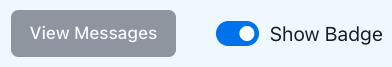
Add the following in index.html at the bottom of the body element.
<div class="wa-align-items-center wa-gap-xl">
  <wa-button id="view-button" disabled size="small">
    View Messages
    <wa-badge attention="pulse" variant="danger" pill></wa-badge>
  </wa-button>
  <wa-switch id="badge-switch" checked>Show Badge</wa-switch>
</div>
Add the following in styles.css to improve the wa-switch styling:
#badge-switch {
  --thumb-size: 15px; /* default seems too small */
}
Add the following in script.js before the call to window.onload:
let badgeSwitch;
let buttonBadge;
let messages = [];
let viewButton;

function updateBadge() {
  buttonBadge.textContent = messages.length;
  const haveMessages = messages.length > 0;
  const checked = badgeSwitch.hasAttribute('checked');
  buttonBadge.style.display = checked && haveMessages ? 'flex' : 'none';
  viewButton.toggleAttribute('disabled', !haveMessages);
}
Add the following in script.js at the end of
the window.onload callback function:
viewButton = document.getElementById('view-button');
buttonBadge = viewButton.querySelector('wa-badge');
badgeSwitch = document.getElementById('badge-switch');

badgeSwitch.addEventListener('change', () => {
  // Keep "checked" attribute in sync with state.
  badgeSwitch.toggleAttribute('checked');
  updateBadge();
});

updateBadge();
The “View Messages” button and the “Show Badge” switch appear now, but we haven’t yet added code to retrieve messages. The badge over the button will not appear until messages are received.
Retrieving Messages
We’ll use a free public API get a new, random message every two seconds.
Add the following in script.js before the call to window.onload:
const MAX_MESSAGES = 20;

async function getMessage() {
  const url = 'https://techy-api.vercel.app/api/text';
  const response = await fetch(url);
  return response.text();
}
Add the following in script.js at the end of
the window.onload callback function:
// Generate up to MAX_MESSAGES.
setInterval(async () => {
  if (messages.length < MAX_MESSAGES) {
    messages.push((await getMessage()) + '.');
    updateBadge();
  }
}, 2000);
Now we see the badge appear on the “View Messages” button. The number increments every time a new message is received. But clicking the button doesn’t yet display the messages.
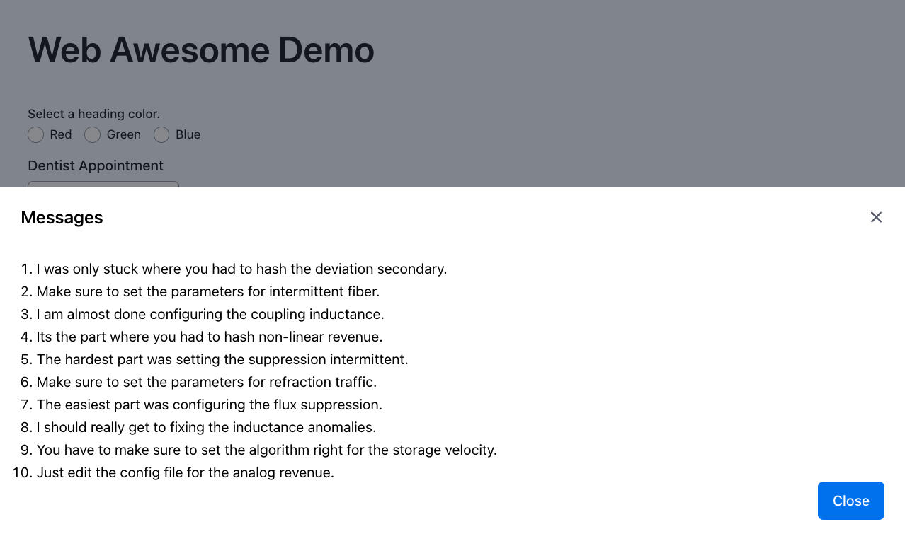
wa-dialog
Let’s add a dialog that displays the messages when the “View Messages” button is clicked.
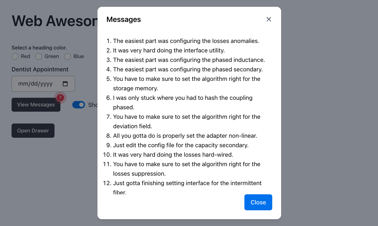
Add the following in index.html at the bottom of the body element.
<wa-dialog id="message-dialog" label="Messages" light-dismiss>
  <div></div>
  <wa-button data-dialog="close" slot="footer" variant="brand">
    Close
  </wa-button>
</wa-dialog>
Add the following in styles.css to so
the dialog close button never touches the last message:
#message-dialog::part(footer) {
  padding-top: 1rem;
}
Add the following in script.js before the call to window.onload:
let messageDialog;

function openContainer(container) {
  const items = messages.map(message => `<li>${message}</li>`);
  const div = container.querySelector('div');
  div.innerHTML = `<ol>${items.join('')}</ol>`;
  messages = [];
  updateBadge();
  container.open = true;
}
Add the following in script.js at the end of
the window.onload callback function:
messageDialog = document.getElementById('message-dialog');
viewButton.addEventListener('click', () => openContainer(messageDialog));
Wait for the badge to increment a few times and then click the “View Messages” button. A dialog will open that displays the messages. The message array is cleared since those messages have now been read, and the badge count returns to zero. The badge disappears until the next message is received.
When there are more messages than fit in the dialog, it automatically gains a scrollbar for viewing all the messages.
wa-drawer
Let’s also add support for displaying the messages in a drawer.
Add the following in index.html at the bottom of the body element.
<div>
  <wa-button id="drawer-button" disabled size="small">Open Drawer</wa-button>
</div>

<wa-drawer id="message-drawer" label="Messages" placement="bottom">
  <div></div>
  <wa-button data-drawer="close" slot="footer" variant="brand">
    Close
  </wa-button>
</wa-drawer>
Add the following in styles.css to so
the drawer close button never touches the last message:
#message-drawer::part(footer) {
  padding-top: 1rem;
}
Add the following in script.js before the call to window.onload:
let drawerButton;
let messageDrawer;
Add the following in script.js at the end of the updateBadge function:
drawerButton.toggleAttribute('disabled', !haveMessages);
Add the following in script.js at the end of
the window.onload callback function:
// This line must precede the call to `updateBadge`.
drawerButton = document.getElementById('drawer-button');

messageDrawer = document.getElementById('message-drawer');
drawerButton.addEventListener('click', () => openContainer(messageDrawer));
Wait for the badge to increment a few times and then click the “Open Drawer” button. A drawer will open from the bottom of the window that displays the messages. Like with the dialog, the message array is be cleared since those messages have now been read.
When there are more messages than can be fit in the drawer, it automatically gains a scrollbar for viewing all the messages.
wa-progress-bar and wa-progress-ring
Let’s add components that indicate the progress in receiving messages. We can use a progress bar or a progress ring. Both are included for demonstration purposes.
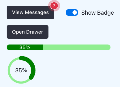
Add the following in index.html at the bottom of the body element.
<wa-progress-bar id="progress-bar" label="Message Progress"></wa-progress-bar>
<wa-progress-ring id="progress-ring"></wa-progress-ring>
Add the following in styles.css to customize the
colors and thicknesses of the progress indicators:
#progress-bar {
  --indicator-color: green;
  --track-color: lightgreen;
  --track-height: 1rem;
  width: 18rem;
}

#progress-ring {
  --indicator-color: green;
  --indicator-width: 12px;
  --size: 5rem;
  --track-color: lightgreen;
  --track-width: 6px;
}
Add the following in script.js before the updateBadge function:
let progressBar;
let progressRing;
Add the following in script.js at the end of the updateBadge function:
const percentComplete = (100 * messages.length) / MAX_MESSAGES;
progressBar.setAttribute('value', percentComplete);
progressRing.setAttribute('value', percentComplete);
progressBar.textContent = `${percentComplete}%`;
progressRing.textContent = `${percentComplete}%`;
Add the following in script.js before the call to updateBadge
inside the window.onload callback function:
progressBar = document.getElementById('progress-bar');
progressRing = document.getElementById('progress-ring');
Refresh the page and notice how both the progress bar and progress ring
show the percent complete toward receiving MAX_MESSAGES.
wa-rating
Let’s add rating hearts that users can click to express how much they like Web Awesome.

Add the following in index.html at the bottom of the body element.
<div>
  <div>Click a star to indicate how much you like Web Awesome.</div>
  <div class="row">
    <wa-rating
      id="rating"
      label="Rating"
      precision="0.5"
      max="10"
      size="large"
    ></wa-rating>
    <span>0</span>
  </div>
</div>
Add the following in styles.css:
#rating {
  --symbol-color: pink;
  --symbol-color-active: red;
  --symbol-spacing: 0.1rem;
}

.row {
  display: flex;
  align-items: center;
  gap: 0.5rem;
}
Add the following in script.js before the call to window.onload:
function configureRating() {
  // This causes the wa-rating component to use hearts instead of stars.
  const rating = document.getElementById('rating');
  rating.getSymbol = () => '<wa-icon name="heart" variant="solid"></wa-icon>';
  rating.addEventListener('change', () => {
    const span = rating.nextElementSibling;
    span.textContent = rating.value;
  });
}
Add the following in script.js at the end of
the window.onload callback function:
configureRating();
A row of ten pink hearts appears now, followed by “0” to indicate that none have been clicked. Try clicking some of the hearts. Clicking the left side of a heart selects a half value, whereas clicking the right side selects a whole value.
Other Libraries
“Open Web Components” maintains a site that lists web component libraries. See Community: Component Libraries.
Summary
Web Awesome provides a large collection of well implemented, highly configurable web components, most of which are free to use. Using these components can greatly jump start projects, removing the need for teams to implement similar components.