Overview
See my talk on Web Components at OCI Tech Lunch - July 2025.
See my updated slides from this talk at Lambda Calculus slides.
Web components define custom HTML elements that can be used just like standard HTML elements. They are defined by a set of standards that include the Custom Elements, Shadow DOM, HTML Templates, and JavaScript Modules.
Web components can be used in any web page, with any web framework, and in Markdown files. This gives them much broader applicability than components implemented using a specific frameworks such as React. Those components can typically only be used in applications that use the same framework.
Web components are more future-proof than other kinds of components because they are likely to be usable in applications built with future web frameworks.
Implementing a web component requires a bit more effort than implementing components using a framework like Svelte. The extra effort is worthwhile for components that will be used in multiple apps written using multiple frameworks. Even if you are only using one web framework today, that may change in the future. The investment in creating high quality, reusable web components is likely to pay off in the long run.
Web components can encapsulate their markup, styles, and functionality by using a “shadow DOM”.
Tags for custom elements cannot be self-closing,
even when they have no content.
For example, <my-element></my-element> is valid, but <my-element /> is not.
HTML parsers only handle a fixed set of
“void elements” that can be self-closing.
Commonly used examples include br, hr, img, input, link, and meta.
DOM Terminology
The term “shadow DOM” refers to DOM nodes that
have an ancestor that is a “shadow root”.
A shadow root is created by calling the HTMLElement attachShadow method.
The term “shadow host” refers to the regular DOM node to which the shadow root is attached.
The term “light DOM” refers to DOM nodes that are supplied as slot content to a web component.
The term “regular DOM” refers to all DOM nodes that are not in a shadow DOM or light DOM.
Pros and Cons
Some of the pros of using web components include:
- only uses web standards
- very portable … can be used in all web frameworks
- no build tools are required unless using TypeScript
Some of the cons of using web components include:
- more tedious to implement than components in frameworks like Svelte
- need to use another library like Lit to simplify
Open UI
Open UI is a W3C Community Group whose goal is “to allow web developers to style and extend built-in web UI components and controls, such as select dropdowns, checkboxes, radio buttons, and date/color pickers.”
The components proposed by this group could eventually work their way into the HTML specification. This would provide native alternatives to some of the web components we might build and use today.
See the list of components being explored at the Open UI link above.
Migrating to Web Components
A recommended way to begin using web components in existing web applications is to identify their UI components that would be useful in other applications and one-by-one rewrite them as web components.
Basic Example
The following file src/greet-message.js defines a web component.
export class GreetMessage extends HTMLElement {
  // This constructor can be omitted for approach #1.
  constructor() {
    super();
    this.attachShadow({mode: 'open'});
  }

  connectedCallback() {
    const name = this.getAttribute('name');
    if (!name) throw new Error('name is a required attribute');

    // Approach #1
    // Using shadow DOM is not required.
    /*
    const div = document.createElement('div');
    div.textContent = `Hello, ${name}!`;
    div.style.color = 'purple';
    this.appendChild(div);
    */

    // Approach #2
    /*
    const div = document.createElement('div');
    div.textContent = `Hello, ${name}!`;
    div.style.color = 'purple';

    this.shadowRoot.appendChild(div);
    */

    // Approach #3
    this.render();
  }

  // attributeChangedCallback will only be called for attributes listed here.
  static get observedAttributes() {
    return ['name'];
  }

  attributeChangedCallback(name) {
    if (name === 'name') this.render();
  }

  render() {
    const name = this.getAttribute('name');
    // Setting innerHTML removes the need to use low-level
    // DOM methods like `createElement` and `appendChild`.
    this.shadowRoot.innerHTML = `
      <div style="color: purple;">Hello, ${name}!</div>
    `;
  }
}

customElements.define('greet-message', GreetMessage);
It is common to use a template literal (in backticks) to construct
the string used as the value of the innerHTML property.
When the string contains an optional HTML element, the following pattern can be used to specify it.
element.innerHTML = `
  <always-present></always-present>
  ${value ? `<optionally-present></optionally-present>` : ''}
  <always-present></always-present>
`;
When the string contains an HTML element with an optional attribute, the following pattern can be used to specify it.
element.innerHTML = `
  <some-element ${value ? `some-attr="${value}"` : ''}></some-element>
`;
The following HTML renders an instance of the web component defined above. It uses Alpine to add a bit of interactivity.
<!DOCTYPE html>
<html>
  <head>
    <title>Web Components Demo</title>
    <script type="module" src="greet-message.js"></script>
    <script
      defer
      src="https://cdn.jsdelivr.net/npm/alpinejs@3.x.x/dist/cdn.min.js"
    ></script>
  </head>
  <body>
  <body x-data="{name: 'World'}">
    <greet-message :name="name"></greet-message>
    <button @click="name = 'Earth'">Change Name</button>
  </body>
</html>
Options
There are three options for implementing web components:
- Do not use a shadow DOM.
- Use an “open” shadow DOM.
- Use a “closed” shadow DOM.
Regardless of the option selected, there are two ways to specify the component DOM:
- Set the
innerHTMLproperty of some object. - Call the
appendChildmethod on some object.
When not using a shadow DOM, “some object” is this.
When using an open shadow DOM, “some object” is this.shadowRoot.
When using a closed shadow DOM, “some object” is
the return value of the attachShadow method.
There are two places where you might consider
specifying the DOM of the web component,
in its constructor or in its connectedCallback method.
While doing this in the constructor sometimes works, it is discouraged.
The reason is that when the constructor runs,
the attributes and child nodes of the custom element are not yet known.
To create a shadow DOM,
call this.attachShadow({mode: "open"})
or this.attachShadow({mode: "closed"}).
The attachShadow method returns a ShadowRoot object.
The recommended mode is “open”, which causes this.shadowRoot
to be set to the same ShadowRoot object that is returned.
When the mode is “closed”, this.shadowRoot is not set.
It either mode, code in the web component
can add nodes to the ShadowRoot object by
setting its innerHTML property or calling its appendChild method.
When the mode is “open”, code outside the web component can
query, add, modify, and delete its nodes and styles.
However, when the mode is “closed”, none of that is possible
unless the web component implements methods that
provide access to descendants of the ShadowRoot object.
For example, calling the querySelectorAll method on a custom element
that uses a shadow DOM in “closed” mode always returns an empty NodeList
regardless of the selector.
In browser DevTools, all ancestors of the ShadowRoot are visible
regardless of the mode.
Libraries That Simplify
Available Web Components
-
“Make something awesome with open-source web components.”
-
“A forward-thinking library of web components.”
-
from Microsoft
-
“Fundamental white label web components for building your design system.”
-
Awesome Standalones from Dave Rupert
“A curated list of awesome framework-agnostic standalone web components.”
-
This web component enables playing Lottie animations. It can be included from a CDN with the following:
<script src="https://unpkg.com/@lottiefiles/lottie-player@0.2.0/dist/lottie-player.js"></script>To render an animation, add the
lottie-playercustom element in HTML as follows:<lottie-player autoplay loop src="https://assets3.lottiefiles.com/packages/lf20_UJNc2t.json" style="width: 250px" > </lottie-player>
For more, see Community: Component Libraries.
Custom Elements
Custom Elements provide a way to define and use custom HTML elements.
A custom element is defined by a JavaScript class that extends HTMLElement.
The following code in the file hello-world.js
demonstrates a very basic web component.
class HelloWorld extends HTMLElement {
  constructor() {
    super();
    this.attachShadow({mode: 'open'});
    this.shadowRoot.textContent = 'Hello, World!';
  }
}
A tag name can be associated with this class as follows:
customElements.define('hello-world', HelloWorld);
The names of custom elements must be all lowercase and contain at least one hyphen (dash). This avoids name conflicts with standard HTML elements.
The name of the class that implements a custom element is not required to correspond to the tag name in any way. However, a common convention is for class names to use CamelCase and element names to use kebab-case.
Often the part before the first hyphen serves as a namespace. For example, all the custom elements provided by Shoelace begin with “sl-”.
The following HTML demonstrates using the custom element defined above.
<!DOCTYPE html>
<html>
  <head>
    <title>Custom Element Demo</title>
    <script type="module" src="hello-world.js"></script>
  </head>
  <body>
    <hello-world></hello-world>
  </body>
</html>
Shadow DOM
The Shadow DOM provides a way to encapsulate the content and styling of a custom element.
Many standard HTML elements utilize a shadow DOM.
Examples include input, audio, video, and detail.
This can be seen by examining such elements
in the Chrome DevTools “Elements” tab.
The “shadow-root” of standard HTML elements
can only be viewed in the DevTools when enabled.
To enable this, click the settings gear icon, scroll to the “Elements” section,
and check “Show user agent shadow DOM”.
The “shadow-root” of custom elements is always visible.
To use a shadow DOM in a web component,
add a line line the following in the constructor
where the value of mode is 'open' or 'closed':
this.attachShadow({mode: 'open'});
To add content to the shadow DOM in a web component,
add a line like the following in the connectedCallback method:
this.shadowRoot.appendChild(someElement);
The CSS display property for custom elements defaults to “inline”.
Often it is desirable to change this to “block” or “inline-block”.
To do this, use the :host CSS pseudo-class.
For example:
<style>
  :host {
    display: inline-block;
  }
</style>
Piercing the Shadow DOM
The CSS defined in web components that create a shadow DOM is scoped to them. It does not “leak out” to affect HTML outside it.
By default, web component styling cannot be modified by users of the web components. There are four workarounds for this, each described below.
Inheritable CSS Properties
Inheritable CSS properties, of which there are many,
can be used by web components.
These include color, cursor, font,
font-family, font-size, font-style, font-variant, font-weight,
letter-spacing, line-height, text-align, text-indent, text-transform,
visibility, and white-space, word-spacing.
For example, suppose we want to set the color used for
label elements in a custom element named dog-data.
In the head element of the main HTML file, add the following:
<style>
  dog-data {
    color: green;
  }
</style>
Then in the web component that defines the custom element, add the following:
<style>
  label {
    color: inherit;
  }
</style>
CSS Variables
Web components can allow specific CSS property overrides by using CSS variables with default values.
For example, suppose we want to allow users of the dog-data
custom element to select the label color which defaults to “purple”.
In the web component that defines the custom element, add the following:
The var above specifies that the color should be the value of the
--dog-data-label-color CSS variable if it is set, and “purple” otherwise.
Then in the head element of the main HTML file, add the following:
<style>
  dog-data {
    --dog-data-label-color: red;
  }

  /* OR */

  :root {
    --dog-data-label-color: red;
  }
</style>
part Attributes
The styles of elements rendered by web components that use a shadow DOM
can be modified if they have a part attribute.
For example, suppose we want to enable
styling a span element in the custom element my-counter:
<span part="count">${this.count}</span>
In HTML that uses the custom element, add CSS like the following:
my-counter::part(count) {
  color: blue;
}
Shared CSS Files
Another way to share styles across components is
to have each refer to the same .css file.
For example, the following main page and two web components
all use the file share.css to get
the same styling for all button elements.
In share.css:
button {
  background-color: cornflowerblue;
  color: orange;
}
In index.html:
<html>
  <head>
    <link rel="stylesheet" href="share.css" />
    <script src="wc-one.js"></script>
    <script src="wc-two.js"></script>
  </head>
  <body>
    <button>Main</button>
    <wc-one></wc-one>
    <wc-two></wc-two>
  </body>
</html>
In wc-one.js:
class WCOne extends HTMLElement {
  constructor() {
    super();
    this.attachShadow({mode: 'open'});
  }

  connectedCallback() {
    this.shadowRoot.innerHTML = /*html*/ `
      <link rel="stylesheet" href="share.css" />
      <button>WC One</button>
    `;
  }
}

customElements.define('wc-one', WCOne);
In wc-two.js:
class WCTwo extends HTMLElement {
  constructor() {
    super();
    this.attachShadow({mode: 'open'});
  }

  connectedCallback() {
    this.shadowRoot.innerHTML = /*html*/ `
      <link rel="stylesheet" href="share.css" />
      <button>WC Two</button>
    `;
  }
}

customElements.define('wc-two', WCTwo);
Forms
Instances of web components that are nested in a form element
cannot by default contribute to the set of name/value pairs
that are submitted by the form.
They are prevented from doing so by the shadow DOM.
However, this can be implemented if
the static property formAssociated is set to true and
the component sets the form values to be contributed to the containing form
using the setFormValue method
on an object returned by the HTMLElement method attachInternals method.
To demonstrate this, let’s create three web components that render a group of radio buttons.
First, we will look at an implementation that does not use a shadow DOM.
Instances of this component can be nested in form elements
and their values will be automatically included in form submissions.
An example instance follows. It takes the required attributes “name” and “options”. The “name” attribute is the name associate with the value in a form submission. The “options” attribute is a comma-separated list of radio button values that are also used for the labels that follow them. It also accepts the optional attributes “default” and “value”. If the “value” attribute is omitted, the “default” value is used. If the “default” attribute is also omitted, the first option is used.
<radio-group-no-shadow
  name="color1"
  options="red,green,blue"
  default="green"
  value="blue"
>
</radio-group-no-shadow>
class RadioGroupNoShadow extends HTMLElement {
  #name;
  #value;

  connectedCallback() {
    this.#name = this.getAttribute('name');
    const options = this.getAttribute('options')
      .split(',')
      .map(option => option.trim());
    this.#value =
      this.getAttribute('value') || this.getAttribute('default') || options[0];

    this.innerHTML = /*html*/ `
      <style>
        :not(:defined) {
          visibility: hidden;
        }

        .radio-group {
          display: flex;
          gap: 0.25rem;

          > div {
            display: flex;
            align-items: center;
          }
        }
      </style>
      <div class="radio-group">
        ${options.map(option => this.#makeRadio(option)).join('')}
      </div>
    `;
  }

  #makeRadio(option) {
    return /*html*/ `
      <div>
        <input
          type="radio"
          id="${option}"
          name="${this.#name}"
          value="${option}"
          ${option === this.#value ? 'checked' : ''}
        />
        <label for="${option}">${option}</label>
      </div>
    `;
  }
}

customElements.define('radio-group-no-shadow', RadioGroupNoShadow);
Next, we will look at an implementation that does use a shadow DOM. It can be used in same way as “radio-group-no-shadow”, but its implementation is a bit more complicated in order to work around the restrictions of the shadow DOM.
class RadioGroupShadow extends HTMLElement {
  static formAssociated = true;
  #default;
  #internals;
  #name;
  #value;

  constructor() {
    super();
    this.attachShadow({mode: 'open'});
    this.#internals = this.attachInternals();
  }

  connectedCallback() {
    this.#name = this.getAttribute('name');
    const options = this.getAttribute('options')
      .split(',')
      .map(option => option.trim());
    this.#default = this.getAttribute('default') || options[0];
    this.value = this.getAttribute('value') || this.#default;

    this.shadowRoot.innerHTML = /*html*/ `
      <style>
        :not(:defined) {
          visibility: hidden;
        }

        .radio-group {
          display: flex;
          gap: 0.25rem;

          > div {
            display: flex;
            align-items: center;
          }
        }
      </style>
      <div class="radio-group">
        ${options.map(option => this.#makeRadio(option)).join('')}
      </div>
    `;

    // Add event listeners to the radio buttons.
    const inputs = this.shadowRoot.querySelectorAll('input');
    for (const input of inputs) {
      input.addEventListener('change', event => {
        this.value = event.target.value;
      });
    }
  }

  formResetCallback() {
    const value = (this.value = this.#default);
    for (const input of this.shadowRoot.querySelectorAll('input')) {
      input.checked = input.value === value;
    }
  }

  handleChange(event) {
    this.value = event.target.value;
  }

  #makeRadio(option) {
    return /*html*/ `
      <div>
        <input
          type="radio"
          id="${option}"
          name="${this.#name}"
          value="${option}"
          ${option === this.value ? 'checked' : ''}
        />
        <label for="${option}">${option}</label>
      </div>
    `;
  }

  get value() {
    return this.#value;
  }

  set value(newValue) {
    this.#value = newValue;
    this.#internals.setFormValue(newValue);
  }
}

customElements.define('radio-group-shadow', RadioGroupShadow);
Finally, we will look at an implementation in TypeScript
that uses the Lit library.
It can also be used in same way as “radio-group-no-shadow”.
This has about the same complexity and number of lines
as the RadioGroupShadow class.
import {LitElement, css, html} from 'lit';
import {customElement, property} from 'lit/decorators.js';

@customElement('radio-group-lit')
export class RadioGroupLit extends LitElement {
  static formAssociated = true;
  #internals;
  #options;

  static styles = css`
    :not(:defined) {
      visibility: hidden;
    }

    .radio-group {
      display: flex;
      gap: 0.25rem;

      > div {
        display: flex;
        align-items: center;
      }
    }
  `;

  @property({type: String}) name = ''; // used in form submission
  @property({type: String}) options = ''; // comma-separated list
  // This is the reset value and
  // the initial value if the "value" attribute is not specified.
  @property({type: String}) default = '';
  @property({type: String}) value = ''; // current value

  constructor() {
    super();
    this.#internals = this.attachInternals();
  }

  connectedCallback() {
    super.connectedCallback();
    this.#options = this.options.split(',').map(label => label.trim());
    if (!this.default) this.default = this.#options[0];
    if (!this.value) this.value = this.default;
  }

  formResetCallback() {
    this.value = this.default;
  }

  // This is called when a radio button or its label is clicked.
  handleChange(event) {
    this.value = event.target.value;
  }

  #makeRadio(option) {
    return html`
      <div>
        <input
          type="radio"
          id="${option}"
          name="${this.name}"
          value="${option}"
          .checked=${option === this.value}
          @change=${this.handleChange}
        />
        <!-- Note the "." before "checked", not "", in order to
             update the "checked" property of the input element
             and not just the checked attribute. -->
        <label for="${option}">${option}</label>
      </div>
    `;
  }

  // This called automatically initially and
  // whenever a property value changes (such as "value").
  render() {
    return html`
      <div class="radio-group">
        ${this.#options.map(option => this.#makeRadio(option))}
      </div>
    `;
  }

  // This is called automatically after every DOM update,
  // such as those triggered by the render method.
  updated() {
    // Keep the form value in sync with the "value" property.
    this.#internals.setFormValue(this.value);
  }
}
All the example implementations above
contribute a single value to a form submission.
A web component that does not use a shadow DOM
can contribute multiple values by simply rendering multiple
input, textarea, and select elements.
A web component that uses a shadow DOM can do this using the FormData class.
For example, the lines that call the setFormValue method
in the RadioGroupShadow and RadioGroupLit classes
can be replaced with the following code:
const data = new FormData();
data.append(this.#name, newValue);
data.append('favoriteNumber', 19);
this.#internals.setFormValue(data);
JavaScript Modules
The JavaScript Modules support exporting and importing functions, classes, objects, constants, and variables.
To use the export and import keywords in a JavaScript source file,
it must be included with a script element like the following:
<script src="{path-to-js-file}" type="module" defer></script>
Including the defer attribute is recommended.
It allows the download of the JavaScript file to occur in parallel
with parsing the HTML and downloading other JavaScript files.
Top-level JavaScript statements in the downloaded files
will not be executed until HTML parsing completes.
Each downloaded file will be executed in the order specified
rather than the order in which each download completes.
HTML Templates
The HTML template element provides a way to define an HTML fragment
that can be cloned and inserted multiple times into a DOM tree.
This is fast because the content of a template element in parsed only once.
The resulting DOM root element is assigned to its content property.
All template elements have their CSS display property set to none,
so their content is not rendered.
Changing the display property to another value does not cause it to render.
To render the contents of a template, create a deep clone and append the clone to another element. This is faster than parsing an HTML string again. For example:
document.body.appendChild(myTemplate.content.cloneNode(true));
Templates can contain slots that are used to insert content.
Each template can contain one unnamed slot and any number of named slots.
This is primarily useful when template elements are cloned by web components.
The following code demonstrates
using a template element inside a web component.
This approach has the advantage that the content of a web component
can be described with HTML instead of creating it using
DOM methods like createElement and appendChild.
However, it has the disadvantage that the web component definition
must assume that a template with a given id has been defined outside it.
HTML does not define a mechanism for including one HTML file into another. So we can’t define templates in a separate file that is included.
class MyCard extends HTMLElement {
  constructor() {
    super();
    this.attachShadow({mode: 'open'});
  }

  connectedCallback() {
    const template = document.getElementById('my-card');
    this.shadowRoot.appendChild(template.content.cloneNode(true));
  }
}

customElements.define('my-card', MyCard);
<!DOCTYPE html>
<html>
<head>
<title>Template Demo</title>
<script src="my-card.js"></script>
</head>
<body>
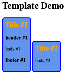
<h1>Template Demo</h1>
<template id="my-card">
<!-- This styling is only scoped when the
template is used in a web component. -->
<style>
.card {
display: inline-block;
background-color: cornflowerblue;
border: 3px solid blue;
border-radius: 0.5rem;
padding: 0.5rem;
}
h2 {
color: orange;
margin-top: 0;
}
</style>
<section class="card">
<h2><slot name="title">Untitled</slot></h2>
<h3><slot name="header" /></h3>
<p><slot name="body" /></p>
<h3><slot name="footer" /></h3>
</section>
</template>
<my-card>
<span slot="title">Title #1</span>
<span slot="header">header #1</span>
<span slot="body">body #1</span>
<span slot="footer">footer #1</span>
</my-card>
<my-card>
<span slot="title">Title #2</span>
<span slot="body">body #2</span>
</my-card>
</body>
</html>
Slots and Parts
A web component can render HTML that includes slots and parts. Slots are locations where content can be inserted. Each web component can have one default slot (unnamed) and any number of named slots.
A web component can identify some of the elements it renders as “parts”. This enables the parts to be styled from outside of the shadow DOM. It is an alternative to using CSS variables to “pierce” the shadow DOM, which was described earlier.
The following example demonstrates a web component that uses both slots and parts.
export class VanillaWC extends HTMLElement {
  constructor() {
    super();
    this.attachShadow({mode: 'open'});
    const root = this.shadowRoot;

    root.innerHTML = `
      <style>
        /* This targets the shadow host. */
        :host {
          display: inline-block;

          border: 1px solid blue;
          padding: 1rem;
          width: 30%;
        }

        /* This targets any top-level child placed in the slot named "nav". */
        slot[name="nav"]::slotted(*) {
          border-bottom: 1px solid blue;
        }

        /* This could be used in place of the previous rule.
        nav {
          border-bottom: 1px solid blue;
        } */

        /* This targets any top-level p elements placed in any slot.
          ::slotted only supports single-element selectors. */
        ::slotted(p) {
          color: green;
          font-style: italic;
        }
      </style>
      <div>
        <h2>Vanilla Web Component</h2>
        <nav><slot name="nav"></slot></nav>
        <div part="header">header</div>
        <p><slot></slot></p>
      </div>
    `;
  }
}
customElements.define('vanilla-wc', VanillaWC);
The ::slotted pseudo-element styles light DOM elements.
It only works in CSS specified inside a shadow DOM.
It applies to actual elements in slots, not text nodes.
The following HTML demonstrates using the web component defined above.
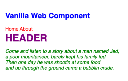
<!DOCTYPE html>
<html>
  <head>
    <title>Web Component Demo</title>
    <style>
      /* This specifies inheritable styles that will be
         used by web components unless overridden. */
      body {
        color: blue;
        font-family: sans-serif;
      }

      /* This targets the part named "header" in the web component. */
      vanilla-wc::part(header) {
        color: purple;
        font-size: 2rem;
        font-weight: bold;
        text-transform: uppercase;
      }

      /* This targets all a elements in light DOM
         which includes the elements inserted into slots. */
      vanilla-wc a {
        color: red;
      }
    </style>
    <script type="module" src="/src/vanilla-wc.js"></script>
  </head>
  <body>
    <vanilla-wc>
      <div slot="nav">
        <a href="/home">Home</a>
        <a href="/about">About</a>
      </div>
      <p>
        Come and listen to a story about a man named Jed,<br />
        a poor mountaineer, barely kept his family fed.<br />
        Then one day he was shootin at some food<br />
        and up through the ground came a bubblin crude.
      </p>
    </vanilla-wc>
  </body>
</html>
Lifecycle Methods
Custom elements have lifecycle methods that are automatically called at specific points during their lifetime or when specific things occur. These include the following.
constructor
This lifecycle method is called automatically when an instance is initially created and again if the custom element definition is modified. It is commonly used for one time initializations such as computing property values.
This method can be omitted if no initializations are required.
If a constructor is included, it must begin with a call to super
which executes the constructor in the superclass HTMLElement.
connectedCallback
This lifecycle method is called automatically after an instance is added to the DOM. This method is typically used to add elements to the DOM of the web component and add event listeners.
An event listener can be a specific method in a web component, or simply this.
When this is specified and the event is dispatched,
the handleEvent method is called, passing it an Event object.
For example:
connectedCallback() {
  const decrementBtn = this.shadowRoot.querySelector('#decrement-btn');
  decrementBtn.addEventListener('click', this.decrement);

  this.incrementBtn = this.shadowRoot.querySelector('#increment-btn');
  this.incrementBtn.addEventListener('click', this);
}

decrement() {
  this.count--;
}

handleEvent(event) {
  if (event.target === this.incrementBtn) {
    this.count++;
  }
}
attributeChangedCallback(name, oldValue, newValue)
This lifecycle method is called automatically when the value of an observed attribute changes.
To define the attributes that are observed, implement the following static method. This cannot be determined dynamically when an instance of the custom element is created.
static get observedAttributes() {
  return ['name1', 'name2', ...];
}

attributeChangedCallback(name, oldValue, newValue) {
  // Do something with the new attribute value.
  this.render(); // assumes this method exists and updates the shadow DOM
}
In Lit, all properties with the @property and @state decorators
are automatically treated as observed properties.
Lit refers to them as “reactive properties”.
disconnectedCallback
This lifecycle method is called automatically
after an instance is removed from the DOM.
It can be used to remove event listeners
and clean up anything done in connectedCallback
if that is needed.
adoptedCallback
This lifecycle method is called automatically when the instance is moved to a different document. This method is rarely used.
Attributes
Attributes can be passed to custom elements in the same way that attributes are passed to standard HTML elements.
The class of a custom element can:
-
get the names of all provided attributes
const attrNames = this.getAttributeNames(); -
get the value of an attribute
const value = this.getAttribute('some-name'); -
set the value of an attribute
this.setAttribute('some-name', someValue);
Elements
The class of a custom element can:
-
create new elements
const el = document.createElement('element-name'); -
find elements within its shadow DOM
const el = this.querySelector('element-name'); const els = this.querySelectorAll('element-name'); -
attach new elements to its shadow DOM
el.appendChild(otherEl); // appends a single element el.append(node1, node2, ...); // appends any number of nodes -
set text content
el.textContent = 'some text'; -
set inner HTML
el.innerHTML = 'some HTML';
Flash Of Undefined Custom Elements (FOUCE)
When a page containing web components is initially rendered, the CSS and JavaScript for the components may not be loaded yet. This can cause FOUCE and layout shift. To avoid this, include the following CSS which prevents rendering components that are not yet “defined”.
:not(:defined) {
  visibility: hidden;
}
A more involved approach using customElements.whenDefined
is described in Waiting for Components to Load.
Counter Example
This section shows four ways to implement a counter web component that contains a minus button, the current count value, and a plus button.
Vanilla with No Shadow DOM
class CounterNoShadow extends HTMLElement {
  static template;

  static get observedAttributes() {
    return ['count'];
  }

  constructor() {
    super();
    CounterNoShadow.template = document.createElement('template');
  }

  attributeChangedCallback() {
    if (this.isConnected) this.update();
  }

  connectedCallback() {
    const {template} = CounterNoShadow;
    template.innerHTML = /*html*/ `
      <style>
        :not(:defined) {
          visibility: hidden;
        }

        .counter {
          display: flex;
          align-items: center;
          gap: 0.5rem;
        }

        button {
          background-color: lightgreen;
        }

        button:disabled {
          background-color: gray;
        }
      </style>
      <div>
        <button id="decrement-btn">-</button>
        <span part="count">${this.count}</span>
        <button id="increment-btn">+</button>
      </div>
    `;

    this.appendChild(template.content.cloneNode(true));

    this.decrementBtn = this.querySelector('#decrement-btn');
    this.decrementBtn.addEventListener('click', () => {
      this.decrement();
    });
    this.querySelector('#increment-btn').addEventListener('click', () => {
      this.increment();
    });

    this.span = this.querySelector('span');
    this.update();
  }

  // Treat the count attribute as the source of truth
  // rather than adding a property.
  get count() {
    return this.getAttribute('count') || 0;
  }

  set count(newCount) {
    this.setAttribute('count', newCount);
  }

  decrement() {
    if (this.count === 0) return;

    this.count--;
    // this.count gets converted to a string,
    // so we have to use == instead of === on the next line.
    if (this.count == 0) {
      this.decrementBtn.setAttribute('disabled', 'disabled');
    }
    this.update();
  }

  increment() {
    this.count++;
    this.decrementBtn.removeAttribute('disabled');
    this.update();
  }

  update() {
    if (this.span) this.span.textContent = this.count;
  }
}

customElements.define('counter-no-shadow', CounterNoShadow);
Vanilla with Shadow DOM “open”
This uses the same template used in the previous example.
class CounterShadowOpen extends HTMLElement {
  static get observedAttributes() {
    return ['count'];
  }

  constructor() {
    super();
    this.attachShadow({mode: 'open'});
  }

  attributeChangedCallback() {
    if (this.isConnected) this.update();
  }

  connectedCallback() {
    const root = this.shadowRoot;
    root.appendChild(CounterNoShadow.template.content.cloneNode(true));

    this.decrementBtn = root.querySelector('#decrement-btn');
    this.decrementBtn.addEventListener('click', () => {
      this.decrement();
    });
    root.querySelector('#increment-btn').addEventListener('click', () => {
      this.increment();
    });

    this.span = root.querySelector('span');
    this.update();
  }

  // Treat the count attribute as the source of truth
  // rather than adding a property.
  get count() {
    return this.getAttribute('count') || 0;
  }

  set count(newCount) {
    this.setAttribute('count', newCount);
  }

  decrement() {
    if (this.count === 0) return;

    this.count--;
    // this.count gets converted to a string,
    // so we have to use == instead of === on the next line.
    if (this.count == 0) {
      this.decrementBtn.setAttribute('disabled', 'disabled');
    }
    this.update();
  }

  increment() {
    this.count++;
    this.decrementBtn.removeAttribute('disabled');
    this.update();
  }

  update() {
    if (this.span) this.span.textContent = this.count;
  }
}

customElements.define('counter-shadow-open', CounterShadowOpen);
Vanilla with Shadow DOM “closed”
This uses the same template used in the previous example.
class CounterShadowClosed extends HTMLElement {
  static get observedAttributes() {
    return ['count'];
  }

  constructor() {
    super();
    // When the mode is "closed", there is no shadowRoot property.
    // This prevents access to the DOM of this component from outside.
    // To access the DOM from inside this component,
    // we must capture the return value of the attachShadow method.
    this.root = this.attachShadow({mode: 'closed'});
  }

  attributeChangedCallback() {
    if (this.isConnected) this.update();
  }

  connectedCallback() {
    this.root.appendChild(CounterNoShadow.template.content.cloneNode(true));

    this.decrementBtn = this.root.querySelector('#decrement-btn');
    this.decrementBtn.addEventListener('click', () => {
      this.decrement();
    });
    this.root.querySelector('#increment-btn').addEventListener('click', () => {
      this.increment();
    });

    this.span = this.root.querySelector('span');
    this.update();
  }

  // Treat the count attribute as the source of truth
  // rather than adding a property.
  get count() {
    return this.getAttribute('count') || 0;
  }

  set count(newCount) {
    this.setAttribute('count', newCount);
  }

  decrement() {
    this.count--;
    // this.count gets converted to a string,
    // so we have to use == instead of === on the next line.
    if (this.count == 0) {
      this.decrementBtn.setAttribute('disabled', 'disabled');
    }
    this.update();
  }

  increment() {
    this.count++;
    this.decrementBtn.removeAttribute('disabled');
    this.update();
  }

  update() {
    if (this.span) this.span.textContent = this.count;
  }
}

customElements.define('counter-shadow-closed', CounterShadowClosed);
Lit
In package.json:
{
  "name": "lit-demo",
  "type": "module",
  "scripts": {
    "dev": "vite",
    "build": "vite build",
    "preview": "vite preview"
  },
  "dependencies": {
    "lit": "^3.0.0"
  },
  "devDependencies": {
    "typescript": "^5.0.0",
    "vite": "^5.0.0"
  }
}
In tsconfig.json:
{
  "compilerOptions": {
    "target": "ES2022",
    "experimentalDecorators": true,
    "useDefineForClassFields": false
  }
}
In counter-lit.ts:
import {LitElement, css, html} from 'lit';
import {customElement, property} from 'lit/decorators.js';

@customElement('counter-lit')
export class CounterLit extends LitElement {
  static styles = css`
    .counter {
      display: flex;
      align-items: center;
      gap: 0.5rem;
    }

    button {
      background-color: lightgreen;
    }

    button:disabled {
      background-color: gray;
    }
  `;

  @property({type: Number}) count = 0;

  private decrement() {
    if (this.count > 0) this.count--;
  }

  private increment() {
    this.count++;
  }

  render() {
    return html`
      <div class="counter">
        <button ?disabled=${this.count === 0} @click=${this.decrement}>
          −
        </button>
        <span>${this.count}</span>
        <button @click=${this.increment}>+</button>
      </div>
    `;
  }
}
In index.html:
<html>
  <head>
    <script src="counter-lit.ts" type="module"></script>
  </head>
  <body>
    <counter-lit count="3"></counter-lit>
  </body>
</html>
wrec
I wanted to see whether I could provide the primary benefits of Lit
using much less code and avoid requiring a build process.
JavaScript classes that implement a web component
simply extend Wrec instead of HTMLElement or LitElement.
The following goals are achieved when using the Wrec superclass:
-
Simplify adding event listeners.
An HTML element can include attributes whose names begin with “on”, followed by the name of a DOM event in any case. The value of these attributes must be the name of a method that will handled the events. For example:
<button onclick="increment">+</button> -
Simplify updating the text content and attribute values of elements to match the value of a given web component property.
For example, the content of the
spanelement below will always be the current value of thecountproperty. The ”$” prefix is required to opt into this behavior.<span>$count</span> -
Simplify updating the text content and attribute values of elements to match the value of a given expression involving any number of web component property.
For example, the
disabledattribute on thebuttonelement below is automatically updated based on the value of the expressioncount === 0. The ”$:” prefix is required to indicate that what follows is a JavaScript expression that can refer to property names.<button disabled="$: count === 0" onclick="decrement">-</button> -
Associate all web component attributes with a web component property so that modifying either causes the other to be modified to the same value.
To demonstrate this:
- Browse the
index.htmlfile shown below in Chrome. - Open the DevTools.
- Click the “Elements” tab.
- Double-click the value of the
countattribute on thecounter-wreccustom element. - Change the value to another number.
- Note that the UI updates to display the new value.
- Click the “Console” tab.
- Enter
$0.count. - Note that the value of this property matches the new attribute value.
- Enter
$0.count = 10. - Note that the UI updates to display the new value.
- Note that the
countattribute on the custom element updates to the new value.
- Browse the
In counter-wrec.js:
import Wrec, {css, html} from '../wrec';

class CounterWrec extends Wrec {
  static properties = {
    label: {type: String},
    count: {type: Number}
  };

  static css = css`
    label {
      font-weight: bold;
    }
    button {
      background-color: lightgreen;
    }
    button:disabled {
      opacity: 0.8;
    }
  `;

  static html = html`
    <label>this.label</label>
    <button onClick="this.count--" type="button" disabled="this.count === 0">
      -
    </button>
    <span>this.count</span>
    <button onClick="this.count++" type="button">+</button>
    <span>this.count < 10 ? "single" : "double"</span> digit
  `;
}

CounterWrec.register();
In index.html:
<html>
  <head>
    <script src="counter-wrec.js" type="module"></script>
  </head>
  <body>
    <counter-wrec label="Level" count="1"></counter-wrec>
    <br />
    <counter-wrec label="Score" count="0"></counter-wrec>
  </body>
</html>
Web Component Documentation
Hunter Smith from Microsoft created several open source tools that aid in documenting web components.
Custom Elements Manifest
Install the analyzer tool which generates a .cem file
from a web component source file which can contain
JSDoc comments that describe its API.
-
cdto the project root directory. -
Enter
npm i -D @custom-elements-manifest/analyzer -
Add the following script in
package.json:"cem": "custom-elements-manifest analyze", -
Enter
npm run cem
Code Bubble
Code Bubble …
-
Enter
npm install code-bubble -
Add the following code to where the code bubble should be rendered. If adding this in a
.htmlfile, wrap it in `.import {CodeBubble} from 'code-bubble'; const options = {}; new CodeBubble(options); -
Add code like the following where the code bubble should be rendered. Note how the ”<” and ”>” characters inside the
codeelement must be escaped by using ”<” and ”>“.<code-bubble> <pre> <code class="language-html"> <hello-world greeting="What's up" name="Mark"> <div slot="before">This line precedes the greeting.</div> <div slot="after">This line follows the greeting.</div> </hello-world> </code> </pre> </code-bubble>
wc-dox
To display documentation for your web components in a web application using data in a custom element manifest file:
-
Enter
npm install wc-dox. -
Add the following code at the root of the web application:
import { setWcDoxConfig } from 'wc-dox/index.js'; import manifest from './custom-elements.json' with { type: 'json' }; setWcDoxConfig(manifest); -
Add one of the following where the documentation should be rendered:
<wc-dox tag="my-element"></wc-dox>
<wc-dox component-name="MyElement"></wc-dox>
Storybook
Storybook can be used to demonstrate and debug web components. The steps to use it are:
-
cdto the project root directory. -
Enter
npm create storybook@latest. -
When prompted “What configuration should we install”, select “Recommended: Component dev, docs, test”
-
If you see the message “We couldn’t detect your project type. (code: UNDETECTED)”, followed by the prompt “Do you want to manually choose a Storybook project type to install”, select “Y”.
-
Select “web_components”.
-
After a few minutes, Storybook will launch in your default web browser.
-
Suppose your web component is defined in the file
src/components/hello-world.js. -
Optionally delete the files in the
storiesdirectory related to thebutton,header, andpagecomponents. -
Create the file
stories/hello-world.stories.jscontaining code like the following:import '../src/hello-world.js'; export default {title: 'Components/hello-world'}; const html = String.raw; export const Default = () => html`<hello-world></hello-world>`; export const WithName = () => html`<hello-world name="Mark"></hello-world>`; export const WithGreetingAndName = () => html`<hello-world greeting="What's up" name="Mark"></hello-world>`; export const WithSlots = () => html` <hello-world greeting="Welcome aboard" name="Captain" > <div slot="before">This line precedes the greeting.</div> <div slot="after">This line follows the greeting.</div> </hello-world>`; -
To run Storybook again, enter
npm run storybook
Web Components Language Server
This is a VS Code extension for VS Code that provides:
- IntelliSense
This provides auto-completion for web component properties, methods, and events. It also provides type-aware suggestions based on component definitions.
- Advanced Code Analysis
This provides real-time validation of web component syntax and structure. It also provides error detection for common web component patterns.
-
Code Navigation
-
Executing the “Go to definition” command on a custom element navigates to the relevant position the in the Custom Elements Manifest.
In the future this will be available for other IDEs and editors.