Overview
SwiftUI is a Swift framework for building iOS, iPadOS, watchOS, macOS, and tvOS apps. It is an alternative to its predecessor UIKit.
By comparison SwiftUI ...
- is declarative in nature than imperative
- emphasizes use of structs over classes (UIKit uses classes)
- requires far less code to do the same things
- has somewhat better performance
- only runs on iOS 13 and above
- is currently missing some features of UIKit
(ex. SwiftUI
Textis less powerful than UIKitUITextView.) - doesn't use Storyboard to build views
- doesn't use
AppDelegateorSceneDelegate(read about these here)
While much code can be reused between apps that target different platforms, SwiftUI is not intended to be used for creating single apps that run on multiple platforms. Some features of SwiftUI are only available on specific platforms.
Many SwiftUI views are built on UIKit components, but knowing their relationships is not necessary.
It is possible to use UIKit components in a SwiftUI app by wrapping them in a struct that conforms to the UIViewRepresentable protocol. However, there is enough functionality in SwiftUI that this is typically not necessary.
To use SwiftUI in a source file, add import SwiftUI at the top of the file.
Most example code here assumes this is done and does not include it.
Getting Started
- Open Xcode which includes Swift and SwiftUI.
- Select "Create a new Xcode project".
- Select an Application type such as "App" and click "Next".
- Enter a Product Name.
- Select a Team such as "your name (Personal Team)".
- Enter an Organization Identifier such as your email address.
- Select an Interface such as "SwiftUI".
- Select a Language such as "Swift".
- Check "Use Core Data" to enable persisting data in a local database.
- Check "Include Tests" to get a jump start on enable writing unit tests.
- Click "Next".
- Select the directory where the project will be stored and click "Create".
The new project will have the following structure and files:
A new "App" project begins with a group that has the same name as the project. The group contains the following files:
-
{ProjectName}App.swiftThis defines the main struct which implements the
Appprotocol. It is preceded by the@mainattribute which marks the entry point of the app. It has a computed property namedbodywhose value implements theSceneprotocol. The actual value is an instance ofWindowGroup. This renders an instance ofContentViewwhich is defined in the next file. Apps for macOS and iPadOS can specify more than one window in theWindowGroup, but iOS and watchOS apps cannot. iOS will render all the windows as if they were in aVStack. -
ContentView.swiftThis defines the
ContentViewstruct which implements theViewprotocol and is the topmost view. It also defines theContentView_Previewsstruct which describes the previews that should display in the Canvas area. This can be one or more views that are each displayed in a separate Preview. -
Assets.xcassetsThis associates names with assets such as colors, images, and data files. It is not used for audio and video files. Initially this only contains
AccentColorandAppIconthat both have no value. -
Preview ContentgroupThis contains the file
Preview Assets.xcassetswhich holds assets that are only used to previews of views. -
{ProjectName}.xcodeprojThis file is not visible in the Project Navigator, but can be viewed and edited by clicking the top entry in the Project Navigator. The editor for this data contains the following tabs: General, Signing & Capabilities, Resource Tags, Info, Build Settings, Build Phases, and Build Rules. The General tab configures the app display name, version of iOS, targets (iPhone, iPad, or Mac), status bar style, and more.
To add a particular kind of provided UI View in a .swift file,
manually enter code or click where it should go in the code
and click the "+" in the upper-right of the Code Editor.
Clicking the "+" displays the Object Library dialog
that contains a list provided view types.
Selecting one displays related documentation and code examples.
Double-click a view type to insert code for it at the cursor
or drag a view type to the desired code location.
To change the device being simulated, click the device drop-down after the app name near the top and select the device type (such as "iPhone 13").
Press the black, right-pointing triangle near the top to build and run the initial version of the app in the simulator.
To change the target version of iOS, click the app name at the top of the Navigator, click the "General" tab, and select an iOS version from the dropdown in the "Deployment info" section.
To change the name displayed below the app icon, click the app name at the top of the Navigator, select the app target, and modify the value of "Display Name".
Canvas / Preview
The Canvas area displays Previews of the UI running outside of a simulator. To hide/show the Canvas area, select Editor ... Canvas or press cmd-option-return. If Preview isn't running inside the Canvas area, press the "Resume" button at the top to start it or press cmd-option-p.
By default a preview of the view is only displayed when the file that defines it is selected in the Navigator. To keep the preview of a specific view in the Canvas area even when a different file is selected, select its source file in the Navigator and click the pin icon in the lower-left of the Canvas.
When code changes are saved and there are no errors, the Preview is automatically updated. When there are errors, the Preview pauses and must be manually restarted by click the "Resume" button or pressing cmd-option-p.
If the Canvas area displays the message "Failed to build" in the upper-left, click the "Diagnostics" button in the upper-right to see error messages.
Typically views are added to the body of the currently selected source file
by typing code into the editor pane.
Another way to do this is to:
- Open the Preview.
- Open the Library (press cmd-shift-l).
- Select the "Show the Views Library" tab.
- Drag a view over the Preview without dropping it.
- Note the popup below the Preview that indicates how it will be added.
- Drop the view onto the Preview.
- Configure the view in the Inspector on the right.
To zoom in and out on the Preview area, click the magnifier glass icons in the lower right (minus and plus) or select a zoom level from the percent dropdown.
The Preview is in "Live Preview" mode by default. Key things to know about not being in this mode include:
- Clicking a View in the Preview selects it rather than triggering tap events. The corresponding code is highlighted and the Inspector changes to show the properties of the selected View.
- Double-clicking a View in the Preview is similar, but moves focus to the code so it can be edited.
- Clicking a View in the code selects the corresponding View in the Preview and also populates the Inspector.
- Changes made in the Inspector update the Preview and the code, but they do not take effect until focus is moved out of the modified Navigator field. This is a great way to learn about supported view modifiers and their syntax.
When "Live" mode is off, click the button with a triangle inside a circle to turn it on. This allows tap events to be honored and enables scrolling by dragging. Clicking this also triggers the Preview to resume if it is paused and rebuilds the code.
Output from print calls does not appear in the Debug area
when interacting with a preview.
This is a serious deficiency!
To rotate the display to landscape mode, click the button above the display that contains a square with a curved arrow on its upper-left corner. This only works when not in "Live Preview" mode. The same button appears in the Simulator.
It is possible for the Preview area to show more than one preview.
This is controlled by the ContentView_Previews struct
defined in ContentView.swift.
For example, the following renders
ContentView in portrait orientation and light mode,
ContentView in landscape orientation and dark mode.
struct ContentView_Previews: PreviewProvider {
    static var previews: some View {
        ContentView()
            .previewInterfaceOrientation(.portrait)
            .preferredColorScheme(.light)
        ContentView()
            .previewInterfaceOrientation(.landscapeLeft)
            .preferredColorScheme(.dark)
    }
}
Note that if any of the previews are in "Live Preview" mode, only that preview will be displayed. Exit out of that mode to get the other previews to display again.
To reduce the size of previews to only show their content
and not the surrounding device chrome,
call .previewLayout(.sizeThatFits).
Inspector
The Inspector shows commonly used modifiers of the selected view. To see additional modifiers, click "Add Modifier" at the button of the Inspector. Optionally type part of a modifier name to filter the list. Click a modifier to add it to the Inspector. To stop displaying a modifier in the Inspector, hover over it and click the "Delete" button that appears.
Apple Human Interface Guidelines (HIG)
Apple documents guidelines for building user interfaces at Human Interface Guidelines. This includes recommendations for macOS, iOS, watchOS, and tvOS user interfaces.
The guidelines for iOS are divided into several categories, three of which are Bars, Views, and Controls. The following summarizes what is found in those sections and how the described components map to SwiftUI views.
SF Symbols
See SF Symbols.
App Icons
Each app can have an app icon that is uploaded into the Assets.xcassets file
using the provided "Image Set" name "AppIcon"
which initial has no associated image.
To add an app icon, click Assets.xcassets in the Project Navigator,
select AppIcon, and drag an image into its editor.
When creating an iOS or watchOS app there are two options for adding an app icon, "All Sizes" and "Single Size". Select one of these in the Inspector on the right. A single size icon must have the dimensions 1024 x 1024. When "All Sizes" is selected, a different icon must be dragged into the editor for many different sizes.
SVG images are not supported for app icons. To convert an SVG image to another format such as PNG, consider using cloudconvert.
Avoid app icons with transparent backgrounds because the transparent area will be rendered in black.
Bakery from Jordi Bruin is an excellent macOS app for creating app icons. It supports specifying the following aspects of an icon:
- background color with optional gradient (selected from a provided palette or custom colors selected from the system color picker)
- one or two layers where each displays an SF Symbol, emoji, or custom image
- location of each image inside the icon (by dragging)
- size of each image inside the icon (by adjusting a slider)
- rotation of each image inside the icon (by adjusting a slider)
- color of each SF Symbol used (selected from a provided palette or custom colors selected from the system color picker)
- thickness of each SF Symbol used (selected from a dropdown menu)
Bakery displays the warning message "Note that these icons should only be used for development purposes, not for submissions to the App store due to the license on SF Symbols and Emoji." Fortunately any image, including SVG images, can be dragged onto the preview icon to use in place of SF Symbols and emoji.
Once an app icon has been designed, Bakery can generate an icon set
containing various icon sizes ready for dragging in Assets.xcassets.
This displays the icon on the screen outside the app with instructions
to drag it onto the Assets.xcassets editor in Xcode.
Additional features can be unlocked by upgrading to "Pastry Chef" which has four suggested prices, all of which unlock all the features.
Views
Every visible part of an app created with SwiftUI is a view and views can render other views.
Views are used for both components and layout. Views that layout other views are often referred to as "container" or "combiner" views.
Views in SwiftUI are structs that conform to the View protocol.
The only requirement this imposes is that conforming types
must define a body computed property whose type is some View
which is an opaque type.
The some keyword describes an "opaque type".
In this case it means that body can return
an instance of any type that conforms to the View protocol.
It should be fast to compute the value of a body property.
For example, evaluating a body property should not require
waiting on network calls.
It should also not cause side effects such as
changing @State or @Published properties.
A body definition can contain any number of top-level views.
These are automatically wrapped in a TupleView
which becomes the single view that is returned.
By default this positions its child views vertically like a VStack.
Most properties declared in a View struct should be private.
Exceptions include the body property and
any properties that are passed in when instances are created.
The body value is a ViewBuilder that
can contain up to 10 child view instances.
When this limit is exceeded, the rather unhelpful error
"Extra argument in call" will be reported.
The Group view can be used to work around this limitation
since each Group only counts as one view instance.
Functions that create views often take a ViewBuilder their last argument.
These are typically written as trailing closures.
Views can be given an explicit identifier with the .id method
that is passed an identifier.
This is useful in methods that take a view identifier
like the ScrollViewReader method scrollTo.
To cause a view to take the full width of the screen,
apply the frame view modifier.
For example, myView.frame(maxWidth: .infinity).
In can also be useful to specify the height.
For example, myView.frame(maxWidth: .infinity, maxHeight: 100).
Many views utilize the app accent color, also referred to as "global tint".
To set this, select the Assets.xcassets file in the Navigator,
select "AccentColor", click the "Universal" swatch,
and click the "Color" dropdown in the Inspector.
This does not affect Toggle views which require using the view modifier
.toggleStyle(SwitchToggleStyle(tint: someColor)).
The following sections describe the views defined by SwiftUI.
Container Views
-
- an alert that presents two or more choices related to the current context
- on small screens, slides in from bottom
- on large screens, appears as a Popover
- can use to request confirmation before a destructive operation
- SwiftUI creates this with
ActionSheet, but that is deprecated. TODO: What takes its place? Perhaps it must be created usingSheet.
-
- a set of activity buttons applicable in current context such as Copy, Add, or Find
- also referred to as a "share sheet"
- appears as a Sheet or Popover
- SwiftUI creates this with what? TODO: Is this supported in SwiftUI? Maybe UIKit is required.
-
- a modal dialog with a title, optional message, one or more buttons, and optional input text fields
- avoid having more than two buttons
- minimize usage to important situations
- SwiftUI creates this with the
alertview modifier that can be called on any kind of view. See the Alerts section.
-
- manages an ordered set of content, like photos presented as a grid of thumbnails
- tap an item to select
- touch and hold an item to edit
- swipe to scroll
- SwiftUI creates this with what? TODO: Is this supported in SwiftUI? Maybe UIKit is required.
-
- displays a single image or an animated sequence
- can fill the entire display
- SwiftUI creates this with
Image
-
- implements linear navigation between a set of related pages using either scrolling or page curl effects
- SwiftUI provides this in
TabViewwhen it has atabViewStyleview modifier with a value of.page. See an example in the TabView section.
-
- a modal or non-modal dialog displayed in response to tapping a control or tapping in an area
- typically renders a "tail" pointing to what triggered it
- can contain many kinds of elements including Navigation Bars, Toolbars, Tab Bars, and more
- avoid using on iPhones
- SwiftUI creates this with the
popoverview modifier
-
- scrolls content larger than the visible area
- displays transient scrolling indicators
- can operate in paging mode
- can support zooming
- SwiftUI creates this with
ScrollView
-
- a card that partially covers the primary content
- used to perform a task related to current context
- top corners are rounded and can customize the radius
- there are two available heights, large (default) and medium
- modal by default
- SwiftUI creates this with the
sheetview modifier. See an example in the Modal Dialogs section.
-
- presents hierarchical data with two or three columns: primary, supplementary, and content
- selections in primary cause changes in supplementary
- selections in supplementary cause changes in content
- highlights current selections
- used in Mail app where primary is a list of mailboxes, supplementary is a list of messages in the selected mailbox, and content is the content of the selected email
- SwiftUI doesn't directly support this, but
similar functionality can be implemented using
NavigationView. This displays side-by-side views on iPads in landscape mode.
-
- a scrolling, single-column of rows that are each divided into sections
- can use for navigation in a Split View
- three styles: plain, grouped, and inset grouped
- not a data grid like in other UI frameworks
- SwiftUI uses the
Listview in place of the UIKitUITableViewview.Listis easier to use. It doesn't require specifying the number of rows, and cells don't need to be configured. Instead aListis composed of rows that each know how to arrange and display their data. See the List section.
-
- multi-line styled text
- optional scrolling
- can control alignment, font, and color
- can be editable and if so can specify a keyboard type; see the UIKeyboardType enum
- SwiftUI creates this with a combination of
TextandAttributedString. See the AttributedString section.
-
- renders embedded HTML or HTML from a web site
- can enable forward and backward navigation
- SwiftUI does not include support for web views.
WKWebViewcan be used, but setting it up in SwiftUI app is not trivial.
Controls
-
- several predefined button styles are supported including
- toggle: different from
Toggleview - pop-up: displays a menu of mutually exclusive options; after choosing an option the button content can change to indicate the selection
- pull-down: displays a menu of items that relate to the button purpose; button content never changes
- toggle: different from
- predefined sizes are small, medium, and large
- predefined styles include plain, gray, tinted, and filled (used for most likely action)
- can include an SF Symbol icon
- can have a
roleofnormal,primary,cancel, ordestructive - can be a close button (x in a circle) that closes the parent view
- can be an info button (i in a circle) that displays information about the parent view
- SwiftUI creates this with
Button
- several predefined button styles are supported including
-
- displays a currently selected color in a circle
- when tapped, displays the system color picker to change the selected color
- SwiftUI creates this with
ColorPicker
-
- displays a menu of context-sensitive items when the menu label is tapped
- can contain sub-menus
- can include separators to group options
- SwiftUI creates this with
Menu
-
- a provided horizontal menu that is displayed when a long press occurs in a text field, text view, web view, or image view
- by default contains buttons for Cut, Copy, Paste, Select, Select All, Delete, Replace..., Look Up, and Share...
- can disable any of the default buttons to remove them
- SwiftUI provides this automatically when a long press occurs
in a
TextFieldorTextEditor.
-
- renders an icon and/or text
- takes a String for the text and an
systemImagestring that is the name of an icon in SF Symbols - by default displays both
- to render only the text, add the modifier
.labelStyle(TitleOnlyLabelStyle) - to render only the icon, add the modifier
.labelStyle(IconOnlyLabelStyle)
-
- a row of indicator images that represent pages in a list
- can handle any number of pages
- image for current page is highlighted
- can customize images
- SwiftUI provides this in
TabViewwhen it has atabViewStyleview modifier with a value of.page. See an example in the TabView section.
-
- displays distinct values in a scrollable list and allows users to select one
- SwiftUI creates this with
PickerandDatePicker
-
- informs users that an activity is running in the background
- can indicate how much longer it will run using a progress bar
- "activity indicators" are for indeterminate activities
- SwiftUI creates this with
ProgressView
-
- becomes visible when a user pulls down on a view to request a content reload
- usually used in a table view
- SwiftUI creates this with the
refreshableview modifier which is often used onListviews
-
- a set of toggle buttons
- can use in place of web UI radio buttons
- can use to select between different kinds of views
- SwiftUI creates this with
Picker(...).pickerStyle(.segmented)
-
- a horizontal track with a thumb that slides between minimum and maximum values
- can display text and/or icons on leading and trailing ends
- SwiftUI creates this with
Slider
-
- pair of minus and plus buttons that decrement and increment a value
- can replace "-" and "+" with images
- doesn't display current value
- SwiftUI creates this with
Stepper
-
- a toggle between mutually-exclusive states
- can set tint to match app theme
- usually used in table rows with a label on the leading side
- SwiftUI creates this with
Toggle
-
- single-line text input with fixed height
- usually has rounded corners
- brings up on-screen keyboard when tapped
- can contain placeholder text which is preferred over preceding with a label
- optionally includes a clear button (x in a circle)
- can mask inputs like passwords
- can include images on leading and/or trailing sides
- can specify a keyboard type defined by the UIKeyboardType enum
- SwiftUI creates this with
TextField,SecureField, andTextEditor(multi-line).
View Size
SwiftUI executes the following steps to determine the size of each view:
- The parent view proposes a size to each child view.
- Each child view selects a size considering six values:
minWidthandminHeightmaxWidthandmaxHeightidealWidthandidealHeight
- The parent view must honor the size selected by each of its children and uses those sizes to determine their layout.
For the Image view, minWidth and minHeight
default to the actual size of the image.
The fixedSize view modifier creates a new wrapping view whose
minimum size values are the ideal size values
of the view to which it is applied.
It is possible to fix the size in only one dimension
by specifying horizontal and vertical Bool arguments.
Frames
To specify the width, height, and alignment of a view, apply the frame view modifier. The frame of a view is only considered for determining layout. To clip a view so any content outside its frame is hidden, apply the clipped view modifier.
Constants
Custom views often make use of constants.
One recommended way to define constants that are used by multiple source files
is to place them in the file Constants.swift.
The contents of this file could be similar to the following:
struct Constants {
    static let someValue = 19

    struct Colors {
        // This uses a custom Color initializer takes a hex parameter.
        // It is defined in a Color extension in the Colors section below.
        static let background = Color(hex: 0xf1faff)
        static let disabled = Color.gray
        static let primary = Color(hex: 0x006197)
        static let secondary = Color(hex: 0x3eb3e5)
    }
}
Note how a nested struct is used to group related constants.
An example reference to one of these is Constants.Colors.primary.
Extracting Views
When the body of a view is longer than what can be displayed on the screen
it is a good idea to extract some of the content.
There are four ways to move some content from a view to another location:
- Move it to a constant property (
let) if it never changes. - Move it to a computed property (
var) if it can change. - Move it to a method (
func) if the current location needs to supply data (by passing arguments). - Move it to a new
structthat inherits fromViewand has its ownbodyproperty.
Creating a computed property is useful for cases where the extracted code is only useful in the current view and no arguments need to be provided. Creating a method is similar, but allows arguments to be passed. Creating a new struct is useful when the new view might be used by other views. In this case, consider moving it to its own source file.
Command-click a view to get a context menu that contains the options "Extract to Variable", "Extract to Method", and "Extract Subview".
Icons
SF Symbols
is a library of over 4000 icons provided by Apple.
To use it, browse the website linked above and click the "Download" link.
This downloads a .dmg file.
Double-click this and double-click the .pkg file icon to install
the library and the "SF Symbols" app.
To discover icon names, launch the "SF Symbols" app,
browse the collection of icons, and click them.
To use an icon in a SwiftUI app, add an Image view. For example:
Image(systemName: "heart").font(.largeTitle)) // one way to set font size
Image(systemName: "cloud.snow").font(.system(size: 64)) // another way
The size, weight, and color of an SF Symbols icon
can be specified using the same view modifiers
as are used to style Text views.
Some SF Symbols do not have a 1-1 aspect ratio,
so using the frame modifier with the same values for width and height
can skew them.
Some SF Symbols support multiple colors and optional parts. For example:
To use FontAwesome icons, select File ... Add Packages... and enter the URL https://github.com/onmyway133/FontAwesomeSwiftUI in the search input in the upper-right. Select FontAwesomeSwiftUI and press the "Add Package" button.
To render a FontAwesome icon, call FontAwesome.register()
and pass icons to the Text view.
For example, Text(AwesomeIcon.aws.rawValue).
Bars
-
- appears at top of screen below status bar
- enables navigation through hierarchical screens
- provides a leading back button
- can have trailing buttons like "Edit" and "Done"
- can have a tint color
- can have an inline or large title
- can use a "Segmented Control" in place of title
- SwiftUI creates this with
NavigationView
-
- a text input for entering search text
- has magnifier glass icon
- can display in a Navigation Bar
- can include clear and confirm buttons
- SwiftUI creates this with the
searchableview modifier can be applied to a view that is inside aNavigationView. See an example in the Search section.
-
- provides app-level navigation to top-level collections of content
- for example, the Mail app displays a list of mailboxes in a sidebar
- selecting an item in the sidebar changes what is displayed in the pane that follows
- SwiftUI creates this by applying the listStyle view modifier to a
Listview, passing it.sidebar. See an example in the Sidebars section.
-
- appears at top of screen above Navigation Bar
- the system provided Status Bar displays the time on the left and indicators for cell strength, WiFi strength, and battery remaining on the right
- can style to light or dark mode and customize colors
- should not replace with a custom status bar
- can temporarily hide it, but should never permanently hide it
- to hide the system status bar, apply the statusBarHidden view modifier to the top
NavigationView - SwiftUI needs nothing to support this because the system provides it
-
- used to navigate to top-level app sections (groups of related pages)
- appears at bottom of screen
- SwiftUI creates this with
TabView
-
- contains buttons that perform page-specific actions
- appears at bottom of screen
- SwiftUI creates this with the
toolbarview modifier andToolbarItemGrouporToolbarItemviews. See an example in the Toolbars section.
Core Graphics (CG)
Several types used in views have names that begin with "CG" which stands for "Core Graphics". These include:
-
CGAffineTransformThis holds a transformation matrix used in 2D transformations.
-
CGColorCGColoris a type used by Core Graphics to represent colors. It is typically only used to apply color operations in Core Graphics contexts like CGImage and CGLayer. -
CGFloatThis holds a floating point value whose size depends on the CPU architecture. It can be 32 or 64 bits.
-
CGPointThis holds
xandyproperties that haveCGFloatvalues. -
CGRectThis holds an
originproperty that is aCGPointand asizeproperty that is aCGSize. It also has the following computed properties withCGFloatvalues:height,width,minX,maxX,minY,maxY,midX, andmidY. -
CGSizeThis holds
widthandheightproperties that haveCGFloatvalues. -
CGVectorThis holds
dxanddyproperties that haveCGFloatvalues.
ViewBuilders
A ViewBuilder is a parameter type that is function
that takes no arguments and returns a View.
It uses list-oriented syntax to describe a list of
one to ten other views that are combined into a single view.
Note that a ForEach view counts as a single view.
A ViewBuilder is a kind of result builder.
For more information on these, see the Result builders proposal.
The last argument of container view initializers has the type ViewBuilder.
This allows a list of child views to be supplied using a trailing closure.
ViewBuilder blocks are parsed differently by the compiler
than ordinary closures.
In addition to containing views,
they can also contain local variable declarations and
conditional logic with if, if let, and switch statements.
However, no other Swift syntax is allowed inside them.
For iteration in a ViewBuilder, use a ForEach View.
There is no corresponding view for conditional logic,
so if and switch statements are used instead.
Functions that have a return type of some View
must always return the same kind of view.
When conditional logic is used inside a function
to decide which kind of View to return,
there are a few ways to satisfy this requirement, shown below.
It is usually best to avoid writing functions
that can can return multiple kinds of views.
struct ContentView: View {
    /*
     // This doesn't compile because it can return two kinds of Views.
     private func doesNotCompile(_ condition: Bool) -> some View {
         if condition {
             Text("Hello, World!")
         } else {
             Color.red.frame(width: 100, height: 100)
         }
     }
     */

    private func useGroup(_ condition: Bool) -> some View {
        Group {
            if condition {
                Text("Hello, World!")
            } else {
                Color.red.frame(width: 100, height: 100)
            }
        }
    }

    private func useAnyView(_ condition: Bool) -> some View {
        if condition {
            return AnyView(Text("Hello, World!"))
        } else {
            return AnyView(Color.red.frame(width: 100, height: 100))
        }
    }

    @ViewBuilder
    private func useViewBuilder(_ condition: Bool) -> some View {
        if condition {
            Text("Hello, World!")
        } else {
            Color.red.frame(width: 100, height: 100)
        }
    }

    var body: some View {
        VStack {
            useGroup(true)
            useGroup(false)
            useAnyView(true)
            useAnyView(false)
            useViewBuilder(true)
            useViewBuilder(false)
        }
    }
}
@ViewBuilder is a custom parameter attribute used to indicate
that a parameter accepts ViewBuilder closure that returns a list of views.
This is similar to the concept of "slots" in some web frameworks
which allow chunks of HTML to be passed to and rendered by a component.
The following example implements a custom view
that takes two @ViewBuilder parameters.
These represent views for the front and back of a card.
Tapping the card causes it to flip to the other side with a 3D animation.
// Since each ViewBuilder parameter can result in a different kind of View,
// we need two generic parameters to represent their types.
struct Card<V1, V2>: View where V1: View, V2: View {
    @ViewBuilder let front: V1
    @ViewBuilder let back: V2

    @State private var backDegrees = 90.0 // goes from 90 to 0
    @State private var frontDegrees = 0.0 // goes from 0 to -90
    @State private var isFlipped = false

    typealias Axis = (x: CGFloat, y: CGFloat, z: CGFloat)

    let axis: Axis = (x: 0, y: 1, z: 0)
    let cardHeight = 300.0
    let cardWidth = 200.0
    let cornerRadius = 20.0
    let duration: CGFloat = 0.3

    var body: some View {
        ZStack {
            front
                .frame(width: cardWidth, height: cardHeight)
                .clipShape(RoundedRectangle(cornerRadius: cornerRadius))
                .rotation3DEffect(
                    Angle(degrees: frontDegrees),
                    axis: axis
                )
            back
                .frame(width: cardWidth, height: cardHeight)
                .clipShape(RoundedRectangle(cornerRadius: cornerRadius))
                .rotation3DEffect(
                    Angle(degrees: backDegrees),
                    axis: axis
                )
        }
        .onTapGesture {
            flip()
        }
    }

    private func flip() {
        isFlipped.toggle()
        if isFlipped {
            withAnimation(.linear(duration: duration)) {
                frontDegrees = -90
            }
            withAnimation(.linear(duration: duration).delay(duration)) {
                backDegrees = 0
            }
        } else {
            withAnimation(.linear(duration: duration)) {
                backDegrees = 90
            }
            withAnimation(.linear(duration: duration).delay(duration)) {
                frontDegrees = 0
            }
        }
    }
}
The Card view above can be used as follows:
Card(
    front: {
        ZStack {
            Color.red
            Text("Front").font(.largeTitle)
        }
    },
    back: {
        ZStack {
            Color.blue
            Text("Back").font(.largeTitle)
        }
    }
)
Property Wrappers
Swift property wrappers attach logic to the properties of classes, structs, and enums.
SwiftUI supports the property wrappers described below and custom property wrappers can be defined. See Property Wrappers in the Swift blog page.
@State
Views often get data from view model objects,
especially when the data is used by multiple views.
When data is only used by a single view, the @State
property wrapper can be applied to a property of the view.
This essentially creates a constant pointer inside a view struct
to non-constant data held in the property wrapper.
It allows a view instance to maintain state.
When the value of a normal struct property
(declared without a property wrapper)
is modified, a new instance of the struct is created.
This happens because structs are value types.
We don't want a new instance to be created for structs that represent views.
Applying the @State property wrapper to a struct property
prevents this because SwiftUI manages the value inside the property wrapper
rather than in the view struct.
When the value of this kind of property is changed,
the view body is recomputed.
This is somewhat like the useState hook in React.
Properties declared with @State should include the private
access control keyword because the data is only used by that view.
The @State view modifier is intended for storing basic values
with types like Bool, Int, Double, and String.
An @State property can also store more complex types.
However if it is used to store a class instance (a reference type)
and a property of the class is modified,
the associated view body will not be recomputed.
A new class instance must be created to trigger an update.
Using a struct instead of a class
in the scenario described above does work.
The reason is that changing the value of a struct property
creates a new instance of the struct.
However, this may not be desirable because it makes a copy of the struct.
Updates to @State properties should occur in the main queue.
To do this from asynchronous code, wrap the update as follows:
Task { @MainActor in
    myState = newValue
}
To initialize a state property based on
data passed to an initializer (init method),
prefix the state property name with an underscore
and set it to a State object with an initialValue argument.
The following example demonstrates using component state to implement a counter view:
struct Counter: View {
    @State private var count: Int

    init(start: Int = 0) {
        // _count = State(initialValue: start) // old way
        count = start // new way
    }

    var body: some View {
        // HStack is a container view that arranges it children horizontally.
        HStack {
            Button("-") { count -= 1 }
            Text("\(count)")
            Button("+") { count += 1 }
        }.font(.largeTitle)
    }
}

struct ContentView: View {
    var body: some View {
        // VStack is a container view that arranges it children vertically.
        VStack {
            Counter()
            Counter(start: 7)
        }
    }
}
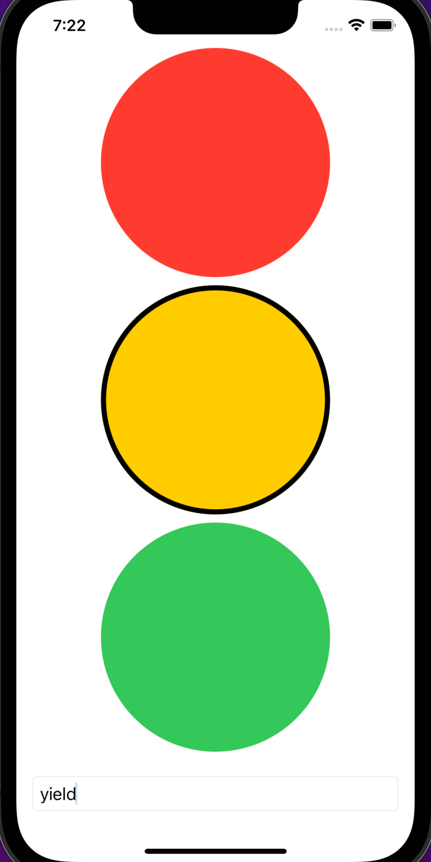
The following example holds the status of a stoplight
in a state property named "status".
Note the use of $ before the name to
get a two-way binding with a TextField.
struct CircleButton: View {
    var color: Color
    var selected: Bool = false
    var action: () -> Void // a function

    var body: some View {
        Button(action: action, label: {
            Circle()
                .stroke(selected ? color : .black, lineWidth: 5)
                .fill(color)
                .frame(height: 50)
        }
    }
}

struct Light: Identifiable {
    let id: String
    let color: Color
}

struct MyTextField: View {
    var label: String
    var text: Binding<String>

    var body: some View {
        TextField(label, text: text)
            .autocapitalization(.none)
            // When the `padding` view modifier is applied with no arguments,
            // it uses "adaptive padding" and adds the same padding to all sides.
            // The amount is determined by the content of the view
            // and the environment in which the app is running.
            // It iOS the amount is typically 20.
            .padding()
            .textFieldStyle(.roundedBorder)
    }
}

// This file must define a struct named "ContentView".
struct ContentView: View {
    @State private var status = "stop"

    let lights: [Light] = [
        Light(id: "stop", color: .red),
        Light(id: "yield", color: .yellow),
        Light(id: "go", color: .green)
    ]

    var body: some View {
        VStack {
            // When iterating over elements that do not conform to
            // the `Identifiable` protocol, add the "id:" argument
            // whose value is a key path that specifies
            // how to find something unique in the element.
            ForEach(lights) { light in
                CircleButton(
                    color: light.color,
                    selected: status == light.id
                ) {
                    status = light.id
                }
            }
            // $ in front of status is needed for a two-way binding.
            MyTextField(label: "status", text: $status)
        }
    }
}
To avoid the need to specify id: \.self for String values,
define the following extension:
// Make String instances identifiable by their value.
// This assumes that no two Strings in an Array will have the same value.
extension String: Identifiable {
    public var id: String { self }
}
One way to cause a view that uses a binding to a @State property
to animate when the state changes is to apply the `animation method
to the binding.
The following code demonstrates using a Toggle view
to trigger a Text view to fade in an out.
struct ContentView: View {
    @State private var showingWelcome = false

    var body: some View {
        VStack(spacing: 20) {
            Toggle(
                "Toggle",
                isOn: $showingWelcome.animation(.easeInOut(duration: 1))
            )
            if showingWelcome {
                Text("Hello World")
            }
            Spacer()
        }
        .padding()
    }
}
@Binding
The @Binding property wrapper is applied to a property of a child view
that is passed a binding ($ syntax) from a parent view.
It connects a child property to a parent property.
This allows the child view to get and set a property that
is owned by a parent view and si passed in as an argument.
There are other property wrappers that contain the word "State" in their names. Each of these own data rather than having it be owned by another view that passes it in.
struct ChildView: View {
    @Binding var n: Int

    var body: some View {
        VStack {
            Text("ChildView: n = \(n)")
            Button("Increment") {
                n += 1
            }
            .buttonStyle(.bordered)
        }
    }
}

struct ParentView: View {
    @State var number = 0

    var body: some View {
        VStack {
            Text("ParentView: number = \(number)")
            ChildView(n: $number) // $ is required to pass a binding
        }
    }
}
To pass a binding to a constant value, use .constant(value).
This is typically only used during initial development of an app feature
when the intended value is not yet available.
@StateObject
The @StateObject property wrapper is applied to view properties
that hold ("own") a "view model". This is an instance of a class
that conforms to the ObservableObject protocol.
Such classes should be annotated with the @MainActor attribute
so changes to the properties occur in the main queue.
View models typically have properties that are annotated with the
Published property wrapper.
Changes to the values of these properties are published.
This triggers the body of each view that depends on them
to be recomputed, which updates the UI.
The following code demonstrates defining a view model and subscribing to it:
@MainActor
class MyState: ObservableObject {
    @Published var score: Int = 0
    // Could declare additional published properties here.
}

struct ContentView: View {
    @StateObject var myState = MyState()

    var body: some View {
        VStack {
            Button("Increment") {
                myState.score += 1
            }
            .buttonStyle(.bordered)
            Text("score = \(myState.score)")
        }
    }
}
To initialize a state variable in an init method,
write code like the following:
    init() {
        // Note the underscore prefix on the variable name.
        _myState = StateObject(wrappedValue: someValue)
    }
Classes that conform to the ObservableObject protocol can choose to
manually publish changes rather than have it happen automatically.
This can be useful when validation needs to occur before publishing.
To do this, do not mark a property as @Published and
instead call objectWillChange.send() before the value changes.
For example:
@MainActor
class Game: ObservableObject {
    var score = 0 {
        willSet {
            print("willSet: old value = \(score)")
            print("willSet: new value = \(newValue)")
        }
        didSet {
            print("didSet: old value = \(oldValue)")
            print("didSet: new value = \(score)")
            if score < 5 {
                // Notify subscribers of the change.
                // This is an explicit alternative to adding the
                // @Published property wrapper to the score property.
                objectWillChange.send()
            } else {
                print("didSet: reset to old value")
                score = oldValue
            }
        }
    }
}
@ObservedObject
The @ObservedObject property wrapper marks a property
that receives an instance of a view model (ObservableObject)
that is passed in from a parent view.
This subscribes to changes published by an observable object (indicated by
applying the @Published property wrapper to specific properties),
but it doesn't "own" the object.
The @Published property wrapper internally uses the Combine framework.
When changes in an @Published property occur,
any view body computed properties that use it are recomputed.
The following code demonstrates passing a view model from one view to another:
@MainActor
class MyState: ObservableObject {
    @Published var score: Int = 0
    // Could declare additional published properties here.
}

struct ChildView: View {
    @ObservedObject var share: MyState

    var body: some View {
        VStack {
            Button("ChildView: Increment") {
                // This also updates myState in ContentView.
                share.score += 1
            }
            .buttonStyle(.bordered)
            Text("ChildView: score = \(share.score)")
        }
    }
}

struct ContentView: View {
    @StateObject var myState = MyState()

    var body: some View {
        VStack {
            Button("ContentView: Increment") {
                // This also updates share in ChildView.
                myState.score += 1
            }
            .buttonStyle(.bordered)
            Text("ContentView: score = \(myState.score)")

            // Passing the @StateObject variable.
            ChildView(share: myState)
        }
    }
}
@Environment
The @Environment property wrapper is used to access environment values. See the Environment section.
In iOS 17+, @Environment can also be used as an alternative to
passing a view model through multiple layers of the view hierarchy.
It this sense it replaces the need for @EnvironmentObject.
The following code demonstrates this.
// EnvironmentDemoApp.swift
import SwiftUI

@main
struct EnvironmentDemoApp: App {
    var body: some Scene {
        WindowGroup {
            ContentView()
                .environment(SharedData())
        }
    }
}
// ContentView.swift
import Observation
import SwiftUI

@Observable
class SharedData {
    var name = "Mark"
    var score = 0
}

// A custom view must be created in order to
// modify properties of Observable objects because they must
// be accessed using the Bindable property wrapper.
struct ScoreButton: View {
    @Bindable var sharedData: SharedData

    var body: some View {
        Button("Increment Score") {
            // This change will be reflected in all views
            // that get SharedData from the environment.
            sharedData.score += 1
        }
        .buttonStyle(.bordered)
    }
}

struct ChildView: View {
    @Environment(SharedData.self) private var sharedData

    var body: some View {
        VStack {
            Text("ChildView: name = \(sharedData.name)")
            Text("ChildView: score = \(sharedData.score)")
            ScoreButton(sharedData: sharedData)
            GrandchildView()
        }
    }
}

struct GrandchildView: View {
    @Environment(SharedData.self) private var sharedData

    var body: some View {
        VStack {
            Text("GrandchildView: name = \(sharedData.name)")
            Text("GrandchildView: score = \(sharedData.score)")
        }
    }
}

struct ContentView: View {
    @Environment(SharedData.self) private var sharedData

    var body: some View {
        VStack {
            Text("ContentView: name = \(sharedData.name)")
            Text("ContentView: score = \(sharedData.score)")
            ChildView()
        }
    }
}
@EnvironmentObject
This should only be used in pre-iOS 17 code!
In iOS17+ @Environment, described above, should be used instead.
The @EnvironmentObject property wrapper allows multiple views
to share access to a view model.
It offers an alternative to passing a view model
through multiple layers of the view hierarchy
using the @ObservedObject property wrapper.
The following code demonstrates this. It works in the Simulator, but not in Preview.
// Environment objects must be defined by classes
// that conform to the ObservableObject protocol
// and they should publish at least one property.
@MainActor
class SharedData: ObservableObject {
    @Published var name = "Mark"
    @Published var score = 0
}

struct ChildView: View {
    // This value will be received from the environment.
    // There will be a fatal error of no object of type `SharedData`
    // is found in the environment.  This is added by
    // calling the `environmentObject` view modifier.
    @EnvironmentObject var sharedData: SharedData

    var body: some View {
        VStack {
            Text("ChildView: name = \(sharedData.name)")
            Text("ChildView: score = \(sharedData.score)")
            Button("Increment Score") {
                // This change will be published to all views
                // that use the SharedData score property.
                sharedData.score += 1
            }
            .buttonStyle(.bordered)
            GrandchildView()
        }
    }
}

struct GrandchildView: View {
    // This value will be received from the environment.
    @EnvironmentObject var sharedData: SharedData

    var body: some View {
        VStack {
            Text("GrandchildView: name = \(sharedData.name)")
            Text("GrandchildView: score = \(sharedData.score)")
        }
    }
}

struct ContentView: View {
    @StateObject var sharedData = SharedData()

    var body: some View {
        VStack {
            Text("ContentView: name = \(sharedData.name)")
            Text("ContentView: score = \(sharedData.score)")
            ChildView()
        }
        // All views inside this VStack can access the sharedData object.
        // The environmentObject view modifier can be called
        // multiple times, but only once for each type because
        // the type is how the values are distinguished.
        .environmentObject(sharedData)
    }
}
Colors
Colors are defined by the Color struct. It provides many static properties for predefined colors and many initializers for specifying custom colors.
Terminology
SwiftUI uses the following color terminology:
-
Accent Color
This is the primary theme color of controls in an app such as
ButtonandTextField. It is typically be specified by settingAccentColorinAssets.xcassets. This is preferred over calling theaccentColorview modifier in code. Different colors can be specified for light and dark mode. Controls use the accent color for their default tint color.Accent color is not automatically applied to text-based views like
TextandLabel. To apply the accent color to text-based views, call.foregroundStyle(.accentColor)on them. -
Tint
This overrides the default accent color of controls. It is not applied to text-based views. It is set by calling the
tintview modifier on a specific view. User preferences cannot override this. -
Foreground Color
This takes precedence over both the tint and accent color of a view. It is typically only applied to text-based views. To set it, call the
foregroundStyleview modifier on a specific view.
System Colors
It is recommended to use the "system colors" defined by
UIColor static properties because they are dynamic,
meaning that the actual color used automatically changes
based on whether the device is in light or dark mode.
The change is subtle.
To use these in code, enter Color(UIColor.system
and select a system color from the code completion popup
which includes the following names all preceded by "system":
Red, Orange, Yellow, Green, Mint, Teal, Cyan, Blue, Indigo, Purple,
Pink, Brown, Gray, Gray2, Gray3, and Gray4.
Each new OS version can change the actual colors associated with these names,
so using these in place of custom colors allows apps to
continue using Apple-recommended colors across OS versions.
watchOS always uses dark mode.
To see the exact values of the system colors in light and dark mode, see the "Specifications" section in the Apple Human Interface Guidelines (HIG) page Color.
Semantic Colors
Three of the Color struct static properties are "semantic colors".
The table below shows their default colors in light and dark mode.
| Semantic Color | Light | Dark |
|---|---|---|
accentColor |
blue (007aff) | slightly lighter blue (0a84ff) |
primary |
black (000000) | white (ffffff) |
secondary |
gray (8a8a8e) | slightly lighter gray (8d8d93) |
watchOS always uses dark mode.
The values for primary and secondary are controlled by the OS
and cannot be modified in code.
Color.primary defaults to the same colors as UIColor.label.
and it is the default foregroundStyle of Text views.
Color.primary is typically used for text because it automatically
switches based on whether the device is in light or dark mode.
SwiftUI doesn't provide its own way to access the background color,
but it can be obtained from UIColor.systemBackground.
This is typically the opposite of the primary color.
To change the semantic colors, override them in an extension as follows:
extension Color {
    static var accentColor: Color = .red
    static var primary: Color = .green
    static var secondary: Color = .orange
}
Color.accentColor can also be changed by
selecting a color for AccentColor in Assets.xcassets,
but overriding it in an extension takes precedence.
To override the accent color for a specific control view,
apply the tint
view modifier.
For non-control views, apply the foregroundStyle view modifier.
To specify the default accent color for all controls,
apply the tint view modifier to the top view (often named ContentView).
For example:
@State private var love = false
...
Button("Love") {
    love.toggle()
}
.tint(.red)

Image(systemName: love ? "heart.fill" : "heart").foregroundStyle(.red)
The accentColor view modifier is deprecated and is replaced by the
tint view modifier.
Color.accentColor is the equivalent of tintColor in UIKit.
Screen Background
The screen background can be modified to fill with a color or an image. It defaults to using:
Color(UIColor.systemBackground).edgesIgnoringSafeArea(.all)
To fill the screen background with a color:
struct ContentView: View {
    var body: some View {
        ZStack {
            Color("BGColor") // name of a Color Set
            VStack {
                Text("Hello").font(.largeTitle)
                Text("World").font(.largeTitle)
            }
        }
    }
}
The Color Set "BGColor" used above can be configured to use different colors for light and dark mode.
It is not necessary to apply the view modifier
.edgesIgnoringSafeArea(.all) to the Color
in order to fill the entire screen.
The following code fills the screen background with an image:
struct ContentView: View {
    var body: some View {
        ZStack {
            Image("Background") // name of an Image Set
                .resizable()
                .scaledToFill()
                .edgesIgnoringSafeArea(.all)
            VStack {
                Text("Hello").font(.largeTitle)
                Text("World").font(.largeTitle)
            }
        }
    }
}
The Image Set "Background" used above can be configured to use different images for light and dark mode.
Color Literals
A "color literal" displays a color swatch in source code.
To create one, enter #colorLiteral(.
That will be replaced by a swatch icon
indicating that no color has been selected yet.
This works in a variable declaration, but not in a parameter value.
Double-click the swatch to select a color from a popup color panel. Click the "Other..." button to open the system color picker which provides many more ways to select a color.
Custom Colors
To define a custom named color:
- In the Navigator, select the
Assets.xcassetsfile. - Right-click in the list of assets and select "New Color Set".
- Change the default name "Color" to the name that will be specified in code.
- In the Inspector panel on the right, select the Attributes tab (4th). The value for "Appearances" defaults to "Any, Dark". "Any" refers to all devices running iOS 12 and earlier (which do not support dark mode) and devices running iOS 13 or later that are in light mode. Change "Appearances" to "None" to select a single color to be used in both light and dark mode. This will replace the "Any Appearance" and "Dark" boxes with a "Universal" box.
- For each color box:
- Click the box.
- Click the "Attributes" tab in the Inspector (4th).
- Select a color using one of the many supported "Content" and "Input Method" options.
In general darker colors should be used in light mode (because they look nicer on a light background) and lighter colors should be used in dark mode (because they look nicer on a dark background).
When specifying a dark mode color, consider selecting the same color used for "Any Appearance". Then click the "Show Color Panel" button, change the slider type drop-down to "HSB Sliders", and reduce the value for Brightness (perhaps to 50%).
To use a custom color in code, enter Color("some-name").
iOS 17 added automatic generation of constants for colors and images
defined in .xcassets files.
This allows replacing Color("some-name") with just .someName.
Before iOS 17 it was recommended to avoid typos when named colors
by defining a Color extension that
defines computed properties like the following:
extension Color {
    static var danger: Color { Color("Danger") }
    static var success: Color { Color("Success") }

    // This custom initializer enables creating colors based on hex codes.
    init(hex: UInt, alpha: Double = 1) {
        self.init(
            .sRGB,
            red: Double((hex >> 16) & 0xFF) / 255,
            green: Double((hex >> 8) & 0xFF) / 255,
            blue: Double(hex & 0xFF) / 255,
            opacity: alpha
        )
    }

    // This uses the custom initializer above.
    static let background = Color(hex: 0xf1faff)
}
Simulator Light/Dark Mode
There are several ways to switch between light and dark mode in the simulator.
- Press cmd-shift-a (easiest).
- Open the Settings app, select Developer, and change the "Dark Appearance" toggle.
- Apply the following view modifier to the top-most view:
.preferredColorScheme(.dark)or.light - Apply the following view modifier to the top-most view:
.environment(\.colorScheme, .light)or.dark
UIColor
UIKit uses UIColor instead of Color.
To create a UIColor from a Color,
pass the Color to a UIColor initializer.
For example, let redUIColor = UIColor(Color.red).
Mapping from UIKit to SwiftUI
The name of the SwiftUI view that corresponds to a UIKit class is often the same without the "UI" prefix. The table below lists the corresponding names.
| UIKit Class | SwiftUI View |
|---|---|
NSAttributedString |
Text |
UIActivityIndicatorView |
ProgressView without value |
UIAlertController |
Alert or ActionSheet |
UIButton |
Button |
UICollectionView |
LazyHGrid or LazyVGrid |
UIDatePicker |
DatePicker |
UIImageView |
Image |
UILabel |
Text |
UINavigationController |
NavigationView |
UIProgressView |
ProgressView with value |
UISegmentedControl |
Picker |
UISlider |
Slider |
UIStackView |
HStack or VStack |
UIStepper |
Stepper |
UISwitch |
Toggle |
UITableView |
List |
UITextField |
TextField or SecureField |
UITextView |
TextEditor |
Container Views
Container views act as a container of other views and layout those views in a specific way.
To hide a view but still take up the space that would be occupied
if the view was visible, consider setting its opacity to zero.
This is done with the opacity view modifier.
For example, someView.opacity(0).
To automate wrapping views in a container view, select them and command-click to get a context menu that contains the options "Embed in HStack", "Embed in VStack", "Embed in ZStack", "Embed in List", and "Embed..." (for embedding in an arbitrary container).
Here are the container views that are provided by SwiftUI.
Stack Containers
HStack
The HStack view is a container that lays out its child views horizontally.
The child views are centered vertically by default.
To change this, add the alignment attribute which can be set to
.top, .center, .bottom, .firstTextBaseline, or .lastTextBaseline.
A default amount of space is added between each child determined by the system.
In iOS this seems to be 8, but I cannot find a documented value.
To change the space between child views, add the spacing attribute.
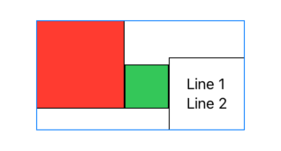
The following example shows the effect of
setting alignment to .lastTextBaseLine.
HStack(alignment: .lastTextBaseline, spacing: 0) {
    Rectangle()
        .fill(.red)
        .frame(width: 100, height: 100)
        .border(.black)
    Rectangle()
        .fill(.green)
        .frame(width: 50, height: 50)
        .border(.black)
    Text("Line 1\nLine 2").padding(20).border(.black)
}.border(.blue)
VStack
The VStack view is a container that lays out its child views vertically.
The child views are centered horizontally by default.
To change this, add the alignment attribute which can be set to
.leading, .center, or .trailing.
A default amount of space is added between each child determined by the system.
In iOS this seems to be 16 when the children are containers
and zero when they are views, but I cannot find a documented value.
To change the space between child views, add the spacing attribute.
ZStack
The ZStack view is a container that, by default, stacks its child views from bottom to top. It is ideal for adding a background to a set of views.
Here are three approaches to render text with a colored background,
one of which uses a ZStack.
struct ContentView: View {
    let bgColor: Color = .yellow
    let text = "Test"

    var body: some View {
        VStack {
            let rect = Rectangle()
                .fill(bgColor)
                .frame(width: 50, height: 40)

            // Approach #1: Use a ZStack.
            // Semicolons must separate multiple statements
            // on the same line.
            ZStack { rect; Text(text) }

            // Approach #2: Use the background view modifier.
            Text(text)
                .padding(10)
                // Use a view as a background.
                .background(Rectangle().foregroundStyle(bgColor))

            // Approach #3: Use the overlay view modifier.
            rect.overlay(Text(text))
        }
    }
}
By default, all child views of a ZStack have a z-index of zero
and they are stacked in the order in which they are specified.
To change the display order without changing the order in which
the child views are specified, apply the zIndex view modifier to child views
that should have a z-index other than zero.
Pass the desired z-index, which can be positive or negative,
to this view modifier.
For example:

let size = 100.0
ZStack(alignment: .topLeading) {
    Color.red
        .frame(width: size, height: size)
    Color.green
        .frame(width: size, height: size)
        .padding(20.0)
        .zIndex(1)
    Color.blue
        .frame(width: size, height: size)
        .padding(40.0)
LazyHStack
The LazyHStack
view is similar to HStack, but only
builds and renders child views when they are visible.
The rendered child views are retained in memory
after scrolling out of view so rendering them again later is efficient.
LazyHStack is commonly used inside a ScrollView
with axes set to .horizontal.
ScrollView(.horizontal) {
    LazyHStack {
        ForEach(1..<100) {
            Text(String($0))
        }
    }
}
LazyVStack
The LazyVStack
view is similar to VStack, but only
builds and renders child views when they are visible.
LazyVStack is commonly used inside a ScrollView
with axes set to .vertical,
which is the default.
ScrollView {
    LazyVStack {
        ForEach(1..<101) {
            Text(String($0))
        }
    }
}
Grid Containers
Grid
The views Grid and GridRow are used to arrange other views in a grid of rows and columns. See Grid for details.
LazyHGrid
The LazyHGrid
view specifies a number of rows and adds columns as necessary.
The grids are described by an array of GridItem
objects that each specify their size, spacing, and alignment.
For example, a GridItem can adapt to the width of its content,
but also have a minimum size of 25 by specifying
GridItem(.adaptive(minimum: 25)).
See the example in LazyVGrid below.
LazyVGrid
The LazyVGrid
view is similar to LazyHGrid, but
specifies a number of columns and adds rows as necessary.
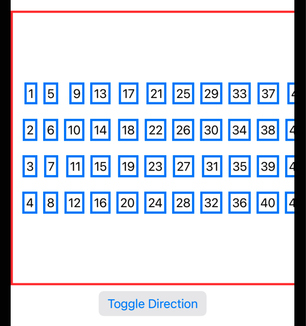
The following example demonstrates both LazyHGrid and LazyVGrid.
It spreads a list of numbers over either rows or columns.
struct ContentView: View {
  private static let count = 4
  @State private var isVertical = false // Why can't this be static?

  // Describe the characteristics of each grid.
  private static let gridItem = GridItem(
      // This specifies the grid width in LazyVGrid.
      // or the grid height in LazyHGrid.
      .fixed(40),

      // This specifies that the width of each column
      // should be based on the total size available
      // AND the width of the views in each column.
      // Minimum and maximum widths can be specified.
      // .flexible()

      // This is similar to `flexible`, but allows
      // multiple views to be placed in the same column.
      // .adaptive(minimum: 100)

      // This specifies the vertical spacing in LazyHGrid
      // or horizontal spacing in LazyVGrid.
      spacing: 10,
      alignment: .trailing
  )

  var gridItems: [GridItem] = Array(repeating: gridItem, count: count)

  var body: some View {
      VStack {
          if isVertical {
              ScrollView {
                  LazyVGrid(columns: gridItems) {
                      ForEach(1..<101) {
                          Text(String($0)).padding(5).border(.blue, width: 3)
                      }
                  }
                  .padding()
                  .border(.red, width: 5)
              }
          } else {
              ScrollView(.horizontal) {
                  LazyHGrid(rows: gridItems) {
                      ForEach(1..<101) {
                          Text(String($0)).padding(5).border(.blue, width: 3)
                      }
                  }
                  .padding()
                  .border(.red, width: 3)
              }
          }
          Button("Toggle Direction") {
              isVertical.toggle()
          }.buttonStyle(.bordered)
      }
  }
}
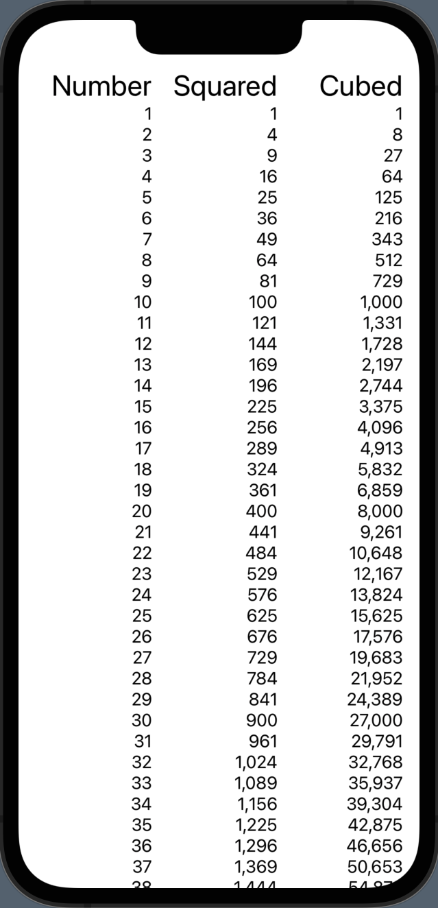
The following example demonstrates LazyVGrid
where the views created are intended for specific columns.
func intPow(_ base: Int, _ exponent: Int) -> Int {
    Int(pow(Float(base), Float(exponent)))
}

struct ContentView: View {
    var body: some View {
        let columns: [GridItem] =
            Array(
                repeating: GridItem(.flexible(), alignment: .trailing),
                count: 3
            )

        ScrollView {
            LazyVGrid(columns: columns) {
                Text("Number").font(.title)
                Text("Squared").font(.title)
                Text("Cubed").font(.title)
                ForEach(1 ... 50, id: \.self) { number in
                    Text("\(number)")
                    Text("\(intPow(number, 2))")
                    Text("\(intPow(number, 3))")
                }
            }
            .padding(.horizontal)
        }
    }
}
Split Containers
HSplitView
The HSplitView view is a layout container that organizes its children horizontally and allows users to resize the children by dragging dividers between them. It is only supported in macOS.
VSplitView
The VSplitView view is a layout container that organizes its children vertically and allows users to resize the children by dragging dividers between them. It is only supported in macOS.
Other Containers
ControlGroup
A ControlGroup is a container for related controls. It works best when the children are Button views.
A ControlGroup is particularly useful for groups of buttons in toolbars.
The buttons are displayed horizontally if there is sufficient space.
Otherwise a label is displayed instead and tapping the label
displays a popup menu containing a vertical stack of the buttons.
To prevent use of a popup menu and force the child views
to be displayed horizontally, apply the controlGroupStyle view modifier passing it the value .navigation.
This seems ill-advised because it will do so
even if the child views do not fit in the space available.
The way in which a ControlGroup is rendered depends on the platform.
In iOS it looks identical to a segmented Picker,
but it doesn't change to indicate which child view was tapped last.
The following code includes a ControlGroup in the main view and in a toolbar.
It also includes a segmented Picker to show how it differs.
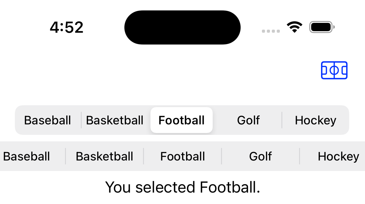
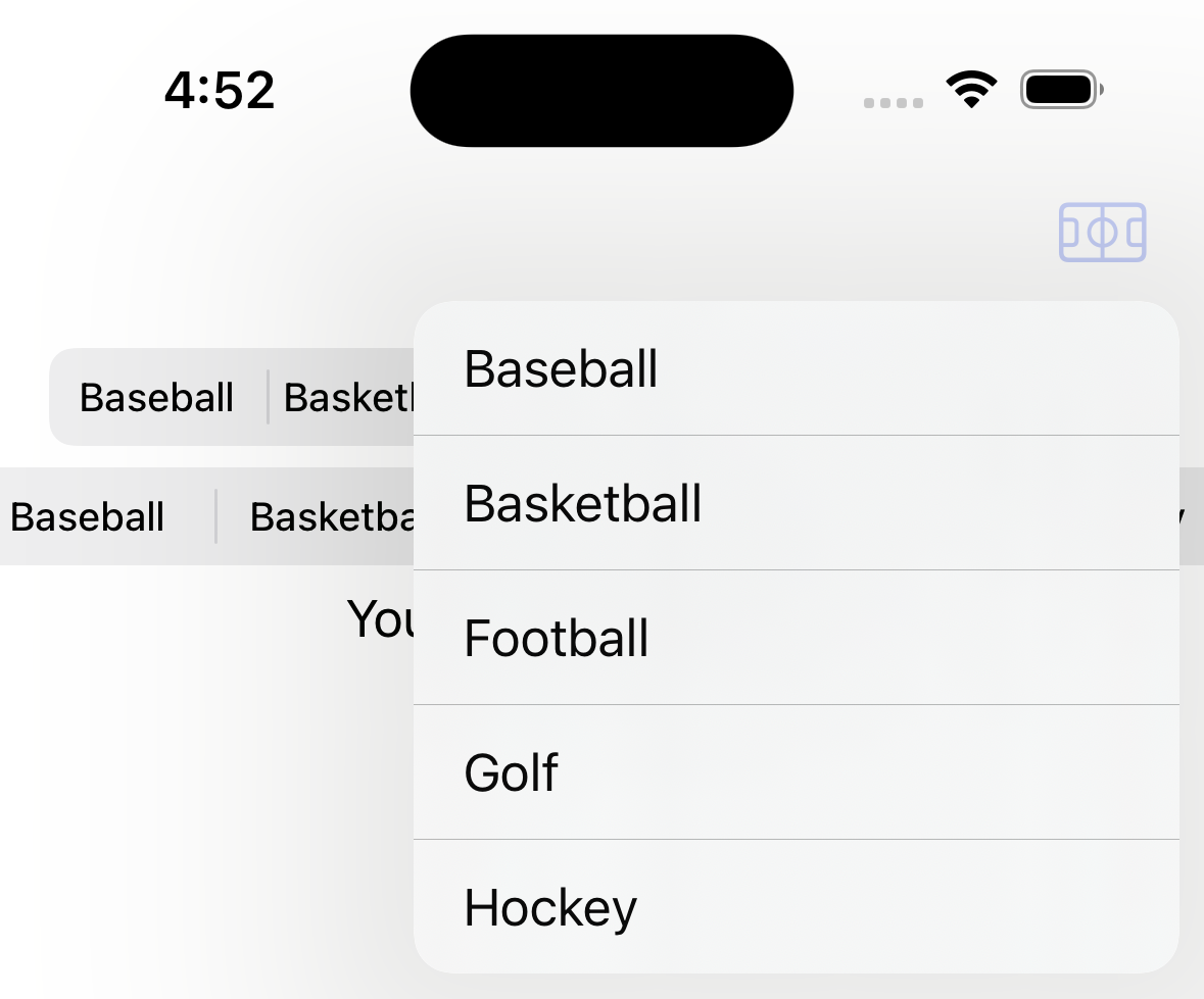
struct ContentView: View {
    // @State private var hungry = false
    @State private var selectedIndex = -1

    let sports = ["Baseball", "Basketball", "Football", "Golf", "Hockey"]

    var body: some View {
        NavigationStack {
            VStack {
                Picker("", selection: $selectedIndex) {
                    ForEach(sports.indices, id: \.self) { index in
                        Text(sports[index]).tag(index)
                    }
                }
                .pickerStyle(.segmented)

                // This renders poorly if the child views do not fit
                // when laid out horizontally in the space available.
                ControlGroup {
                    ForEach(sports.indices, id: \.self) { index in
                        Button(sports[index]) {
                            selectedIndex = index
                        }
                    }
                    // This renders, but tapping it does nothing.
                    // Toggle("Hungry?", isOn: $hungry)
                }

                if selectedIndex != -1 {
                    Text("You selected \(sports[selectedIndex]).")
                }

                Spacer()
            }
            .padding()
            .toolbar {
                ControlGroup {
                    ForEach(sports.indices, id: \.self) { index in
                        Button(sports[index]) {
                            selectedIndex = index
                        }
                    }
                } label: {
                    // The optional label argument is only used
                    // when a ControlGroup appears in a toolbar.
                    Label("Sport", systemImage: "sportscourt")
                }
            }
        }
    }
}
DisclosureGroup
The DisclosureGroup view hides and shows its contents
based on whether it is in an expanded state.
By default it is not expanded.
It can be expanded by tapping or by associating
a Bool binding that is programmatically set to true.
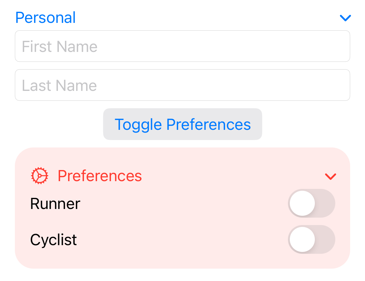
struct ContentView: View {
    @State private var cyclist = false
    @State private var firstName = ""
    @State private var lastName = ""
    @State private var preferencesExpanded = false
    @State private var runner = false

    var body: some View {
        // Form { // background doesn't work well with this
        VStack {
            DisclosureGroup("Personal") {
                TextField("First Name", text: $firstName)
                TextField("Last Name", text: $lastName)
            }
            .disableAutocorrection(true)

            Button("Toggle Preferences") {
                withAnimation {
                    preferencesExpanded.toggle()
                }
            }
            .buttonStyle(.bordered)

            DisclosureGroup(isExpanded: $preferencesExpanded) {
                Toggle("Runner", isOn: $runner)
                    .padding(.trailing, 2) // fixes a bug
                Toggle("Cyclist", isOn: $cyclist)
                    .padding(.trailing, 2) // fixes a bug
            } label: {
                Label("Preferences", systemImage: "gear")
            }
            .tint(.red)
            .padding()
            .background(
                RoundedRectangle(cornerRadius: 20)
                    .fill(Color.red)
                    .opacity(0.1)
            )

            Spacer()
        }
        .padding()
    }
}
ForEach
The ForEach struct iterates of the elements of a RandomAccessCollection
(includes Array and Range types)
and renders the view specified by a provided ViewBuilder.
The elements in the RandomAccessCollection must either conform to
the Identifiable protocol (which requires them to have an id property)
OR the id: argument must be supplied.
If the elements are not Identifiable
and no id: argument is supplied, the view
may not update property when the collection changes.
If the elements are not Identifiable and you wish to use
the elements values as their id, specify id: \.self.
Only constant ranges are allowed (ex. 0..<5, but not begin..<end)
unless the id argument key path \.self is specified.
The value of the id argument is a key path that specifies
how to find a unique value in the element.
For example, the String type does not implement Identifiable.
To iterate over an array of String values:
// \.self is a key path that refers to the entire object.
ForEach(stringArray, id: \.self) { ... }
Form
The Form view a container of data input views.
Embedding data input views in a Form
instead of another container such as VStack
can change the way they look and feel and
this can differ based on the platform (ex. iOS vs. macOS).
One example of a data input that changes is Picker.
To control whether a data input view is disabled,
apply the disabled view modifier passing it a Boolean value.
Typically disabled data input views are grayed out.
The following example demonstrates many common views used in forms.
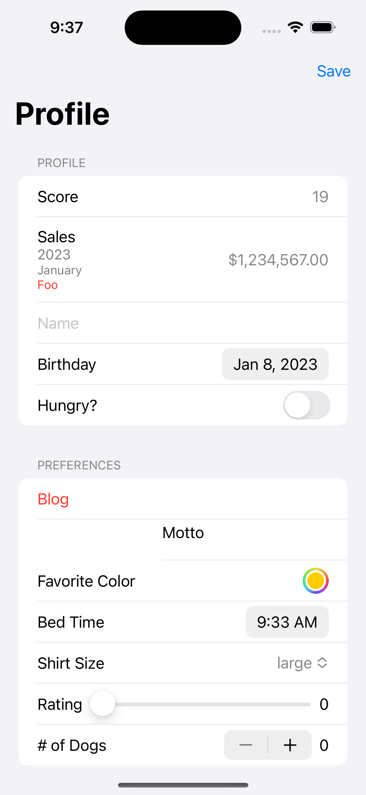
enum ShirtSize: String, CaseIterable {
  case small
  case medium
  case large
  case extraLarge
}

struct ContentView: View {
    private static let blogUrl = "https://mvolkmann.github.io/blog"

    // Typically form data would be tied to ViewModel properties
    // rather than using @State.
    @State private var bedTime = Date()
    @State private var birthday = Date()
    @State private var favoriteColor: Color = .yellow
    @State private var dogCount = 0
    @State private var hungry = false
    @State private var name = ""
    @State private var motto = "This is my motto."
    @State private var rating = 0.0
    @State private var shirtSize: ShirtSize = .large

    private var isEditing = false

    private var sales = 1_234_567.0

    private var formattedSales: String {
        let formatter = NumberFormatter()
        formatter.numberStyle = .currency
        return formatter.string(from: NSNumber(value: sales))!
    }

    var body: some View {
        NavigationView { // deprecated in iOS 16
            Form {
                Section(header: Text("Profile")) {
                    // When LabeledContent is used inside a Form
                    // its label is placed on the leading edge and
                    // its value is placed on the trailing edge.
                    LabeledContent("Score", value: String(19))
                    // If the label has multiple views,
                    // they are stacked vertically with each
                    // subsequent view being a bit smaller and lighter.
                    LabeledContent {
                        Text(formattedSales)
                    } label: {
                        Text("Sales")
                        Text("2023")
                        Text("January")
                        Button("Foo") { print("got tap") }
                    }
                    TextField("Name", text: $name)
                    DatePicker(
                        "Birthday",
                        selection: $birthday,
                        displayedComponents: .date
                    )
                    Toggle("Hungry?", isOn: $hungry)
                        .toggleStyle(SwitchToggleStyle(tint: .red))
                }
                Section(header: Text("Preferences")) {
                    // Links work in Simulator, but not in Preview.
                    Link(
                        "Blog",
                        destination: URL(string: ContentView.blogUrl)!
                    )
                    VStack {
                        Text("Motto")
                        // It seems TextEditor lineLimit is
                        // only enforced on initial render.
                        // It doesn't prevent more lines from being
                        // displayed if the user types more text.
                        TextEditor(text: $motto).lineLimit(2)
                    }
                    ColorPicker(
                        "Favorite Color",
                        selection: $favoriteColor
                    )
                    DatePicker(
                        "Bed Time",
                        selection: $bedTime,
                        displayedComponents: .hourAndMinute
                    )
                    Picker("Shirt Size", selection: $shirtSize) {
                        ForEach(ShirtSize.allCases, id: \.self) { size in
                            Text(size.rawValue).tag(size)
                        }
                    }
                    HStack {
                        Text("Rating")
                        Slider(value: $rating, in: 0...10, step: 1)
                        Text("\(Int(rating))")
                    }
                    HStack {
                        Stepper(
                            "# of Dogs",
                            value: $dogCount, in: 0...10
                        )
                        Text(String(dogCount))
                    }
                }
            }
            .navigationTitle("Profile")
            // accentColor changes the color of many elements including
            // the text cursor color, focus color, and Slider bar color.
            // It does not affect the focus background color of Toggle
            // views.  Use the "toggleStyle" view modifier for that.
            .accentColor(.red)
            .toolbar {
                ToolbarItemGroup(placement: .navigationBarTrailing) {
                    Button("Save", action: saveUser)
                }
            }
        }
    }

    private func saveUser() {
        print("saveUser was called.")
    }
}
Form views have default background color.
Changing this requires two view modifiers.
Form {
    ...
}
.scrollContentBackground(.hidden) // hides default background
.background(.red) // adds custom background
To run code when the user completes entering text in any TextField,
SecureField, or TextEditor within the Form,
apply the onSubmit view modifier passing it a closure.
This can also be applied to an individual input
as described in the TextField section.
Common UI components that are not built into SwiftUI include:
- checkbox: alternative is Toggle
- image picker: must build or use a library
- multiple choice: alternative is
ListinsideNavigationViewwith anEditButton - radio buttons: alternative is
Picker, supported in macOS withPickerand.pickerStyle(RadioGroupPickerStyle()) - toggle buttons: alternative is
Picker
Group
The Group view collects all its child views into a single view without changing their layout.
Container views have a limit of ten child views.
The Group view is often used to work around this limitation.
For example, 15 child views can be divided into three Group views
containing five views each.
This allows the container to only contains these three Group views.
Another option is to group views into Section views
described in Section.
View modifiers applied to the Group are applied to each of the children.
Group {
    Text("One")
    Text("Two")
}.foregroundStyle(.blue)
GroupBox
The GroupBox
view creates a grouping of other views
with an optional Label at the top and a light background color.
Nesting GroupBox views causes their background colors to alternate.
The following code demonstrates creating nested GroupBox views.
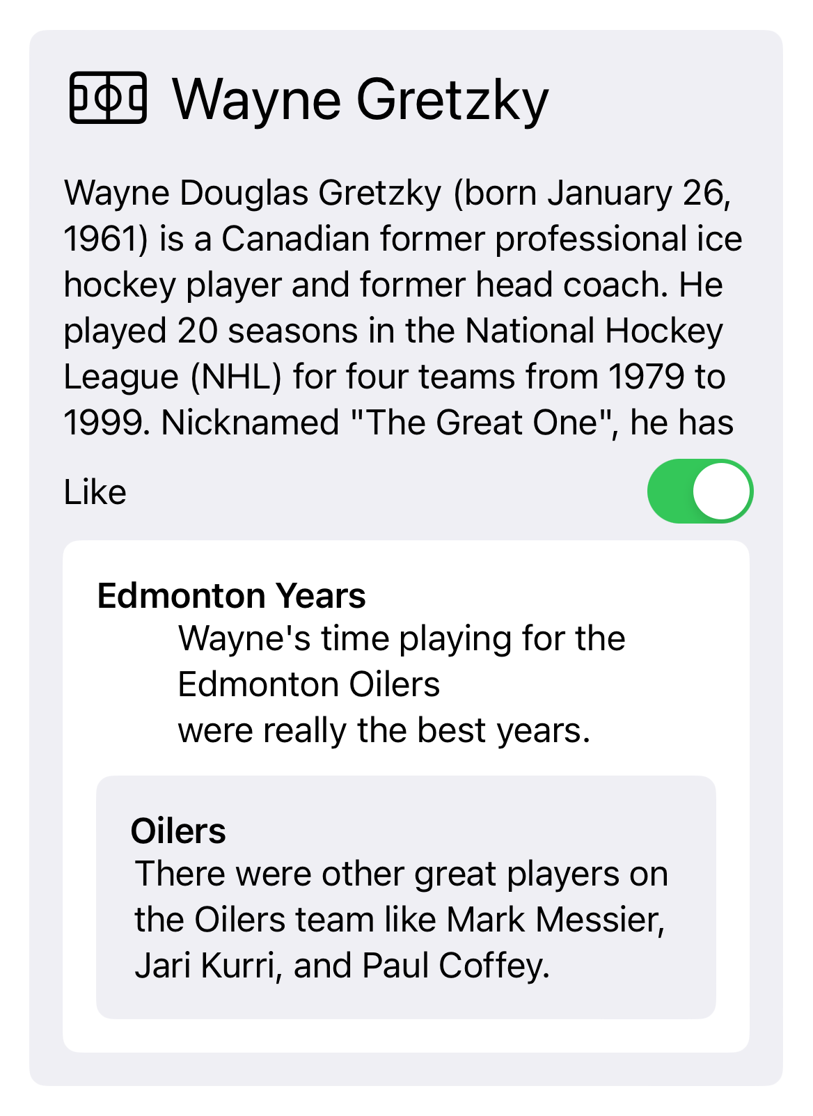
struct ContentView: View {
    static let text = """
    Wayne Douglas Gretzky (born January 26, 1961) is a Canadian \
    former professional ice hockey player and former head coach. \
    He played 20 seasons in the National Hockey League (NHL) for \
    four teams from 1979 to 1999. Nicknamed "The Great One", \
    he has been called the greatest hockey player ever by many \
    sportswriters, players, The Hockey News, and by the NHL itself. \
    Gretzky is the leading goal scorer, assist producer and \
    point scorer in NHL history, and has more assists in his career \
    than any other player scored total points. \
    He is the only NHL player to total over 200 points in one season, \
    a feat he accomplished four times.
    """

    @State private var like = true

    var body: some View {
        GroupBox(
            label: Label(
                "Wayne Gretzky",
                systemImage: "sportscourt"
            ).font(.title)
        ) {
            ScrollView {
                Text(ContentView.text)
            }.frame(maxWidth: .infinity, maxHeight: 130)
            Toggle("Like", isOn: $like)

            GroupBox(label: Text("Edmonton Years")) {
                Text("""
                Wayne's time playing for the Edmonton Oilers
                were really the best years.
                """)
                GroupBox(label: Text("Oilers")) {
                    Text("""
                    There were other great players on the Oilers team \
                    like Mark Messier, Jari Kurri, and Paul Coffey.
                    """)
                }
            }
        }.padding()
    }
}
List
A List view displays a list of other views in a single, scrollable column.
The contents of a List describe the rows and can be any views.
It is not necessary to wrap a List in a ScrollView
to gain the ability to scroll.
A divider line is drawn between each row. To specify the color of the lines, apply the listRowSeparatorTint.
List { ... }
.listRowSeparatorTint(.red)
To hide these, apply the listRowSeparator.
List { ... }
.listRowSeparator(.hidden)
Child views in a List can be grouped using Section views.
For example:
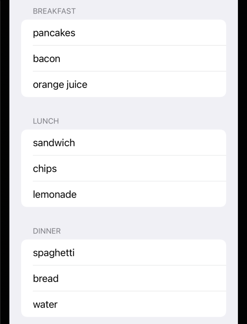
List {
    Section("Breakfast") {
        Text("pancakes")
        Text("bacon")
        Text("orange juice")
    }
    Section("Lunch") {
        Text("sandwich")
        Text("chips")
        Text("lemonade")
    }
    Section("Dinner") {
        Text("spaghetti")
        Text("bread")
        Text("water")
    }
}
A List can act like ForEach for iterating over array elements.
It is not necessary to place a ForEach inside a List
in order to iterate over the elements of a sequence.
If the elements do not conform to the Identifiable protocol
then the id argument must be set to a key path that
identifies the property in the elements that uniquely identifies them.
For example:
List(teams, id: \.city) { team in
    Text("\(team.city) \(team.name)")
}
To set the background color of a list item, apply the listRowBackground view modifier passing it a Color.
For example:
List {
    Text("Apple")
        .listRowBackground(Color.red)
    Text("Banana")
        .listRowBackground(Color.yellow)
    Text("Blueberry")
        .listRowBackground(Color.blue)
}
List views have default background color.
Changing this requires two view modifiers.
List {
    ...
}
.scrollContentBackground(.hidden) // hides default background
.background(.red) // adds custom background
To remove horizontal padding that is added to list elements by default,
apply the .listRowInsets(EdgeInsets()) view modifier
to each child of the List.
List Styles
To change the style of the List, apply the listStyle view modifier which takes one of the following ListStyle values:
bordered: not available in iOScarousel: not available in iOSelliptical: not available in iOSgrouped: edge-to-edgeinset: small left and right paddinginsetGrouped: large left and right paddingplain: seems the same asinsetsidebar: same asinsetGroupedbut adds disclosure buttons to sections
The following code demonstrates various list styles.
The user can select a style from a Picker.
import SwiftUI

// This type enables iterating over objects that conform to the
// ListStyle protocol and getting their names as a String.
// The main reason this is needed is that the type [any ListStyle]
// does not conform to Equatable and Hashable which are required by ForEach.
struct MyListStyle: Equatable, Hashable {
    let style: any ListStyle

    var name: String {
        // All names contain "ListStyle" and we want the part before that.
        var name = String(describing: style)
        let index = name.range(of: "ListStyle")?.lowerBound
        if let index { name.removeSubrange(index...) }
        return name
    }

    init(_ style: any ListStyle) {
        self.style = style
    }

    static func == (lhs: MyListStyle, rhs: MyListStyle) -> Bool {
        lhs.name == rhs.name
    }

    // inout allows passing by reference so a copy is not made.
    func hash(into hasher: inout Hasher) {
        hasher.combine(name)
    }
}

struct ContentView: View {
    @State private var selectedStyle = MyListStyle(.plain)

    let styles: [MyListStyle] = [
        // "bordered": .bordered, // not in iOS
        // "carousel": .carousel, // not in iOS
        // "elliptical": .elliptical, // not in iOS
        MyListStyle(.grouped),
        MyListStyle(.inset),
        MyListStyle(.insetGrouped),
        MyListStyle(.plain),
        MyListStyle(.sidebar)
    ]

    var body: some View {
        VStack {
            Picker("List Style", selection: $selectedStyle) {
                ForEach(styles, id: \.self) { style in
                    Text(style.name).tag(style)
                }
            }

            // This avoids the error
            // "Type 'any View' cannot conform to 'View'".
            AnyView(
                List {
                    Section("Breakfast") {
                        Text("pancakes")
                        Text("bacon")
                        Text("orange juice")
                    }
                    Section("Lunch") {
                        Text("sandwich")
                        Text("chips")
                        Text("lemonade")
                    }
                    Section("Dinner") {
                        Text("spaghetti")
                        Text("bread")
                        Text("water")
                    }
                }
                .listStyle(selectedStyle.style)
            )
        }
    }
}
For more detail on customizing List views see Customizing Lists in SwiftUI.
Expandable Lists
The List view can display a tree of data including
disclosure buttons that expand and collapse parts of the tree.
This requires passing an array of objects to the List
that have a property that is an array of other objects of the same type.
For example:

struct Item: Identifiable {
    let name: String
    let icon: String // SF Symbols name
    var children: [Item]?
    var id: String { name }
}

var items: [Item] = [
    Item(name: "Weather", icon: "sun.max.circle", children: [
        Item(name: "Snow", icon: "cloud.snow"),
        Item(name: "Sun", icon: "sun.max.fill", children: [
            Item(name: "sunrise", icon: "sunrise"),
            Item(name: "minimum", icon: "sun.min"),
            Item(name: "maximum", icon: "sun.max"),
            Item(name: "sunset", icon: "sunset"),
        ]),
        Item(name: "Rain", icon: "cloud.rain")
    ]),
    Item(name: "Transportation", icon: "figure.walk.circle", children: [
        Item(name: "Bus", icon: "bus"),
        Item(name: "Car", icon: "car"),
        Item(name: "Plane", icon: "airplane"),
        Item(name: "Train", icon: "tram")
    ]),
    Item(name: "Sport", icon: "figure.run.circle", children: [
        Item(name: "Baseball", icon: "figure.baseball"),
        Item(name: "Basketball", icon: "figure.basketball"),
        Item(name: "Football", icon: "figure.american.football"),
        Item(name: "Hockey", icon: "figure.hockey")
    ]),
]

struct ContentView: View {
    var body: some View {
        List(items, children: \.children) { row in
            // Automatically creates an HStack containing these.
            Image(systemName: row.icon)
            Text(row.name)
        }
    }
}
Swipe Actions
Swipe actions associate buttons with rows.
To add a swipe action to a list row, apply the swipeActions view modifier to the row.
This must be applied to each row, not to the the List.
The swipeActions view modifier must be passed a closure
that describes one or more buttons to be added.
By default swipe actions are added to the right side
and are revealed by swiping left.
To add swipe actions to the left side so they are revealed by swiping right,
pass the edge argument to the allowsSwipeView view modifier
with a value of .leading. The default value is .trailing.
Swiping a row a short distance reveals action buttons
and tapping one executes its action.
Swiping a row a longer distance executes the action of the first button
without waiting for the user to tap the button.
To disable processing long swipes in this way,
pass the allowsFullSwipe argument to the swipeAction view modifier
with a value of false.
The following example adds two swipe actions buttons to each list row. The first button toggles whether the row is "liked" which adds a heart icon after its name. The second button deletes the row.
struct ContentView: View {
    @State private var liked: Set<String> = []
    @State private var sports = ["Baseball", "Basketball", "Football", "Hockey"]

    var body: some View {
        List(sports.indices, id: \.self) { index in
            let sport = sports[index]
            let like = liked.contains(sport)
            HStack {
                Text(sport)
                    .swipeActions {
                        if like {
                            Button("Dislike") { liked.remove(sport) }
                        } else {
                            Button("Like") { liked.insert(sport) }
                        }
                        Button("Delete", role: .destructive) {
                            sports.remove(at: index)
                        }
                    }
                if like {
                    Image(systemName: "heart")
                }
            }
        }
    }
}
Selecting Rows
The following example demonstrates using a List inside a NavigationView
to enable selecting ids of the objects represented by the rows.
To select rows, tap "Edit" in the upper-right corner.
This also demonstrates implementing "pull to refresh" using the refreshable view modifier.
This is passed a closure that runs in an async context
and can fetch additional data to display.
Dragging the list down executes the closure and
displays an activity indicator until the supplied closure completes.
The List then displays the new data.
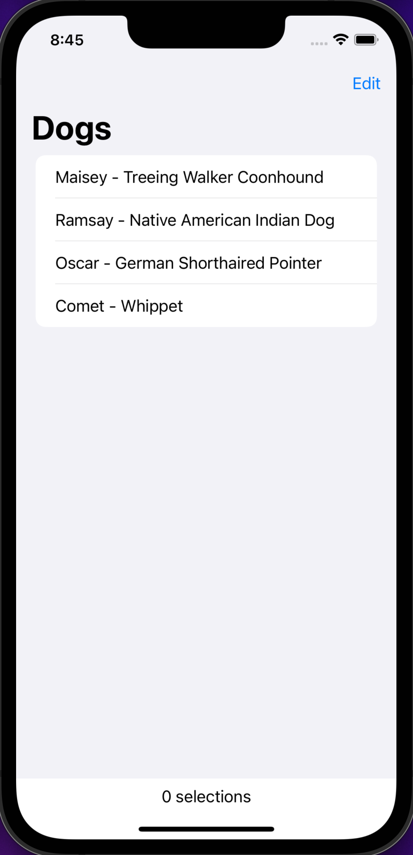
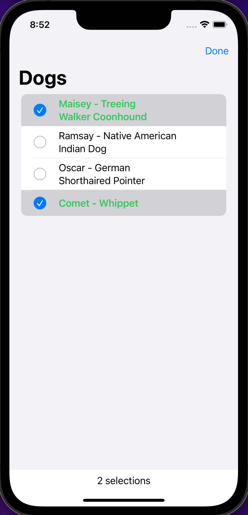
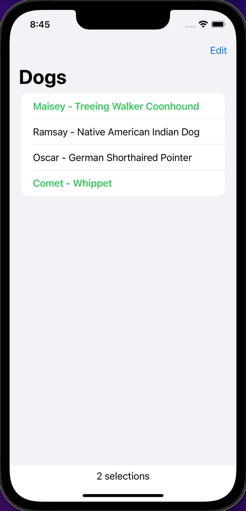
struct ContentView: View {
    struct Dog: CustomStringConvertible, Identifiable, Hashable {
        let id = UUID()
        let name: String
        let breed: String
        var description: String { "\(name) - \(breed)" }
    }

    @State private var dogs = [
        Dog(name: "Maisey", breed: "Treeing Walker Coonhound"),
        Dog(name: "Ramsay", breed: "Native American Indian Dog"),
        Dog(name: "Oscar", breed: "German Shorthaired Pointer"),
        Dog(name: "Comet", breed: "Whippet")
    ]

    //@State private var selection: UUID? // single selection
    @State private var selectedIds = Set<UUID>() // multiple selection

    func loadMore() async {
        // This calls a REST service that returns nothing after 2 seconds.
        let url = URL(string: "https://httpbin.org/delay/2")!
        let request = URLRequest(url: url)
        // Not using the return value for this example.
        let _ = try! await URLSession.shared.data(for: request)

        dogs.append(Dog(name: "Clarice", breed: "Whippet"))
        dogs.append(Dog(name: "Vixen", breed: "Whippet"))
    }

    var body: some View {
        VStack {
            NavigationView {
                List(dogs, selection: $selectedIds) { dog in
                    let desc = String(describing: dog)
                    if selectedIds.contains(where: {$0 == dog.id}) {
                        Text(desc).bold().foregroundStyle(.green)
                    } else {
                        Text(desc)
                    }
                }
                .navigationTitle("Dogs")
                // The EditButton in the toolbar toggles
                // the edit mode of the NavigationView.
                .toolbar { EditButton() }
            }.refreshable { await loadMore() }
            Text("\(selectedIds.count) selections")
        }
    }
}
Deleting and Moving Rows
The following example is similar to the previous one,
but allows rows to be deleted and moved.
It seems that it isn't possible for a List to support
row selection and also support deleting and moving rows.
See this forum thread.
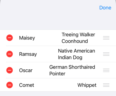
struct Dog {
    var name: String
    var breed: String
}

// This makes it easier to render text that has a specified width.
struct SizedText: View {
    private var text: String
    private var width: Double

    init(_ text: String, width: Double) {
        self.text = text
        self.width = width
    }

    var body: some View {
        Text(text).frame(width: width, alignment: .leading)
    }
}

struct DogRow: View {
    var dog: Dog

    var body: some View {
        HStack {
            SizedText(dog.name, width: 100)
            SizedText(dog.breed, width: 200)
        }
    }
}

struct ContentView: View {
    @State private var dogs = [
        Dog(name: "Maisey", breed: "Treeing Walker Coonhound"),
        Dog(name: "Ramsay", breed: "Native American Indian Dog"),
        Dog(name: "Oscar", breed: "German Shorthaired Pointer"),
        Dog(name: "Comet", breed: "Whippet")
    ]

    var body: some View {
        NavigationView {
            VStack {
                // This is the older approach that provides more control
                // over what happens when a row is deleted or moved.
                /*
                List {
                    // A nested ForEach is required in order to
                    // enable swipe to delete/move.
                    // The onDelete and onMove methods exists on ForEach,
                    // but not on List because a List can include static rows.
                    ForEach(dogs, id: \.name) { dog in
                        DogRow(dog: dog)
                    }
                    .onDelete(perform: deleteDog)
                    .onMove(perform: moveDog)
                }
                .listStyle(.grouped)
                .toolbar { EditButton() }
                */

                // This is a newer approach that provides less control
                // over what happens when a row is deleted or moved,
                // but requires less code.
                // `editActions` can be set to:
                // `.delete` to allow deleting rows, but not moving them.
                // `.move` to allow moving rows, but not deleting them.
                // `.all` to allow users to delete and move rows.
                // To delete a row, swipe left and tap the red "Delete" button.
                // To move a row, long-press and drag it up or down.
                List($dogs, id: \.name, editActions: .all) { $dog in
                    DogRow(dog: dog)
                }
                .listStyle(.grouped)
                .toolbar { EditButton() }
            }
        }
    }

    // This function is only used by the older approach.
    private func deleteDog(at offsets: IndexSet) {
        dogs.remove(atOffsets: offsets)
    }

    // This function is only used by the older approach.
    private func moveDog(source: IndexSet, destination: Int) {
        dogs.move(fromOffsets: source, toOffset: destination)
    }
}
Lists Over a Binding
A List can get its data from an array binding and
each row can include input views that
allow the user to modifier the current array element.
This is efficient because it avoids rebuilding the entire view
when one row changes.
The following example demonstrates list rows where the user can toggle a Boolean property of objects in an array binding.
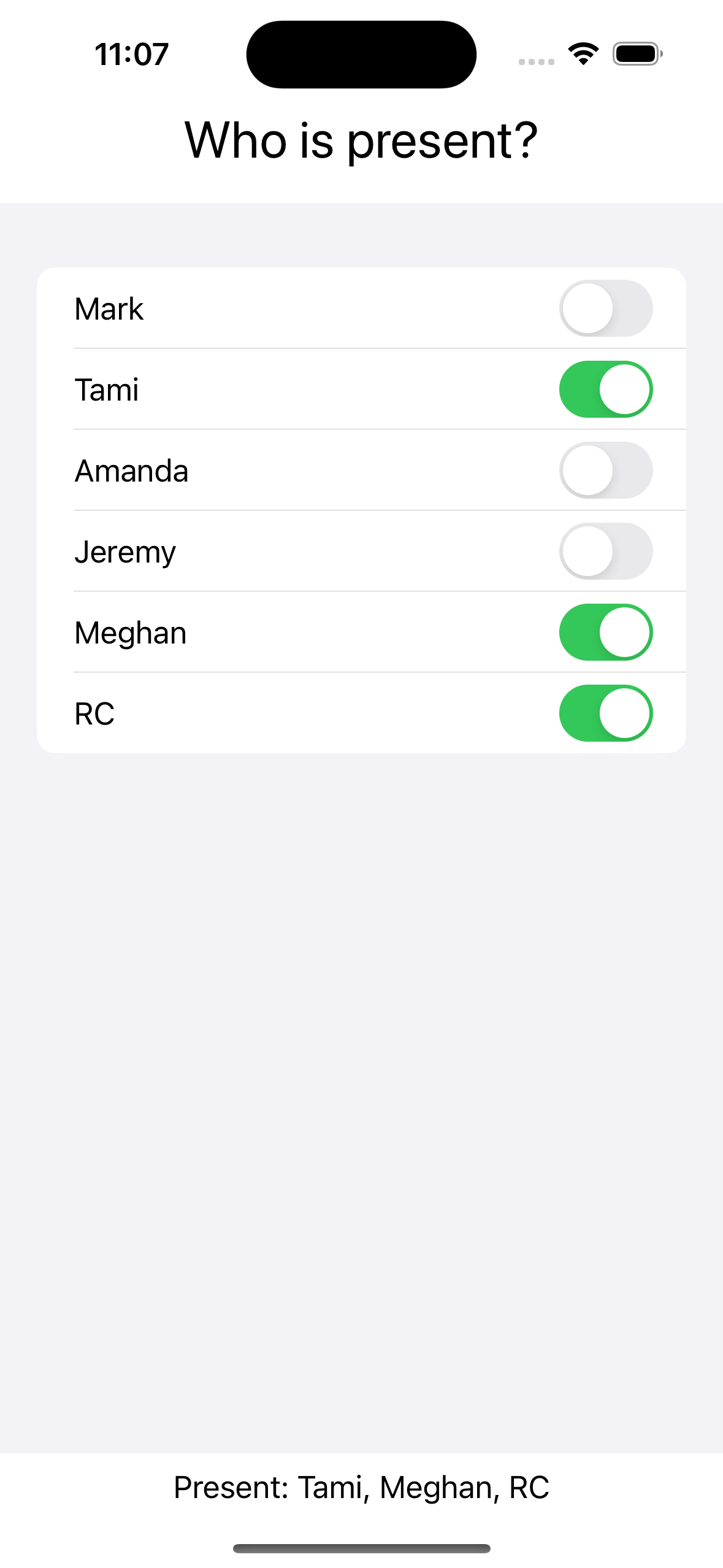
struct Person: Identifiable {
    let name: String
    var id: String { name }
    var present = false

    init(_ name: String) {
        self.name = name
    }
}

struct ContentView: View {
    @State private var people = [
        Person("Mark"),
        Person("Tami"),
        Person("Amanda"),
        Person("Jeremy"),
        Person("Meghan"),
        Person("RC")
    ]

    var body: some View {
       VStack {
            Text("Who is present?").font(.title)
            List($people) { $person in
                HStack {
                    Text(person.name)
                    Spacer()
                    Toggle("", isOn: $person.present)
                }
            }

            let presentNames = people.filter { $0.present }.map { $0.name }
            let present = presentNames.joined(separator: ", ")
            Text("Present: \(present.isEmpty ? "nobody" : present)")
        }
    }
}
OutlineGroup
The OutlineGroup view displays a tree of data with disclosure angle brackets. See my SwiftUI-OutlineGroup project and the questions in it.
Section
Section views groups the contents of a Form, List, or Picker
into sections with optional headers and footers.
When Section views are used inside a List that has the listStyle view modifier applied using .listStyle(.sidebar),
disclosure buttons are provided on the right side of each header
to allow users to collapse them.
Section titles are made all uppercase by default.
To prevent this, apply the textCase view modifier passing it nil.
The following code displays a list of sections that each have header and footer, and are collapsible.
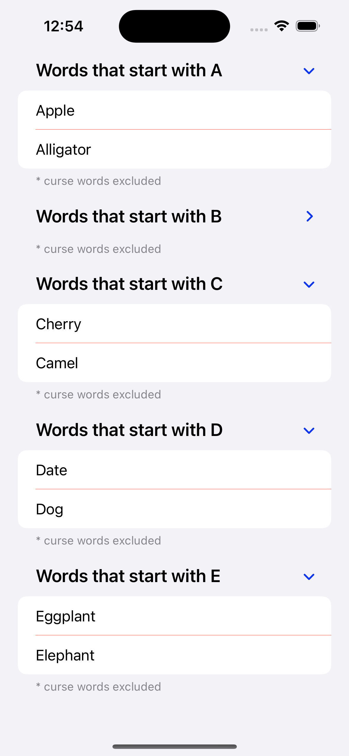
struct ContentView: View {
    let footerText = "* curse words excluded"
    let wordDict: Dictionary = [
        "A": ["Apple", "Alligator"],
        "B": ["Banana", "Bear"],
        "C": ["Cherry", "Camel"],
        "D": ["Date", "Dog"],
        "E": ["Eggplant", "Elephant"]
    ]

    var body: some View {
        List {
            ForEach(wordDict.keys.sorted(), id: \.self) { letter in
                Section(
                    header: Text("Words that start with \(letter)"),
                    footer: Text(footerText)
                ) {
                    ForEach(wordDict[letter] ?? [], id: \.self) { word in
                        Text(word)
                    }
                }
                // This increases header font size, makes it bold,
                // and does not change the case.  Without this
                // all characters are transformed to be uppercase.
                .headerProminence(.increased)
                .listRowSeparatorTint(.red)
            }
        }
        // This includes disclosure buttons in each section header.
        .listStyle(.sidebar)
    }
}
See more examples of using the Section view
in the Form section and in the List section.
ScrollView
The ScrollView view creates a scrollable view where scrolling reveals additional child views when they do not all fit.
Scrolling is vertical by default, but can be changed to horizontal
by passing .horizontal to the initializer.
To enable scrolling in both directions,
pass the array [.horizontal, .vertical].
A ScrollView occupies all the space offered to it.
To hide the scroll bars (indicators),
pass the showIndicators argument with a value of false to the initializer.
Another way to gain the ability to scroll is to use a List view.
See examples of using ScrollView in the
descriptions of LazyHStack and LazyVStack.
ScrollViewProxy
An instance of this type is passed to the trailing closure
of ScrollViewReader. See the example below.
ScrollViewReader
To scroll programmatically, use ScrollViewReader and the scrollTo method as shown below.
This also requires using the Namespace property wrapper which defines a "persistent identity"
for an object to which it is applied (typically a View).
Note the use of the withAnimation function to add animation to the programmatic scrolling.
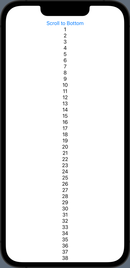
struct ContentView: View {
    @Namespace var topId
    @Namespace var bottomId

    var body: some View {
        ScrollView {
            ScrollViewReader { proxy in
                Button("Scroll to Bottom") {
                    withAnimation {
                        proxy.scrollTo(bottomId)
                        // The optional "anchor" argument controls alignment.
                    }
                }
                .id(topId)

                VStack(spacing: 0) {
                    ForEach(1 ..< 101) { i in
                        Text(String(i))
                    }
                }

                Button("Scroll to Top") {
                    withAnimation {
                        proxy.scrollTo(topId)
                    }
                }
                .id(bottomId)
            }
        }
    }
}
Table
The Table view displays data in rows and columns. It isn't currently very useful in iOS. In macOS it is only available in version 12 and above.
The following example demonstrates using a Table
that supports row selection and column sorting.
struct Dog: Identifiable {
  let name: String
  let breed: String
  let color: String
  let id = UUID()
}

private var dogs = [ // initially sorted on name
    Dog(name: "Comet", breed: "Whippet", color: "black brindle"),
    Dog(name: "Maisey", breed: "Treeing Walker Coonhound", color: "black"),
    Dog(name: "Oscar", breed: "German Shorthaired Pointer", color: "white"),
    Dog(name: "Ramsay", breed: "Native American Indian Dog", color: "gray")
]

struct ContentView: View {
    @State private var selectedDogs = Set<Dog.ID>()
    @State private var sortOrder = [KeyPathComparator(\Dog.name)] // initial

    var body: some View {
        Table(dogs, selection: $selectedDogs, sortOrder: $sortOrder) {
            TableColumn("Name", value: \.name)
            TableColumn("Breed", value: \.breed)
            TableColumn("Color", value: \.color)
        }
        // Why do these view modifiers have no effect?
        //.tableStyle(InsetTableStyle.inset(alternatesRowBackgrounds: true))
        //.tableStyle(BorderedTableStyle.bordered(alternatesRowBackgrounds: true))

        // Why does the first click on a table heading do nothing?
        .onChange(of: sortOrder) { dogs.sort(using: $0) }
        Text("\(selectedDogs.count) dogs selected")
    }
}
TabView
The TabView view creates a row of buttons at the bottom of the display that can be tapped to navigate to associated views. If there are more than five buttons, the first four will render followed by along with a "More" button. The "More" button can be tapped to go a view containing a tappable list of the remaining options.
From the docs, "Tab views only support tab items of type Text, Image, or an image followed by text. Passing any other type of view results in a visible but empty tab item." A good size for these images is 32x32.
When using SF Symbols, do not request filled version of the icons because the operating system will decide whether filled versions should be used.
To use TabView in conjunction with NavigationView,
wrap each page in its own NavigationView
rather than placing the TabView inside a NavigationView.
Having a NavigationView for each page
allows use of the toolbar view modifier
to add a toolbar at the top of each page.
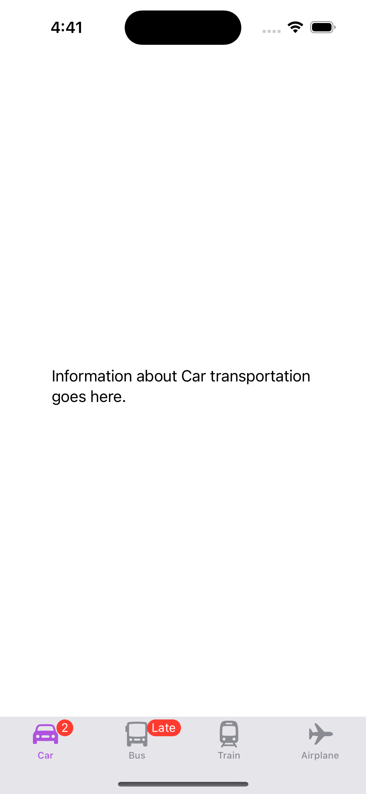
struct Transportation: View {
    var kind: String

    var body: some View {
        Text("Information about \(kind) transportation goes here.")
            .navigationBarTitle("\(kind) Transportation")
            .padding()
    }
}

struct ContentView: View {
    var body: some View {
        TabView {
            Transportation(kind: "Car")
                .tabItem {
                    Label("Car", systemImage: "car")
                }
                .badge(2) // number available
            Transportation(kind: "Bus")
                .tabItem {
                    Label("Bus", systemImage: "bus")
                }
                .badge("Late") // status
            Transportation(kind: "Train")
                .tabItem {
                    Label("Train", systemImage: "tram")
                }
            Transportation(kind: "Airplane")
                .tabItem {
                    Label("Airplane", systemImage: "airplane")
                }
        }
        .onAppear() {
            UITabBar.appearance().backgroundColor = .systemGray5
        }
        // Change color of Image and Text views which defaults to blue.
        .accentColor(.purple)
    }
}
By default the first tab is initially displayed. To start on another tab, add a state variable that holds the tag of the desired initial tab.
@State private var selection = 3
...
TabView(selection: $selection) {
    ...
    SomeView().tabItem {
        ...
    }
    .tag(3)
}
Here's another example that displays a set of pages the user can swipe through. Page controls with a dot representing each page are displayed at the bottom.
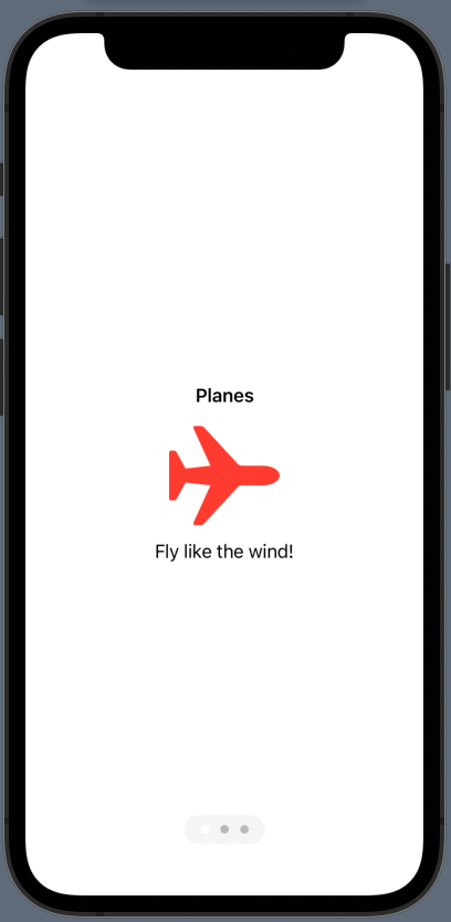
struct Page: View {
    var title: String
    var description: String
    var imageName: String

    var body: some View {
       VStack {
            Text(title).font(.headline)
            Image(systemName: imageName)
                .resizable()
                .scaledToFit() // or .scaledToFill()
                .frame(width: 100, height: 100)
                .foregroundStyle(.red)
            Text(description)
        }
    }
}

struct ContentView: View {
    var body: some View {
        TabView {
            Page(
                title: "Planes",
                description: "Fly like the wind!",
                imageName: "airplane"
            )
            Page(
                title: "Trains",
                description: "Travel the tracks!",
                imageName: "tram"
            )
            Page(
                title: "Automobiles",
                description: "Drive the open road!",
                imageName: "car"
            )
        }
        // This provides "paging dots" at the bottom of each page.
        .tabViewStyle(.page(indexDisplayMode: .always))

        // This allows swiping between pages without displaying paging dots.
        // .tabViewStyle(.page(indexDisplayMode: .never))

        // This adds a background behind the paging dots
        // so they are easier to see.
        .indexViewStyle(.page(backgroundDisplayMode: .always))
    }
}
Specific tab bar destinations can hide the tab bar by applying
the view modifier .toolbar(.hidden, for: .tabBar) view modifier
to the destination view.
TimelineView
The TimelineView view is a container that re-renders its children at scheduled times. The following example renders the date and time every second. For example, "Nov 8, 2021 at 5:19:47".
private var dateFormatter: DateFormatter {
    let df = DateFormatter()
    df.dateFormat = "MMM d, YYYY 'at' h:mm:ss a"
    return df
}

private let schedule = PeriodicTimelineSchedule(from: Date(), by: 1)

var body: some View {
    VStack {
        TimelineView(schedule) { context in
            Text(dateFormatter.string(from: context.date))
        }
    }
}
Component Views
AnyView
The AnyView view ... TODO: What is this?
AsyncImage
The AsyncImage view asynchronously loads and displays an image. A specified placeholder image is displayed while the specified image is being downloaded. It works in the Simulator, but not in Preview.
The following example renders the Swift logo:

struct ContentView: View {
    private let imageUrl =
        "https://developer.apple.com/swift/images/swift-og.png"
    private let size = 100.0

    var body: some View {
        VStack {
            AsyncImage(
                url: URL(string: imageUrl),
                content: { image in image.resizable() },
                placeholder: { ProgressView() } // spinner
            )
            .frame(width: size, height: size)
        }
    }
}
AsyncImage does not cache downloaded images,
so they can be downloaded multiple times.
To cache the images, see this Stack Overflow post.
Button
The Button view renders a tappable button.
The contents can be specified in two ways,
passing a String as the first argument or using the label argument
which can be specified with a trailing closure.
A Button specifies a function to call when pressed
using the action argument
which can also be written as a trailing closure.
The action argument is ignored for Button views that are inside a List.
In that case use the onTapGesture modifier instead.
By default buttons have no border, no background color, and the text is the accent color.
When the buttonStyle view modifier is passed .bordered, the background is gray.
When the buttonStyle view modifier is passed .borderedProminent,
the background is the accent color and the text is white.
In both cases no actual border is drawn.
They just add a background color inside a rounded rectangle.
To change the background color, apply the tint view modifier.
To change the border shape, apply the buttonBorderShape view modifier
passing it .capsule, .roundedRectangle,
or .roundedRectangle(radius: cornerRadius).
This only takes effect when the buttonStyle view modifier is also applied.
To change the text color,
apply the tint or foregroundStyle view modifier passing it a Color.
When their role attribute is set to .destructive, the text is red.
When their role attribute is set to .cancel, .none, or not specified,
there is no visible change.
To change the background color,
apply the tint view modifier passing it a Color.
To change the size, apply the controlSize modifier,
passing it .small or .large (default is .regular).
To disable a Button,
apply the disabled view modifier passing it a Bool.
// Button containing text and action specified with a trailing closure.
Button("My Label", role: .destructive) {
    // code to run when button is pressed
}.buttonStyle(.borderedProminent)

// Button with an "action" argument whose value
// can be a closure or a function reference
// and a "contents" argument whose value is a ViewBuilder
// that can be written as a trailing closure.
Button(action: {
    // code to run when button is pressed
}) {
    HStack {
        Text("Heart")
        Image(systemName: "heart")
    }
}
When there are multiple buttons on the same row of a Form or List,
tapping any of them runs all of their actions
instead of just the action of the tapped Button.
One fix for this is to add .buttonStyle(.borderless) to each of the buttons.
This is demonstrated in the simple app below.
struct ContentView: View {
    @State var number = 0

    var body: some View {
        // VStack { // no issues
        // List { // has bug
        Form { // has bug
            HStack {
                Button("One") { number = 1 }
                Button("Two") { number = 2 }
                Button("Three") { number = 3 }
            }
            .buttonStyle(.borderless) // fixes the bug

            Text("You tapped button #\(number)").padding()
        }
    }
}
Custom ButtonStyle
When an app uses several Button instances
that require the same customized styling,
it is useful to define a custom ButtonStyle
and apply that to each of the buttons.
For example:
struct MyButtonStyle: ButtonStyle {
    func makeBody(configuration: Configuration) -> some View {
        configuration.label
            .font(.system(size: 30, weight: .bold))
            .padding(15)
            .foregroundStyle(.white)
            .background(.purple)
            .clipShape(Capsule())
            .overlay(Capsule().strokeBorder(.blue, lineWidth: 3))
            .scaleEffect(configuration.isPressed ? 1.25 : 1)
            .animation(
                .linear(duration: 0.1),
                value: configuration.isPressed
            )
    }
}

struct ContentView: View {
    @State private var selection = ""

    var body: some View {
        VStack(spacing: 30) {
            Button("First") { selection = "First" }
            Button("Second") { selection = "Second" }
            if !selection.isEmpty {
                Text("You selected \(selection).")
            }
        }
        .buttonStyle(MyButtonStyle())
        .padding()
    }
}
Color
The Color struct plays two roles.
It represents a color and is also a view that
creates a rectangular view with a specific background color
which grows to fill all the space offered to it.
For example, Color.red and Color.clear (transparent) are views.
A UIColor can be converted to a Color.
For example, UIColor.blue can be converted with Color(.systemBlue).
ColorPicker
The ColorPicker view renders a color well
for displaying a currently selected color
and changing the color using the system color picker.
It takes a label and a selection argument
that is a binding to the currently selected Color.

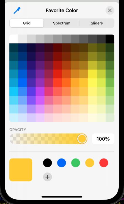
ColorPicker(
    "Favorite Color",
    selection: $favoriteColor // a binding
)
DatePicker
The DatePicker
view allows selecting a date, time, or both.
It takes the text to display as a prompt and
a selection argument which is a binding that
holds the currently selected Date value.
The optional displayedComponents argument specifies
what can be selected using a single value or an array of
DatePickerComponent values
which include .date and .hourAndMinute.
Note that it is not possible to request allowing
selection of a month and day without a year.
DatePicker(
    "Birthday",
    selection: $birthday, // a binding
    displayedComponents: [.date, .hourAndMinute] // array or single value
)
To restrict the dates that can be selected,
add the in argument with a Range value after the selection argument.
To only allow dates in the past or now, use ...Date().
To only allow dates in the future or now, use Date()....
To hide the label, apply the labelsHidden view modifier.
DatePicker("", selection: $birthday, displayedComponents: .date)
    .labelsHidden()
Apply the datePickerStyle view modifier to choose a style.
The options that can be passed to this include:
-
.automatic- This is the default and is the same as.compactin iOS. -
.compact- This renders date in a button that can be tapped to render the.graphicalcontrols (see below) for changing the date.
DatePicker compact style 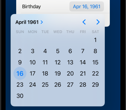
DatePicker compact style after tapping 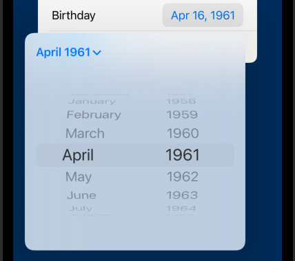
DatePicker compact style after tapping -
.field- This not available in iOS. -
.graphical- The renders a calendar view that contains controls for picking a month and year, going to the previous or next month, and selecting a day of the month.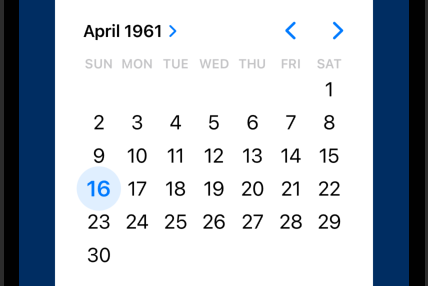
DatePicker graphical style -
.stepperField- This not available in iOS. -
.wheel- This provides separate wheel pickers for month, day, and year.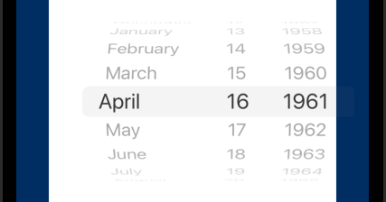
DatePicker wheel style
EditButton
The EditButton
view toggles the edit mode of a List.
It is typically added to a List using the toolbar view modifier.
See the example in the List section.
Gauge
The Gauge view shows a current value in relation to minimum and maximum values. One example is a car fuel gauge. This is currently only supported in watchOS.
We can build a similar view to use on other platforms. For example:
struct MyGauge: View {
    var value: Double
    var min = 0.0
    var max = 100.0
    let fontSize: CGFloat = 50
    var strokeColor: Color = .blue
    var strokeWidth = 20.0
    var textColor: Color = .black

    var body: some View {
        ZStack {
            let percent = (value - min) / (max - min)
            Circle()
                .trim(from: 0, to: percent)
                .stroke(
                    strokeColor,
                    style: StrokeStyle(
                        lineWidth: strokeWidth,
                        lineCap: .round
                    )
                )
                .rotationEffect(.degrees(-90))

            Text(String(format: "%.0f", value))
                .font(.system(size: fontSize, weight: .bold))
                .foregroundStyle(textColor)
        }
    }
}

struct ContentView: View {
    @State private var value = 25.0

    var body: some View {
        VStack(spacing: 20) {
            MyGauge(
                value: value,
                strokeColor: .red,
                strokeWidth: 15,
                textColor: .blue
            )
            .frame(width: 150, height: 150)

            HStack {
                Button("Decrease") {
                    withAnimation { value = max(value - 10, 0) }
                }
                Button("Increase") {
                    withAnimation { value = min(value + 10, 100) }
                }
            }
            .buttonStyle(.bordered)

            Slider(value: $value, in: 0 ... 100, step: 1) {
                Text("Value")
            }
        }
        .padding()
    }
}
EmptyView
The EmptyView view renders nothing. It is useful in cases where a view needs to be returned, but there is nothing to display.
EquatableView
The EquatableView view ... TODO: What is this?
Image
The Image view renders an image.
Many image formats are supported including PNG, JPEG, and HEIC.
To add images, click Assets.xcassets in the Navigator.
Click the "+" in the lower-left to add an entry.
Give the entry a name and drag images into the 1x, 2x, and 3x boxes.
Pass the name to the Image view as an unlabelled argument.
For example, Image("Comet").
iOS 17 added automatic generation of constants for colors and images
defined in .xcassets files.
This allows replacing Image("Comet") with Image(.comet).
Newer devices use 3x images, slightly older devices use 2x images, and really old devices use 1x images. See Displays.
Smaller sizes are automatically scaled up for use in devices that prefer larger sizes. For example, if only a 1x image is provided, it will be scaled for use in devices that prefer 2x and 3x images.
TODO: Are larger sizes are automatically scaled down for use in older devices? For example, if only a 3x image is provided, it will be scaled down for use in devices that prefer 2x and 1x images?
One way to create a new "Image Set" is to:
- Select
Assets.xcassetsin the Project Navigator. - Drag an image from the Finder into in the editor area.
- Optionally add different images for light and dark mode, similar to Color Sets.
A good source for test images is Lorem Picsum.
This creates a new "Image Set" whose name matches the name of the image file without its file extension. The image will appear in the 1x box and will be used for all devices.
To supply a single image for a given Image Set in Assets.xcassets:
- Select the image set.
- Open the Inspector panel on the right.
- Select the Attributes tab (4th).
- Change the value for "Scales" to "Single Scale".
- Paste an image into the All - Universal box.
For vector images such as those described by SVG and PDF files:
- Change the value for "Scales" to "Single Scale" as described above.
- After the "Resizing" option, check the "Preserve Vector Data" checkbox.
Icons from SF Symbols can be used by specifying
their name as the systemName argument.
For example, Image(systemName: "cloud.snow").
Image views are not resizable by default.
To make them resizable, apply the resizable view modifier.
To tile the image across the space given to it,
apply the view modifier .resizable(resizingMode: .tile).
To maintain the original aspect ratio, apply the aspectRatio view modifier.
This takes a contentMode argument which can
have the values .fill and .fit.
These are equivalent: .aspectRatio(contentMode: .fill) and .scaledToFill().
And these are equivalent: .aspectRatio(contentMode: .fit) and .scaledToFit().
To change an Image to have a size different from its default,
apply the frame view modifier.
A new size can cause the image to skew.
To clip an image to a given shape, apply the clipShape view modifier.
The order in which these view modifiers are applied is important. Here is an example of correct usage.
Image("some-name")
    .resizable()
    .scaledToFit() // enables omitting one dimension below
    .frame(width: 300, height: 300)
    .clipShape(Circle())
    .overlay(Circle().stroke(Color.red, lineWidth: 10))
When an Image Set in Assets.xcassets is configured to use template mode,
it renders with a single color.
To change an Image Set to always render in template mode:
- Select the image set.
- Open the Inspector panel on the right.
- Select the Attributes tab (4th).
- Change the value for "Render As" to "Template Image".
Single-color SF Symbol icons and images in template mode use the accent color.
To render an image in template mode, apply the renderingMode view modifier.
Using this approach rather than configuring the Image Set "Render As" property
allows the Image Set to be rendered using its actual colors elsewhere
and render in template mode here.
Image("someName").renderingMode(.template)
To supply different images for use when the devices is in light or dark mode:
- Select the image set.
- Open the Inspector panel on the right.
- Select the Attributes tab (4th).
- Change the value for "Appearances" to "Any, Dark". "Any" refers to all devices running iOS 12 and earlier (which do not support dark mode) and devices running iOS 13 or later that are in light mode.
- Paste an images to be used in light mode into the "Any Appearance" boxes.
- Paste an images to be used in dark mode into the "Dark" boxes.
Generally lighter images should be used in light mode and darker images should be used in dark mode.
Label
The Label view renders an icon and text where the icon appears first.
Label supports many initializers but the most commonly used
take the text as a String followed by the icon
as either a systemName String (for an SF Symbol)
or a image String (for an image asset name).
For example:
Label("Rain", systemImage: "cloud.rain")
Applying the font view modifier scales both the text and the icon.
The labelStyle
view modifier changes which parts are rendered.
The default argument value is .titleAndIcon which renders both parts.
To render only the text, pass .titleOnly.
To render only the icon, pass .iconOnly.
LabeledContent
The LabeledContent view displays a label and a value.
It is most often used inside a Form.
See examples of using this in the Form section.
Link
The Link view creates a hyperlink like an HTML a element.
It takes link text and a destination argument
whose value is a URL struct.
Tapping a Link opens the associated URL in Safari.
Links work in the Simulator but Preview is not able to open Safari.
Link(
    "link text",
    destination: URL(string: "https://some-domain/some-path"
)
To display a view instead of plain link text,
add the label argument as follows:
Link(
    destination: URL(string: "https://some-domain/some-path"),
    label: SomeView
)
Apply the font view modifier to change the font.
Apply the tint view modifier to change the color.
When using Link views it may be necessary to
add the key "Supports Document Browser" with the Boolean value "YES"
in the target Info tab to remove a build warning.
To open a URL programmatically, get the openURL function
from the environment and pass it a URL object.
For example:
struct SomeView: View {
    @Environment(\.openURL) var openURL

    var body: some View {
        Button("My Blog") {
            openURL(URL(string: "https://mvolkmann.github.io/blog/")!)
        }
    }
}
Menu
The Menu view renders a label containing the menu title.
When clicked, a menu appears below or above the label
containing a vertical stack of buttons and sub-menus.
To separate groups of menu items include Divider views
The placement of the menu and the order of the buttons depends on the position of the menu. Normally the menu is displayed below the label and the buttons or ordered from top to bottom. However, if the menu is near the bottom of the display then the menu is displayed above the label and the button order is reversed in order to make all the buttons visible.
Menu("My Menu") {
    Button("Option 1", action: {})
    Button("Option 2", action: {})
    // This demonstrates using a nested menu.
    Menu("Option 3") {
        Button("Option 3.1", action: {})
        Button("Option 3.2", action: {})
    }
}
The following example uses a Menu to
select the color used to fill a Rectangle.
Menus can specify a primaryAction closure that is executed
if the user taps the label rather than long pressing it.
struct ContentView: View {
    @State private var color = Color.red

    var body: some View {
        VStack {
            Menu("Color ...") {
                Button("Red") { color = .red }
                Button("Green") { color = .green }
                Button("Blue") { color = .blue }
            } primaryAction: {
                color = .gray
            }

            Rectangle().fill(color).frame(width: 50, height: 50)
        }
    }
}
NavigationLink
The NavigationLink view is used inside a NavigationView.
This is deprecated in iOS 16. See the new approach at Navigation.
NavigationView
The NavigationView view marks an area where
a stack of views will be rendered one at a time.
It contains NavigationLink views that are similar to HTML anchor elements.
Tapping them causes the associated view
to be rendered inside the NavigationView.
See the Navigation section.
This is deprecated in iOS 16. See the new approach at Navigation.
PasteButton
The PasteButton view renders a button for pasting data from the system clipboard.
The following example uses one PasteButton for pasting copied text
and another for pasting a copied image.
struct ContentView: View {
    @State private var copiedText = ""
    @State private var copiedImage: Image?

    let items = ["Fork", "Spoon", "Knife"]

    var body: some View {
        VStack {
            Text("Long press an item below and select Copy.")
                .fontWeight(.bold)
            ForEach(items, id: \.self) { item in
                Text(item).textSelection(.enabled)
            }

            // Why is an array passed to the closure?
            PasteButton(payloadType: String.self) { contents in
                guard let first = contents.first else { return }
                copiedText = first
            }
            if copiedText.isEmpty {
                Text("No text has been pasted.")
            } else {
                Text("You pasted \(copiedText).")
            }

            PasteButton(payloadType: Image.self) { images in
                guard let first = images.first else { return }
                copiedImage = first
            }
            if let copiedImage {
                copiedImage
                    .resizable()
                    .scaledToFit()
            } else {
                Text("No image has been pasted.")
            }
        }
        .font(.system(size: 24))
    }
}
Picker
The Picker view supports selecting an option from a list.
It takes label text and a selection argument
which is a binding that holds the selected value.
The options are specified with child Text views.
If these are provided using ForEach, the selection value
comes from the values over which the ForEach iterates,
not from the value being displayed by the Text views.
To change these, apply the tag view modifier to the Text views,
passing it a value.
The prompt text passed to the Picker initializer
is only displayed if the Picker is inside a Form or List.
Apply the pickerStyle view modifier
to change the way the options are rendered, passing it a PickerStyle.
The label is only rendered by some styles.
PickerStyle values include:
-
automatic (default)
This selects a style based on the context in which the
Pickeris used. It is typically either.menuor.wheel. When thePickeris inside aFormwhich is inside aNavigationViewand nopickerStyleis specified, clicking thePickerdisplays the options on a separate page.
automatic picker before clicking 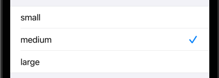
automatic picker new page after clicking -
This displays the prompt and all the options (visible simultaneously) in the current sheet. The selected option is indicated by a check mark. This works when the
Pickeris inside aForm. Otherwise it uses the.wheelstyle. -
This does not display the prompt and only displays the currently selected value. When the current value is tapped, all the options are rendered in a dropdown menu inside the current sheet. There is no limit to the number of options that can appear in the menu and it will scroll vertically if they do not all fit on the screen.

menu picker before clicking 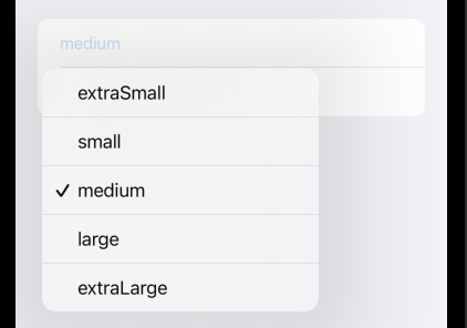
menu picker after clicking -
palette - added in iOS 17
This "presents the options as a row of compact elements". See the example project PickerStyleDemo.
-
radioGroup - not available in iOS
-
This does not display the prompt, and renders the options as a "Segmented Control" which is a horizontal row of buttons. There is no limit to the number of options, but their text will be elided if it doesn't fit inside the buttons.

segmented picker -
This does not display the prompt, and renders all the options as a scrollable wheel. It requires sufficient vertical space to render properly. A height of 300 works well.
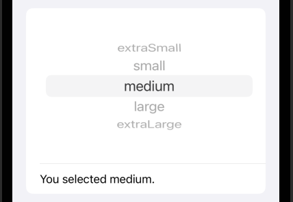
wheel picker
The background color and font used by a Picker
can be customized in limited ways.
To set the background color, apply the background view modifier
For example, .background(Color.yellow.opacity(0.3)).
The tint view modifier does not effect Picker views.
To set the font and foreground color, apply the font and foregroundStyle
view modifiers to the Text views used to render the options.
For example, .font(.headline).foregroundStyle(.red).
This only applies to automatic and wheel pickers,
not menu or segmented pickers.
When the options are generated using ForEach to iterate over an array,
the selection value will be one of the array items.
This can be changed by applying the tag view modifier
to the immediate child view of the ForEach.
The type of the tag value must match the type of the selection argument.
If these types differ, the compiler does not generate an error,
but it will not be possible to change the selected option.
struct ContentView: View {
    enum ShirtSize: String, CaseIterable {
        case sm = "Small"
        case md = "Medium"
        case lg = "Large"
        case xl = "Extra Large"
    }

    @State private var shirtSize: ShirtSize = .sm

    var body: some View {
        Form {
            Picker("Shirt Size", selection: $shirtSize) {
                ForEach(ShirtSize.allCases, id: \.self) { size in
                    Text(size.rawValue) // no need for tag view modifier

                    // The text displayed here has
                    // no effect on the value of shirtSize!
                    // If we use the following in place of the previous line,
                    // we can still select each of the four shirt sizes
                    // despited each option displaying the same text.
                    // Text("junk")

                    // If we iterate over ShirtSize.allCases.indices
                    // instead of iterating over ShirtSize.allCases
                    // and display the index values,
                    // we can use the tag view modifier to associate
                    // each option with one of the ShirtSize enum cases.
                    // Text("\(index)").tag(ShirtSize.allCases[index])
                }

                // We can hard-code alternative names of the shirt sizes
                // and associate them with ShirtCase cases.
                // Text("Tiny").tag(ShirtSize.sm)
                //  Text("In-Between").tag(ShirtSize.md)
                // Text("Big").tag(ShirtSize.lg)
            }

            Text("selected \(shirtSize.rawValue)")
            Text("type is \(String(describing: type(of: shirtSize)))")
        }
    }
}
The following Picker example saves the index of a selected item
rather than the item itself.
It begins with no option being selected.
struct Person {
    let name: String
}

struct ContentView: View {
    @State private var selectedPersonIndex: Int = -1 // nothing selected

    let people = [
        Person(name: "Mark"),
        Person(name: "Tami"),
        Person(name: "Amanda"),
        Person(name: "Jeremy")
    ]

    private var selectedPerson: Person? {
        selectedPersonIndex == -1 ? nil : people[selectedPersonIndex]
    }

    var body: some View {
        Form {
            Picker("Person", selection: $selectedPersonIndex) {
                Text("").tag(-1)
                ForEach(people.indices, id: \.self) { index in
                    Text(people[index].name)
                }
            }

            Text("You selected \(selectedPerson?.name ?? "nobody").")
        }
    }
}
ProgressView
The ProgressView view displays a progress indicator.
It takes a label,
an optional value argument that is a binding to the current value,
and an optional total argument that is the maximum value (default is 0.0).
If the value argument is supplied then the determinate style
that displays a thin progress bar is used.
If the value argument is omitted then the indeterminate style
that uses the standard Apple spinner is used.
struct ContentView: View {
    @State private var progress = 0.0

    func startTimer() {
        // Run every 3 hundredths of a second.
        // When "repeats" is false, this is like setTimeout in JavaScript.
        // When "repeats" is true, this is like setInterval in JavaScript.
        Timer.scheduledTimer(withTimeInterval: 0.03, repeats: true) { timer in
            progress += 0.01
            if (progress >= 1) {
                timer.invalidate() // stops Timer
                progress = 0
            }
        }
    }

    var body: some View {
        VStack {
            if progress > 0 {
                ProgressView() // indeterminate
                ProgressView(value: progress).padding() // determinate
            }
        }
        .onAppear { startTimer() }
    }
}
To change the color of a ProgressView
apply the tint view modifier passing it a Color.
To change the size of an indeterminate ProgressView
apply the scaleEffect modifier. For example:
ProgressView().scaleEffect(1.5)
Sometimes it is desirable to delay rendering a ProgressView
by a short amount of time. For example, when making a network call it is best
to only display a progress indicator if the call does not complete quickly.
One way to achieve this is with DispatchQueue.main.asyncAfter.
This can be wrapped in a custom view modifier to simplify the code.
See Improving the Loading Experience in SwiftUI.
SecureField
The SecureField view is like TextField,
but obscures the characters that are typed.
It is typically used for sensitive data like
passwords and social security numbers.
SecureField("Password", text: $password)
    .autocapitalization(.none)
    .disableAutocorrection(true)
ShareLink
The ShareLink view displays an icon and a label that can be tapped to open a share sheet for sharing specific data. The share sheet allows selecting the method of sharing which include Print, "Save to Files", AirDrop, text message, email, and many application-specific methods such as Facebook, Mastadon, Messenger, and Twitter.
The icon and label displayed by a ShareLink can be customized.
The data to share, referred to as the "item",
must conform to the Transferable protocol.
The built-in types AttributedString, Data, Image, String, and URL do this.
In addition, custom types can conform to Transferable.
In addition to sharing the item, an optional message is also shared.
The following code example demonstrates
a basic ShareLink that shares a URL,
a ShareLink that shares a URL with a customized icon and label,
and a ShareLink that shares an Image.
struct ContentView: View {
    private let linkColor: Color = .purple
    private let urlDescription = "The Question Mark - blog by Mark Volkmann"
    private let link = URL(string: "https://mvolkmann.github.io/blog")!
    private let linkSize: CGFloat = 20

    private let imageName = "Comet"
    private var imageMessage: String { "\(imageName), the whippet" }
    private var image: Image { Image(imageName) }

    var body: some View {
        VStack(alignment: .leading, spacing: 20) {
            // Basic sharing of a URL
            ShareLink(
                // Supply a first argument String to keep the default icon
                // which is "square.and.arrow.up" and
                // follow it with text other than the default "Share...".
                urlDescription, // optional
                item: link,
                message: Text(urlDescription) // optional
            )
            .font(.system(size: linkSize))
            .tint(linkColor)

            // Sharing of a URL with a custom icon
            ShareLink(
                item: link,
                message: Text(urlDescription)
            ) {
                // Supply a label closure instead of a first argument String
                // in order to change the icon which defaults to
                // "square.and.arrow.up" and the default text.
                Label(urlDescription, systemImage: "heart.fill")
                    .font(.system(size: linkSize))
                    .tint(linkColor)
            }

            // Sharing an image
            ShareLink(
                imageMessage,
                item: image,
                message: Text(imageMessage),
                // The preview appears at the top of the share sheet.
                preview: SharePreview(imageName, image: image)
            )
            .font(.system(size: linkSize))
            .tint(linkColor)
        }
    }
}
Slider
The Slider view renders a horizontal track with a thumb
that slides between minimum and maximum values
specified by the in argument whose value is a ClosedRange.
The value argument value is a binding that holds the current value
as a Float, not an Int.
An optional step argument indicates the steps in which the value changes.
Text and/or icons can be displayed at the leading and trailing ends.

// No text or icons at ends.
Slider(value: $rating, in: 0...10, step: 1)

// Has text at ends and displays current value below.
VStack {
    Slider(
        value: $rating,
        in: 0...10,
        step: 1,
        label: { Text("Rating") }, // not rendered
        // The next two attributes must be closures that return the
        // same kind of view.  Image and Text are common choices.
        minimumValueLabel: { Image(systemName: "hand.thumbsdown") },
        maximumValueLabel: { Image(systemName: "hand.thumbsup") }
    ).padding()
    Text("rating = \(Int(rating))")
}
Stepper
The Stepper view displays "-" and "+" buttons that can be
tapped to decrement and increment a value.
It takes a label to display before the buttons,
a binding for the current value,
an optional range the value must remain inside, and
a closure to execute every time the Stepper changes the value.

VStack {
    Stepper(
        "# of Dogs: \(dogCount)",
        value: $dogCount,
        in: 0...10
    ) { v in
        tooManyDogs = dogCount > 2
    }

    Text("Too Many Dogs? \(String(tooManyDogs))")
}.padding()
The optional onIncrement and onDecrement arguments take a closure
that runs when the plus and minus buttons are tapped.
They are typically used to modify the value
in a way other than adding or subtracting one.
Text
The Text view renders text.
If the text is too long to fit on a single line,
it is automatically wrapped to additional lines.
To prevent this, apply the lineLimit view modifier
and pass the number of lines that can be used (perhaps 1).
If the text doesn't fit in the allowed number of lines,
it will be elided and an ellipsis will appear at the end.
To set the foreground color, apply the foregroundStyle view modifier.
To set the font size, apply the font view modifier.
Text("Hello World").foregroundStyle(.red).font(.system(size: 24))
The Text view can only be passed a String.
Other types such as Int and Double must be converted to String.
Consider extending Text to add initializers for other types.
For example:
extension Text {
    init(_ number: Double) {
        self.init(String(number))
    }

    init(_ number: Int) {
        self.init(String(number))
    }
}
To render text with multiple styles and no space between them,
use the "+" operator between Text views. For example:
Text("Red").foregroundStyle(.red) +
Text("Green").foregroundStyle(.green) +
Text("Blue").foregroundStyle(.blue)
TODO: Describe the use of LocalizedStringKey to lookup the actual text to use. TODO: See the description in the Localization page.
Text Modifiers
There are many view modifiers that can be applied to Text views.
The bold
view modifier changes the font used by a Text view to bold.
The foregroundStyle view modifier changes the text color of a Text view
to a given Color.
The italic
view modifier changes the font used by a Text view to italic.
The kerning and tracking view modifiers both add space between letters. The difference is that the former even adds space between ligatures whereas the later does not.
The lineLimit view modifier limits the number of lines
on which the text can be wrapped, specified by the argument value.
If more lines are needed, the text is elided
(truncated with an ellipsis at the end).
To change where the ellipsis appears, apply the truncationMode view modifier
with the value .head, .middle or .tail (default).
The ellipsis always appears in the last line of multi-line text.
The minimumScaleFactor view modifier causes the font size
to be scaled down in order to get the text to fit within its frame.
Its argument is a percent value between 0 and 1.
For example, Text(myTitle).lineLimit(1).font(.title).minimumScaleFactor(0.75)
will use the title font size if the text will fit,
but will scale as low as 75% of that font size.
It uses the largest size that will fit that is between
100% and 75% of the requested font size.
If the text doesn't fit at 75% of the requested font size,
it will be elided (truncated with ... at the end).
The strikethrough view modifier a Text view
to have a horizontal line drawn through it.
The textCase view modifier transforms the case of the text. The supported argument values are:
.lowercase: changes all characters to lowercase.uppercase: changes all characters to uppercasenone: makes no changes
Several views such as Text, Label, and Button
automatically recognize and honor Markdown syntax.
For example:
Text("plain *italic* **bold** ~strike~ `code`")
Text("[link](https://apple.com)")
By default users cannot select the text rendered by Text views.
To enable this, apply the textSelection view modifier with the argument value .enabled.
To copy the text, press until a popup containing
"Copy" and "Share" buttons appears.
The entire text is copied, not individual characters or words.
Applying the textSelection view modifier to a List view
makes each Text view inside it selectable.
The underline view modifier changes the text in a Text view
to be underlined.
The color of the underline defaults to the text color, but can be specified.
Text modifiers can be combined. For example, the following code renders text that is bold, italic, and underlined.
Text("Hello, World!").bold().italic().underline()
style Argument
The Text initializer can be passed a Date
if a style argument is also passed.
For example:
Text(Date(), style: .date) // December 3, 2022
Text(Date(), style: .time) // 11:20 AM

// Each of these update automatically every second.
Text(Date(), style: .offset) // +41 seconds
Text(Date(), style: .relative) // 41 sec
Text(Date(), style: .timer) // 0.41
format Argument
The Text initializer can be passed a type other than String
if a format argument with a compatible value is also passed.
For example:
// These format currency values, but do not perform currency conversion.
let price = 123.456
Text(price, format: .currency(code: "USD")) // $123.46
Text(price, format: .currency(code: "GBP")) // £123.46

// These format the current date.
Text(Date(), format: .dateTime) // 12/3/2022, 11:17 AM
Text(Date(), format: .iso8601) // 2022-12-03T17:17:56Z

// These format an array of strings by placing a comma between each
// and including the word "and" or "or" before the last value.
let stooges = ["Moe", "Larry", "Curly"]
Text(stooges, format: .list(type: .and)) // Moe, Larry, and Curly
Text(stooges, format: .list(type: .or)) // Moe, Larry, or Curly
Also see the AttributedString section for applying different formatting to substrings of a string.
Gradients
A gradient can be used to supply text color. For example:

struct ContentView: View {
    let gradient = LinearGradient(
        colors: [.red, .orange, .yellow, .green, .blue, .purple],
        startPoint: .leading,
        endPoint: .trailing
    )
    var body: some View {
        Text("Colors of the rainbow\nfound in one sentence.")
            .font(Font.system(size: 30, weight: .bold))
            .multilineTextAlignment(.center)
            .foregroundStyle(gradient)
    }
}
Embedding Images
It is possible to embed images in Text views
and concatenate them with other Text views.
This works best when the images come from SF Symbols
because those can be automatically sized to match the text size.
The concatenated Text views will wrap as expected.
For example:
struct ContentView: View {
    private let run =
        Text(Image(systemName: "figure.run")).foregroundStyle(.red)
    private let cycle =
        Text(Image(systemName: "figure.indoor.cycle"))

    var body: some View {
        VStack {
            Text("I like to go for a long ") + run +
                Text(" in the morning before work.") +
                Text(" If the weather is bad, I might opt for a ") + cycle +
                Text(".")
        }
        .font(.system(size: 28))
        .padding()
    }
}
If a custom image (not from SF Symbols) is passed to the Text initializer
then the size of the image cannot be specified using the frame view modifier
because the value passed to the Text initializer
must conform to StringProtocol and the return value
of the frame view modifier does not do that.
Measurements
The Measurement struct from the Foundation library
is used to specify a quantity (Double) with a unit of measure.
Values of this type can be passed to the Text initializer
along with a format argument of type Measurement.FormatStyle.
The supported quantity types include UnitAcceleration, UnitAngle,
UnitArea, UnitDispersion, UnitDuration, UnitElectricalCharge,
UnitElectricalCurrent, UnitEnergy, UnitFrequency, UnitFuelEfficiency,
UnitIlluminance, UnitLength, UnitMass, UnitPoint, UnitPower,
UnitPressure, UnitSpeed, UnitTemperature, and UnitVolume.
Each of these define a set of class properties that specify the supported units.
For example, UnitLength defines the metric system class properties
millimeters, centimeters, meters, and kilometers,
the imperial system class properties inches, feet, yards, and miles,
and many more.
For example:
// A `Measurement` has a `value` and a `unit`.
let metricLength = Measurement(value: 10, unit: UnitLength.centimeters)
Text("metric length value is \(metricLength.value)") // 10.000000
Text("metric length unit is \(metricLength.unit.symbol)") // cm

let imperialWidth = Measurement(value: 7, unit: UnitLength.inches)

// The output shown in the comments below assumes
// the app is run in the United States where
// the Imperial system is used rather the Metric system.
Text(metricLength, format: .measurement(width: .wide)) // 3.9 inches
Text(metricLength, format: .measurement(width: .abbreviated)) // 3.9 in
Text(metricLength, format: .measurement(width: .narrow)) // 3.9"
Text(imperialWidth, format: .measurement(width: .wide)) // 7 inches

// Measurements support many operators including +, -, *, /.
// These operators return a new `Measurement` instance.
// Only one operand can be a `Measurement`.
// The other must be a number.

// Measurements support comparison operators like ==, <, and >.

// Measurements can be converted to compatible units.
let metricWidth = imperialWidth.converted(to: metricLength.unit)
Text("\(metricWidth.value)") // 17.78 cm

let metricArea = Measurement(
    value: metricLength.value * metricWidth.value,
    unit: UnitArea.squareCentimeters
) // 177.8 square centimeters
Text(metricArea, format: .measurement(width: .wide)) // 28 square inches
TextField
A TextField provides single-line text entry.
It also works with non-String types using a FormatStyle object
to convert between String values and the type.
It takes label text, a binding to a variable, and an optional prompt.
In macOS apps, the label precedes the input area
and the prompt is used as placeholder text.
In iOS apps, no text precedes the input area
and the prompt or label is used as placeholder text.
The style can be set with the textFieldStyle view modifier.
The options are plain (default) and roundedBorder.
When the plain style is used, it's not obvious that the value can be edited
unless it is wrapped in a Form.
Auto-capitalization of words is provided by default.
To disable this, pass .none to the autocapitalization view modifier.
Auto-correction is provided by default.
To disable this, pass true to the disableAutocorrection view modifier.
TextField("First Name", text: $firstName)
    .padding()
    .textFieldStyle(.roundedBorder)
An alternative to using a rounded border is to add a background color in a capsule shape. For example:
TextField("First Name", text: $firstName)
    .padding()
    .background(.yellow.opacity(0.2))
    .clipShape(Capsule())
To add a clear button ("x" in a circle) that can be tapped
to clear the value of TextField instances add the following
to a container view that contains all of them:
.onAppear {
    UITextField.appearance().clearButtonMode = .whileEditing
}
To allow entering multiple lines of text,
set the axis argument to .vertical.
Optionally limit the maximum number of visible lines with the lineLimit view modifier.
More lines can be entered, but no more than this number of lines
will be displayed.
For example:
TextField("Name", text: $bio, axis: .vertical)
    .lineLimit(3)
    .textFieldStyle(.roundedBorder)
Pass reservesSpace: true to the lineLimit view modifier
to reserve enough vertical space to hold the specified number of lines
even if the entered text isn't long enough to require them.
Instead of passing a single maximum number of lines
to the lineLimit view modifier, pass a range such as 3...6
to make the TextField occupy at least three lines and not more than 6.
TextField supports a format argument that can be set to .number.
However, this doesn't prevent users from entering non-numeric characters.
It only causes it to attempt to convert what is entered to a number
after the user taps the "return" key.
A better way to only accept numeric characters is to
use the numberPad keyboard as shown below.
// Using a non-String value, Int in this case.
// This doesn't provide arrows to increment and decrement the value.
TextField("Score", value: $score, format: .number)
    // Use .decimalPad to allow floating point numbers,
    // but this allows entering more than one decimal point.
    .keyboardType(.numberPad)
    .padding()
    .textFieldStyle(.roundedBorder)
Use the keyboard type .decimalPad
to allow entering digits and a decimal point.
But this doesn't prevent entering multiple decimal points.
Also, on iPads the keyboards for .numberPad and .decimalPad
contain additional keys that should not be allowed in numbers.
The supported keyboard types include the following:

A more robust solution is to use the following custom view modifier inspired by the Stewart Lynch video Numeric TextFields in SwiftUI.
import Combine // for onReceive method
import SwiftUI

// See the Stewart Lynch video at
// https://www.youtube.com/watch?v=dd079CQ4Fr4&t=2s.
struct NumbersOnlyViewModifier: ViewModifier {
    @Binding var text: String
    var float: Bool

    func body(content: Content) -> some View {
        let decimalSeparator = Locale.current.decimalSeparator ?? "."
        let allowed = "0123456789" + (float ? decimalSeparator : "")

        content
            // Using a keyboardType of .decimalPad or .numberPad is not enough
            // to prevent other keys from being pressed because those keyboards
            // contain more keys when running on an iPad.
            .keyboardType(float ? .decimalPad : .numberPad)
            .onReceive(Just(text)) { newValue in
                // If there are multiple decimal separators ...
                if newValue.count(of: decimalSeparator) > 1 {
                    // Remove the last decimal separator.
                    let character = decimalSeparator.first!
                    let index = newValue.lastIndex(of: character)
                    if let index {
                        var filtered = newValue // makes a copy
                        filtered.remove(at: index)
                        self.text = filtered
                    }
                } else {
                    // Remove all characters that are not allowed.
                    // We can't just check the last character
                    // because the user can insert characters anywhere.
                    let filtered = newValue.filter { allowed.contains($0) }
                    if filtered != newValue {
                        self.text = filtered
                    }
                }
            }
    }
}

extension String {
    func count(of string: String) -> Int {
        let char = string.first!
        return reduce(0) { $1 == char ? $0 + 1 : $0 }
    }
}

extension View {
    func numbersOnly(
        _ text: Binding<String>,
        float: Bool = false
    ) -> some View {
        modifier(NumbersOnlyViewModifier(text: text, float: float))
    }
}
Here is an example of using the numbersOnly view modifier:
import SwiftUI

struct ContentView: View {
    enum Field {
        case caloriesBurned, cyclingMiles
    }

    @FocusState private var focusedField: Field?

    @State private var caloriesBurned = "850"
    @State private var cyclingMiles = "20.0"

    var body: some View {
        Form {
            HStack {
                Text("Cycling Miles")
                Spacer()
                TextField("", text: $cyclingMiles)
                    .focused($focusedField, equals: .cyclingMiles)
                    .numbersOnly($cyclingMiles, float: true)
                    .textFieldStyle(.roundedBorder)
                    .frame(maxWidth: 90)
            }
            HStack {
                Text("Calories Burned")
                Spacer()
                TextField("", text: $caloriesBurned)
                    .focused($focusedField, equals: .caloriesBurned)
                    .numbersOnly($caloriesBurned)
                    .textFieldStyle(.roundedBorder)
                    .frame(maxWidth: 90)
            }
        }
        // This enables dismissing the keyboard which is
        // displayed when a TextField has focus.
        .toolbar {
            ToolbarItem(placement: .keyboard) {
                Button {
                    focusedField = nil
                } label: {
                    Image(systemName: "keyboard.chevron.compact.down")
                }
            }
        }
    }
}
To apply good foreground and background colors in both light and dark mode use the following:
TextField("my placeholder", text: $locationVM.searchQuery)
    .padding(10)
    .background(
        RoundedRectangle(cornerRadius: 10).fill(.background)
    )
    .foregroundStyle(.primary)
By default the on-screen keyboard that appears
when a TextField, SecureField, or TextEditor has focus
contains a "submit" button labelled "return".
This can be changed to eight other values by applying the
submitLabel view modifier and passing it a SubmitLabel static property. These values include .continue,
.done, .go, .join, .next, .return, .search, and .send.
To run code when the user completes entering text in a TextField,
SecureField, or TextEditor by pressing the "submit" button,
apply the onSubmit view modifier passing it a closure.
For example:
struct ContentView: View {
    @State private var name = ""
    @State private var textColor: Color = .red

    var body: some View {
        VStack {
            TextField("Name", text: $name)
                .textFieldStyle(.roundedBorder)
                .onSubmit {
                    textColor = .green
                }
            if !name.isEmpty {
                Text("Hello, \(name)!")
                    .foregroundStyle(textColor)
            }
        }
        .padding()
    }
}
The onSubmit view modifier can be attached to any view.
The closure passed to it will run when any TextField,
SecureField, or TextEditor nested inside it is submitted.
This makes the Form view and good candidate.
TextEditor
The TextEditor
view supports multi-line text entry.
The number of lines can be limited,
but it seems the limit is only enforced on initial render.
It doesn't prevent more lines from being
displayed if the user types more text.
Use the frame view modifier to set the size.
let lines = 3
TextEditor(text: $reasonForVisit)
    .lineLimit(lines)
    .frame(maxWidth: .infinity, maxHeight: CGFloat(lines * 24))
    .overlay(
        RoundedRectangle(cornerRadius: 5)
            .stroke(Color(UIColor.lightGray))
    )
TextEditor views have default background color.
Changing this requires two view modifiers.
TextEditor(...)
    .scrollContentBackground(.hidden) // hides default background
    .background(.red) // adds custom background
The TextEditor view supports find and replace, but the TextField view does not.
This can be activated from a physical keyboard by pressing cmd-option-f.
To enable this without a physical keyboard, apply the findNavigator view modifier as demonstrated in the code below.
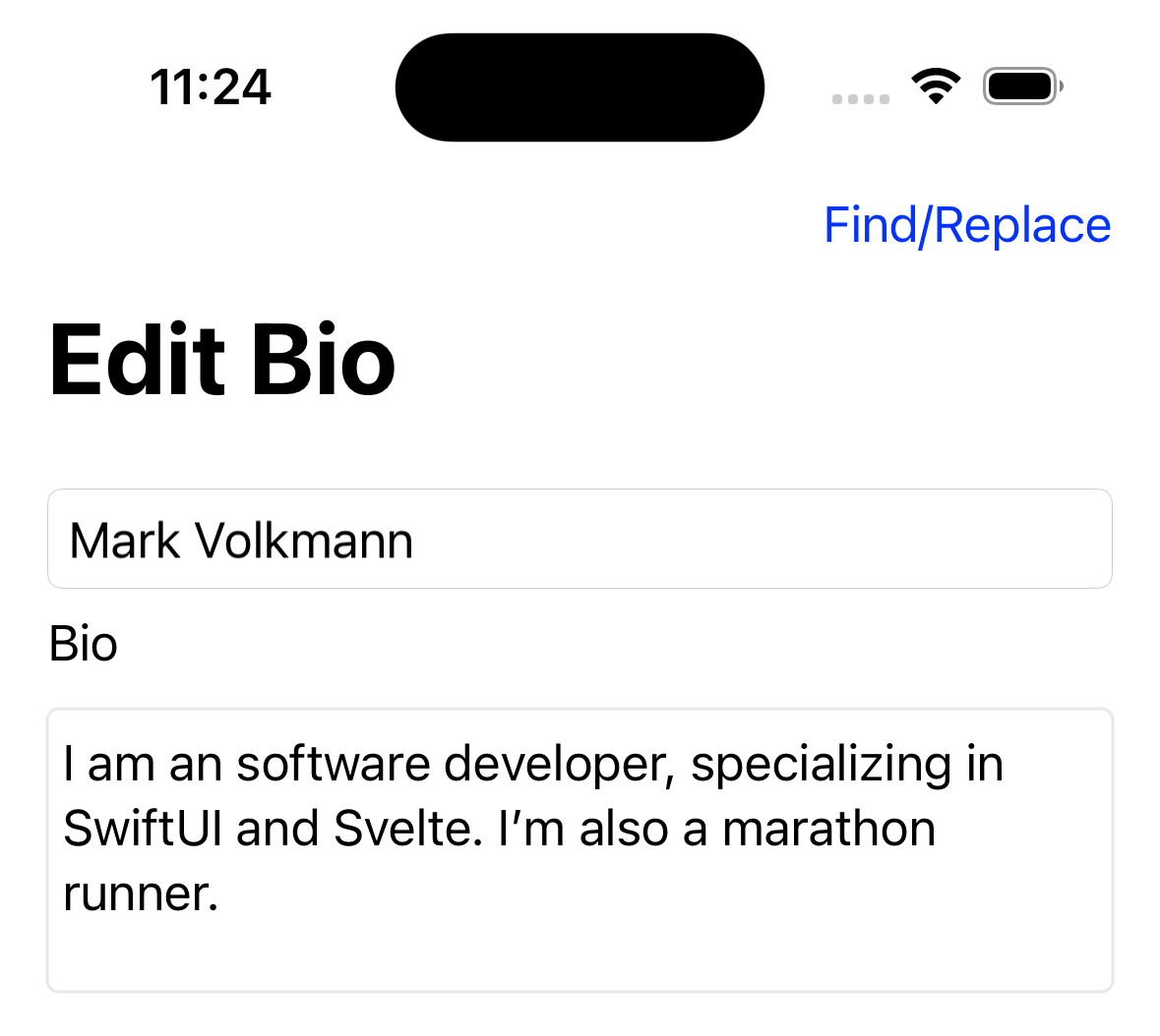
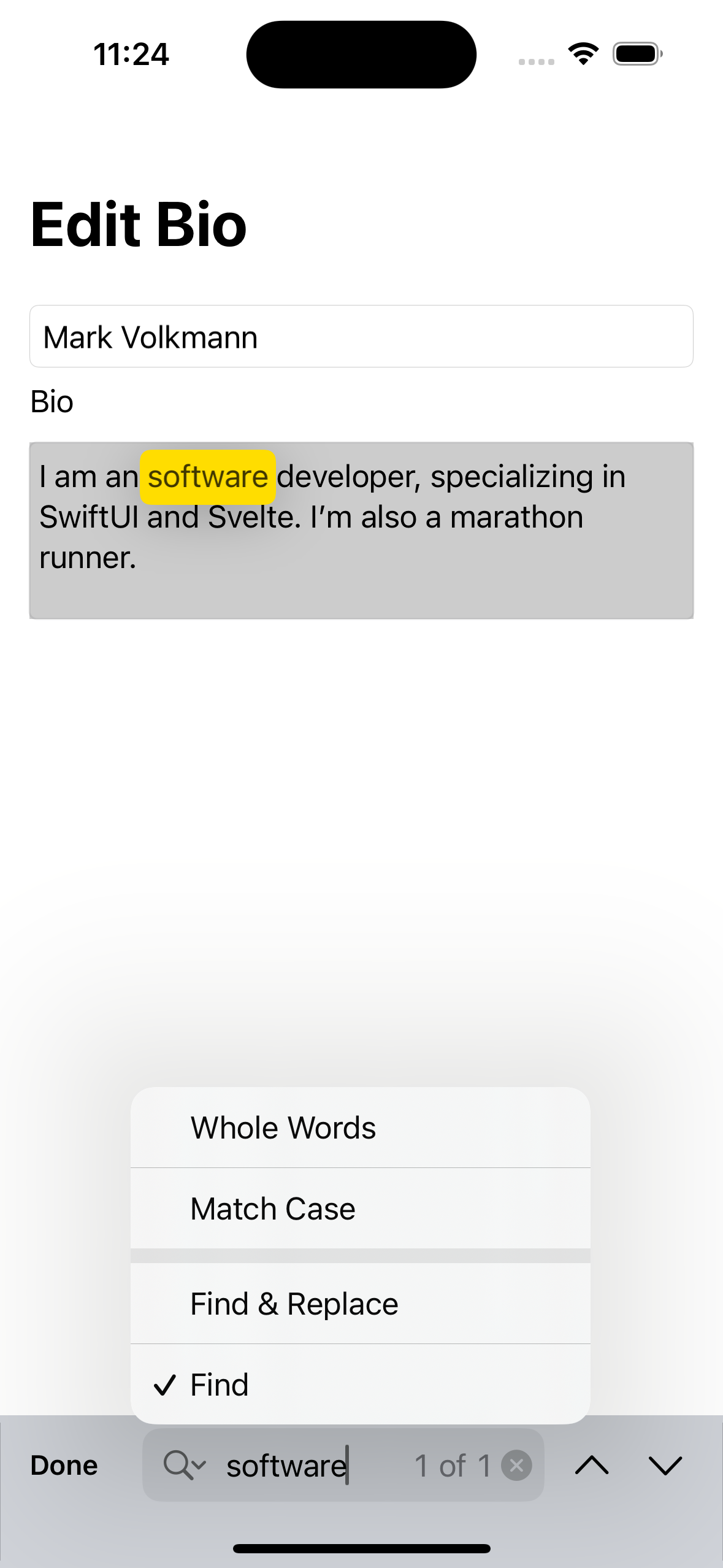
struct ContentView: View {
    @FocusState private var bioHasFocus: Bool
    @State private var bio = ""
    @State private var name = ""
    @State private var isShowingFindReplace = false

    private let bioLines = 4

    var body: some View {
        NavigationStack {
            VStack(alignment: .leading) {
                TextField("Name", text: $name)
                    .textFieldStyle(.roundedBorder)
                Text("Bio")
                TextEditor(text: $bio)
                    .lineLimit(bioLines)
                    .frame(
                        maxWidth: .infinity,
                        maxHeight: CGFloat(bioLines * 24)
                    )
                    .focused($bioHasFocus)
                    .overlay(
                        RoundedRectangle(cornerRadius: 4)
                            .stroke(Color.secondary)
                            .opacity(0.2)
                    )
                    .findNavigator(isPresented: $isShowingFindReplace)

                    .toolbar {
                        if bioHasFocus {
                            Button("Find/Replace") {
                                isShowingFindReplace.toggle()
                            }
                        }
                    }
                    .navigationTitle("Edit Bio")
                Spacer()
            }
            .padding()
        }
    }
}
Toggle
The Toggle view enables toggling between on and off states. By default it renders as a switch with a circular thumb with a label on the leading side.
The default switch background color is
the AccentColor set in Assets.xcassets.
To change this apply the tint view modifier.
A Toggle can also render as a button whose text is the accent color
and whose background color indicates whether it is off or on.
When it is off, the background color is clear.
When it is on, the background color is a lighter shade of the accent color.
The Toggle initializer takes a String to render
(either before the switch or inside the button)
and a binding to a Bool value.
To omit the label, apply the labelsHidden view modifier.
Toggle("Hungry", isOn: $hungry).tint(.red)

// The default `toggleStyle` is `.switch`.
Toggle("Hungry", isOn: $hungry).toggleStyle(.button)

TupleView
The TupleView view is a view created from a tuple of other views.
View Modifiers
A view modifier modifies some aspect of the view on which it is applied. Each view modifier conforms to the ViewModifier protocol.
View modifiers do not modify the view on which they are called.
They instead create and return a new view that either
wraps the receiver (ex. frame) or
is a modified version of the receiver (ex. foregroundStyle).
For most view modifiers, the type returned is ModifiedContent.
In a way, view modifiers are like Svelte components that contain slots. They take a view to be "modified" and return a new view that typically contains the view passed to them.
When a view modifier only modifies one aspect of a view,
it is similar to a CSS property.
For example, there is a bold view modifier that makes text bold.
Custom view modifiers can modify multiple aspects of a view.
In this case they are similar to a CSS class.
For most view modifiers there is a method in the View protocol
that makes it easy to apply the view modifier to a view.
Without this a view modifier is applied by calling the
modifier method on the a view,
passing it the result of initializing an instance of the ViewModifier subtype.
For example:
Text("Marching Ants")
    .padding()
    /* using custom ViewModifier through a View method
    .marchingAnts(
        clockwise: true,
        dashLength: 10,
        dashWidth: 3
    )
    */
    .modifier(MarchingAnts( // using custom ViewModifier directly
        clockwise: true,
        dashLength: 10,
        dashWidth: 3
    ))
Calls to view modifiers can be chained since each returns a view.
The following example demonstrates using the
foregroundStyle, padding, and stroke view modifiers.
Text("Hello, World!")
    .foregroundStyle(.red)

RoundedRectangle(cornerRadius: 20)
    .stroke(lineWidth: 3)
    .padding(.all)
Some view modifiers can be applied to any view.
Others are specific to certain kinds of views.
For example, the stroke view modifier can only be applied
to views that implement the Shape protocol.
Categories of view modifiers are listed in the Apple documentation for the View protocol. The following sub-sections describe each of the view modifiers using the categories described by Apple.
Accessibility Modifiers
See the Apple documentation page on Accessibility modifiers.
Appearance Modifiers
-
Background
- backgroundStyle sets background style.
- background adds views below the receiver view.
- background sets background style.
- background sets background style to its default.
- background sets background to an "insettable" shape filled with a specified style.
- background sets background to an "insettable" shape filled with the default style.
- background sets background to a shape filled with a specified style.
- background sets background to a shape filled with the default style.
- scrollContentBackground determines whether the background is visible behind scrollable views inside the receiver view.
-
Borders
- border adds a border with specified style and width.
- buttonBorderShape
sets the border shape used by a
Buttonthat has.borderStyle(.bordered)or.borderStyle(.borderedProminent).
-
Color Scheme
-
colorScheme sets the color scheme of a receiver view. This is now deprecated and replaced by
preferredColorScheme, but that doesn't seem to work on individual views. -
preferredColorScheme sets the preferred color scheme which by default is based on whether the device is currently in light or dark mode.
-
-
Controls
- controlSize sets the size for controls inside the receiver view. This seems to have very little effect. The code example in the documentation doesn't produce the screenshot result.
-
Dynamic Island
- dynamicIsland specifies the vertical placement of the receiver in an expanded Live Activity inside the Dynamic Island.
-
Foreground
- foregroundStyle sets primary foreground style.
- foregroundStyle sets primary and secondary foreground styles.
- foregroundStyle sets primary, secondary, and tertiary foreground styles.
-
Listviews- listRowSeparator
determines whether the top and bottom list row separators are visible.
Row separators are visible by default.
Typically this is only applied to hide them
using
.listRowSeparator(.hidden)and not specifying the edges. - listRowSeparatorTint sets list row tint color.
- listSectionSeparator
determines whether the top and bottom section separators are visible.
Section separators are hidden by default.
Typically this is only applied to show them
using
.listSectionSeparator(.visible)and not specifying the edges. - listSectionSeparatorTint sets list section ting color.
- listItemTint sets list item tint color.
- listItemTint sets list item effect.
- listRowBackground adds a background view to a list row.
- listRowSeparator
determines whether the top and bottom list row separators are visible.
Row separators are visible by default.
Typically this is only applied to hide them
using
-
Menuviews- menuOrder
sets the order of menu items.
The supported values are:
.automatic: default; system decides.fixed: top to bottom.priority: first item is closest to user interaction point; can be top to bottom or bottom to top
- menuIndicator
determines when the "menu indicator" should be visible.
The supported values are
.automatic(view decides),.hidden, and.visible. Regardless of the value, I never see a menu indicator!
- menuOrder
sets the order of menu items.
The supported values are:
-
Overlays
-
Pickerviews- defaultWheelPickerItemHeight sets the default height of wheel picker items.
- horizontalRadioGroupLayout
changes a
Pickerwith.pickerStyle(.radioGroup)to lay out the radio buttons horizontally rather that vertically (macOS-only).
-
Privacy
-
privacySensitive redacts text in the view. This is typically applied to
Textviews. Text will only be redacted if an ancestor view applies theredactedview modifier. For example:VStack { Text("public") // not redacted Text("private").privacySensitive() // redacted } .redacted(reason: .privacy) -
redacted provides a reason why some text is redacted which is typically
.privacy. -
unredacted removes the reason for redacting text from a subview that has a reason.
-
-
ScrollViewviews- scrollDisabled disables or enabled the ability to scroll.
- scrollIndicators
determines when scroll indicators should be visible.
Scroll indicators are visible by default.
Typically this is only applied to hide them
using
.scrollIndicators(.hidden)and not specifying the edges.
-
Sectionviews- headerProminence
sets the prominence of a
Sectionheader. The supported values are.standard(default) and.increased.
- headerProminence
sets the prominence of a
-
Tint
-
Visibility
- hidden hides a view.
- labelsHidden hides all labels inside a view.
- persistentSystemOverlays What are "system overlays"?
-
Widgets
These view modifiers are related to the WidgetKit framework.
Text and Symbol Modifiers
-
Fonts
-
allowsTightening sets whether space between characters can be compressed in order to get all of the text to fit on a single line based on a
Bool. -
baselineOffset sets the vertical offset of the text from its baseline. For example:
HStack(spacing: 0) { Text("H") Text("2").baselineOffset(10) Text("O") } -
bold uses a bold font for text.
-
dynamicTypeSize sets the dynamic type size of the receiver to one of
.xSmall,.small,.medium,.large,.xLarge,.xxLarge, or.xxxLarge. See an example in the Fonts section. -
dynamicTypeSize limits the dynamic type size of the receiver to a value in a given range. See an example in the Fonts section.
-
font sets the default font of the receiver.
-
fontDesign sets the font design used by the receiver to one of
.default,.monospaced,.rounded, or.serif. -
fontWeight sets the font weight to one of
.ultralight,.thin,.light,.medium,.regular,.semibold,.bold,.heavy, or.black. -
fontWidth sets the font width of the receiver to one of
.compressed,.condensed,.expanded, or.standard. -
italic determines if the receiver font is italic based on a
Bool. -
kerning sets the spacing between characters.
-
monospaced determines if all characters in the receiver should be monospaced based on a
Bool. -
monospacedDigit determines if digit characters in the receiver should be monospaced. Non-digit characters are not affected.
-
strikeThrough determines if the receiver text should have strike-through based on a
Bool. Several line styles are supported and the color of the line can be specified. -
textCase transforms the case of the receiver text to
.lowercaseor.uppercase. -
tracking sets the additional space in points that should be added to each character after layout determines the position of each view. This seems like a rarely used feature.
-
underline determines if the receiver text should be underlined based on a
Bool. Several line styles are supported and the color of the line can be specified.
-
-
ScrollViewviews-
scrollDismissesKeyboard specifies whether the on-screen keyboard should be dismissed if the user scrolls the screen while it is displayed. The supported values are:
.automatic: system decides; seems the same as.never.immediately: dismisses when scrolling begins.interactively: dismisses if user scrolls up.never: on-screen keyboard remains visible
-
-
Symbols
-
symbolRenderingMode sets the rendering mode for all symbol images inside the receiver view to one of the following:
hierarchical: multiple layers with varying opacities applied to foreground stylemonochrome: single layer with foreground stylemulticolor: multiple layers with inherited stylespalette: multiple layers with different styles
-
symbolVariant sets the variant for all symbol images inside the receiver view. This removes the need to specify the desired variant as part of the symbol name. It only works if the requested variant exists in SF Symbols. For example, the "suit.*" icons have "fill" variants, but none of the other variants. The supported variants are
.none,.circle,.square,.rectangle,.fill, and.slash.
-
-
Textviews- flipsForRightToLeftLayoutDirection
mirrors the view contents when the layout direction is right-to-left
based on a
Bool - minimumScaleFactor sets the minimum percentage by which text can be scaled down in order to fit in the space available. This is ideal in cases where surrounding views sometimes grow, leaving less room for certain text.
- truncationMode
enables eliding text when it does not fit in the available space.
Eliding replaced text with an ellipsis and
can occur at the beginning, middle, or end of the text
based on the mode that is passed which can be
.head,.middle, or.tail. - lineLimit sets the maximum number of lines onto which text can wrap. Excess text is replaced by an ellipsis.
- lineLimit sets the minimum number of lines onto which text will wrap. If fewer lines are required, empty lines are added.
- lineLimit
sets the maximum number of lines that will be visible.
In
Textviews, excess text is replaced by an ellipsis. InTextFieldviews if more lines are needed, the text can be scrolled vertically to see them. - lineLimit sets both the minimum and maximum number of lines through which text should/can wrap.
- lineLimit
sets the maximum number of lines that will be visible
and supports reserving space for that number of lines.
In
Textviews, excess text is replaced by an ellipsis. InTextFieldviews if more lines are needed, the text can be scrolled vertically to see them. - lineSpacing sets the space between each wrapped line of text.
- multilineTextAlignment
determines how each line in wrapped text will be aligned.
The supported values are
.leading(default),.center, and.trailing. - textSelection
specifies whether users can select the text for copying.
The supported values are
.disableddefault and.enabled.
- flipsForRightToLeftLayoutDirection
mirrors the view contents when the layout direction is right-to-left
based on a
-
TextEditorviewsThe view modifiers listed under
TextFieldbelow likely also work forTextEditorviews. In addition, the following view modifiers are specific toTextEditorviews.-
findNavigator presents a find and replace interface when a
Boolbinding istrue. -
findDisabled disables the find and replace interface that was enabled in an ancestor view when a
Boolbinding istrue. -
replaceDisabled disables the ability to replace text using the find and replace interface that was enabled in an ancestor view when a
Boolbinding istrue.
-
-
TextFieldviews-
autocorrectionDisabled conditionally disables autocorrection of entered text based on a
Bool. -
keyboardType sets the keyboard type to one of
.default,.alphabet,.asciiCapable,.asciiCapableNumberPad,.decimalPad,.emailAddress,.namePhonePad,.numberPad,.numbersAndPunctuation,.phonePad,.twitter,.URL, or.webSearch. -
textInputAutocapitalization specifies when the shift key is automatically enabled. The supported values are:
.characters: capitalizes every letter.words: capitalizes the first letter of every word.sentences: capitalizes the first letter of every sentence.never: never automatically capitalizes anything
-
textContentType sets the content type for text input so the system can offer user-specific suggestions. This works on real devices, but not in the Simulator. The supported values, some of which are only available on certain platforms, are:
-
Authentication
.username.password.newPassword.oneTimeCode
-
Contact
.emailAddress.telephoneNumber
-
Names
.familyName.givenName.jobTitle.middleName.name.namePrefix.nameSuffix.nickname.organizationName
-
Locations
.addressCity.addressCityAndState.addressState.countryName.fullStreetAddress.location.postalCode.streetAddressLine1.streetAddressLine2.sublocality
-
Other
-
.creditCardNumber: doesn't complete -
.dateTime -
.flightNumber -
.shipmentTrackingNumber
-
-
Auxiliary View Modifiers
-
Badges
- badge
adds a badge described by an
Intto an item in aTabVieworList. - badge
adds a badge described by a
Stringto an item in aTabVieworList. - badge
adds a badge described by a LocalizedStringKey to an item in a
TabVieworList. - badge
adds a badge described by a
Textview to an item in aTabVieworList.
- badge
adds a badge described by an
-
Context Menus
-
contextMenu adds a context menu to the receiver that is displayed when the user long presses. The context menu can contain
Button,Toggle, andPickerviews. -
contextMenu adds a context menu to the receiver that includes a preview. The preview is typically an
Imagefound inAssets.xcassetsthat is displayed above the context menu. -
contextMenu adds a context menu to the receiver that has functionality that will not be obvious to users and is best avoided.
-
Help
TODO: It is unclear what action users must take to cause the help text described by this view modifiers to be displayed! See https://forums.swift.org/t/triggering-help-in-ios/62184.
-
Navigation
-
navigationTitle sets the title to appear in the navigation bar from a
String. This should be applied to the top-most view in each screen. -
navigationTitle sets the title to appear in the navigation bar from a
LocalizedStringKey. -
navigationTitle sets the title to appear in the navigation bar from a
Textview. -
navigationTitle sets the title to appear in the navigation bar from the return value of a function that takes no arguments.
-
navigationTitle sets the title to appear in the navigation bar from a
Stringbinding. -
navigationSubtitle sets the subtitle to appear in the navigation bar from a
String. This is only available in macOS. -
navigationSubtitle sets the subtitle to appear in the navigation bar from a
LocalizedStringKey. This is only available in macOS. -
navigationSubtitle sets the subtitle to appear in the navigation bar from a
Textview. This is only available in macOS. -
navigationDocument adds a document preview. Clicking the preview navigates to the document. I could not get this to display a preview!
-
navigationBarBackButtonHidden conditionally hides the navigation back button ("<") based on a
Boolvalue that defaults totrue. This should be applied to the top-most view in each screen. -
navigationBarTitleDisplayMode sets the title display mode to one of:
.automatic: inherit from previous navigation item which defaults to.large; default.inline: navigation title on same line as back button in smaller font.large: navigation title on line after back button in larger font
-
navigationDestination takes a data type and a closure that selects a destination view based on the value of that data type passed to the closure.
-
navigationDestination navigates to a given destination view when a
Boolbinding becomestrue. -
navigationSplitViewColumnWidth sets a fixed width for a specific column in a
NavigationSplitView. -
navigationSplitViewColumnWidth sets a flexible, preferred width for a specific column in a
NavigationSplitView.
-
-
Toolbars
-
toolbar adds content to a navigation bar or toolbar. The content can be any kind of views.
-
toolbar adds content to a navigation bar or toolbar. The content must be instances of
ToolbarItemorToolbarGroup. -
toolbar adds content to a navigation bar or toolbar. The content must be instances of
CustomizableToolbarContentwhich allows users to customize the views and their layout. -
toolbar changes the visibility of specified toolbars.
-
toolbarBackground sets the background
ShapeStyleof specified toolbars. -
toolbarBackground changes the visibility of the background for specified toolbars.
-
toolbarColorScheme changes the
ColorSchemeused by specified toolbars. -
toolbarRole changes the semantic role of the content in a specific toolbar. The supported roles are
.browser,.editor, and.navigationStack. -
toolbarTitleMenu adds a menu to a navigation bar title or a toolbar title. I was able to get this to work for a navigation bar, but not for a toolbar. The following code example displays the current date in the navigation bar title. There is a menu indicator on its right side that can be tapped to reveal a menu containing a button. Tapping the button opens a sheet containing a
DatePickerwhere the user can select a different date.struct ContentView: View { @State private var selectedDate = Date.now @State private var isSelecting = false var body: some View { NavigationStack { VStack { Text("The selected date is") Text(selectedDate, style: .date) } .navigationTitle( Text(selectedDate, style: .date) ) .navigationBarTitleDisplayMode(.inline) .toolbarTitleMenu { Button("Change Date") { isSelecting = true } } .sheet(isPresented: $isSelecting) { DatePicker( "Select date", selection: $selectedDate, displayedComponents: .date ) .datePickerStyle(.graphical) .presentationDetents([.medium]) .onChange(of: selectedDate) { _ in isSelecting = false } } } } }
-
-
Status Bars
- statusBarHidden
conditionally hides the status bar that typically displays the
current time, Wi-Fi strength, and battery level
based on a
Boolargument that defaults totrue.
- statusBarHidden
conditionally hides the status bar that typically displays the
current time, Wi-Fi strength, and battery level
based on a
-
Touch Bars
These view modifiers affect the touch bar on some MacBook models.
Chart View Modifiers
There are too many chart-related view modifiers to describe here. See Chart view modifiers and my Swift Charts blog page.
Style Modifiers
There are many view modifiers that change the style of specific kinds of views.
- buttonStyle
- buttonStyle
- controlGroupStyle
- datePickerStyle
- disclosureGroupStyle
- gaugeStyle
- groupBoxStyle
- indexViewStyle
- labelStyle
- listStyle
- menuStyle
- navigationSplitViewStyle
- pickerStyle
- presentedWindowStyle
- presentedWindowToolbarStyle
- progressViewStyle
- tableStyle
- tabViewStyle
- textFieldStyle
- toggleStyle
Layout Modifiers
-
frame places the receiver view in an invisible frame with a specified size and alignment.
-
frame places the receiver view in an invisible frame with specified size constraints and alignment.
-
fixedSize causes the receiver view to take on its ideal size regardless of its parent view size.
-
fixedSize causes the receiver view to take on its ideal size in specific dimensions (horizontal and/or vertical) regardless of its parent view size.
-
layoutPriority changes the priority under which space is allocated to the receiver view relative to sibling views.
-
position positions the center of the receiver view at a specific
CGPointin coordinate space of its parent. -
position positions the center of the receiver view at specific x and y coordinates in coordinate space of its parent.
-
offset offsets the receiver view by a
CGSize. -
offset offsets the receiver view by x and y distances.
-
coordinateSpace assigns a name to the coordinate space of the receiver view that can be used in other views to operate on points and sizes in that coordinate space.
-
alignmentGuide sets the horizontal alignment of the receiver view.
-
alignmentGuide sets the vertical alignment of the receiver view.
-
padding adds the same padding to all sides of the receiver view. This is often called with no arguments in order to use "adaptive padding". This selects the amount of padding to apply based on the content of the view to which it is applied and the environment in which the app is running. When padding is added to an
HStackorVStackin iOS, the amount seems to be 16. -
padding adds the same padding to specific sides (edges) of the receiver view.
-
padding adds different amounts of padding to specific sides (edges) of the receiver view.
-
listRowInsets adds insets to specified sides (edges) of list rows.
-
scenePadding adds scene-specific padding to the specified sides (edges) of the receiver view.
-
scenePadding adds the specified kind of scene-specific padding to the specified sides (edges) of the receiver view. The supported kinds of padding are
.minimumand.navigationBar. -
gridCellColumns sets the number of columns that a grid cell should span.
-
gridCellAnchor sets the anchor position of a grid cell using a
UnitPointwhich takesxandyarguments whose values areCGFloatvalues between 0 and 1. Alternatively the following static properties can be used:.zero(origin).topLeading,.top,.topTrailing.leading,.center,.trailing.bottomLeading,.bottom,.bottomTrailing
-
gridCellUnsizedAxes tells a grid layout not to offer extra size in the specified axes to views.
-
gridColumnAlignment overrides the default horizontal alignment of the grid column in which the receiver view appears.
-
ignoresSafeArea expands the receiver view out of its safe area. The safe areas to ignore can be specified with the values
.all(default),.container(includes top and bottom bars), and.keyboard(on-screen keyboard). The sides (edges) to expand can be specified with the values.all(default),.top,.bottom,.leading,.trailing,.horizontal, and.vertical. -
safeAreaInset shows the receiver view beside the modifier view. What does this mean?
-
safeAreaInset shows the receiver view above or below the modifier view. What does this mean?
-
zIndex sets the stacking order of the receiver view. One use is to make the view appear below views that were rendered before it.
-
layoutValue associates a value with a custom layout property. Is this use when a custom approach for laying out views has been implemented? Is this related to the Layout protocol added in iOS 16?
Graphics and Rendering Modifiers
TODO: Resume adding view modifier descriptions here!
-
Masking and Clipping
-
Scaling
-
This can be applied to an
Imageto scale it to a relative size of.small,.medium, or.large.
-
Transformations
-
Graphical Effects
-
Composites
-
Animations
Input and Event Modifiers
-
Interactivity
-
List Controls
-
Taps and Gestures
-
Keyboard Shortcuts
-
Hover
-
Focus
-
Copy and Paste
-
Drag and Drop
-
Submission
-
Movement
-
Deletion
-
Commands
-
Digital Crown
-
User Activities
-
View Life Cycle
-
File Renaming
-
URLs
-
Publisher Events
-
Hit Testing
-
Content Shape
-
Import and Export
-
App Intents
Search Modifiers
-
Displaying a Search Interface
-
Searching with Tokens
-
Making Search Suggestions
-
Limiting Search Scope
Presentation Modifiers
-
Alerts without a Message
-
Alerts with a Message
-
Confirmation Dialogs without a Message
-
Confirmation Dialogs with a Message
-
Sheets
-
Popovers
-
Configuration for Sheets and Popovers
-
File Managers
-
Quick Look Previews
-
Family Sharing
-
Live Activities
-
Apple Music
-
StoreKit
-
PhotoKit
State Modifiers
-
Identity
-
Environment Values
-
Preferences
-
Default Storage
Deprecated Modifiers
See Deprecated Modifiers.
Color Modifiers
The following view modifiers can change the colors used in a view.
background(alignment, content)foregroundStyle(ShapeStyle)- can be aColoropacity(Double)shadow(color: Color, radius: CGFloat, x: CGFloat, y: CGFloat)tint(Color?)
The background view modifier takes a content argument whose value is
a ViewBuilder function that can return any kind of View
including a Color, Shape, or Image.
The foregroundStyle view modifier is used style any kind of View
that supports styling with a ShapeStyle.
This includes Text and views that conform to the Shape protocol.
For example, it can be used to add gradient color to text.

Text("Hello, World!")
    .foregroundStyle(
        .linearGradient(
            colors: [.blue, .red],
            startPoint: .leading,
            endPoint: .trailing
        )
    )
The HierarchicalShapeStyle struct defines the static properties
primary, secondary, tertiary, and quaternary.
They can be used to style text and shapes.
They are defined by the OS and cannot be modified.
The only difference I see between them is that
they vary from dark gray to light gray.
They are typically passed to the foregroundStyle view modifier as shown below:
These are typically passed to the foregroundStyle view modifier
as shown below:
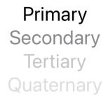
Text("Primary").foregroundStyle(.primary)
Text("Secondary").foregroundStyle(.secondary)
Text("Tertiary").foregroundStyle(.tertiary)
Text("Quaternary").foregroundStyle(.quaternary)
The shadow view modifier adds a shadow to a view. For example:

struct ContentView: View {
    func shadowDemo(radius: CGFloat) -> some View {
        Text("Shadow Radius \(String(format: "%.0f", radius))")
            .font(.system(size: 40))
            .foregroundStyle(.blue)
            .shadow(color: .gray, radius: radius, x: 10, y: 10)
    }

    var body: some View {
        VStack {
            shadowDemo(radius: 0)
            shadowDemo(radius: 2)
            shadowDemo(radius: 4)
        }
    }
}
Size Modifiers
The following view modifiers change the size of a view:
frame(width: CGFloat?, height: CGFloat?, alignment: Alignment)frame(maxWidth: CGFloat?, maxHeight: CGFloat?, alignment: Alignment)scaledToFill()scaledToFit()scaleEffect(_ scale: CGSize, anchor: UnitPoint)scaleEffect(x: CGFloat, y: CGFloat, anchor: UnitPoint)
The scaleEffect view modifier changes the size of any view.
By default the view is scaled about its center,
but this can be changed by specifying the anchor argument.
It does not affect the layout of other views.
For example:
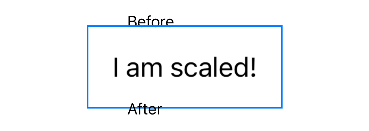
VStack(alignment: .leading) {
    Text("Before")
    Text("I am scaled!")
        .padding()
        .border(.blue)
        .scaleEffect(1.7, anchor: .center) // using default anchor
        // Can pass separate x and y scale values instead of
        // a single scale value that is used for both.
    Text("After")
}
Position Modifiers
The following view modifiers change the position of a view:
offset(x: CGFloat, y: CGFloat)position(x: CGFloat, y: CGFloat)transformEffect(CGAffineTransform)transition(AnyTransition)zIndex(Double)
The offset view modifier moves a view relative to its "natural position"
without affecting the layout of other views.
It is passed x and y arguments that
specify horizontal and vertical offset distances.
When applied to views inside a ZStack this changes how they overlap.
The position view modifier positions a view
within the coordinate space of its parent view
without affecting the layout of other views.
It is passed x and y arguments that specify the position.
This is similar to position: absolute in CSS.
Orientation Modifiers
The following view modifiers change the orientation of a view:
rotationEffect(angle: Angle, anchor: UnitPoint)rotation3DEffect(angle, axis, anchor, anchorZ, perspective)
The rotationEffect view modifier rotates any view by an angle that is specified in degrees or radians.
By default the view is rotated about its center,
but this can be changed by specifying the anchor argument
which has the type UnitPoint.
A UnitPoint represents a pair of x and y values
where each is a CGFloat value between zero and one.
It also defines the following static values for commonly used points:
zero (origin; same as topLeading?),
topLeading, top, topTrailing,
leading, center, trailing,
bottomLeading, bottom, and bottomTrailing.
UnitPoint values can also be used to specify a screen location
in a device-independent way.
Applying the rotationEffect view modifier to a view
does not affect the layout of other views.
For example:
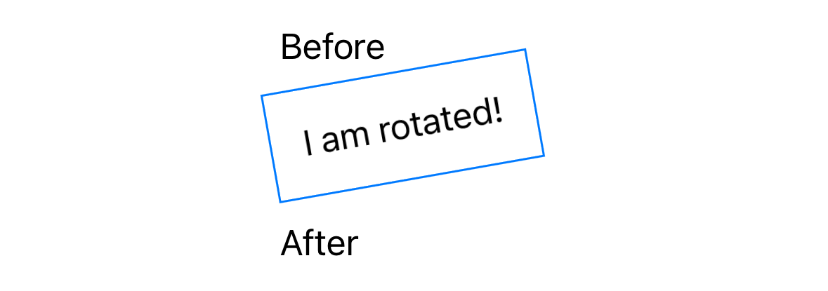
VStack(alignment: .leading) {
    Text("Before")
    Text("I am rotated!")
        .padding()
        .border(.blue)
        .rotationEffect(.degrees(-10), anchor: .bottomLeading)
    Text("After")
}
The rotation3DEffect view modifier rotates any view
around any axes (x, y, and z) in 3D space.
See the Card example in the ViewBuilders section.
Text Modifiers
The following view modifies change text:
textCase(Text.Case?)truncationMode(Text.TruncationMode)
The following example adds a shadow to a Text view:
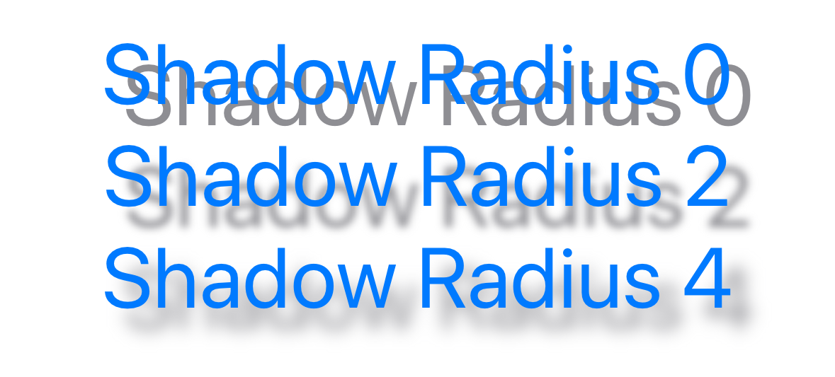
Text("Shadow Demo")
    .padding()
    .background(.yellow)
    .shadow(color: .gray, radius: 3, x: 3, y: 3)
Other commonly used view modifiers include:
border(ShapeStyle, width: CGFloat = 1)cornerRadius(CGFloat, antialiased: Bool)disabled(Bool)disables a form input such as aButtonedgesIgnoringSafeArea(Edge.Set)font(Font?)border(ShapeStyle, width: CGFloat = 1)lineLimit(Int?)multilineTextAlignment(TextAlignment)overlay(ShapeStyle)padding(CGFloat)
The border view modifier adds a border to a view with a given style and width.
The style can be specified in many ways including using a Color or Gradient.
For more advanced borders, see the use of the overlay view modifier
that uses RoundedRectangle in the TextEditor section.
Also see the Marching Ants Border section.
The multilineTextAlignment view modifier specifies how text that
wraps across multiple lines should be horizontally aligned.
It can be passed .leading (default), .center, or .trailing.
The padding view modifier adds padding to view.
It can be passed a side which can be a single value or an array of
.all (default), .leading, .trailing,
.horizontal (same as .leading and .trailing),
.top, .bottom, or .vertical (same as .top and .bottom).
It can also be passed a CGFloat value for the length.
The length defaults to nil and means to use the system default of 20.
View-specific Modifiers
The following view modifiers change the styling of specific kinds of predefined views:
buttonStyle(ButtonStyle)controlGroupStyle(ControlGroupStyle)datePickerStyle(DatePickerStyle)gaugeStyle(GaugeStyle)indexViewStyle(IndexViewStyle)labelStyle(LabelStyle)menuStyle(MenuStyle)navigationViewStyle(NavigationViewStyle)pickerStyle(PickerStyle)progressViewStyle(ProgressViewStyle)presentedWindowStyle(WindowStyle)presentedWindowToolbarStyle(WindowToolbarStyle)tableStyle(TableStyle)tabViewStyle(TabViewStyle)textFieldStyle(TextFieldStyle)toggleStyle(ToggleStyle)
Several view modifiers take a ShapeStyle object.
Types that conform to the ShapeStyle protocol include
AngularGradient, Color, ForegroundStyle, ImagePaint,
LinearGradient, and RadialGradient.
Event Handling Modifiers
The event handling methods like onTapGesture area also view modifiers.
This takes a count argument with a default value of 1
that specifies the number of consecutive taps required
to trigger running a provided closure.
The onTapGesture view modifier can be applied to any view.
Many view modifiers are defined in extensions to the View protocol.
This makes them applicable to any kind of view.
When view modifiers are added to container views,
they are passed down to all descendant views.
In the following example, all the Text views are red
because the VStack that contains them has
a view modifier that sets the foreground color.
VStack {
    Text("Alpha")
    HStack {
        Text("Beta")
        Text("Gamma")
    }
}.foregroundStyle(.red)
iOS 17 added support for the onKeyPress view modifier. See my example at OnKeyPressDemo GitHub repository. also see the Hacking With Swift post How to detect and respond to key press events.
Custom View Modifiers
Custom view modifiers can be created by defining
a struct that implements the ViewModifier protocol.
This requires implementing body method that takes
content which is a View to be modified,
and returns a new View.
The code in the body method is similar to that in any custom view.
The following code defines a custom ViewModifier
that allows the view on which it is called to be collapsed.
It wraps that view in a VStack containing two instances of HStack.
The second HStack includes a Button containing a chevron icon.
Clicking the Button toggles whether the first HStack is rendered.
It also rotates the chevron icon using animation
which is covered later in the Animation section.
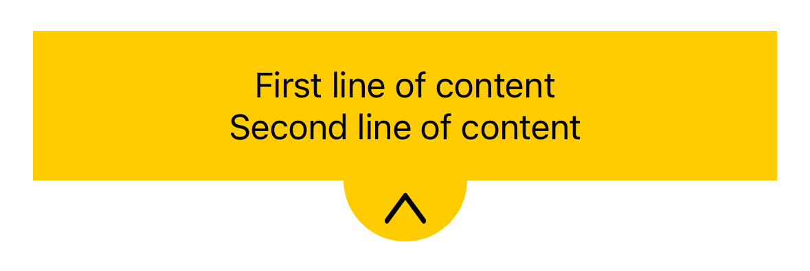
struct Collapsible: ViewModifier {
    private static let diameter = CGFloat(120)
    private static var radius: CGFloat { diameter / 2 }

    var bgColor: Color = .gray
    var duration: Double = 0.5 // in seconds

    @State private var showContent = true

    var halfCircle: some View {
        Circle()
            .trim(from: 0, to: 0.5)
            .fill(bgColor)
            .frame(
                width: Collapsible.diameter,
                height: Collapsible.radius
            )
            .offset(x: 0, y: -16)
    }

    private func toggle() {
        withAnimation(.easeInOut(duration: duration)) {
            showContent.toggle()
        }
    }

    func body(content: Content) -> some View {
        VStack {
            if showContent {
                HStack {
                    Spacer()
                    content
                    Spacer()
                }
                .background(bgColor)

                //TODO: Can you scale the height of the HStack
                //TODO: instead of using the default opacity transition?
                //.transition(.scale)
                //.scaleEffect(showContent ? 1 : 0)
                //.animation(.easeInOut(duration: 1))
            }
            HStack {
                Spacer()
                ZStack {
                    Image(systemName: "chevron.down")
                        .resizable()
                        .frame(
                            width: Collapsible.radius / 3,
                            height: Collapsible.radius / 4
                        )
                        .onTapGesture { toggle() }
                        .rotationEffect( // Angle type is inferred
                            .degrees(showContent ? 180 : 0)
                        )
                        .offset(x: 0, y: -2)
                        // Use a view as a background.
                        .background(halfCircle)
                }
                Spacer()
            }
        }
    }
}

extension View {
    // This attribute triggers the compile-time warning "Use of 'collapsible'
    // treated as a reference to instance method in protocol 'View'"
    // if this method is not called on a view with `.collapsible(...)`.
    // It's too bad that the Apple-supplied view modifiers don't use this.
    @warn_unqualified_access
    func collapsible(
        bgColor: Color = .black,
        duration: Double = 0.5) -> some View {
        modifier(Collapsible(bgColor: bgColor, duration: duration))
    }
}
The following code demonstrates using the custom ViewModifier defined above.
VStack {
    VStack {
        Text("First line of content")
        Text("Second line of content")
    }
    .padding()

    // This way of applying a view modifier doesn't use the View extension.
    //.modifier(Collapsible(bgColor: .yellow))

    // This way uses the View extension and is preferred.
    .collapsible(bgColor: .yellow)

    Spacer()
}
Paul Hudson recommends defining view modifiers that can be used
to conditionally apply other platform-specific view modifiers.
The following code displays a border around Text views
only if running on a given platform.
extension View {
    func iOS<Content: View>(_ modifier: (Self) -> Content) -> some View {
        #if os(iOS)
            return modifier(self)
        #else
            return self
        #endif
    }

    func macOS<Content: View>(_ modifier: (Self) -> Content) -> some View {
        #if os(macOS)
            return modifier(self)
        #else
            return self
        #endif
    }

    // Methods for watchOS and tvOS would be similar.
}

struct ContentView: View {
    var body: some View {
        VStack {
            Text("iOS")
                .iOS { $0.padding().border(.red) }
            Text("macOS")
                .macOS { $0.padding().border(.blue) }
        }
    }
}
For information on choosing between implementing a custom view or a custom view modifiers, see SwiftUI views versus modifiers by John Sundell.
Conditionally Applying View Modifiers
To enable conditionally applying view modifiers,
define the following extension to the View protocol:
import SwiftUI

extension View {
    /// Supports conditional view modifiers.
    /// For example, .if(price > 100) { view in view.background(.orange) }
    /// The concrete type of Content can be any type
    /// that conforms to the View protocol.
    @ViewBuilder
    func `if`<Content: View>(
        _ condition: Bool,
        transform: (Self) -> Content
    ) -> some View {
        // This cannot be replaced by a ternary expression.
        if condition {
            transform(self)
        } else {
            self
        }
    }
}
Fonts
The font view modifier specifies the font, size, and weight
to be used in a view.
This is typically applied to Text views and
Image views that display an SF Symbol icon.
Here are examples of using the default system font:
Text("Hello").font(.system(size: 24, weight: .bold))
Image(systemName: "cloud.snow").font(.system(size: 64))
The code above can be simplified by defining
the following View extension method:
import SwiftUI

extension View {
    func sysFont(_ size: Int, weight: Font.Weight = .regular) -> some View {
        font(.system(size: CGFloat(size)).weight(weight))
    }
}
With this extension in place the previous examples can be rewritten as follows:
Text("Hello").sysFont(24, weight: .bold)
Image(systemName: "cloud.snow").sysFont(64)
Another option is to use "Dynamic Type" font names whose size changes based on user preferences. The dynamic font names are listed below in order from largest to smallest size. Each is followed by the corresponding fixed size when the user has not changed their text size preference.
largeTitle(35)title(28)title2(23)title3(20)headline(17) // same size as .body but boldbody(17)callout(16)subheadline(15)footnote(13)caption(12)caption2(11)
Users can scale the dynamic fonts used in all apps from Settings ... Display & Brightness ... Text Size. Move the slider to one of the seven options. The middle option (4th one) is the default. The screenshots below show all the dynamic fonts in the largest (1st option), default (4th option), and smallest (7th option) text sizes.
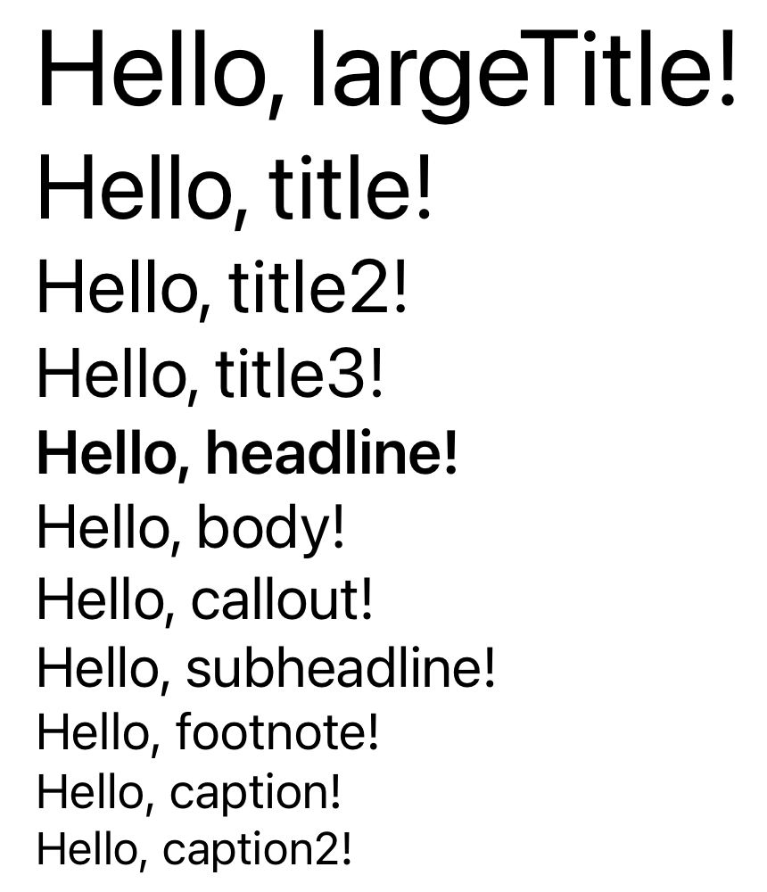
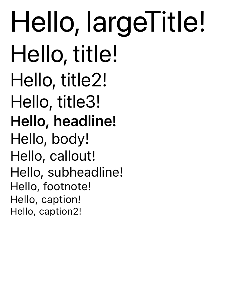
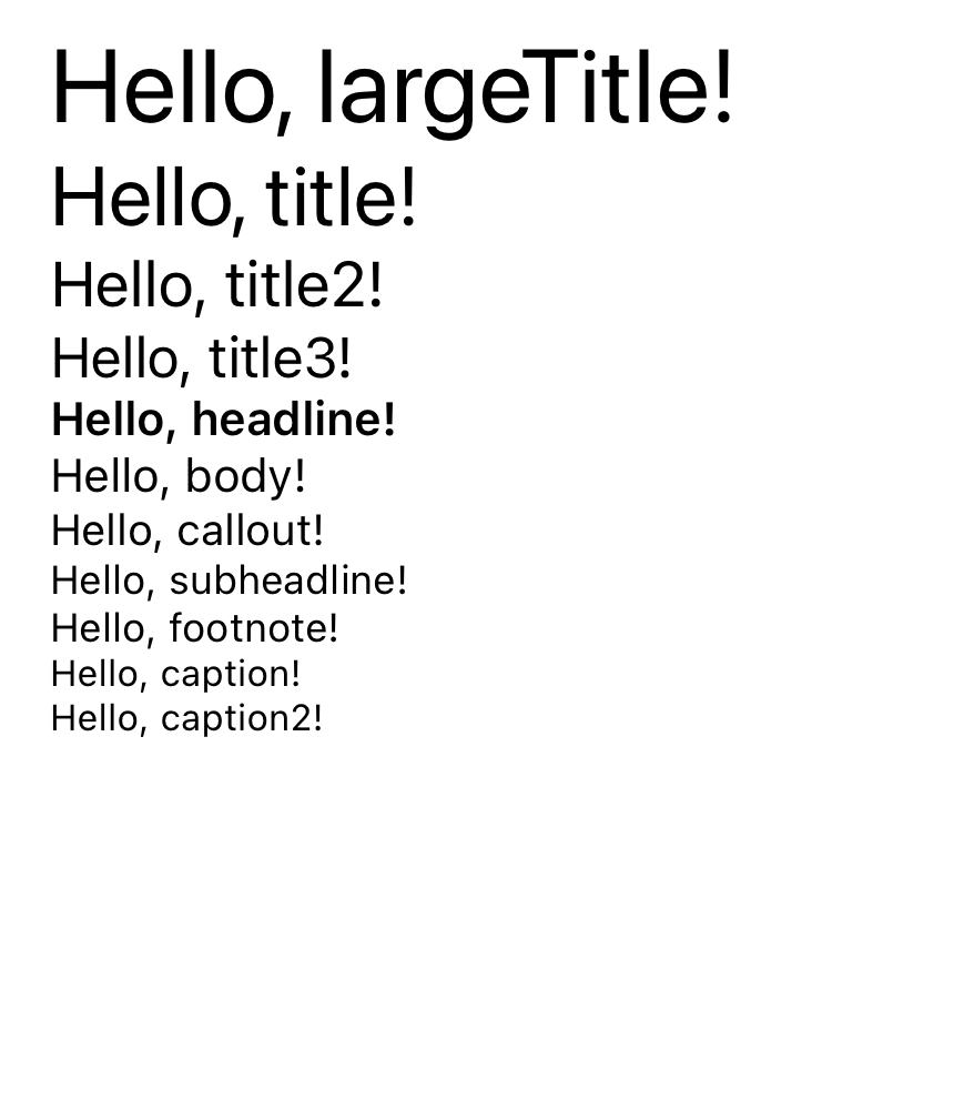
Fonts can be scaled even larger using an accessibility option. Select Settings ... Accessibility ... Display & Text Size ... Larger Text. Enable "Larger Accessibility Sizes" and move the slider to one of the 12 options. The screenshot below shows all the dynamic fonts in the largest possible accessibility size.
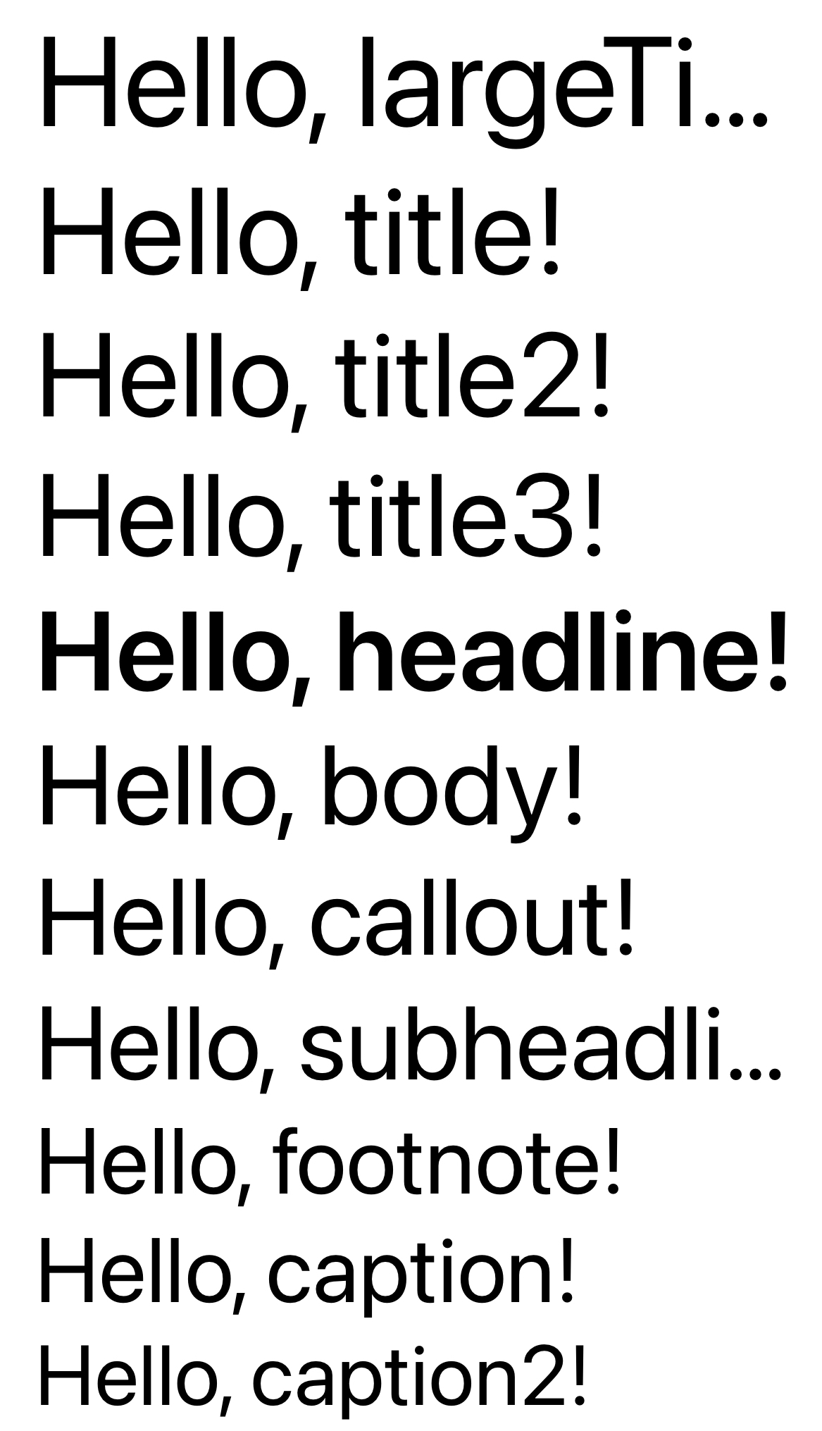
In apps that use dynamic fonts, test all screens at various font size preferences to verify that the resulting layout is acceptable.
Also see the minimumScaleFactor view modifier described in the
Text Modifiers section.
To scale views based on the dynamic font size selected by a user for their device, use the ScaledMetric property wrapper.
The following code demonstrates this:
struct ContentView: View {
    // The actual width used can be less than or greater that this
    // depending on changes the user makes in the Settings app.
    @ScaledMetric var size = 200.0

    var body: some View {
        VStack {
            Image("Checkmark")
                .resizable()
                .scaledToFit()
                .frame(width: size)
        }
    }
}
The dynamicTypeSize environment property can be used to
test the user preference in Settings ... Display & Brightness ... Text Size.
For example:
@Environment(\.dynamicTypeSize) var dynamicTypeSize
...
// Only display something if the user hasn't selected a really large text size.
if dynamicTypeSize < .xxLarge {
    Text("Hello, World!")
}
The dynamicTypeSize view modifier can be used to set
the font size of a view to be a specific dynamic type size.
The supported sizes are .xSmall, .small, .medium,
.large, .xLarge, .xxLarge, and .xxxLarge.
For example:
Text("Hello, World!").dynamicTypeSize(.xxxLarge)
The dynamicTypeSize view modifier can also be used to restrict the font size of everything in a given container to use a range of dynamic type sizes. For example:
// Limit the text size of everything inside this container
// to be less then DynamicTypeSize.xxLarge.
VStack {
    ...
}
.dynamicTypeSize(..<DynamicTypeSize.xxLarge)
Safe Area
The ignoresSafeArea view modifier expands a view so it can extend outside of the safe area which is the area of the screen that excludes the top navigation bar and the bottom toolbar.
This is often used to provide a background color. For example:
ZStack {
    Rectangle().fill(.blue.gradient).ignoresSafeArea()
    VStack {
        Text("Hello").font(.largeTitle)
    }
}
Floating Action Button
SwiftUI does not provide a floating action button view. This is a circular button that hovers of the content of a screen. They typically appear in the lower-right or lower-left corner of the screen. Floating action buttons are popular in Android applications.
The following code demonstrates one way to implement a floating action button in SwiftUI:
struct FloatingActionButton: View {
    var label: String = "+"
    var action: () -> Void

    let diameter: CGFloat = 70
    let shadow: CGFloat = 3

    var body: some View {
        Button(
            action: action,
            label: {
                ZStack(alignment: .center) {
                    Circle()
                        .background(Color.blue)
                        .frame(width: diameter, height: diameter)
                    Text(label)
                        .font(.system(size: 60))
                        .foregroundStyle(.white)
                        .padding(.bottom, 7)
                        .frame(height: diameter)
                }
            }
        )
        .cornerRadius(diameter / 2)
        .padding(.trailing, 35)
        .shadow(
            color: .black.opacity(0.3),
            radius: shadow,
            x: shadow,
            y: shadow
        )
    }
}

struct FloatingActionButton_Previews: PreviewProvider {
    static var previews: some View {
        ZStack(alignment: .bottomTrailing) {
            Color.yellow.ignoresSafeArea()
            FloatingActionButton() {
                print("got tap")
            }
        }
    }
}
Combining Container and Component Views
The following code demonstrates using both container and component views.
Note how views can be defined in computed properties
that are later referenced to render them.
The type of these computed properties can be a specific container view type
or the generic type some View.
Custom views can also be defined in a new struct that inherits from View
Instances of these structs can be created to render them.
// This defines a custom View that is used below.
struct MyRow: View {
    var body: some View {
        HStack {
            Text("Six")
            Text("Seven")
        }
    }
}

struct ContentView: View {
    // This assigns a View to a computed property.
    var row = HStack {
        Text("Four")
        Text("Five")
    }

    var body: some View {
        VStack {
            Text("One")
            HStack {
                Text("Two")
                Text("Three")
            }
            // This refers to a variable to get a View
            // and chains View modifiers onto it.
            row.padding().border(.red)
            MyRow() // This creates a custom View instance.
        }
    }
}
Note how ContentView uses the view MyRow.
It is preferred to create small views like this and compose them
rather than creating views whose code is long and deeply nested.
Shapes
The Shape protocol inherits from the View protocol
and there are many provided views that inherit from Shape.
Examples include
Capsule,
Circle,
Ellipse,
Rectangle, and
RoundedRectangle.
By default, all views that inherit from Shape are
filled with the foreground color of their parent view.
This can be changed using the fill view modifier.
It takes an object of a type that implements the ShapeStyle protocol.
Examples include Color, AngularGradient, LinearGradient,
RadialGradient, and ImagePaint.
An outline can be added to any Shape with the stroke and strokeBorder view modifiers.
The difference between these becomes apparent
when the border width is greater than one.
stroke is drawn so it is centered on the edge of the shape
with half inside and half outside.
strokeBorder is inset so none of the stroke is outside of the shape.
Applying the border view modifier to a shape
adds a rectangular border rather than a stroke on its perimeter.
To fill a shape apply the fill view modifier.
Before iOS 17 it was not possible to apply both the fill view modifier
and either the stroke or strokeBorder view modifier.
One way to render a shape is filled AND has a border
was to render it twice in a ZStack where
the bottom shape is filled and the top shape has a stroke.
Another way is to render the shape once with a stroke
and add a background version of the shape that is filled.
Examples of both approaches follow:
ZStack {
    Circle().fill(Color.yellow)
    Circle().stroke(.red, lineWidth: 10)
}
.frame(width: 100, height: 100)

Circle()
    .stroke(.red, lineWidth: 10)
    .background(Circle().fill(.yellow))
    .frame(width: 100, height: 100)
Starting in iOS 17, both code examples above can be replaced with the following:
Circle()
    .fill(Color.yellow)
    .stroke(.red, lineWidth: 10)
    .frame(height: 100)
The following example code draws several shapes:
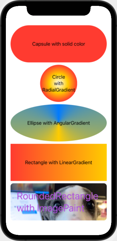
struct ContentView: View {
    let linearGradient = LinearGradient(
        // Any number of colors can be specified.
        gradient: Gradient(colors: [.red, .yellow]),
        startPoint: .leading, // other values are .top and .bottom
        endPoint: .trailing
    )
    let angularGradient = AngularGradient(
        // It's usually best to return to the starting color.
        gradient: Gradient(colors: [.yellow, .blue, .yellow]),
        center: .center,
        startAngle: .degrees(90),
        endAngle: .degrees(90 + 360)
    )
    let radialGradient = RadialGradient(
        gradient: Gradient(colors: [.red, .yellow]),
        center: .center,
        startRadius: 0,
        endRadius: 20
    )

    func radialGradient(over size: CGSize) -> RadialGradient {
        let diameter = min(size.width, size.height)
        let radius = diameter / 2;
        return RadialGradient(
            // Colors go from inside to outside.
            gradient: Gradient(colors: [.white, .yellow, .red]),
            center: .center,
            startRadius: 0,
            endRadius: radius
        )
    }

    var body: some View {
        VStack {
            ZStack {
                Capsule().fill(.red)
                Text("Capsule with solid color")
            }
            ZStack {
                GeometryReader { geometry in
                    let size = geometry.size
                    VStack {
                        Circle().fill(radialGradient(over: size))
                    }
                    .frame(width: size.width, height: size.height)
                }
                Text("Circle\nwith\nRadialGradient")
                    .multilineTextAlignment(.center)
            }
            ZStack {
                Ellipse().fill(angularGradient)
                Text("Ellipse with AngularGradient")
            }
            ZStack {
                Rectangle().fill(linearGradient)
                Text("Rectangle with LinearGradient")
            }
            ZStack {
                RoundedRectangle(cornerRadius: 10)
                    .fill(ImagePaint(image: Image("Comet"), scale: 0.34))
                Text("RoundedRectangle with ImagePaint")
                .font(.largeTitle)
                .foregroundStyle(.purple)
            }
        }
        .padding()
    }
}
To render a fraction of a shape, apply the trim view modifier. This takes from and to arguments
that are both percentages between 0 and 1.
For example:
// In a Circle, 0 is at 0 degrees (right)
// and it is drawn clockwise.
// Percentage values are a percentage along the perimeter.
// 0.25 is at 270 degrees (bottom),
// 0.5 is at 180 degrees (left), and
// 0.75 is at 90 degrees (top).
Circle()
    .trim(from: from, to: to)
    .stroke(.red, lineWidth: 10)
    .frame(width: 100, height: 100)

// In a Rectangle, zero is at the upper right
// and it is drawn clockwise.
// Percentage values are a percentage along the perimeter.
Rectangle()
    .trim(from: from, to: to)
    .stroke(.blue, lineWidth: 10)
    .frame(width: 200, height: 100)
To modify the zero location of the trim, rotate the shape. For example:
Circle()
    .trim(from: from, to: to)
    .stroke(.red, lineWidth: 10)
    .frame(width: 100, height: 100)
    .rotationEffect(.degrees(90))
Trimming filled shapes doesn't typically produce a desired result.
Angle
This is a struct that does not implement the View protocol,
but is used by several drawing views.
Instances can be created using an initializer
that takes either a degrees or a radians argument.
The value can be obtained via either degrees or radians properties
and conversions are performed automatically.
let angle = Angle(radians: Double.pi)
print(angle.degrees) // 180.0
Path
Like Color, Path also creates a view.
The following example draws a path for a triangle
that is both filled and stroked.
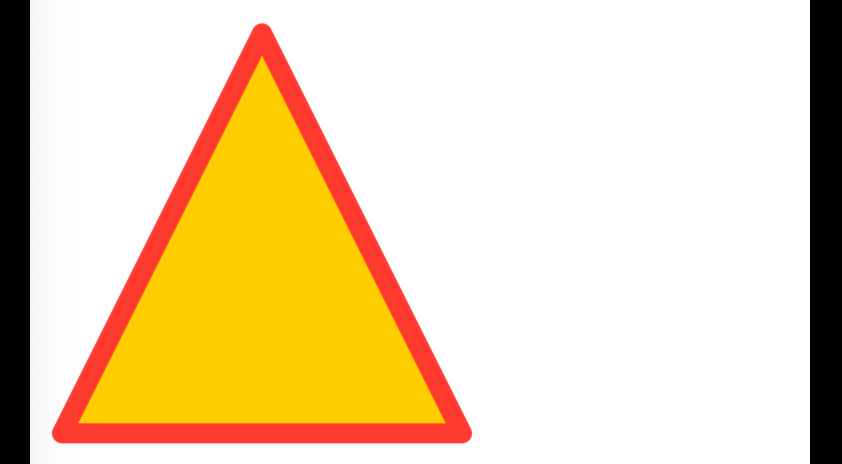
// Define the path as a computed property so it can be
// used once for filling and once for stroking.
var path: Path {
    Path { path in
        path.move(to: CGPoint(x: 0, y: width))
        path.addLine(to: CGPoint(x: halfWidth, y: 0))
        path.addLine(to: CGPoint(x: width, y: width))
        path.closeSubpath()
    }
}

// Inside some container view ...
ZStack {
    path.fill(.yellow)
    path.stroke(
        .red,
        style: StrokeStyle(
            lineWidth: lineWidth,
            lineCap: .round,
            lineJoin: .round
        )
    )
}
The Path view supports many drawing methods including:
addArc, addCurve, addEllipse, addLines, addPath, addQuadCurve,
addRect, addRects, addRelativeArc, and addRoundedRect.
Other Drawing Views
Many drawing views draw exactly what their name implies.
These include Circle, Ellipse, Rectangle,
and RoundedRectangle (has rounded corners).
To add a drop shadow to a shape, apply the fill view modifier.
For example:
Circle()
    .fill(.yellow.shadow(.drop(color: .black, radius: 10)))
    .frame(width: 100)
Other drawing views are less obvious from their name, including:
Anchor: ?AnimatablePair: ?Animation: ?AnyShapeShape: ?AnyTransition: ?Capsule: draws an ovalContainerRelativeShape: ?EmptyAnimatableData: ?OffsetShape: ?ProjectionTransform: ?RotatedShape: ?ScaledShape: ?TransformedShape: ?UnitPoint: ?
Other Views
GeometryReader
The GeometryReader view takes all the space offered to it, wraps other views,
and provides its size which can be used in calculations.
The size is passed to a trailing closure and has the type GeometryProxy
which has a size property whose type is CGSize.
The following example gets the size of a VStack and displays it inside.
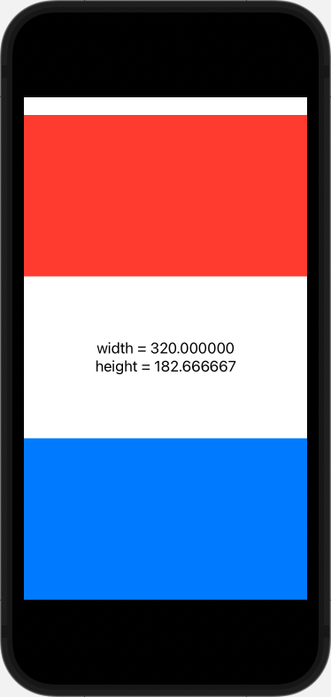
VStack(spacing: 0) {
    // The 3 children below are given equal heights.
    Rectangle().fill(.red)
    GeometryReader { geometry in
        VStack() {
            Text("width = \(geometry.size.width)")
            Text("height = \(geometry.size.height)")
        }
        // This expands the size of the VStack to fill the
        // GeometryReader so the contents are centered.
        .frame(width: geometry.size.width,
            height: geometry.size.height)
         }
    Rectangle().fill(.blue)
}
Spacer
Each Spacer view takes an equal amount of the unused space
inside its parent container view.
It accepts an optional minLength attribute which defaults to zero.
Using Spacer can be compared to web applications that use
the CSS properties display: flex; and justify-content
with the values shown in the following table:
| CSS justify-content value | Spacer placement |
|---|---|
| flex-start | at end of list of views |
| flex-end | at beginning of list of views |
| space-between | one between each child view |
Divider
This draws a light gray, 1-pixel wide line across the container.
The line is vertical in an HStack and horizontal in a VStack.
The line can be customized in several ways:
-
To add space around the line, use the
paddingview modifier.Divider().padding(20) -
To change the color of the line, use the
backgroundview modifier.Divider().background(.red) -
To draw a thicker line, use the
framemodifier. This doesn't actually make theDividerthicker, it just makes the area allocated wider and fills it with a color.Divider().background(.blue).frame(height: 20).background(.blue) -
To avoid drawing the line all the way across the container, use the
frameview modifier and specify themaxWidthattribute.Divider().frame(maxWidth: 200)
AttributedString
Creating AttributedString instances enables associating styling
with a string instead of with a view such as Text.
AttributedString instances have many properties that can be set including
foregroundColor, backgroundColor, underlineStyle, baselineOffset,
and more.
If an AttributedString instance has these properties set
and it is used in a view such as Text,
applying corresponding view modifiers to the view has no effect.
When an AttributedString is concatenated with a String,
the result is a new AttributedString.
The following code demonstrates basic usage of the AttributedString type.
It renders the formula for water ("H2O")
where each letter is a different color and
the "2" is rendered as a superscript.

struct ContentView: View {
    let size = 50.0

    private var water: AttributedString {
        var h = AttributedString("H")
        h.foregroundColor = .red
        h.backgroundColor = .yellow
        h.underlineStyle =
            Text.LineStyle(pattern: .solid, color: .blue)

        var two = AttributedString("2")
        two.font = .system(size: size * 0.5)
        two.foregroundColor = .green
        two.baselineOffset = size * 0.4

        var o = AttributedString("O")
        o.foregroundColor = .blue

        return h + two + o
    }

    var body: some View {
        Text(water)
            // This is ignored because the AttributedString
            // specifies foreground colors.
            .foregroundColor(.purple)

            // This only affects the AttributedStrings
            // that do not specify a font ("H" and "O").
            .font(.system(size: size))
    }
}
For basic styling such as making parts of a string bold or italic,
it is not necessary to use AttributedString because views like
Text, Label, and Button view supports a subset of Markdown syntax.
However, this only works when a literal String is passed.
To pass a variable of type String that contains Markdown syntax,
use Text(.init(myVariable)).
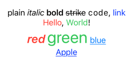
struct ContentView: View {
    private var colors: AttributedString {
        var red = AttributedString("red")
        red.foregroundColor = .red
        red.font = Font.system(size: 24).bold().italic()

        var green = AttributedString("green")
        green.foregroundColor = .green
        green.font = .largeTitle

        var blue = AttributedString("blue")
        blue.foregroundColor = .blue
        blue.underlineStyle = .single

        return red + " " + green + " " + blue
    }

    private var apple: AttributedString {
        var result = AttributedString("Apple")
        result.link = URL(string: "https://apple.com")
        result.underlineStyle = .single
        return result
    }

    var body: some View {
        VStack {
            // This uses built-in Markdown support in Strings.
            Text("plain *italic* **bold** ~strike~ `code`, [link](https://apple.com)")

            // This concatenates Text views that each have their own styles
            // without using AttributedStrings.
            Text("Hello").foregroundColor(.red) +
                Text(", ") +
                Text("World").foregroundColor(.green) +
                Text("!")

            // This uses multiple AttributedStrings in the same String.
            Text(colors)

            // This renders an AttributedString that is a link.
            Text(apple)
        }
    }
}
Badges
The badge view modifier adds an Int to an item in a TabView or List.
To add a String instead, use this badge view modifier.
When applied to an item in a TabView, the badge is rendered as a
red circle or oval that is positioned on the upper-right corner of the item.
See examples in the TabView section.
To change the color of TabView item badges from red to another color,
add the following in the struct of the surrounding view:
init() {
    UITabBarItem.appearance().badgeColor = .blue // or some other color
}
When applied to a List item, the badge is render as
gray text on the trailing edge.
For example:

struct ContentView: View {
    var body: some View {
        List {
            Text("Jean Ratelle").badge(19)
            Text("Wayne Gretzky").badge("Great One")
        }
    }
}
Layout Details
Container views offer space to their child views. The child views can choose their size within the space offered to them. Container views then position the contained views knowing their sizes. Container views can also then choose their own size that perhaps differs from they offered to their child views.
Some views are "inflexible" and want to be a specific size.
Examples including Text and Image views.
Other views are "flexible" and can adapt to the space offered to them.
Examples include Circle and RoundedRectangle.
Container views give space to inflexible child views first and
then divide the remaining space between the flexible child views.
The priority with which container views give space to child views
can be altered by applying the layoutPriority view modifier to child views.
It is passed a float value that defaults to zero.
When a container view contains at least one flexible view, it is also considered to be flexible.
Unsafe areas, such as the area at the top of iPhones that have a camera bump, are removed from offered space by default. Sometimes it is useful to draw in those areas. One example, shown below, is displaying a background image.
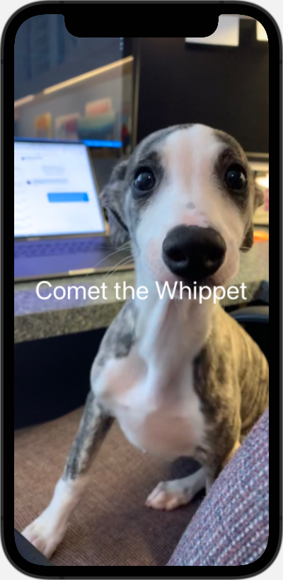
VStack {
    Spacer()
    Text("Comet the Whippet")
        .foregroundStyle(.white)
        .font(.system(size: 36))
    Spacer()
}
    .background(Image("Comet").resizable().scaledToFill())
    .edgesIgnoringSafeArea(.all) // allows drawing in unsafe areas
Executing Code When View Appears/Disappears
There are three ways to specify code to run when a view is created or first appears.
- Place code in the view initializer (
init). - For synchronous code, apply the
onAppearview modifier to the outermost view returned by thebodyfunction, passing it a closure. - For asynchronous code, apply the
taskview modifier to the outermost view returned by thebodyfunction, passing it a closure.
The task view modifier takes a closure that is run in an asynchronous content
and the code inside it can use the await keyword.
This is place to make API calls that fetch data the UI needs.
If the user navigates away from the view before the code is run,
the task and certain asynchronous tasks are automatically cancelled.
To rerun the code in a task closure every time the value of
an observable property such as a @State variable changes,
include the id argument.
By default the task is run at the highest priority.
To give it a lower priority, include the priority argument.
The onAppear view modifier also takes a closure,
but its code can only use the await keyword if it is wrapped in a Task.
To run code when a view disappears, apply the onDisappear view modifier,
passing it a closure.
To run code the app launches, add an init method to the main struct
that inherits from App and place the code there.
This is an ideal place to set default UsersDefaults data
if it has not yet been set.
Event Handling
Views support many methods whose names begin with "on" to register a function to be called when a given event occurs. These include:
-
onTapGesture -
onLongPressGesture -
onDrag -
onDrop -
onAppearThis takes a function to execute every time the view on which it is applied is rendered. Also see the
taskmethod. -
onDisappear -
onCommand -
onCopyCommand -
onCutCommand -
onDeleteCommand -
onExitCommand -
onMoveCommand -
onPasteCommand -
onPlayPauseCommand -
onChangeThe onChange view modifier registers a closure to be invoked when the value of a given state property or computed property changes. The closure is passed the new value. For example:
VStack {
    ...
}
.onChange(of: someState) { newValue in
    ...
}
If the closure passed to
onChangedoes not have a parameter, the somewhat confusing error message "Type '()' cannot conform to '{some-type}'" will appear where some-type is the type of the variable being watched. To fix this, add a parameter to the closure which can be_if the value is not used.In cases where both the old and new value are needed, the following can be used:
// iOS 17 and above .onChange(of: someState) { oldValue, newValue in ... } // iOS 16 and below .onChange(of: someState) { [someState] newValue in // someState holds the old value. ... } -
onContinueUserActivity -
onHover -
onOpenURL -
onReceive -
onSubmit
The View method onTapGesture has a needlessly long name.
To use onTap instead, add this extension method:
extension View {
    public func onTap(
        count: Int = 1,
        perform: @escaping () -> Void
    ) -> some View {
        onTapGesture(count: count, perform: perform)
    }
}
Gestures
SwiftUI supports detecting the following gestures on a view:
TapGestureLongPressGestureDragGestureRotateGesture(iOS 17+) andRotationGesture(pre-iOS 17)MagnifyGesture(iOS 17+) andMagnificationGesture(pre-iOS 17)
Supporting multiple gestures on a single view is easy for some combinations, but not others. For example, supporting both rotate and magnify gestures is easy, but supporting both drag and rotate gestures is problematic
See the example project SwiftUIGesturesDemo.
Keyboard Shortcuts
To defined keyboard shortcuts, apply the keyboardShortcut view modifier.
Pass this a String that describes the key (ex. "x").
This assumes the command key will be held down.
Alternatively the keyboardShort view modifier can be passed a "semantic key".
There are only two defined semantic keys.
The value .cancelAction refers to the escape key.
The value .defaultAction refers to the return key.
For example:
struct ContentView: View {
    @State private var message = "Tap a button."

    var body: some View {
        VStack {
            Button("First") {
                message = "You selected First."
            }
            .keyboardShortcut("f") // cmd-f

            Button("Second") {
                message = "You selected Second."
            }
            .keyboardShortcut(
                .return,
                modifiers: [.command, .shift]
            ) // cmd-shift-return

            Text(message)
        }
    }
}
To require modifier keys other than the default command key,
add the modifiers argument with a value that is
an array of all the required EventModifiers values. These include .capslock, .command,
.control, numericPad, option, and shift.
For example, to require the command key and the shift key
add modifiers: [.command, .shift].
On an iPad with a physical keyboard, hold down the command key to see a keyboard shortcut overlay that lists the available keyboard shortcuts.
Controlling Focus
The FocusState property wrapper is used to
track and modify which input view currently has focus.
The following code demonstrates its use.
Pressing the return key while the focus is in any TextField
moves to the next TextField.
struct ContentView: View {
    @FocusState private var focus: AnyKeyPath?
    @State private var firstName = ""
    @State private var middleName = ""
    @State private var lastName = ""
    @State private var message = ""
    @State private var showError = false
    @State private var showWelcome = false

    private var fullName: String {
        "\(firstName) \(middleName) \(lastName)"
    }

    var body: some View {
        VStack {
            TextField("First Name", text: $firstName, onCommit: nextFocus)
                .focused($focus, equals: \Self.firstName)
            TextField("Middle Name", text: $middleName, onCommit: nextFocus)
                .focused($focus, equals: \Self.middleName)
            TextField("Last Name", text: $lastName, onCommit: nextFocus)
                .focused($focus, equals: \Self.lastName)
            Button("Submit", action: submit)
                .buttonStyle(.borderedProminent)
            Spacer()
        }
        .disableAutocorrection(true)
        .textFieldStyle(.roundedBorder)
        .padding()
        .onAppear {
            focus = \Self.firstName // initial focus
        }
        .alert(
            "Invalid Input",
            isPresented: $showError,
            actions: {}, // no custom buttons
            message: { Text(message) }
        )
        .alert(
            "Welcome",
            isPresented: $showWelcome,
            actions: {}, // no custom buttons
            message: { Text("Hello, \(fullName)!") }
        )
    }

    private func nextFocus() {
        switch focus {
        case \Self.firstName: focus = \Self.middleName
        case \Self.middleName: focus = \Self.lastName
        case \Self.lastName: focus = \Self.firstName
        default: break
        }
    }

    private func submit() {
        if firstName.isEmpty {
            message = "First name is required"
            focus = \Self.firstName
        } else if lastName.isEmpty {
            message = "Last name is required"
            focus = \Self.lastName
        } else if lastName.count < 2 {
            message = "Last name is too short"
            focus = \Self.lastName
        } else {
            message = ""
            focus = nil // dismisses keyboard
        }

        showWelcome = message.isEmpty
        showError = !showWelcome
    }
}
Dismissing Keyboard
It's good practice to provide a way for the user to dismiss the keyboard. One approach is to add a button at the top of the keyboard using the toolbar view modifier. For example:
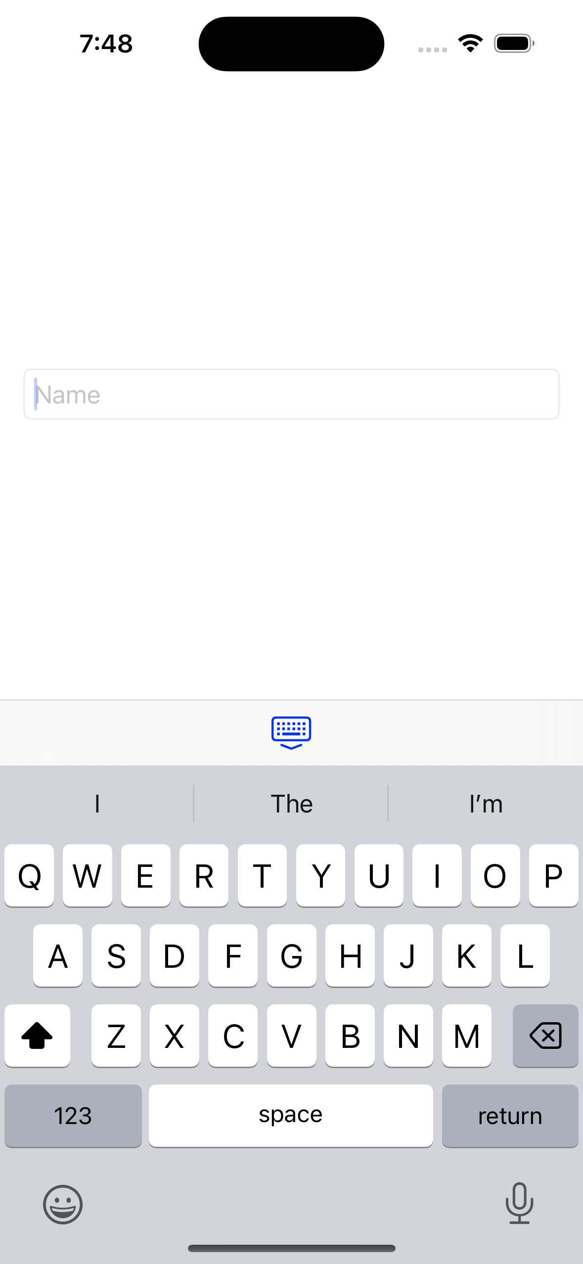
extension View {
    #if os(iOS) // not supported in watchOS
        @available(iOSApplicationExtension, unavailable)
        func dismissKeyboard() {
            UIApplication.shared.sendAction(
                #selector(UIResponder.resignFirstResponder),
                to: nil,
                from: nil,
                for: nil
            )
        }
    #endif
}

struct ContentView: View {
    @State private var name = ""

    var body: some View {
        // A NavigationView is required in order for
        // the keyboard toolbar button to appear and work.
        NavigationView {
            VStack {
                TextField("Name", text: $name)
                    .textFieldStyle(.roundedBorder)
                if !name.isEmpty {
                    Text("Hello, \(name)!")
                }
            }
            .padding()
            // This applies to all TextField instances inside the VStack.
            .toolbar {
                ToolbarItemGroup(placement: .keyboard) {
                    Button(action: dismissKeyboard) {
                        Image(systemName: "keyboard.chevron.compact.down")
                    }
                }
            }
        }
    }
}
Environment
SwiftUI provides many values to all views through the "environment".
Any view in the view hierarchy can access environment data
using the @Environment property wrapper.
For example, @Environment(\.colorScheme) private var colorScheme.
Highlights of environment data include:
-
accessibilityReduceMotion: BoolThis captures the user preference for reducing motion. It can be used to determine the kinds of animations that should be used.
-
colorScheme: ColorSchemeThis is an
enumwith the caseslightanddark. -
defaultWheelPickerItemHeight: CGFloatThis can be used to calculate the
frameheight needed for a wheel picker. -
managedObjectContext: NSManagedObjectContextThis holds the context being used for Core Data.
-
locale: LocaleThis holds the current locale which can be used for internationalization.
-
editMode: EditModeThis indicates whether the user can currently edit view content. It is an
enumwith the casesactive,inactive, andtransient(temporary edit mode). -
font: Font?This describes the default font.
For a full list of the provided environment values, see EnvironmentValues.
It is also possible to add custom data to the environment. Any view below the view where the environment data is added can access it.
The following example demonstrates this by adding the custom environment value "primaryColor". Environment values provided by Apple are accessed and modified in the same way.
// Define a custom environment key and its default value.
private struct PrimaryColorKey: EnvironmentKey {
    static let defaultValue = Color.red
}

// Add the custom environment value.
extension EnvironmentValues {
    var primaryColor: Color {
        get { self[PrimaryColorKey.self] }
        set { self[PrimaryColorKey.self] = newValue }
    }
}

struct ChildView: View {
    @Environment(\.primaryColor) var primaryColor

    var body: some View {
        VStack {
            // Renders in blue.
            Text("in ChildView").foregroundStyle(primaryColor)
            GrandchildView()
        }
    }
}

struct GrandchildView: View {
    @Environment(\.primaryColor) var primaryColor

    var body: some View {
        // Renders in blue.
        Text("in GrandchildView").foregroundStyle(primaryColor)
    }
}

struct ContentView: View {
    @Environment(\.primaryColor) var primaryColor

    var body: some View {
        VStack {
            // Renders in red when run in the Simulator
            // and in green when run in Preview.
            Text("in ContentView").foregroundStyle(primaryColor)
            // Override the default value of primaryColor
            // for all views under ChildView.
            ChildView().environment(\.primaryColor, .blue)

        }
    }
}

struct ContentView_Previews: PreviewProvider {
    static var previews: some View {
        // Override the default value of primaryColor for entire app.
        ContentView().environment(\.primaryColor, .green)
    }
}
State Detection
To detect when the app moves between the
foreground, background, and inactive states, get the scenePhase from the environment.
Apply the onChange view modifier to any view
to watch for changes to the scenePhase.
Values include active (in foreground and interactive),
inactive (in foreground but not interactive; should pause work),
and background (not currently visible).
One use is to reload data that may have changed
since the last time the app was active.
For example:
struct ContentView: View {
    @Environment(\.scenePhase) var scenePhase

    var body: some View {
        Button("Tap Me!") {
            print("got tap")
        }
        // To get only the new value ...
        // .onChange(of: scenePhase) { newPhase in
        // To get old and new values ...
        .onChange(of: scenePhase) { [scenePhase] newPhase in
            if scenePhase == .background, newPhase == .inactive {
                // Reload data here.
            }
        }
    }
}
An app can have multiple scenes.
An app is considered active if any of its scenes are active which means a scene is in the foreground (visible) and interactive.
An app is considered inactive when none of its scenes are active. One or more scenes might be visible, but none are interactive. This happens when the user swipes up from the bottom of the screen to reveal the "App Switcher". This also happens when in multi-tasking mode and the app is visible but another app is active.
An app moves to the background state when another app becomes active.
AppDelegate
SwiftUI apps, unlike UIKit apps, are not required to define a class to be defined that conforms to the UIApplicationDelegate protocol. This protocol defines many methods are automatically invoked at key points in the application lifecycle including:
- app becomes active
- app becomes inactive
- app is about to move to the background
- app has moved to the background
- app is about to move to the foreground
- app is about to terminate
- app is about to leave the background and become active
- app receives a memory warning
- app receives a request to preserve its state
- app receives a request to restore its state
- and many more
While not required, there are situations where have such a class is useful.
To add use of an AppDelegate to a SwiftUI app:
-
Define a class, typically named
AppDelegatethat inherits fromNSObjectand conforms toUIApplicationDelegate.class AppDelegate: NSObject, UIApplicationDelegate { // Define lifecycle methods here. } -
Add the following inside the main struct that inherits from
App:@UIApplicationDelegateAdaptor(AppDelegate.self) var appDelegate
Detecting Device Orientation
The device orientation can be detected by listening for
orientationDidChangeNotification notifications.
The "Hacking With Swift" post How to detect device rotation describes implementing a custom view modifier
that simplifies doing this.
The following is a customized version of the code in that post.
struct OrientationViewModifier: ViewModifier {
    // This is a function that will called when the orientation changes.
    let action: (UIDeviceOrientation) -> Void

    func body(content: Content) -> some View {
        content
            // We must have "onAppear" in order to use "onReceive",
            // but it doesn't need to do anything.
            .onAppear()
            .onReceive(
                NotificationCenter.default
                    .publisher(
                        for: UIDevice
                            .orientationDidChangeNotification
                    )
            ) { _ in
                action(UIDevice.current.orientation)
            }
    }
}

// Define a custom view modifier.
extension View {
    func onOrientationChange(
        action: @escaping (UIDeviceOrientation) -> Void
    ) -> some View {
        modifier(OrientationViewModifier(action: action))
    }
}

struct ContentView: View {
    // UIDeviceOrientation is an enum defined by UIKit.
    @State private var orientation = UIDeviceOrientation.unknown

    var description: String {
        switch orientation {
        case .faceDown, .faceUp:
            return "flat"
        case .landscapeLeft, .landscapeRight:
            return "landscape"
        case .portrait, .portraitUpsideDown:
            return "portrait"
        case .unknown:
            return "unknown"
        @unknown default:
            fatalError("unknown UIDeviceOrientation value")
        }
    }

    var body: some View {
        Text(description)
            .onOrientationChange { orientation in
                self.orientation = orientation
            }
    }
}
The UIDeviceOrientation enum also defines the following computed properties:
isFlat: true for.faceDownand.faceUpisLandscape: true for.landscapeLeftand.landscapeRightisPortrait: true for.portraitand.portraitUpsideDownisValidInterfaceOrientation: true if one of the portrait or landscape values
Search
SwiftUI provides a search input containing a magnifier glass icon
that is rendered in the navigation bar by the searchable view modifier.
This is typically applied to a List view.
A closure can be passed to the searchable view modifier
that creates suggested completions.
These are displayed while typing in the search input.
Tapping a suggested completion selects it.
The following code demonstrates filtering a List
using the searchable view modifier.
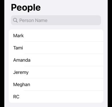
struct ContentView: View {
    @State private var query = ""

    private let people = [
        "Mark",
        "Tami",
        "Amanda",
        "Jeremy",
        "Meghan",
        "RC"
    ]

    // Computed property based on people and query.
    private var matchingPeople: [String] {
        let lower = query.lowercased()
        return lower.isEmpty ?
            people :
            people.filter { $0.lowercased().contains(lower) }
    }

    var body: some View {
        NavigationView {
            List(matchingPeople, id: \.self) { person in
                Text(person)
            }
            .searchable(
                text: $query,
                // Supposedly the search input should be hidden
                // until the user drags down on the List
                // unless the following argument is supplied.
                // However, it seems to be always displayed even without this.
                // placement: .navigationBarDrawer(displayMode: .always),
                prompt: "Person Name"
            ) {
                // Include this closure to provide suggested completions.
                // Tapping one selects it.
                ForEach(matchingPeople, id: \.self) { result in
                    Text(result).searchCompletion(result)
                }
            }
            .autocapitalization(.none)
            .navigationTitle("People")
        }
    }
}
Animation
See Animation.
Drag and Drop
iOS 16 added the view modifiers draggable and dropDestination. These make it relatively easy to implement drag and drop.
In the example code below there are two groups of items. The top group is items available for purchase. The bottom group is items in a shopping cart. Items can be dragged from one group to the other and each group remains in alphabetical order.
When an item is being dragged, it is represented by a "preview".
This is generated automatically from the view being dragged,
but can also be customized in the draggable initializer.
One issue is that it seems there is no way to
specify that drag previews should have a corner radius.
When the view being dragged has a corner radius, the corners are
filled with white which causes the previews to always appear as rectangles.
struct ContentView: View {
    @State private var availableBorderColor: Color = .clear
    @State private var cartBorderColor: Color = .clear
    @State private var unselectedItems: [String] = [
        "Apple",
        "Banana",
        "Cherry"
    ]
    @State private var selectedItems: [String] = []

    private let cornerRadius: CGFloat = 10

    private func draggableItem(_ text: String) -> some View {
        Text(text)
            .font(.system(size: 20))
            .padding()
            .background(.white)
            .cornerRadius(10)
            .draggable(text)
        /*
         // This was an attempt to determine what is being dragged,
         // but the closure gets invoked for all items,
         // not just the one being dragged.
         .draggable(text) {
             print("dragging \(text)")
             return Text(text)
         }
         */
        // TODO: I need to save the text being dragged so I can
        // TODO: add a colored border to the target container.
    }

    private func handleDrop(
        items: [String],
        from: Binding<[String]>,
        to: Binding<[String]>
    ) -> Bool {
        let dropped = items.first!
        // If the item is being dropped into the container
        // where it already resides, don't do anything.
        guard !to.wrappedValue.contains(dropped) else { return false }

        from.wrappedValue.removeAll { item in item == dropped }
        to.wrappedValue.append(dropped)
        to.wrappedValue.sort()
        return true // indicates success
    }

    var body: some View {
        VStack {
            GroupBox(label: Text("Available Items")) {
                HStack {
                    ForEach(unselectedItems, id: \.self) { item in
                        draggableItem(item)
                    }
                }
            }
            .overlay(
                RoundedRectangle(cornerRadius: cornerRadius)
                    .stroke(availableBorderColor)
            )
            .dropDestination(for: String.self) { items, _ in
                handleDrop(
                    items: items,
                    from: $selectedItems,
                    to: $unselectedItems
                )
            } isTargeted: { over in
                // let inCart = selected.contains(
                // availableBorderColor = canDrop ? .green : .clear
                availableBorderColor = over ? .green : .clear
            }

            HStack {
                let size = 20.0
                Image(systemName: "arrow.down")
                    .resizable()
                    .frame(width: size, height: size)
                Text("""
                Long press an item to begin dragging, \
                then drag between these lists.
                """)
                Image(systemName: "arrow.up")
                    .resizable()
                    .frame(width: size, height: size)
            }

            GroupBox(label: Text("Shopping Cart")) {
                HStack {
                    ForEach(selectedItems, id: \.self) { item in
                        draggableItem(item)
                    }
                }
            }
            .overlay(
                RoundedRectangle(cornerRadius: cornerRadius)
                    .stroke(cartBorderColor)
            )
            .dropDestination(for: String.self) { items, _ in
                handleDrop(
                    items: items,
                    from: $unselectedItems,
                    to: $selectedItems
                )
            } isTargeted: { over in
                cartBorderColor = over ? .green : .clear
            }
        }
        .padding()
    }
}
Camera
To enable camera access in a SwiftUI app:
- In the Navigator, select the root group to open the project editor.
- In the project editor, select the target.
- Select the "Info" tab.
- Click the "+" after any existing key to create a new key.
- For the key name enter "Privacy - Camera Usage Description".
- For the key value, enter a user prompt like "Please allow camera access."
Preview and the Simulator cannot access the camera. To test camera access, run the app on a real device.
TODO: Add detail on taking photos from an app.
Photo Library
TODO: Add detail on accessing images in the Photos app.
Scanning QR Codes and Barcodes
The library "CodeScan" makes this easy. The YouTube video Scanning QR codes with SwiftUI demonstrates using this.
- Select File ... Add Packages...
- Enter CodeScanner" in the search input
- Click the "Add Package" button.
- Click the next "Add Package" button.
TODO: Add more detail on using this package.
Audio
The AVAudioPlayer class in the AVKit framework enables playing audio in several formats such as MP3.
A good source of free audio files is
Free Sounds Library.
Download audio files and copy them into an Xcode project next to .swift files.
To add an audio file to the project:
- Do not add the video file to
Assets.xcassets. - Drag an audio file into the Navigator. A dialog will appear.
- In the "Destination" section, check the "Copy items if needed" checkbox.
- In the "Add to target" section, check the app target checkbox.
- Click the "Finish" button.
The following example creates buttons
that each play a different sound when tapped.
It relies on having the files click.mp3 and ding.mp3
copied into the project.
import AVKit
import SwiftUI

// This makes player a "retained" variable which is necessary
// so the player is retained while the sound is playing.
private var player: AVAudioPlayer?

struct ContentView: View {
    @State private var message: String?

    private func play(_ name: String) {
        let url = Bundle.main.url(forResource: name, withExtension: ".mp3")
        guard let url else {
            message = "\(name).mp3 not found"
            return
        }

        do {
            player = try AVAudioPlayer(contentsOf: url)
            player?.play()
            message = nil
        } catch {
            message = "error playing sound: \(error)"
        }
    }

    var body: some View {
        VStack {
            HStack {
                Button("Click") { play("click") }
                Button("Ding") { play("ding") }
            }
            .buttonStyle(.bordered)
            if let message {
                Text(message)
            }
            Spacer()
        }
    }
}
Video
The AVPlayer class from the AVKit framework enables playing videos in several formats such as MP4. To render this player in SwiftUI, wrap it in a VideoPlayer view.
To add a video file to the project:
- Do not add the video file to
Assets.xcassets. - Drag a video file into the Navigator. A dialog will appear.
- In the "Destination" section, check the "Copy items if needed" checkbox.
- In the "Add to target" section, check the app target checkbox.
- Click the "Finish" button.
The video can be played in Xcode by selecting the newly added file in the Navigator and clicking the play button at the bottom of the editor.
import AVKit
import SwiftUI

struct ContentView: View {
    // Use this approach to play video from the web.
    /*
     let url = URL(
         string: "https://commondatastorage.googleapis.com/gtv-videos-bucket/sample/BigBuckBunny.mp4"
     )
     */

    // Use this approach to play video from a file in the project.
    let url = Bundle.main.url(forResource: "BigBuckBunny", withExtension: "mp4")

    var body: some View {
        VStack {
            Text("Big Buck Bunny").font(.largeTitle)
            if let url {
                VideoPlayer(player: AVPlayer(url: url))
                    .frame(height: 300)
            } else {
                Text("video not found")
            }
        }
        .padding()
        .onAppear {
            print("url =", url)
        }
    }
}
Dialing Phone
To initiate making a phone call using the Phone app, use code like the following:
guard let url = URL(string: "tel://\(phoneNumber)") else {
    print("Phone: invalid phone number \(phoneNumber)")
    return
}
UIApplication.shared.open(url)
Sending Text Messages
To initiate sending a custom text message using the Messages app, use code like the following:
guard let url = URL(string: "sms:+1\(phoneNumber)") else {
    print("Phone: invalid phone number \(phoneNumber)")
    return
}
UIApplication.shared.open(url)
MVVM
SwiftUI encourages use of the Model-View-ViewModel (MVVM) paradigm which separates application code into three groups. This differs from UIKit which encourages use of Model-View-Controller (MVC).
Any state held in a view using the @State property modifier
should be transient state such as data related to styling.
Models ...
-
holds data and application logic
-
have no knowledge of the view code that uses the data
-
are structs that typically conform to the
Identifiableprotocol which requires having anidproperty (can have anUUIDvalue); allows iterating over them in aForEachloopFor a unique
Stringvalue, useUUID().uuidString. This is useful for inserting in a database.
ViewModels ...
- are classes (not structs) that implement the
ObservableObjectprotocol (Making them classes allows multiple views to share a reference to the same object.) - should be marked
finalto prevent subclassing and decrease build times - mark the properties whose values they publish
with the
@Publishedproperty wrapper which is a shorthand for explicitly callingobjectWillChange.send() - are passed to views or created inside them and
held in properties with the
@StateObjectproperty wrapper (which subscribes to ViewModel data) - have no knowledge of the views that use them
- have methods referred to as "intents" that are called by by views to update model data
- optionally create and hold model instances,
typically in
privateproperties - react to model changes by optionally transforming model data and publishing changes
Views ...
- decide what to render
- are structs that conform to the
Viewprotocol - should be mostly stateless
- are declarative rather than imperative because they describe what to render based on the current data, not when to render it
- can be associated with any number of ViewModels
- subscribe to changes in ViewModels by declaring properties
using the
@ObservedObjector@StateObjectproperty wrapper - react to changes published by ViewModels by rebuilding their bodies
- have a
bodyvar that rebuilds the view any time there are changes in the data of ViewModels they use - can call the
onReceivemethod to register a function to be called when new data is received (I couldn't get this to work.)
For example, a ViewModel could get the result of a SQL query from the Model and turn it into an array of objects that it publishes to Views.
Read-only data flows from the Model, through the ViewModel, and into the View. Views call ViewModel functions referred to as "intents" to notify it about user interactions. ViewModel methods can trigger Model updates.
To prevent @Published properties from being modified from
outside a ViewModel class, specify private(set) access control.
This will still allow read access from outside.
Here is a basic example of using MVVM. It's not exactly MVVM because it combines the Model and ViewModel into a single class. This is perhaps acceptable in cases where Model data is presented as-is to the View without requiring any data transformation.
Note the use of the @Published and @ObservedObject property wrappers.

// DemoApp.swift
import SwiftUI

@main
struct SwiftUI_MVVMApp: App {
    var model = Model() // defined in Model.swift

    var body: some Scene {
        WindowGroup {
            // This is how the View knows about the model.
            ContentView(model: model)
        }
    }
}
// Model.swift
import Foundation

struct Dog: CustomStringConvertible, Identifiable {
    private static var lastId = 0;

    var breed: String
    var id: Int // required by the Identifiable protocol
    var name: String
    var selected = false

    // This is a computed property required by the CustomStringConvertible protocol.
    var description: String { "Dog: \(name) \(selected)" }

    init(name: String, breed: String) {
        Dog.lastId += 1
        id = Dog.lastId
        self.name = name
        self.breed = breed
    }
}

// This must be a class instead of a struct
// in order to conform to the ObservableObject protocol.
// Classes that do this gain an objectWillChange method
// that publishes changes.
// This can be called directly before changes are made.
// Alternatively, if the properties that can change are annotated with the
// @Published property wrapper, changes will be published automatically.
@MainActor
class Model: ObservableObject {
    // The @Published property wrapper causes changes in properties
    // that are structs, not classes, to be published.
    @Published var dogs: [Dog] = []

    init() {
        // Start with an initial set of dogs.
        dogs.append(Dog(name: "Maisey", breed: "Treeing Walker Coonhound"))
        dogs.append(Dog(name: "Ramsay", breed: "Native American Indian Dog"))
        dogs.append(Dog(name: "Oscar", breed: "German Shorthaired Pointer"))
        dogs.append(Dog(name: "Comet", breed: "Whippet"))
    }

    /// An "intent" that toggles whether a given dog is selected.
    func toggle(_ dog: Dog) {
        // This is not needed if properties have the @Published annotation.
        //objectWillChange.send() // notifies subscribers

        // We can't use the "first" method to find the matching Dog
        // because that would return a copy of the Dog struct.
        // We need to be able to modify the struct in the array, not a copy.
        let index = dogs.firstIndex(where: { $0.id == dog.id })
        if let index = index {
            dogs[index].selected.toggle()
            let msg = "Model.select: selectedDog = \(String(describing: dogs[index]))"
            print(msg)
        }
    }
}
// ContentView.swift
import SwiftUI

// This is a custom view that renders a dog description.
// If the dog is selected, the text is made bold.
struct DogView: View {
    var dog: Dog

    var body: some View {
        let text = Text("\(dog.name) is a \(dog.breed)")
        if dog.selected {
            text.bold()
        } else {
            text
        }
    }
}

struct ContentView: View {
    // Adding the @ObservedObject property wrapper subscribes to changes.
    // Only view bodies that are affected by observed changes are rebuilt,
    // so it is efficient.
    // Selecting a dog mutates this model
    // which causes this view body to be rebuilt.
    @ObservedObject var model: Model

    var body: some View {
        VStack {
            Text("Dogs (\(model.dogs.count))").font(.title).padding()
            VStack(alignment: .leading) {
                ForEach(model.dogs) { dog in
                    DogView(dog: dog).onTapGesture {
                        model.toggle(dog)
                    }
                }
            }
        }
    }
}

struct ContentView_Previews: PreviewProvider {
    static var previews: some View {
        ContentView(model: Model())
    }
}
To persist a ViewModel @Published property every time it changes,
add a didSet method to the property. For example:
@Published var data: [SomeType] = [] {
    didSet {
        persistData()
    }
}
Popovers
Popovers are often used for tooltip or help text.
To define a popover, apply the popOver view modifier to any view.
The following example displays a popover above a Text view
when a Button is tapped.
On an iPad popovers are rendered like speech bubbles
with a tail pointing at an associated view.
On an iPhone popovers are rendered as sheets that slide in from the bottom.

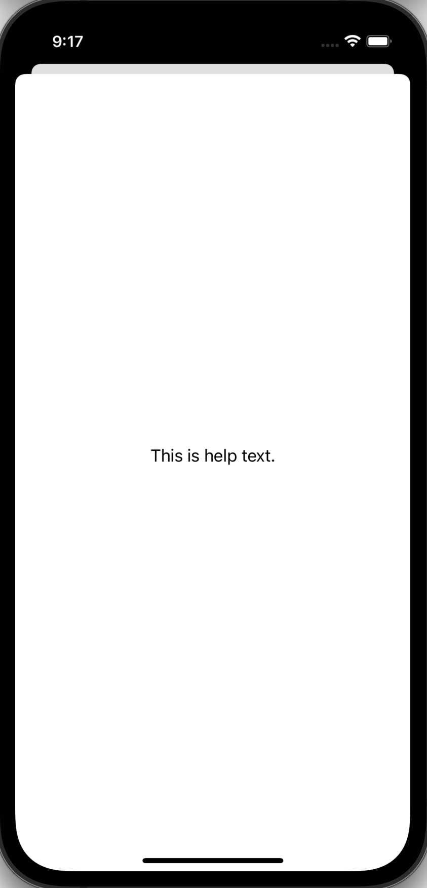
func runAfter(seconds: Int, closure: @escaping () -> Void) {
    DispatchQueue.main.asyncAfter(
        deadline: DispatchTime.now() + 2,
        execute: closure
    )
}

struct ContentView: View {
    @State private var showingHelp = false

    var body: some View {
        VStack(spacing: 30) {
            Text("Some complex text goes here.")
                .padding()
                .background(Color(UIColor.lightGray))
                .popover(isPresented: $showingHelp) {
                    Text("This is help text.").padding()
                }

            Button("Help") {
                // Display the popover for 2 seconds.
                // SwiftUI doesn't support showing
                // multiple popovers at the same time.
                // If this is attempted, none will be displayed.
                showingHelp = true
                runAfter(seconds: 2) { showingHelp = false }
            }
            .buttonStyle(.bordered)
        }
    }
}
Modal Dialogs
There are four view modifiers that display a modal dialog.
- alert
- confirmationDialog
- contextMenu - This is not really a modal, but behaves like one.
- sheet
Each of these view modifiers are described in the following sections.
Alerts
Alerts are simple modal dialogs that are displayed in the center of the screen. They display a title, an optional message, and buttons. "Only unstyled text is supported for the message." Tapping any button executes its action and dismisses the dialog.
To define an alert, apply the alert view modifier to any view.
It is displayed when a given Bool binding is set to true.
The buttons to display are described in the actions argument.
Like any button, these can have associated actions.
When there are more than two buttons, they are stacked vertically. Otherwise they are placed on one row.
If no buttons are provided,
an "OK" button with a role of .cancel is provided.

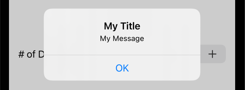
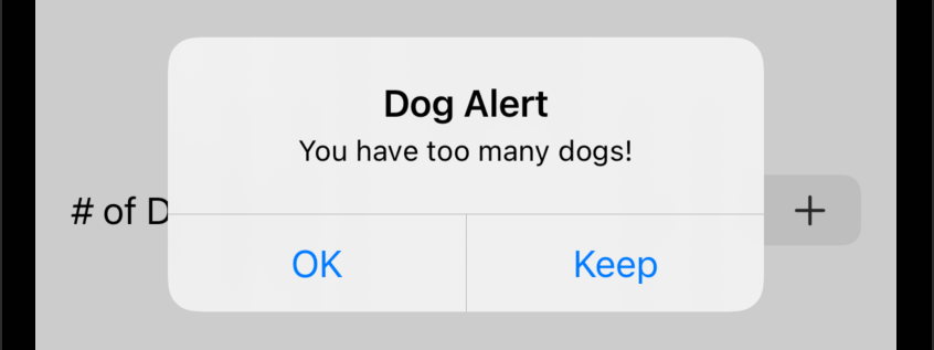
struct ContentView: View {
    @State private var dogCount = 0
    @State private var pressed = false
    @State private var tooManyDogs = false

    var body: some View {
        VStack {
            Button("Press Me") { pressed = true }
            HStack {
                Stepper(
                    "# of Dogs: \(dogCount)",
                    value: $dogCount,
                    in: 0 ... 10
                ) { begin in
                    // true when editing begins (value not yet changed) and
                    // false when editing ends (value already changed)
                    if !begin {
                        tooManyDogs = dogCount > 2
                    }
                }
            }.padding()
        }
        .alert(
            "My Title",
            isPresented: $pressed,
            actions: {}, // no custom buttons
            message: {
                Text("My Message")
            }
        )
        .alert(
            "Dog Alert",
            isPresented: $tooManyDogs,
            actions: {
                Button("OK") {
                    dogCount = 2 // resets to maximum recommended
                }
                Button("Keep") {
                    // Allowing more than two dogs.
                }
            },
            message: {
                // Can only have a single Text view here,
                // not any kind of View!
                Text("You have too many dogs!")
            }
        )
    }
}
Chaining multiple calls to the alert method onto the same view
sometimes results on only the last one working properly.
It is recommended to only chain one call to alert to a view.
This seems to only be an issue when each alert method
is passed a closure that returns an Alert instance.
Alerts can also accept inputs. The following code demonstrates using an alert to prompt for a username and password.
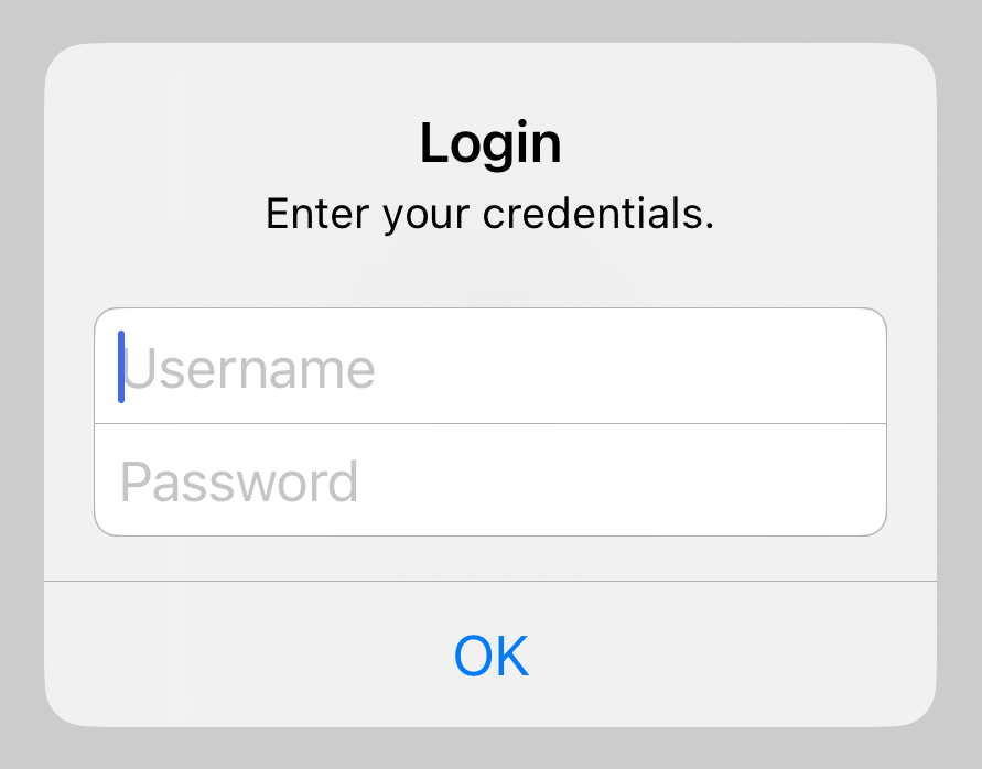
struct ContentView: View {
    @State private var isShowingAlert = false
    @State private var password = ""
    @State private var username = ""

    private var authenticated: Bool {
        username == "test" && password == "pass"
    }

    var body: some View {
        VStack {
            if authenticated {
                VStack {
                    Text("Welcome!").font(.largeTitle)
                    Button("Logout") {
                        username = ""
                        password = ""
                    }
                    .buttonStyle(.borderedProminent)
                }
            } else {
                if !username.isEmpty || !password.isEmpty {
                    Text("Invalid Credentials").foregroundStyle(.red)
                }
                Button("Login") {
                    isShowingAlert = true
                }
                .buttonStyle(.borderedProminent)
            }
        }
        .alert("Login", isPresented: $isShowingAlert) {
            Group {
                TextField("Username", text: $username)
                SecureField("Password", text: $password)
            }
            .autocapitalization(.none)
            .disableAutocorrection(true)
        } message: {
            Text("Enter your credentials.")
        }
    }
}
Confirmation Dialogs
Confirmation dialogs are similar to alerts, but they slide up from the bottom of the screen. They display a title (not on iOS), an optional message, and a vertical stack of buttons. A "Cancel" button is provided automatically and is displayed at the bottom. Tapping any button executes its action and dismisses the dialog. Tapping outside all of the buttons also dismisses the dialog.
To define a confirmation dialog, apply the confirmationDialog view modifier to any view.
It is displayed when a given Bool binding is set to true.
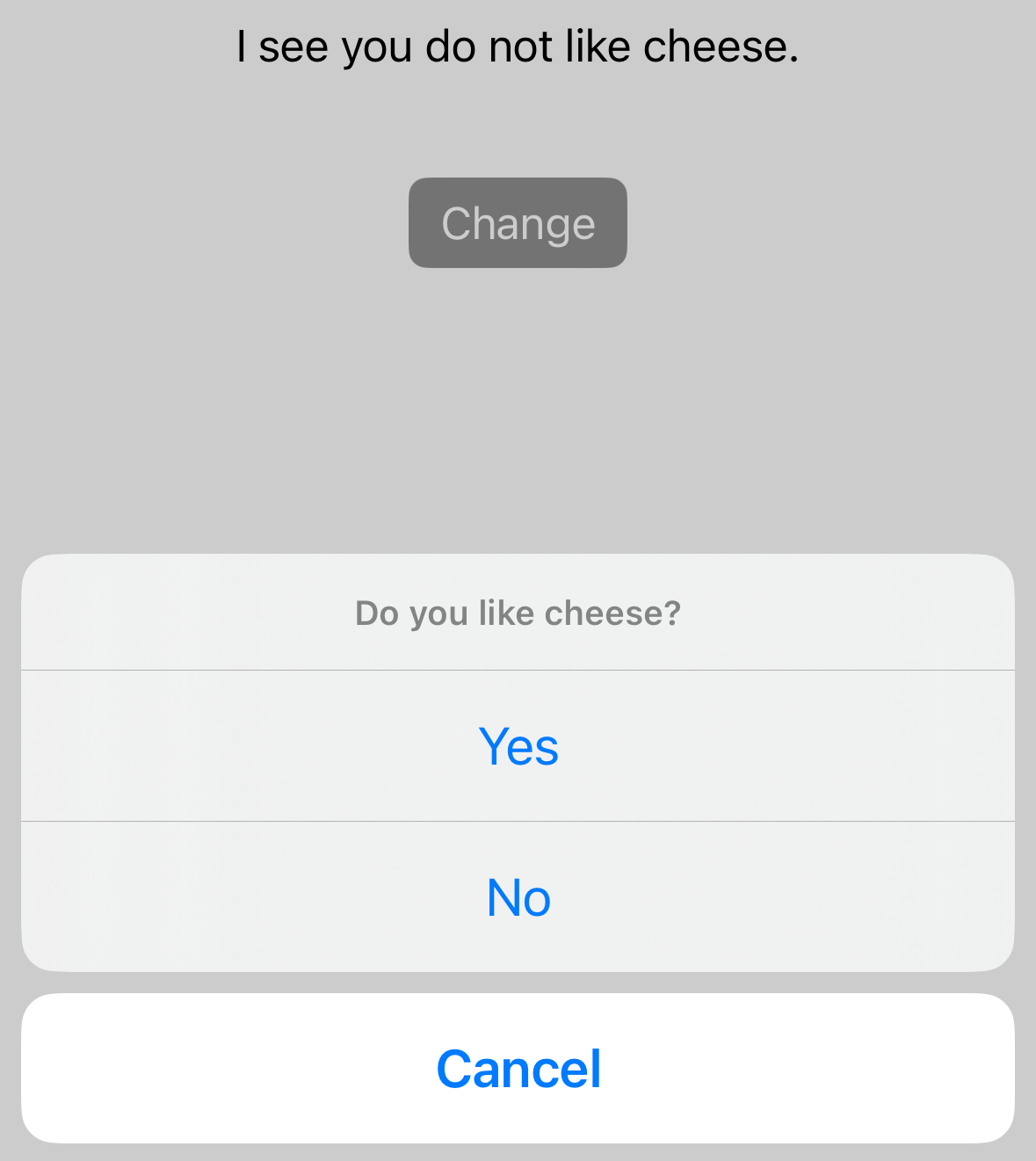
struct ContentView: View {
    @State private var showingConfirmation = false
    @State private var like = false

    var body: some View {
        VStack(spacing: 40) {
            let assessment = like ? "do" : "do not"
            Text("I see you \(assessment) like cheese.")
            Button("Change") {
                showingConfirmation = true
            }
            .buttonStyle(.borderedProminent)
            .confirmationDialog(
                "Question of the Day",
                isPresented: $showingConfirmation,
                actions: {
                    Button("Yes") { like = true }
                    Button("No") { like = false }
                },
                message: {
                    Text("Do you like cheese?")
                }
            )
        }
    }
}
Context Menus
Context menus are popups that are displayed below their associated view. They display a vertical stack of buttons. Tapping any button executes its action and dismisses the popup.
To define a context menu, apply the contextMenu view modifier to any view. It is displayed when the user long presses on the associated view or right-clicks in macOS.
The following example is similar to one found in the Picker section.
Using a Picker is typically preferred because it is more obvious to a user
that they can select a value.
struct ContentView: View {
    enum ShirtSize: String, CaseIterable {
        case sm = "Small"
        case md = "Medium"
        case lg = "Large"
        case xl = "Extra Large"
    }

    @State private var shirtSize: ShirtSize = .sm

    var body: some View {
        Text("Shirt Size: \(shirtSize.rawValue)")
            .contextMenu {
                ForEach(ShirtSize.allCases, id: \.self) { size in
                    Button(size.rawValue) {
                        shirtSize = size
                    }
                }
            }
    }
}
Sheets
Custom modal dialogs are implemented by displaying a "sheet". The sheet slides in from the bottom by default. It portrait mode the sheet covers a customizable portion of the screen, but in landscape mode it covers the entire screen.
To define a sheet, apply the sheet view modifier to any view.
It is displayed when a given Bool binding is set to true.
Users can dismiss a sheet by swiping down. In iOS swiping down to dismiss only works in portrait mode. If a sheet is displayed and the device is held in landscape mode, the device must be rotated to portrait mode in order to dismiss the sheet. See this reddit post.
In some cases users must enter data before dismissing a sheet.
To prevent dismissing by swiping down, apply the interactiveDismissDisabled view modifier to the top view in the sheet.
To make this conditional, perhaps based on the data entered,
pass it a Bool value.
The following example defines the custom view MyModal
which is displayed in the sheet.
Custom views, like any struct, can have properties
whose values are passed in when instances are created.
The ContentView struct declares the boolean property showModal
and passes it to the MyModal struct as a binding.
This allows the action of the "Close" button in MyModal
to set it to false which hides the sheet.
An alternative way to dismiss a sheet is to
use the dismiss function from the environment.
Both approaches are shown below.

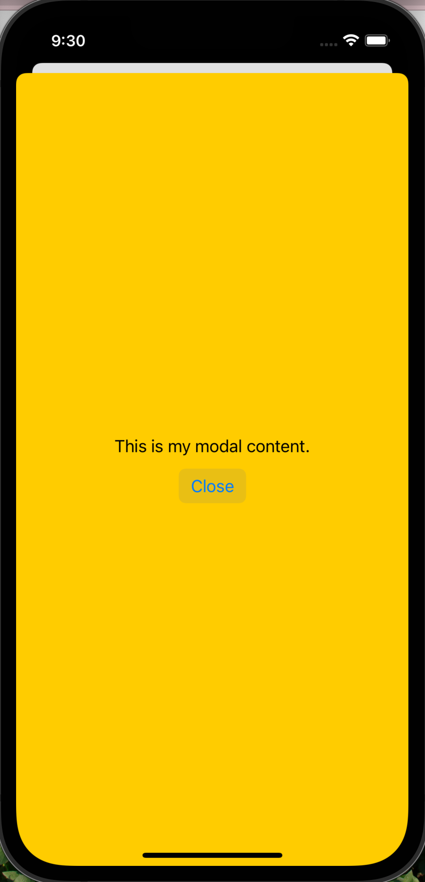
struct MySheetView: View {
    // Approach #1
    //@Binding var isPresented: Bool

    // Approach #2
    @Environment(\.dismiss) var dismiss

    var body: some View {
        ZStack {
            Color.yellow
            VStack {
                Text("This is my modal content.")
                Button("Close") {
                    //isPresented = false // Approach #1
                    dismiss() // Approach #2
                }.buttonStyle(.bordered)
            }
        }.edgesIgnoringSafeArea(.bottom)
    }
}

struct ContentView: View {
    @State private var isSheetPresented = false

    var body: some View {
        VStack {
            Text("This is my main view.")
            Button("Show Sheet") { isSheetPresented = true }
                .buttonStyle(.bordered)
                // This slides up from the bottom and covers ~90% of the screen.
                // To cover the entire screen, call fullScreenCover instead.
                .sheet(isPresented: $isSheetPresented) {
                    // Only need to pass this argument in approach #1.
                    //MySheetView(isPresented: $isSheetPresented)
                    MySheetView()
                        // .interactiveDismissDisabled()
                }
        }
    }
}
To change the vertical size of a sheet, apply the presentationDetents view modifier to the top view passed to .sheet
with an array of size specifiers which can be .medium or .large.
The first value specifies the default size of the sheet.
The optional second value specifies the size of the sheet
if the user taps on the drag indicator or drags it up.
For example, .presentationDetents([.medium, .large]).
For more precise sizing, pass .fraction and .height values.
For example, .presentationDetents([.height(200)]).
When only one size is specified, the drag indicator is not displayed.
When two sizes are specified, the drag indicator is displayed.
To change the visibility of the drag indicator, apply the presentationDragIndicator view modifier
to the top view passed to .sheet with a value of .visible.
To display full screen sheet, use the fullScreenCover view modifier in place of the .sheet view modifier.
This removes the ability of the user to dismiss the sheet by dragging down.
Error Handling
SwiftUI doesn't prescribe a particular way to handle errors and display messages that are relevant to users. Azam Sharp created the YouTube video Presenting Errors Globally in SwiftUI Applications that implements a nice approach. A modified version of his suggestion is described below. It displays error messages in an alert.
Begin by adding the file ErrorViewModel.swift containing the following:
import SwiftUI

class ErrorViewModel: ObservableObject {
    @Published var errorOccurred = false
    @Published private var error: Error?
    @Published private var message = ""

    func alert(error: Error? = nil, message: String) {
        if let error { Log.error(error) } // defined below
        self.error = error
        self.message = message
        errorOccurred = true
    }

    var text: Text {
        var content = message
        if let error { content += "\n" + error.localizedDescription }
        return Text(content)
    }
}
In the topmost view, typically defined in ContentView.swift,
add code like the following:
import SwiftUI

struct ContentView: View {
    @EnvironmentObject private var errorVM: ErrorViewModel

    var body: some View {
        VStack {
            ...
        }
        .alert(
            "Error",
            isPresented: $errorVM.errorOccurred,
            actions: {}, // no custom buttons
            message: { errorVM.text }
        )
    }
}
In all catch blocks that need to inform the user of an error,
add code like the following:
        do {
            try ...
        } catch {
            errorVM.alert(
                error: error,
                message: "Add a message that is relevant to users here."
            )
        }
The following code defines the Log type that
defines helper methods for logging errors using the Logger struct
provided by the Apple os framework.
Logger output appears in the Console pane.
The amount of detail shown for each logged item can be configured
with a popup accessed at the bottom of the Console pane.
Right-clicking a logged item offers many actions including "Jump to Source"
to jump to the line of code that produced the logged item.
import Foundation // for Bundle
import os // needed?
import OSLog // for Logger

// This is necessary to allow OSLogType values to be Dictionary keys.
extension OSLogType: Hashable {}

enum Log {
    // MARK: - Constants

    private static let typeToEmoji: [OSLogType: String] = [
        .debug: "🪲",
        .error: "❌",
        .fault: "☠️",
        .info: "🔎"
    ]

    private static let typeToName: [OSLogType: String] = [
        .debug: "debug",
        .error: "error",
        .fault: "fault",
        .info: "info"
    ]

    private static let logger = Logger(
        subsystem: Bundle.main.bundleIdentifier!,
        category: ""
    )

    // MARK: - Methods

    private static func buildMessage(
        _ type: OSLogType,
        _ message: String,
        _ file: String,
        _ function: String,
        _ line: Int
    ) -> String {
        let fileName = file.components(separatedBy: "/").last ?? "unknown"
        let emoji = typeToEmoji[type] ?? ""
        let name = typeToName[type] ?? ""
        return """
        \(fileName) \(function) line \(line)
        \(emoji) \(name): \(message)
        """
    }

    static func debug(
        _ message: String,
        file: String = #fileID,
        function: String = #function,
        line: Int = #line
    ) {
        let message = buildMessage(.debug, message, file, function, line)
        log(message: message, type: .debug)
    }

    static func error(
        _ err: Error,
        file: String = #fileID,
        function: String = #function,
        line: Int = #line
    ) {
        let message = err.localizedDescription
        error(message, file: file, function: function, line: line)
    }

    static func error(
        _ message: String,
        file: String = #fileID,
        function: String = #function,
        line: Int = #line
    ) {
        let message = buildMessage(.error, message, file, function, line)
        log(message: message, type: .error)
    }

    static func fault(
        _ message: String,
        file: String = #fileID,
        function: String = #function,
        line: Int = #line
    ) {
        let message = buildMessage(.fault, message, file, function, line)
        log(message: message, type: .fault)
    }

    static func info(
        _ message: String,
        file: String = #fileID,
        function: String = #function,
        line: Int = #line
    ) {
        let message = buildMessage(.info, message, file, function, line)
        log(message: message, type: .info)
    }

    /*
     This sets "privacy" to "public" to prevent values
     in string interpolations from being redacted.
     From https://developer.apple.com/documentation/os/logger
     "When you include an interpolated string or custom object in your message,
     the system redacts the value of that string or object by default.
     This behavior prevents the system from leaking potentially user-sensitive
     information in the log files, such as the user’s account information.
     If the data doesn’t contain sensitive information, change the
     privacy option of that value when logging the information."
     */
    private static func log(message: String, type: OSLogType) {
        switch type {
        case .debug:
            // The argument in each of the logger calls below
            // MUST be a string interpolation!
            logger.debug("\(message, privacy: .public)")
        case .error:
            logger.error("\(message, privacy: .public)")
        case .fault:
            logger.fault("\(message, privacy: .public)")
        case .info:
            logger.info("\(message, privacy: .public)")
        default:
            logger.log("\(message, privacy: .public)")
        }
    }
}

// This simplifies print statements that use string interpolation
// to print values with types like Bool.
// For example: print("isHavingFun = \(sd(isHavingFun))")
func sd(_ css: CustomStringConvertible) -> String {
    String(describing: css)
}
Toolbars
Toolbars are collections of buttons that can be
displayed at the top or bottom of the display.
The are created by applying the toolbar view modifier
to the top view inside a NavigationView.
Single buttons can be described inside a ToolbarItem view.
Multiple buttons can be described inside a ToolbarItemGroup view.
If there are only two buttons in a toolbar,
they are laid out as if there is a Spacer between them.
For other layouts, add your own Spacer views.
The placement of a toolbar is specified by the placement attribute
in the ToolbarItem and ToolbarItemGroup views.
Supported placement values include:
.navigationBarLeading: top, left-justified.navigationBarTrailing: top, right-justified; default.bottomBar: bottom, centered
Other placement values seem to be unable to render multiple buttons.
The following code example adds three buttons on the trailing side of the navigation bar and four buttons on the leafing side of the bottom bar.
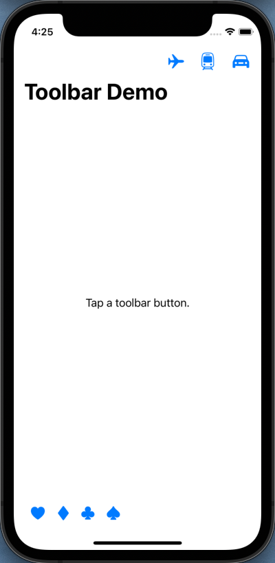
struct ContentView: View {
    @State private var selection = "Tap a toolbar button."

    var body: some View {
        NavigationView {
            Text(selection).padding()
                .navigationTitle("Toolbar Demo")
                .toolbar {
                    ToolbarItemGroup(placement: .navigationBarTrailing) {
                        Button(
                            action: { selection = "planes" },
                            label: { Image(systemName: "airplane") }
                        )
                        Button(
                            action: { selection = "trains" },
                            label: { Image(systemName: "tram") }
                        )
                        Button(
                            action: { selection = "automobiles" },
                            label: { Image(systemName: "car.fill") }
                        )
                    }
                    ToolbarItemGroup(placement: .bottomBar) {
                        Button(
                            action: { selection = "hearts" },
                            label: { Image(systemName: "suit.heart.fill") }
                        )
                        Button(
                            action: { selection = "diamonds" },
                            label: { Image(systemName: "suit.diamond.fill") }
                        )
                        Button(
                            action: { selection = "clubs" },
                            label: { Image(systemName: "suit.club.fill") }
                        )
                        Button(
                            action: { selection = "spades" },
                            label: { Image(systemName: "suit.spade.fill") }
                        )
                        Spacer()
                    }
                }
        }
    }
}
To add a toolbar item that is only present for a given screen, write code similar to the following:
struct SomeView: View {
    @State private var isActive = false

    var body: some View {
        VStack {
            ...
        }
        .onAppear { isActive = true }
        .onDisappear { isActive = false }
        .toolbar {
            if isActive {
                ToolbarItem(placement: .navigationBarTrailing) {
                    Button(action: {
                        ...
                    }) {
                        Image(systemName: "plus.circle.fill")
                    }
                }
            }
        }
    }
}
Navigation
The approach described here is deprecated in iOS 16. See the new approach at Navigation.
The NavigationView view marks the spot where
the views associated with NavigationLinks will be rendered.
The NavigationLink view provides a link that
navigates to a destination view when tapped.
It is passed a destination argument and a closure
that describes the view to be rendered as the link.
The navigationTitle view modifier provides the title to be displayed in the navigation bar of the target screen.
The navigationBarTitleModeDisplay view modifier specifies the title size.
It defaults to .large and can be changed to .inline which is smaller.
The following example code renders four pages. Page 1 contains links to pages 2 and 3. Page 3 contains a link to page 4.
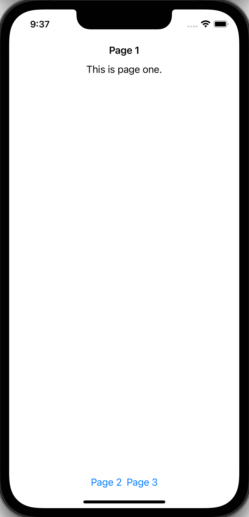
struct Page1: View {
    var body: some View {
        VStack {
            Text("This is page one.")
                .navigationTitle("Page 1")
                .navigationBarTitleDisplayMode(.inline)
                // .large leaves a large amount of space above
            Spacer()
            HStack {
                NavigationLink(destination: Page2()) {
                    Text("Page 2")
                }
                NavigationLink(destination: Page3()) {
                    Text("Page 3")
                }
            }
        }
    }
}

struct Page2: View {
    var body: some View {
        Text("This is page two.").navigationTitle("Page 2")
    }
}

struct Page3: View {
    var body: some View {
        VStack {
            Text("This is page three.").navigationTitle("Page 3")
            Spacer()
            NavigationLink(destination: Page4()) {
                Text("Page 4")
            }
        }
    }
}

struct Page4: View {
    var body: some View {
        Text("This is page four.").navigationTitle("Page 4")
    }
}

struct ContentView: View {
    var body: some View {
        NavigationView {
            Page1()
        }
    }
}
If the view inside a NavigationLink doesn't have a navigationTitle,
the link to go back will just display "Back".
To go back to the previous view programmatically,
add the following to a view and call dismiss with no arguments.
@Environment(\.dismiss) var dismiss
Here is a more advanced example of using NavigationView.
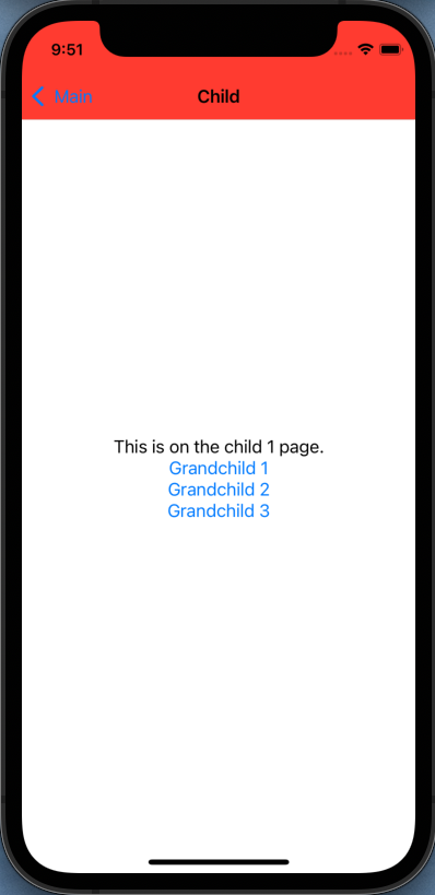
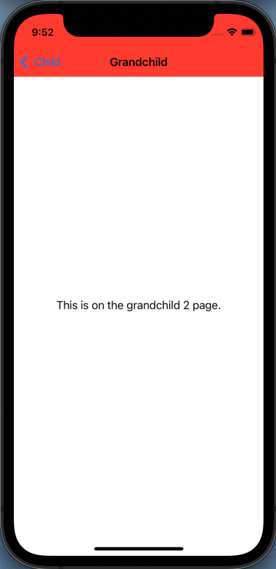
// SwiftUI-NavigationApp.swift
import SwiftUI

@main
struct SwiftUI_NavigationApp: App {
    // This registers use of AppDelegate defined in AppDelegate.swift.
    @UIApplicationDelegateAdaptor(AppDelegate.self) var appDelegate

    var body: some Scene {
        WindowGroup {
            ContentView()
        }
    }
}
// AppDelegate.swift
import UIKit

// To use this, register it in the main .swift file.
class AppDelegate: UIResponder, UIApplicationDelegate {
    func application(
        _ application: UIApplication,
        didFinishLaunchingWithOptions launchOptions: [UIApplication.LaunchOptionsKey: Any]? = nil
    ) -> Bool {
        // Change the appearance of the status and navigation bars.
        // This is not currently possible using only SwiftUI,
        // so we need to use the UIKit approach.
        let appearance = UINavigationBarAppearance()
        appearance.configureWithOpaqueBackground()
        appearance.backgroundColor = .systemRed // a bit more muted than .red
        appearance.largeTitleTextAttributes = [
            .foregroundStyle: UIColor.white
            //.font: UIFont.monospacedSystemFont(ofSize: 36, weight: .bold)
        ]
        UINavigationBar.appearance().scrollEdgeAppearance = appearance

        return true
    }
}
// ContentView.swift
import SwiftUI

// This data is shared between pages as an environment object.
@MainActor
class SharedData: ObservableObject {
    @Published var v1 = 0
    @Published var v2 = "x"
}

// This displays data in an environment object
// and allows users to modify the data.
struct DataView: View {
    // This is needed to gain access to the environment object.
    @EnvironmentObject var data: SharedData

    var body: some View {
        VStack {
            Text("v1 = \(data.v1)")
            // Why does these buttons appear to become disabled
            // after tapping them in the Simulator?
            // This doesn't happen in Preview.
            Button("Add 1") { data.v1 += 1 }.buttonStyle(.bordered)
            Text("v2 = \(data.v2)")
            Button("Update") { data.v2 += "x" }.buttonStyle(.bordered)
        }
    }
}

struct MainPage: View {
    // This is needed to gain access to the environment object.
    @EnvironmentObject var data: SharedData

    // This can have a type other than String such as Int.
    @State private var selection: String? = nil

    // This is used to toggle between displaying page 4 and 5.
    @State private var pageToggle = false

    var body: some View {
        VStack {
            Text("This is on the main page.")

            // This creates two links to ChildPage views.
            ForEach(1..<3) { number in
                NavigationLink(destination: ChildPage(number: number)) {
                    Text("Go to child \(number) page")
                }
            }

            // Tab-based navigation
            // Also consider using the isActive argument which is an
            // @State Bool that indicates if the link should be activated.
            NavigationLink(
                destination: ChildPage(number: 4),
                tag: "four",
                selection: $selection
            ) {
                Text("Go to four")
            }
            NavigationLink(
                destination: ChildPage(number: 5),
                tag: "five",
                selection: $selection
            ) {
                Text("Go to five")
            }

            // Programmatic navigation to the links above
            Button("Mystery Page") {
                // Could make a REST call here and use the data
                // to determine the value of "selection".
                selection = pageToggle ? "five" : "four"

                // Could conditionally decide how to set "pageToggle"
                // which is used above to determine the value of "selection".
                pageToggle.toggle()

                // Return to the current page after 2 seconds.
                // This is like setTimeout in JavaScript.
                DispatchQueue.main.asyncAfter(deadline: .now() + 2) {
                    selection = nil
                }
            }

            Text("data.v1 = \(data.v1)")

            // Can attach an environment object to any view like this.
            //NavigationLink(destination: DataView().environmentObject(data)) {

            // But can also attach an environment object
            // to the NavigationView (see below)
            // to make it available in all linked views.
            NavigationLink(destination: DataView()) {
                Text("Go to DataView")
            }
        }
    }
}

struct ChildPage: View {
    var number: Int

    var body: some View {
        VStack {
            Text("This is on the child \(number) page.")

            // This creates three links to GrandchildPage views.
            ForEach(1..<4) { number in
                NavigationLink(destination: GrandchildPage(number: number)) {
                    Text("Grandchild \(number)")
                }
            }
        }
        .navigationBarTitle("Child", displayMode: .inline)
    }
}

struct GrandchildPage: View {
    var number: Int

    var body: some View {
        Text("This is on the grandchild \(number) page.")
            .navigationBarTitle("Grandchild", displayMode: .automatic)
    }
}

struct ContentView: View {
    // This is registered as an environment object below.
    @ObservedObject var data = SharedData()

    // Going full screen requires hiding both
    // the status bar and the navigation bar.
    // See where this is used below.
    @State private var fullScreen = false

    var body: some View {
        // Usually NavigationView is only used at the top-level.
        // One exception is when using multiple tabs
        // where each has its own NavigationView.
        //
        // Currently SwiftUI only supports two customizations of the navbar.
        // It can be hidden entirely or only the back button can be hidden.
        // Other customizations require use of UIKit.
        NavigationView {
            VStack {
                Button("Toggle Full Screen") { fullScreen.toggle() }
                MainPage()
            }

            // The navigationBarTitle goes on a view inside NavigationView,
            // not on the NavigationView,
            // because the title can change for each page.
            // See other calls to this above.
            // The optional "displayMode" attribute has three options:
            // large (default), inline, and automatic.
            // Automatic uses large for the top view and inline for others.
            .navigationBarTitle("Main")

            .navigationBarHidden(fullScreen)

            // This adds buttons in the navigation bar,
            // only for the view to which this is applied, which is
            // the VStack above that is only rendered on the main page.
            // If the background color of the navigation bar is changed,
            // the color of these buttons typically should be changed also.
            .navigationBarItems(
                leading:
                    Button("Down") { data.v1 -= 1 }
                    .foregroundStyle(.white),
                trailing:
                    HStack {
                        Button("Up") { data.v1 += 1 }
                        Button("Double") { data.v1 *= 2 }
                    }.foregroundStyle(.white)
            )
        }
        .statusBarHidden(fullScreen)

        // This makes an @ObservedObject available
        // to all linked views as an @EnvironmentObject.
        // All views that use it will have their body property
        // reevaluated if the value changes.
        .environmentObject(data)
    }
}
Most SwiftUI code works on all platforms.
However, watchOS does not support NavigationView.
Here is a shim that provides a shell implementation
so the same code that works in iOS can work in watchOS.
To run this app as a watchOS app in the simulator:
- select File ... New ... Target
- click the watchOS tab
- scroll down and select "Watch App for iOS App"
- click Next
- enter a product name
- click Finish, then Activate
TODO: Why does the Apple Watch Simulator always just display "Hello, World!" and not what is in this app?
#if os(watchOS)
struct NavigationView<Content: View>: View {
    let content: () -> Content

    init(@ViewBuilder content: @escaping () -> Content) {
        self.content = content
    }

    var body: some View {
        VStack(spacing: 0) {
            content()
        }
    }
}
#endif
macOS does not support the navigationBarTitle view modifier.
Here is a shim that provides a shell implementation
so the same code that works in iOS can work in macOS.
To run this app as a macOS app in the Simulator, create the app as either a Multiplatform App or a macOS app.
#if os(macOS)
extension View {
    func navigationBarTitle(_ title: String) -> some View {
        self
    }
}
#endif
Sidebars
A sidebar provides app-level navigation to top-level collections of content. For example, the iOS Mail app displays a list of mailboxes in a sidebar. Selecting an item in the sidebar changes what is displayed in the pane that follows.
SwiftUI creates a sidebar when the .listStyle(.sidebar) view modifier
is applied to a List view.
The following example uses a sidebar for selecting a sport. When a sport is selected, the pane to its right displays a list of teams in that sport and allows one to be selected. When a team is selected, the pane to its right displays a list of players on that team.
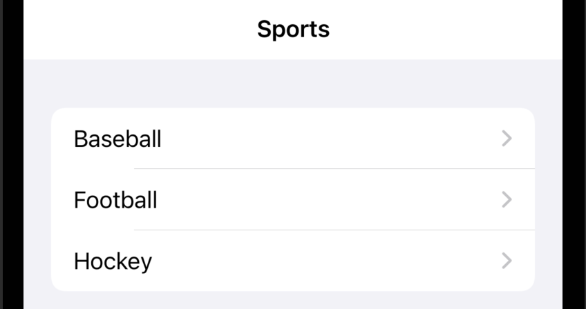
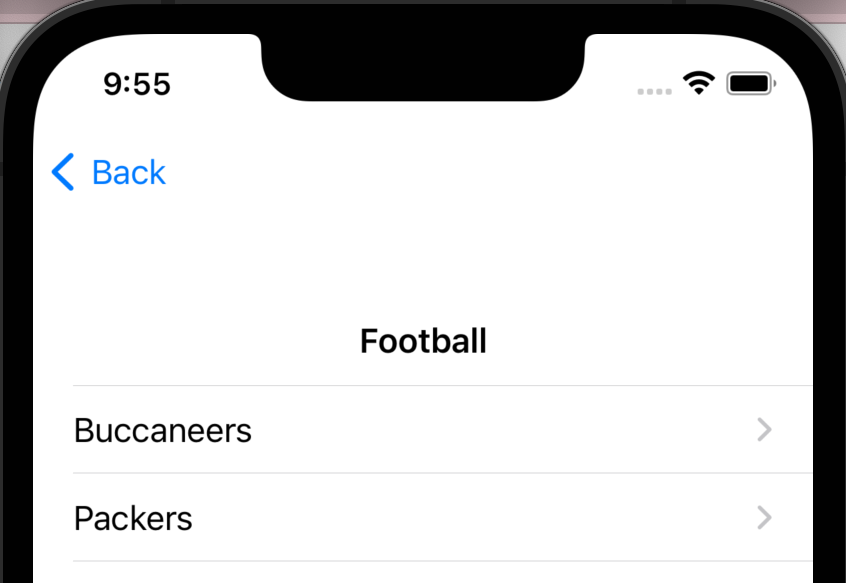
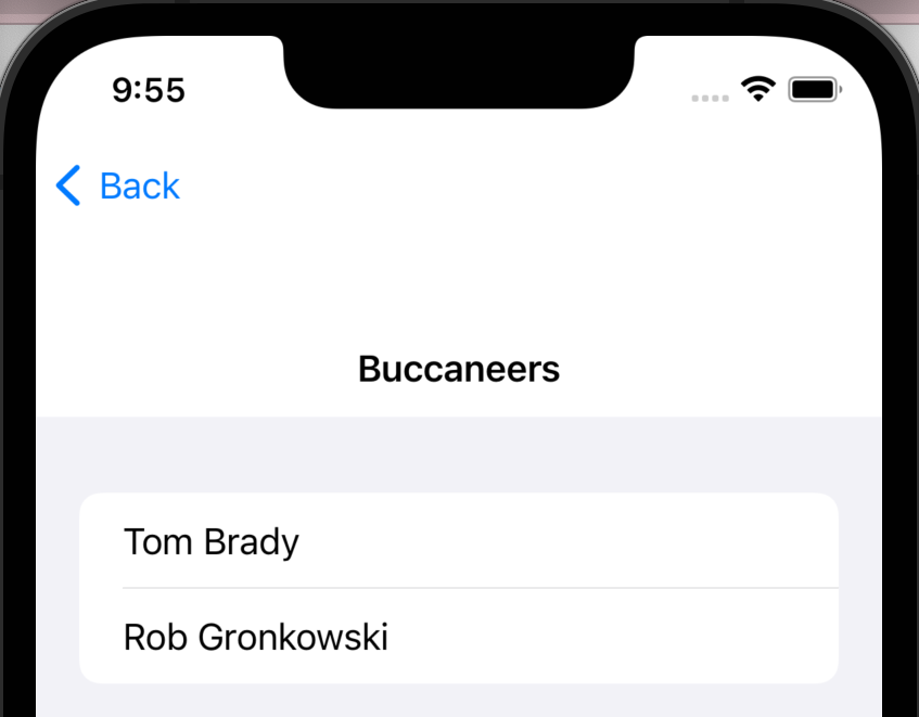
// model.swift
import Foundation

struct Sport: Hashable {
    var name: String
    var teams: [Team] = []
}

struct Team: Hashable {
    var name: String
    var players: [Player] = []
}

struct Player: Hashable {
    var name: String

    init(_ name: String) {
        self.name = name
    }
}

@MainActor
class Model: ObservableObject {
    var baseball = Sport(name: "Baseball")
    var football = Sport(name: "Football")
    var hockey = Sport(name: "Hockey")

    @Published var sports: [Sport] = []

    init() {
        // Baseball data

        var team = Team(name: "Cardinals")
        team.players.append(Player("Yadier Molina"))
        team.players.append(Player("Adam Wainwright"))
        baseball.teams.append(team)

        team = Team(name: "Cubs")
        team.players.append(Player("Jason Heyward"))
        team.players.append(Player("Patrick Wisdom"))
        baseball.teams.append(team)

        sports.append(baseball)

        // Football data

        team = Team(name: "Buccaneers")
        team.players.append(Player("Tom Brady"))
        team.players.append(Player("Rob Gronkowski"))
        football.teams.append(team)

        team = Team(name: "Packers")
        team.players.append(Player("Aaron Rodgers"))
        team.players.append(Player("Davante Adams"))
        football.teams.append(team)

        sports.append(football)

        // Hockey data

        team = Team(name: "Blues")
        team.players.append(Player("Vladimir Tarsenko"))
        team.players.append(Player("Jordan Binnington"))
        hockey.teams.append(team)

        team = Team(name: "Blackhawks")
        team.players.append(Player("Marc-Andre Fleury"))
        team.players.append(Player("Jonathan Toews"))
        hockey.teams.append(team)

        sports.append(hockey)
    }
}
// SwiftUI-SidebarApp.swift
import SwiftUI

@main
struct SwiftUI_SidebarApp: App {
    var body: some Scene {
        WindowGroup {
            ContentView(model: Model())
        }
    }
}
// ContentView.swift
import SwiftUI

struct SportsView: View {
    @ObservedObject var model: Model
    @Binding var selectedSport: Sport?
    @Binding var selectedTeam: Team?

    var body: some View {
        VStack {
            Text("Sports").font(.headline)
            List(model.sports, id: \.self) { sport in
                NavigationLink(
                    destination: TeamsView(
                        selectedSport: $selectedSport,
                        selectedTeam: $selectedTeam
                    ),
                    tag: sport,
                    selection: $selectedSport
                ) {
                    Text(sport.name)
                }
            }.listStyle(.sidebar)
        }
    }
}

struct TeamsView: View {
    @Binding var selectedSport: Sport?
    @Binding var selectedTeam: Team?

    var body: some View {
        VStack {
            Text(selectedSport?.name ?? "None").font(.headline)
            List(selectedSport?.teams ?? [], id: \.self) { team in
                NavigationLink(
                    destination: PlayersView(
                        selectedTeam: $selectedTeam
                    ),
                    tag: team,
                    selection: $selectedTeam

                ) {
                    Text(team.name)
                }
            }
        }
    }
}

struct PlayersView: View {
    @Binding var selectedTeam: Team?

    var body: some View {
        VStack {
            Text(selectedTeam?.name ?? "None").font(.headline)
            List(selectedTeam?.players ?? [], id: \.self) { player in
                Text(player.name)
            }
        }
    }
}

struct ContentView: View {
    @State private var selectedSport: Sport?
    @State private var selectedTeam: Team?

    var model: Model

    var body: some View {
        NavigationView {
            SportsView(
                model: model,
                selectedSport: $selectedSport,
                selectedTeam: $selectedTeam
            )
            Text("Select a sport")
            Text("Select a team")
        }
    }
}

struct ContentView_Previews: PreviewProvider {
    static var previews: some View {
        ContentView(model: Model())
    }
}
Size Classes
The environment variables horizontalSizeClass and verticalSizeClass
can be used to get a rough idea of
the amount of screen space available in those directions.
The values of these variables can change when a device
is rotated between portrait and landscape mode.
The value of these variables is either .regular or .compact.
To make the values of these variables available in a custom view:
@Environment(
    \.horizontalSizeClass
) var horizontalSizeClass: UserInterfaceSizeClass?
@Environment(
    \.verticalSizeClass
) var verticalSizeClass: UserInterfaceSizeClass?
To test the value of these variables, add code similar to the following:
if horizontalSizeClass == .compact {
    Text("Compact")
} else {
    Text("Regular")
}
if verticalSizeClass == .compact {
    Text("Compact")
} else {
    Text("Regular")
}
ViewThatFits
The ViewThatFits view takes any number of child views and renders only the first one that fits in its parent frame. This can often be used in place of evaluating size classes to determine the best way to layout a set of views.
The example below renders ten buttons. If there is enough room to lay them out in a single row, it does that. Otherwise it lays them out vertically.
struct ContentView: View {
    private let labels = [
        "One", "Two", "Three", "Four", "Five",
        "Six", "Seven", "Eight", "Nine", "Ten"
    ]

    private func getContent() -> some View {
        ForEach(labels, id: \.self) {
            Button($0) { print("got tap") }
        }
    }

    var body: some View {
        ViewThatFits {
            HStack(content: getContent)
            VStack(content: getContent)
        }
        .buttonStyle(.bordered)
    }
}
Utility Functions
The dump
function takes a value and prints it for debugging purposes.
The value can be non-primitive such as an object or array.
Optional arguments that follow the value include
name, indent, maxDepth, and maxItems.
Key Paths
A key path refers to a property in a struct or class rather than the value of a property in a particular instance.
A key path can be created with a backslash followed by a type name, a period, and a property name. For example:
struct Person {
  var name: String
}

let namePath = \Person.name
Key paths can also refer to deeply nested properties.
For example, if the Person struct contained an address property
that referred to an Address struct that contained a country property
then the key path \Person.address.country would refer to it.
A key path can be used to get the value of a property from an instance of a struct or class. For example:
let person = Person(name: "Mark")
let name = person[keyPath: namePath] // "Mark"
All objects have the property self that refers to the whole object.
To write a key path that refers to the whole object
rather than a specific property inside it, use \.self.
Environments
A SwiftUI environment specifies key/value pairs that available
in (and can effect) all sub-views of the view on which they are specified.
For example, if a font is specified on a VStack then it
becomes the default font for all views nested inside it at any depth.
To dump the contents on the current environment of a view, chain the following onto the view:
.transformEnvironment(\.self) { dump($0) }
TODO: Watch this video.
Device ID
To get the unique ID of the current device:
if let uuid = UIDevice.current.identifierForVendor?.uuidString {
    // use uuid
}
Network Requests
See the HTTP section in my blog page on Swift.
TODO: Watch this video.
UserDefaults
The UserDefaults class is "an interface to the user's defaults database,
where you store key-value pairs persistently across launches of your app."
When an app is deleted, it's UserDefaults data is also deleted.
This is intended for storing small amounts of non-sensitive data.
The @AppStorage property wrapper makes it easier to work with UserDefaults, but it is limited to the following types:
Bool, Int, Double, String, URL, and Data (byte buffer).
It cannot be used in the example below because
it stores an array of struct instances.
TODO: Can you store an array objects directly without encoding as JSON?
@AppStorage properties can only be defined in View subtypes.
To access the same data in other types, use UserDefaults.
For example, these access the same data:
@AppStorage("showFahrenheit") private var showFahrenheit: Bool?

let showFahrenheit = UserDefaults.standard.bool(forKey: "showFahrenheit")
For small amounts of basic data, using @AppStorage can be
seen as an alternative to defining a view model
(with ObservableObject and @Published) and using the view model
(with @StateObject, @ObservableObject, or @EnvironmentObject).
Views that take a binding such as TextField
can use @AppStorage properties with a $ prefix.
It has the advantage of also persisting the data.
For macOS and iPad apps that have multiple scenes (aka windows),
consider using SceneStorage instead of AppStorage
in order to store different data for each scene.
The code below demonstrates using this to persist data about dogs as JSON.
struct Dog: Codable, CustomStringConvertible, Identifiable {
    var name: String
    var breed: String
    var description: String { "\(name) is a \(breed)"}
    var id: String { name }

    // Can also use this to specify different names for the JSON keys.
    enum CodingKeys: CodingKey {
        case name
        case breed
    }
}

func deleteData(for key: String) {
    UserDefaults.standard.removeObject(forKey: key)
}

func getData<T>(for key: String, defaultingTo defaultValue: T) -> T where T: Decodable {
    if let data = UserDefaults.standard.data(forKey: key) {
        if let decoded = try? JSONDecoder().decode(T.self, from: data) {
            return decoded
        }
    }
    return defaultValue
}

func setData<T>(for key: String, to value: T) where T: Encodable {
    if let encoded = try? JSONEncoder().encode(value) {
        UserDefaults.standard.set(encoded, forKey: key)
    }
}

struct ContentView: View {
    private static let KEY = "dogs"

    @State private var breed = ""
    @State private var name = ""
    @State private var dogs: [Dog] // can't initialize this to an empty array!

    init() {
        dogs = getData(for: ContentView.KEY, defaultingTo: [])
        print("init: dogs =", dogs)
    }

    func deleteAll() {
        deleteData(for: ContentView.KEY)
        dogs = []
    }

    func deleteDogs(at offsets: IndexSet) {
        dogs.remove(atOffsets: offsets)
        save()
    }

    func save() {
        setData(for: ContentView.KEY, to: dogs)
    }

    var body: some View {
        NavigationView {
            VStack {
                Section(header: Text("New Dog")) {
                    Form {
                        TextField("Name", text: $name)
                        TextField("Breed", text: $breed)
                        Button("Add") {
                            dogs.append(Dog(name: name, breed: breed))
                            save()
                            name = ""
                            breed = ""
                        }
                    }
                }
                Section(header: Text("Current Dogs")) {
                    List {
                        ForEach(dogs) { dog in
                            Text(String(describing: dog))
                        }
                        .onDelete(perform: deleteDogs)
                    }
                    Button("Delete All", action: deleteAll)
                }
                Spacer()
            }.navigationBarTitle("Dog Collection", displayMode: .inline)
        }
    }
}
Combine
From the official docs, "The Combine framework provides a declarative Swift API for processing values over time. These values can represent many kinds of asynchronous events. Combine declares publishers to expose values that can change over time, and subscribers to receive those values from the publishers."
TODO: Watch this video.
Secrets
Some apps need to use data that should be not be visible to users and show not be stored in version control systems. This includes keys and passwords that are required to invoke REST services. Here is one approach to store these secrets.
- Create a new file, select the "Other" category, and select "Configuration Settings File".
- Name the file
Secrets.xcconfig. - Add secrets in this file where each line has the format
SOME_SECRET_KEY = SOME_SECRET_VALUE. - In the Navigator, select the top project group.
- In the project editor left nav, select the project.
- Select the "Info" tab.
- Under "Configurations", expand the "Debug" and "Release" sections.
- Register the new file with the app name under each of these by clicking "None" and selecting "Secrets".
- In the project editor left nav, click the target.
- Open the "Custom iOS Target Properties" section.
- For each secret
- Hover over any existing key.
- Click the "+" to add another property.
- Enter a key, select a type, and enter a value
Access secret values in code as follows:
let secretValue = Bundle.main.object(
    forInfoDictionaryKey: "SOME_SECRET_KEY"
) as? String
If the secret values used by the release version of the app
need to differ from those used by the debug version,
create a different Configuration Settings File for each
(perhaps with the names SecretsDebug.xcconfig and SecretsRelease.xcconfig)
and register them appropriately on the 'Info" tab.
Add the Configuration Settings Files to .gitignore
to keep them out of version control.
Consider checking in a template Configuration Settings File
that doesn't contain real values
in order to document the secret keys that are required.
In addition, add the generated file {app-name}-Info.plist to .gitignore.
Background Tasks
Apple introduced the BackgroundTasks framework in 2019 as part of iOS 13.
See How To Use iOS Background Tasks Framework.
To run tasks while an app is in the background:
-
Select the top project entry in the Navigator.
-
Click the top entry under TARGETS
-
Click the "Signing & Capabilities" tab.
-
Click the "+" to add a capability.
-
In the dialog that appears, double-click "Background Modes".
-
Check the checkboxes for "Background fetch" and "Background processing".
-
Click the "Info" tab.
-
Expand the "Custom iOS Target Properties" section if not already expanded.
-
Click the row of the last entry and then click the circled "+" that appears.
-
Add the key "Permitted background task scheduler identifiers"
-
Set the type to "Array".
-
For each background tasks
- Click the "+" on that row to add an item.
- The item type should be "String".
- Set the value to a unique string.
- Register a task.
-
Edit the file "AppDelegate.swift".
-
Add
import BackgroundTasks
Siri
Siri can be used to trigger actions within an app. To configure this:
-
Select the project at the top of the Navigator view.
-
Select the topmost target.
-
Select the "Signing & Capabilities" tab.
-
Select to top entry under "TARGETS".
-
Click the "+" button in the upper-left.
-
Add the "Siri" capability.
-
Select the "Info" tab
-
Under "Custom iOS Target Properties", hover over the last row.
-
Click the "+" button.
-
Select the key "Privacy - Siri Usage Description"
-
Enter the reason Siri is being used. For example, "Siri is used to trigger app actions by voice."
-
Select the "General" tab.
-
Scroll down to the "Frameworks, Libraries, and Embedded Content" section.
-
Click the "+" button.
-
Enter "intent".
-
Select "Intents.framework".
-
Click the Add button.
-
Click the "+" button.
-
Enter "intent".
-
Select "IntentsUI.framework".
-
Click the Add button.
-
In the Navigator, select the file
Info.plist. -
Add the key "NSUserActivityTypes" and set the type to "Array".
-
Add elements describing the activities to be triggered by Siri. For example, "SetBackgroundIntent".
-
Select File ... New ... Target...
-
Under the "Application Extension" section, click "Intents UI Extension".
-
Click the Next button.
-
In the "Product Name" input, enter the current app name followed by "Intent" with no spaces.
-
Click the Finish button.
-
Click the Activate button.
-
In the Navigator, select the application folder that contains the file
ContentView.swift. -
Select File ... New ... File...
-
Under the "Resources" section, click "SiriKit Intent Definition File".
-
Click the Next button.
-
Verify that all the "Targets" checkboxes are checked.
-
Click the Create button.
For each intent to be added:
- In the Navigator, select the file "Intents.intentdefinition".
- Click the "+" in the lower-left.
- Select "New Intent".
- Rename the intent from it's default name of "Intent". The name must begin with a capital letter, for example, "SetBackground".
- Enter a human-readable "Description".
- Select a "Category" such as "Set".
For each parameter of an intent:
- Click the "+" in under "Parameters".
- Select a "Type" such as "String".
- Under "Siri Dialog", enter a "Prompt". For example, "Say the name of a color".
For each shortcut phrase to be supported:
-
Scroll down to the "Shortcut app" section.
-
Select the "Input Parameter" if one is needed. For example, "color".
-
Select the "Key Parameter" if one is needed. For example, "color".
-
Enter a "Summary" such as "change background to color". The word "color" will be highlighted because it is the name of a parameter.
-
Scroll down to the "Suggestions" section.
-
Verify that the "Supports background execution" checkbox is checked.
-
In the intents editor left nav, select "Response".
-
In the "Response Templates" section, select "success" and enter text for the "Voice-Only Dialog".
-
In the "Response Templates" section, select "failure" and enter text for the "Voice-Only Dialog".
-
Select Product ... Build.
-
Attach an iPhone to the computer with a USB cable.
-
Select the iPhone from the device menu at the top.
-
Select Product ... Run or click the run triangle.
-
Why does it prompt "Choose an app to run"?
Debugging Tips
To print to the debug console every time a view body is reevaluated,
add a line like the following inside the body definition:
let _ = print("some debugging information")
To determine what causes the body to be reevaluated,
add a line like the following inside the body definition:
let _ = Self._printChanges()
App Demos
One approach for demonstrating iOS apps to others using a real device instead of the Simulator is to use QuickTime. The steps to do this are:
- Enable "Developer Mode" on an iPhone (Settings ... Privacy & Security ... Developer Mode).
- Attach an iPhone to a computer running macOS using a USB cable.
- Launch the QuickTime Player application.
- Select File ... New Movie Recording.
- Click the drop-down next to the record button and select "iPhone".
- Connect with another user using a video chat service that supports screen sharing such as Google Meet.
- Share your screen.
- Demonstrate apps on the iPhone.
- When finished, quit QuickTime Player without saving the recorded movie and eject the iPhone from Finder.
App Clips
From the Apple App Clips documentation "An App Clip is a lightweight version of your app that offers users access to some of the app’s functionality."
App Clips binaries must be small. For iOS 15 and before the limit is 10 MB. For iOS 16 and beyond the limit is 15 MB.
To implement an app clip for an existing app, create a new target from the "App Clip" template. Select source files in the main app that should be shared with the App Clip by checking the appropriate checkboxes in the Inspector.
App Clips differ from widgets in that they can be interactive whereas widgets cannot.
Questions/Thoughts
-
With over 4000 icons in SF Symbols, how can there be none related to animals? Perhaps Apple feels that emojis should be used for these.
-
Adoption of Swift and SwiftUI would be much higher if there was a way to generate an Android app from a Swift app.
-
Why do SwiftUI
ViewBuilderssupportifandswitchstatements, but notforloops? We have to use theForEachview instead. -
Some method names seem longer than they should be. For example,
onTapGesturecould be justonTap. -
Why doesn't SwiftUI provide a way to specify default styling that applies to all views in an app, similar to CSS for web applications?
-
Why do
Pickerviews appear to be disabled unless they are wrapped in aNavigationViewand aForm? -
I wish
id: \.selfwas needed in fewer situations. For example, why isn't that the default when usingForEachon an array ofStringvalues?